Week 2: 25 Cupcake Iterative Model Making

Before Thursdays class I made three models exploring different parts of our research into the colour orange.

My first model (below) explores the interaction of colours.

This model explores the two primary colours (yellow and red) that create orange. The reason why I created a circular form was because through research I learnt that the colour orange was named after the fruit. This model also explores that the different amounts of red added to a yellow creates a different intensity of orange. In this instance, where the red tulle material folds and overlaps is where a deeper orange occurs.

My second model (below) explores an aspect of our seminar research.

I decided to explore complementary colours through this model. Angle is a very important factor in this model; the amount of orange colour that is shown against the blue depends on the angle it is viewed from.

My third model (below) explores a detail.

I wasn’t quite sure what was meant by ‘explore a detail’ so I decided to take the approach of exploring orange by itself through the closeup interaction of different materials. This model I explored with weaving thin orange paper rope in and around a fixed orange paper straw and to create form I used wire.

During Thursdays class I continued making models through the cupcake exercise. The three models I had already made were positioned as three corners to a rectangle. I then began to make models that were a combination of a chosen opposite two and continued until I had 25 models. Below is an image of my models displayed.

I have also included some evocative images of some of the individual images by themselves.

Week 2: Group Colour Seminar

This week we created a group and started on research on the colour Orange. We split the research up into different sections for each of us in the group to work on. My research included the analysis of five key design precedents and their work, the designers/artists theories about colour and its use in terms of space, and also the consideration of complimentary colours.

Week 1: Model Making

From my colour collage I made a series of models through a model making exercise.

Below is my first model. This model intersects volumes of colour, light and shadow.

This model explored reflection of image and light. It communicated the need for perspective and a different view in order to see and understand what you are looking for.

Below is my second model. This model explores surface texture and shadows

This model explores the way that the light travelling through the cellophane is manipulated and projected into the space. The crinkled affect of the cellophane gives the projection layers creating deeper colour in some areas. The reflective card explores the reflection of this projection and the effect it has.

Below is my third model. This model is a connection between my first and second model.

This model explores the filtration of light through the crinkled, layered cellophane as well as the manipulation of image and light through reflection with the curved reflective card. The blocking white card reiterates the need for a changing view, perspective or angle to engage with the full affect of the model.

Week 1: Colour Collage

From images i collected while travelling to and exploring the surroundings of the site i created a image collage that exlored how i experienced and interpreted colour throughout the journey.

My exploration and interpretation of colour changed throughout the journey to the site. Because of this, I wanted to create a chronological order of images to display my process of thought. The reason why I created the collage to unfold is to iterate my changing perspective and view on colour. It also related to my experience of not knowing the site or where it was located until being showed it and knowing I walk past it on my way to uni everyday. The unfolding motion communicates the way that I didn’t know what was going to be around the corner.

Week 1: Site Exploration

This week we walked down to the St James Theater from our studio and explored its surroundings. Throughout the walk I recorded my observations and interpretation of colour and how it was applied to and expressed in the environment. Below are some drawings and photos I took.

These were some coloured sketches I took just outside of our Studio. I wanted to express the fluidity of the natural colours such as the plants through organic lines and the rigidness of the surrounding artificial city environment with straight lines. I started out with exploring color through its source and how I would portray this visually.

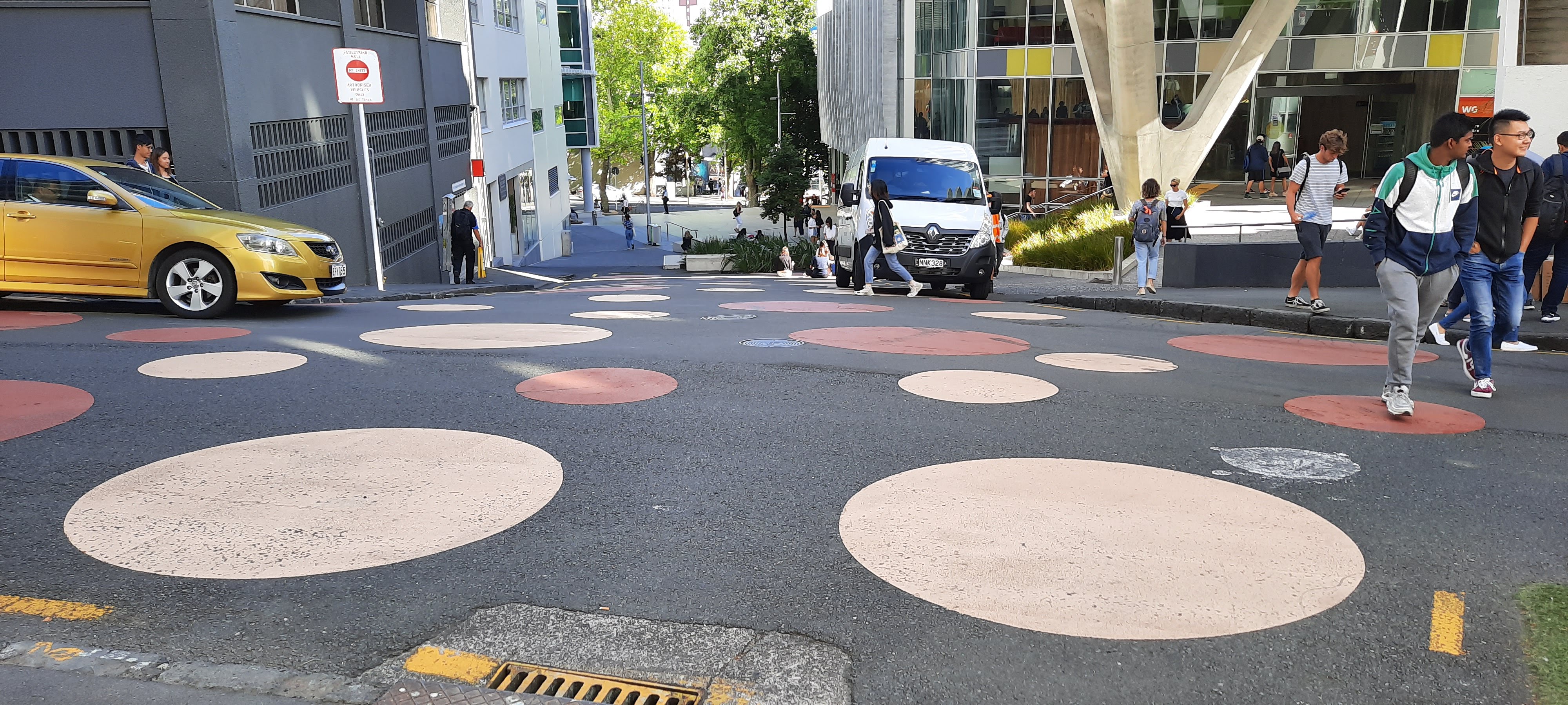
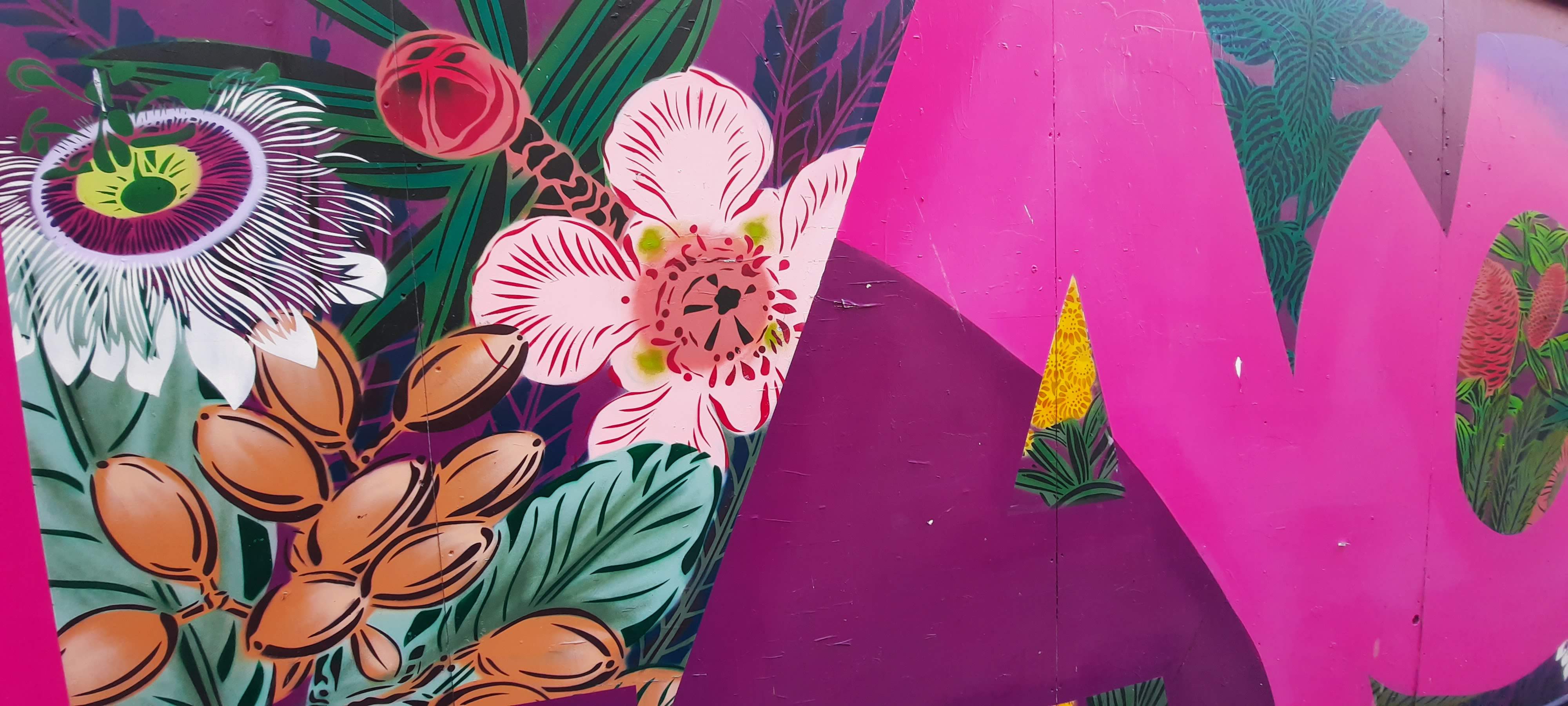
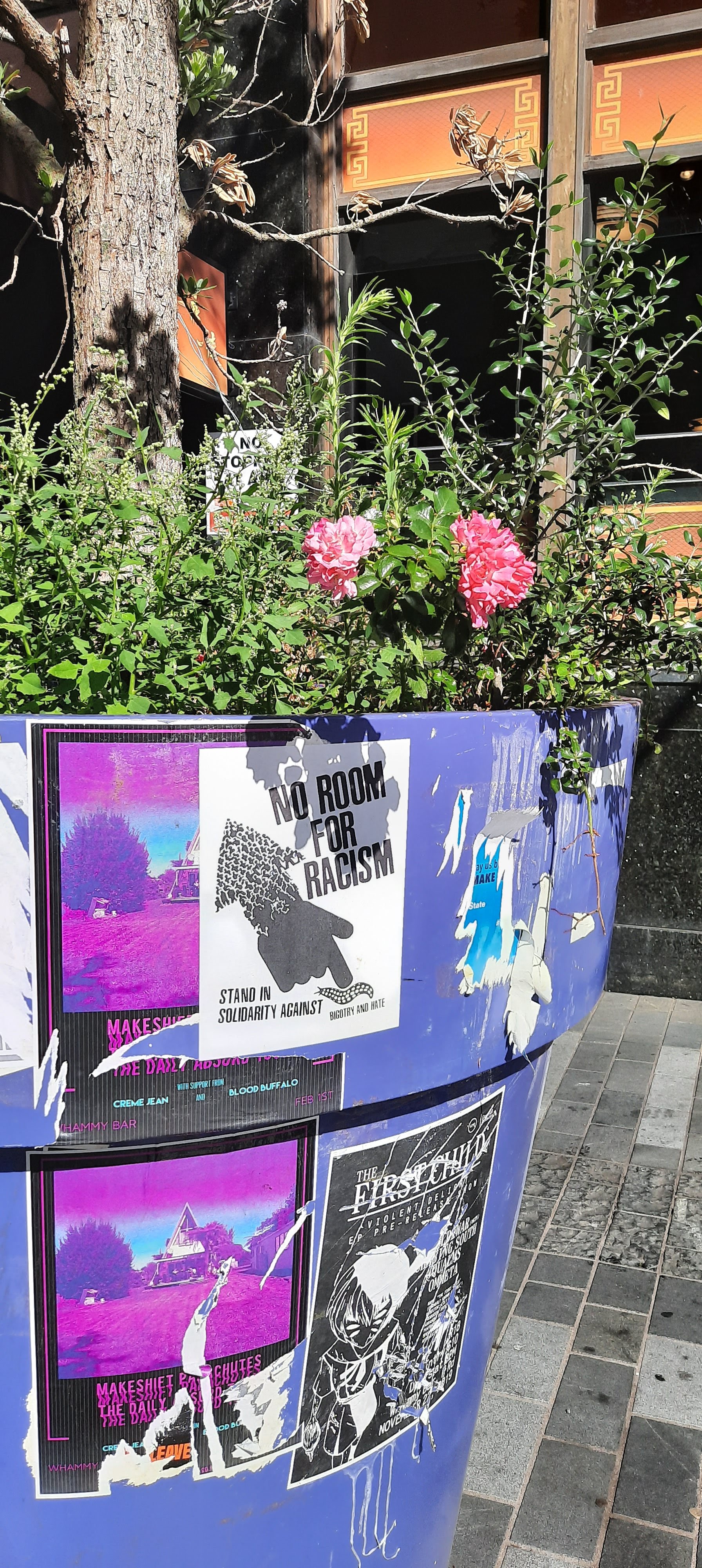
With these photographs I looked further at the contrast of ‘natural’ and ‘unnatural’ colour and also the vibrancy, impact and presence of applied colour through paint and how it interacts with its surroundings. I feel like when we talk about colour in terms of a space, we automatically consider applied colour. Although it was interesting to document and observe this colour within my surroundings, in terms of the project, I wanted to take a different approach to colour; not in the immediate response to colour.

As a traveled through campus and towards the site, I noticed the interesting shadows cast by the late morning sun, I found the shadows to be a describe-less and disregarded sense of colour that always exists within our surroundings and environment, is manipulated, altered and dependent and goes unnoticed as colour in the ‘normal’ sense.

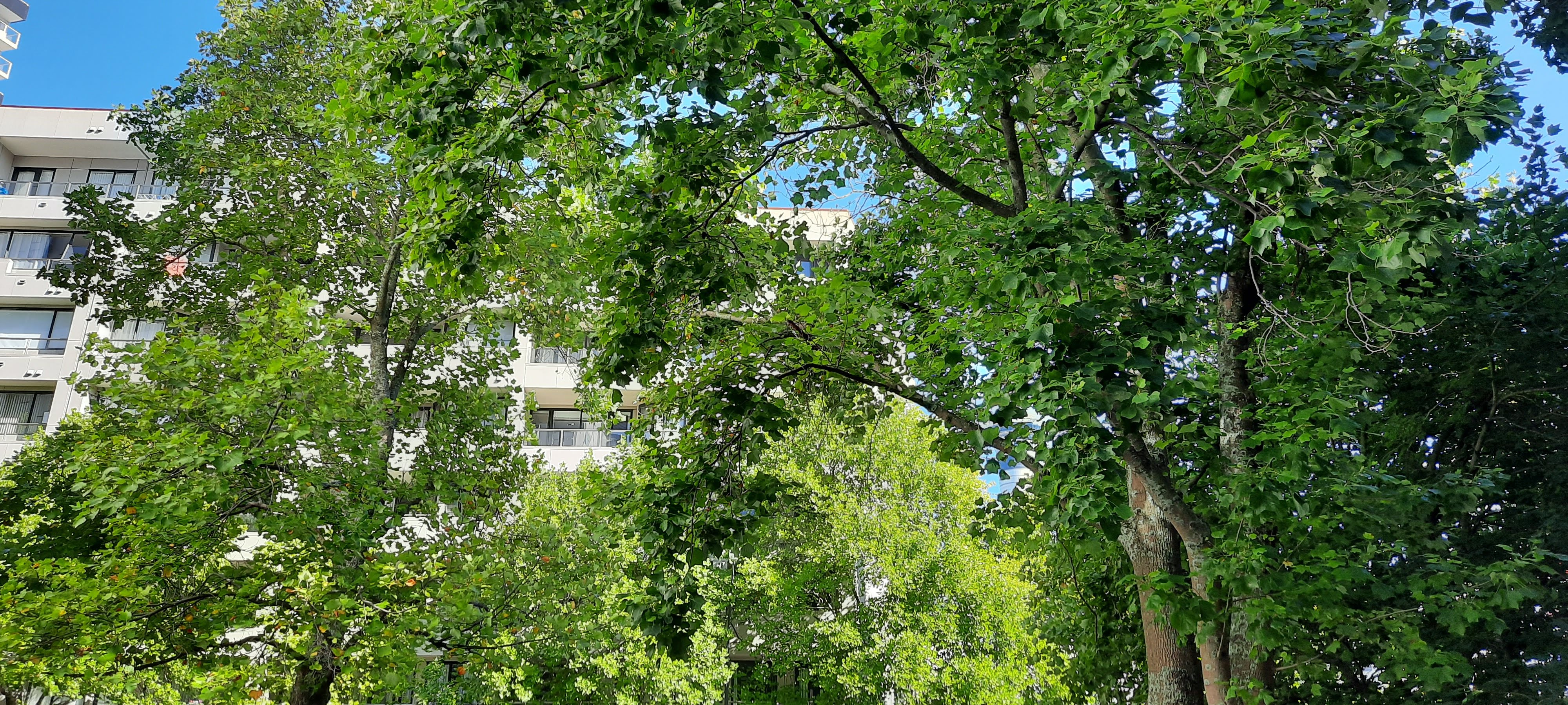
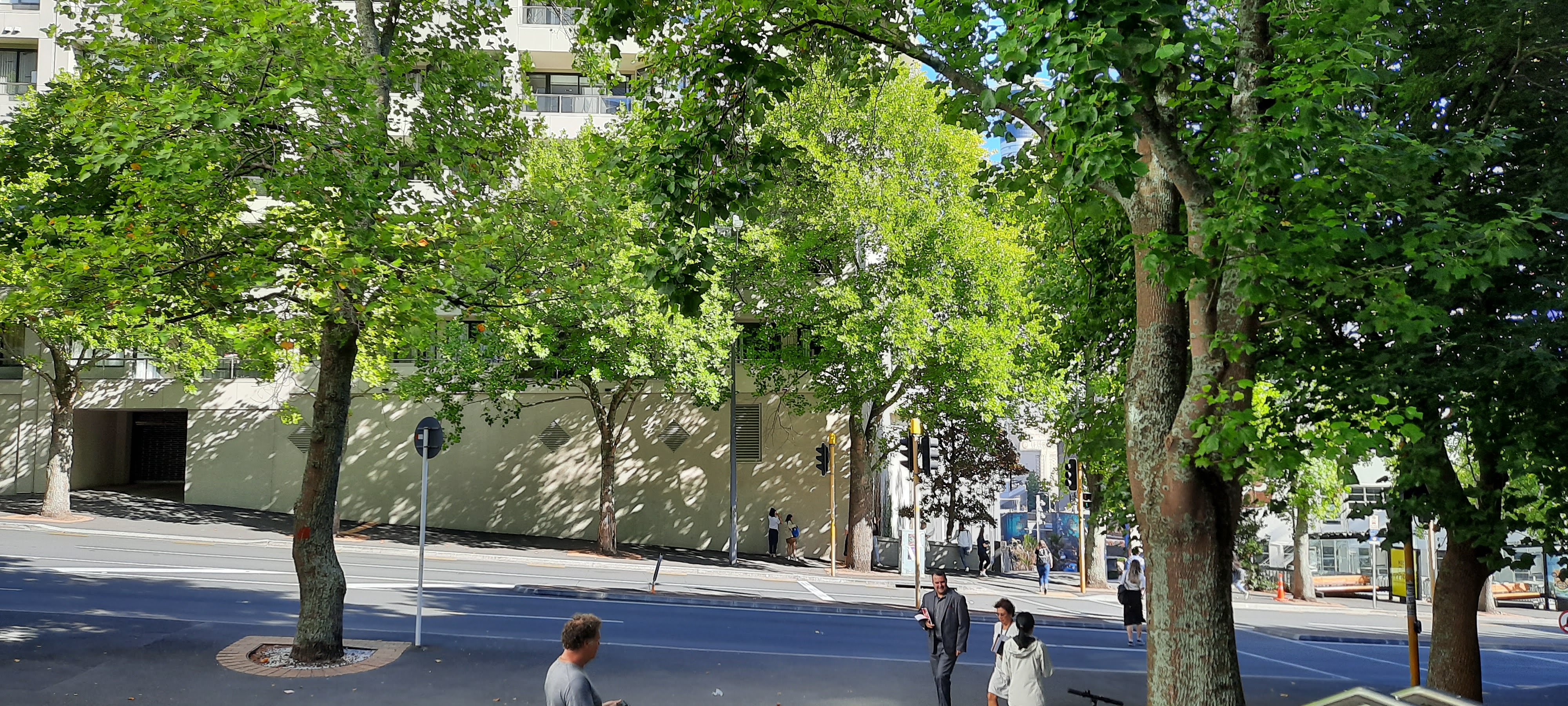
As I moved down the hill closer to Mayoral Dr, I was able to study the trees I had previously captured in a sketch closer. I was fascinated with the way the light was filtrated through the tree giving a variety of tone and depth through the leaves. The slight transparency of the leaves allowed the natural light to organically drip through the density of the trees.

As I crossed the road, I noticed the shadows cast by the trees stretched across the walls of surrounding buildings and the concrete pathways. I yet again found this organic projection interesting. Not only its dependency on its surrounding environment but also the gentle and soft movement of the colour.

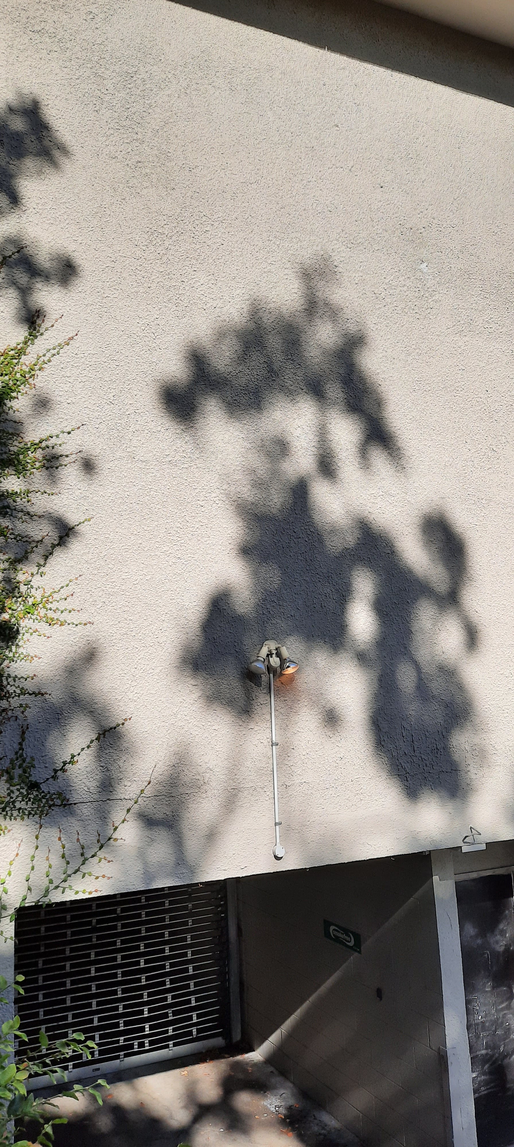
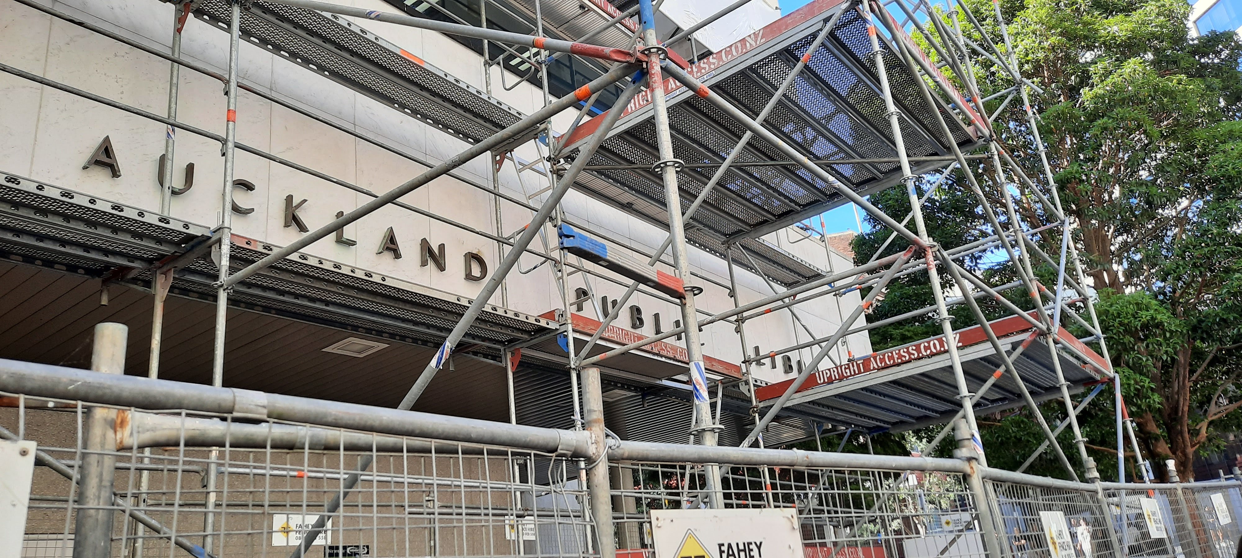
I made my way towards the site and noticed the sunlight reflection from the opposite building projected on the side of the Auckland Library. I found this projection very effective, although possibly not intention. The manipulation of the natural light casting pattern onto the building really intrigues me to look further into the light, shadow and reflection as a way of applying colour.

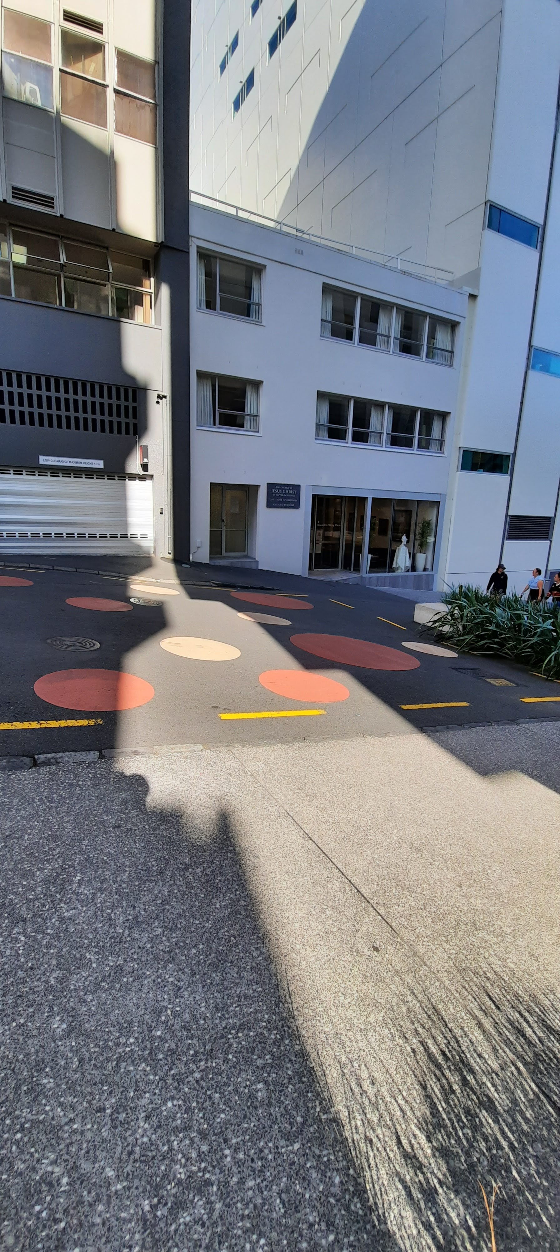
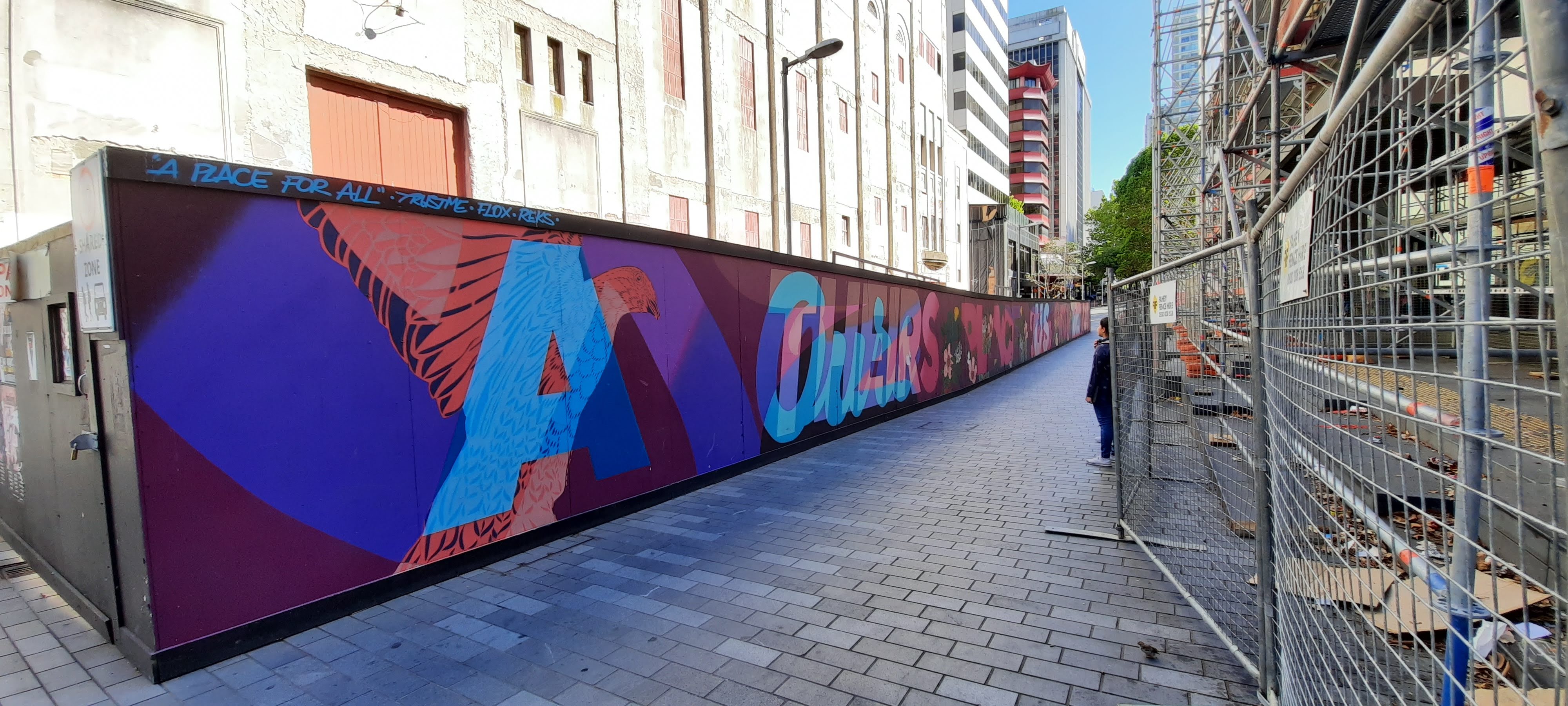
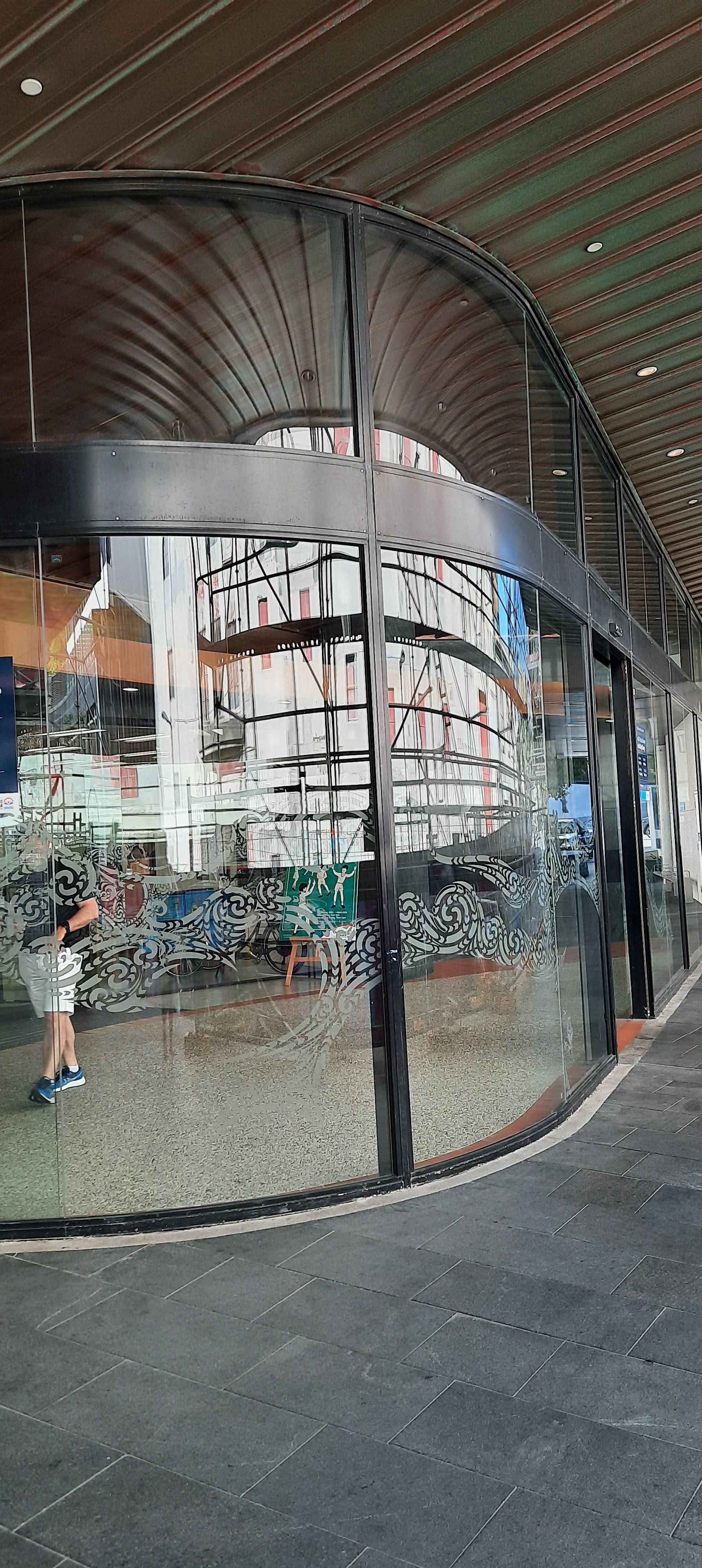
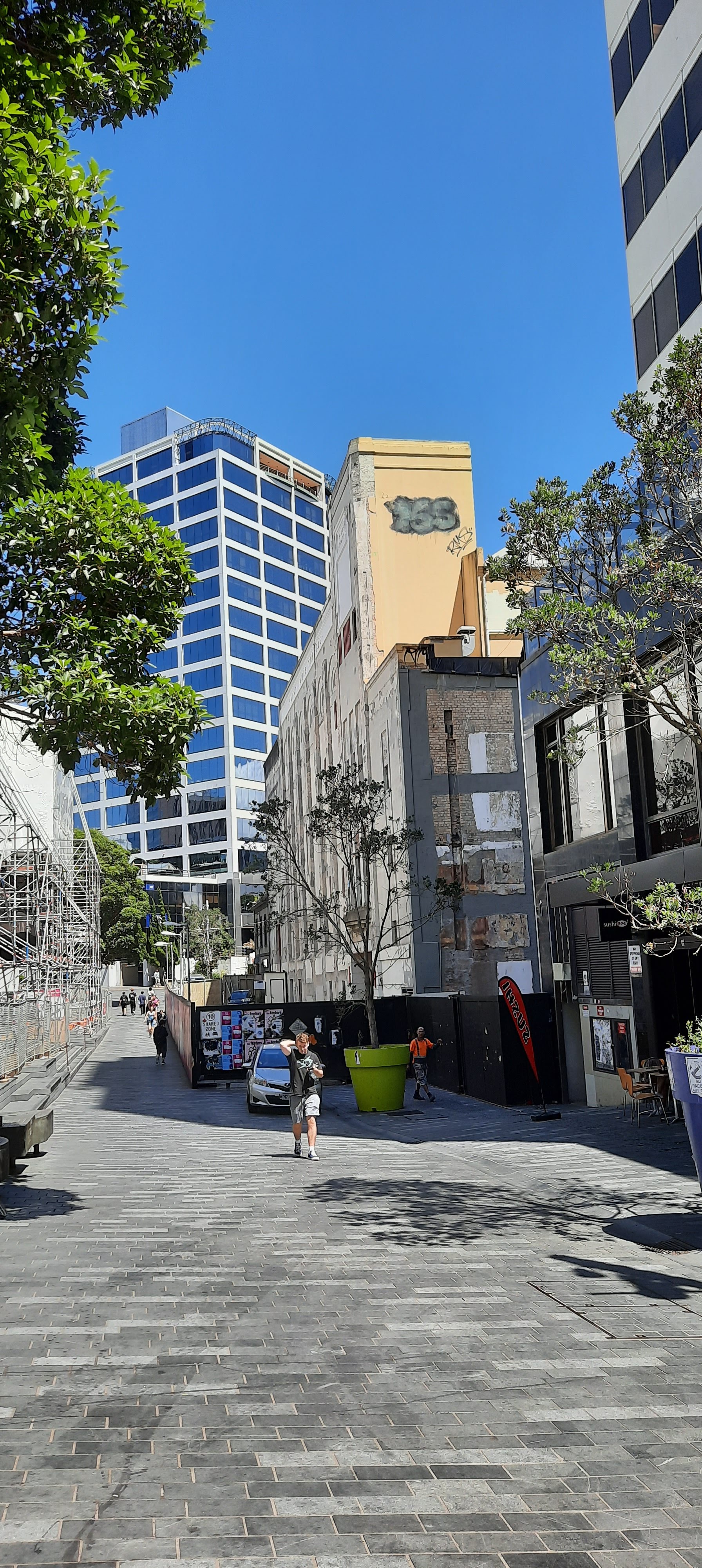
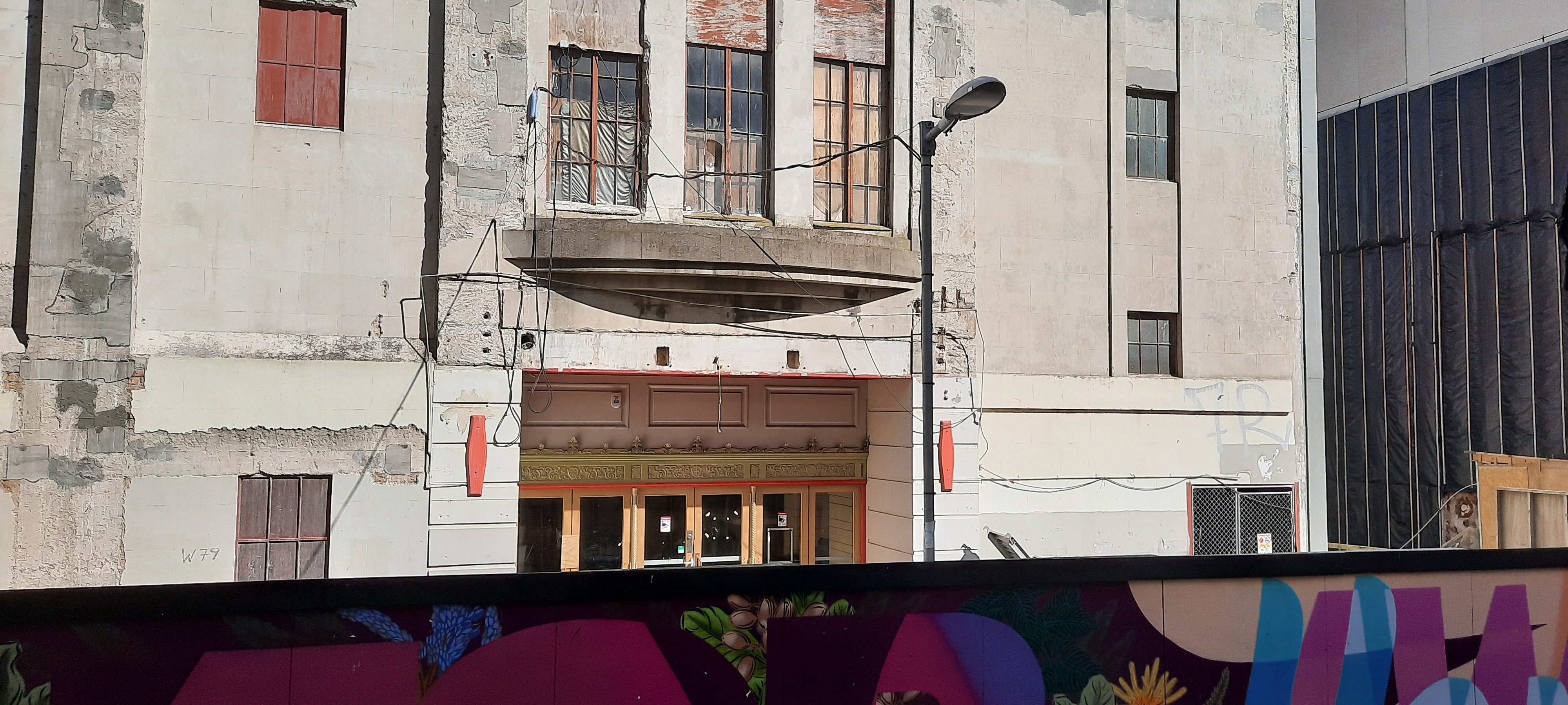
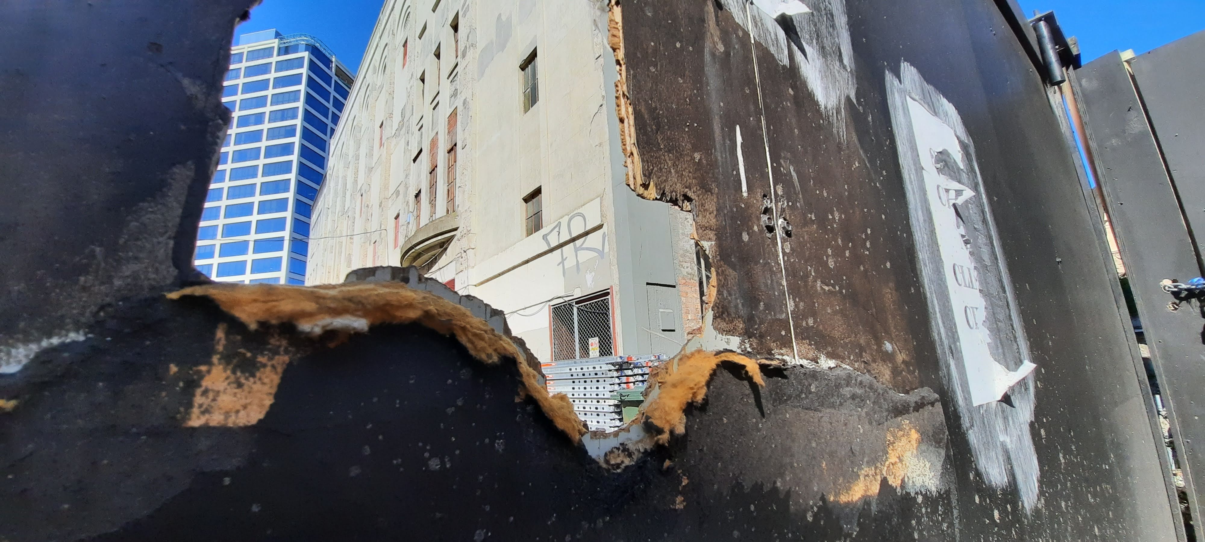
As I arrived at the site, I documented the surroundings including the art wall out the front and the library opposite. I found that there was a focus on the distraction from the derelict site to create a uplifting, pleasing atmosphere to draw the public down this section of Lorne St.

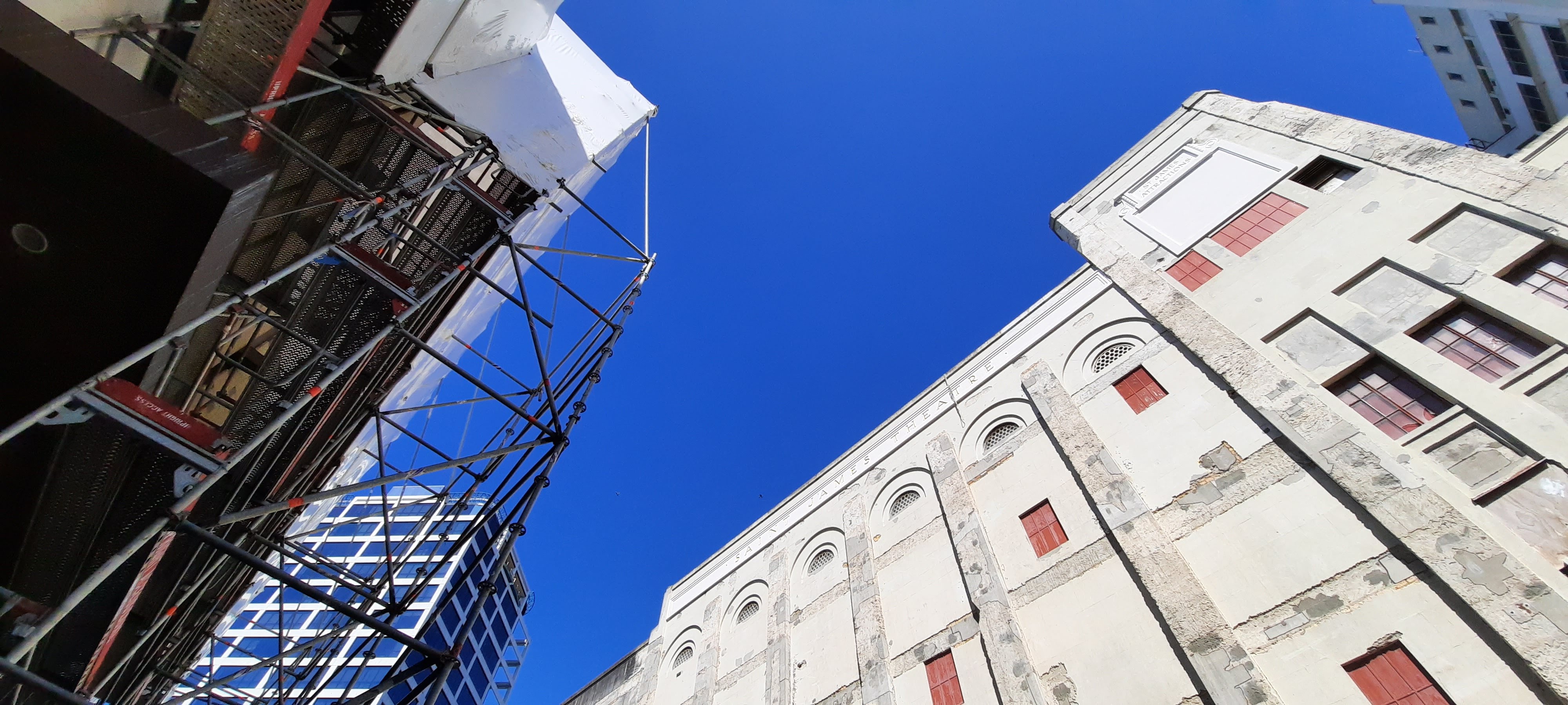
I found that in order to notice and appreciate the St James Theater Building there was a need to look up or look from a different perspective. I myself had walked past the site many a time and never noticed it. It has a sense of disregard because of its weathered appearance. It made me think about how I’ve become so accustomed to focusing on whats directly in front of me that I forget that there is a totally different landscape above my head in the city.

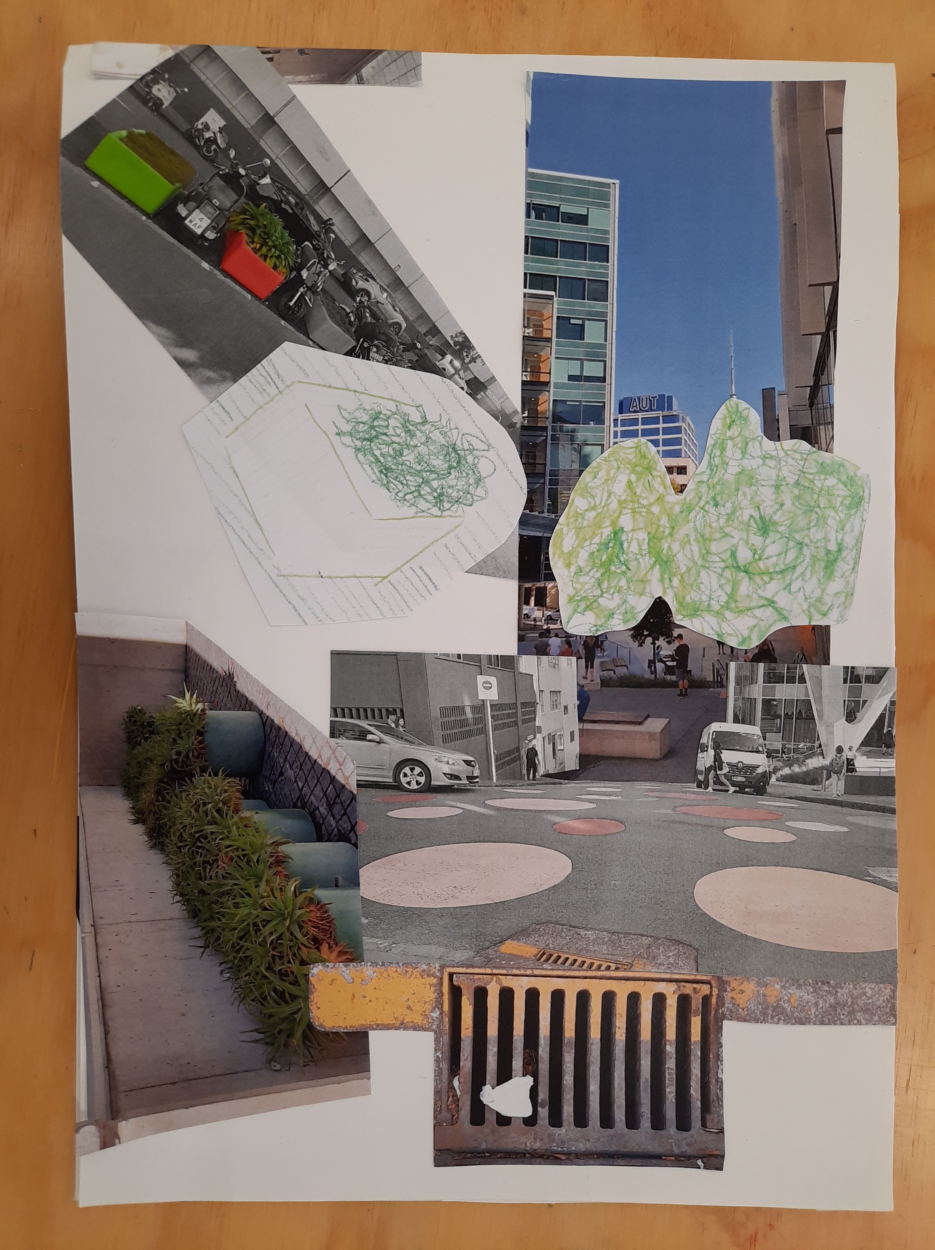
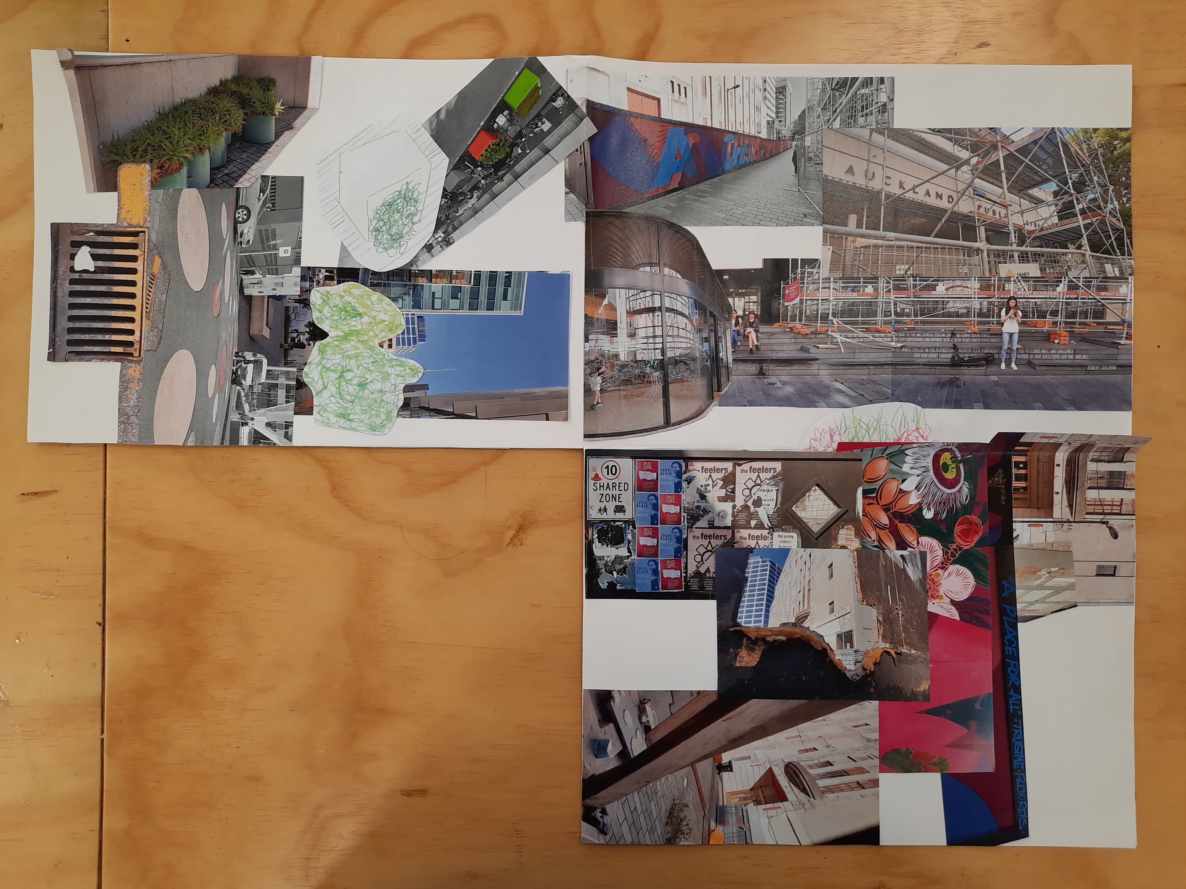
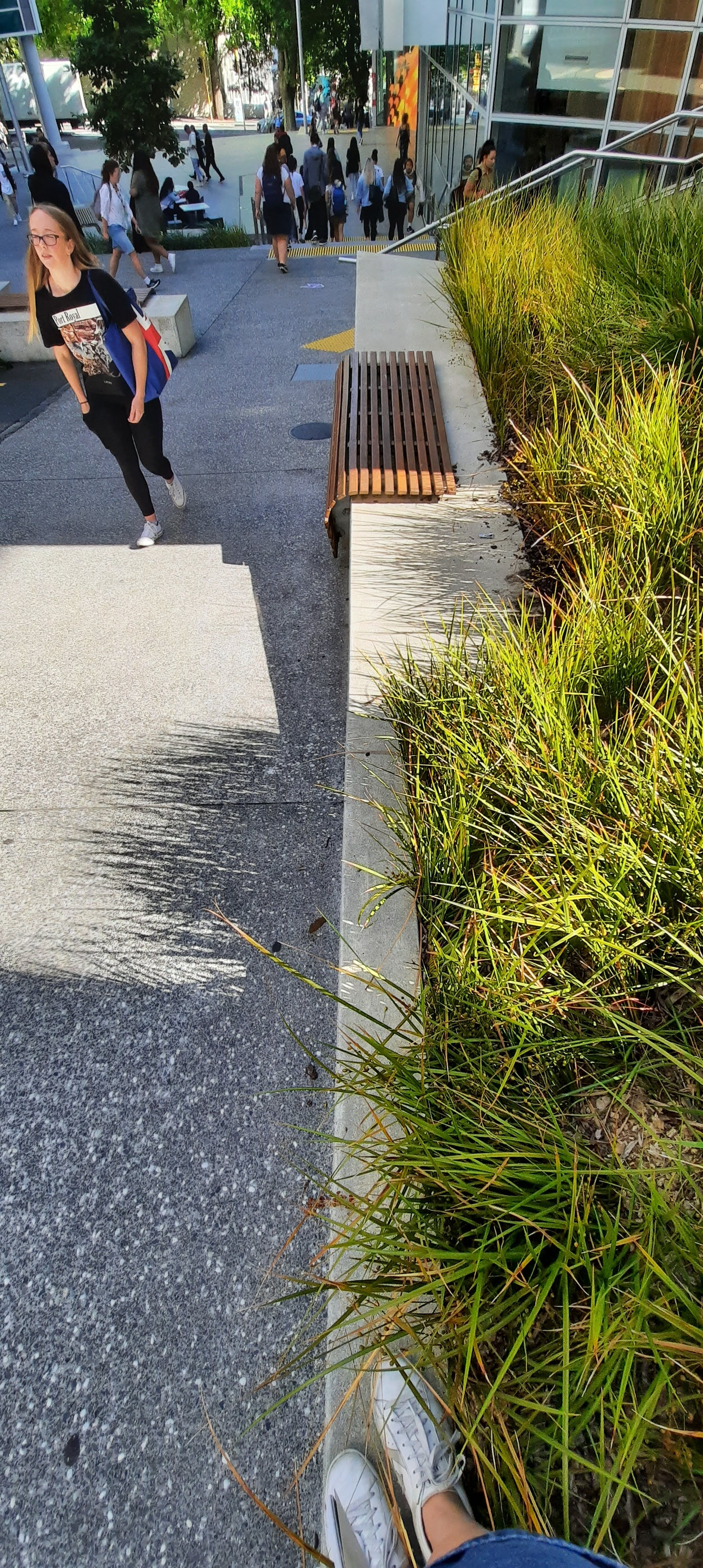
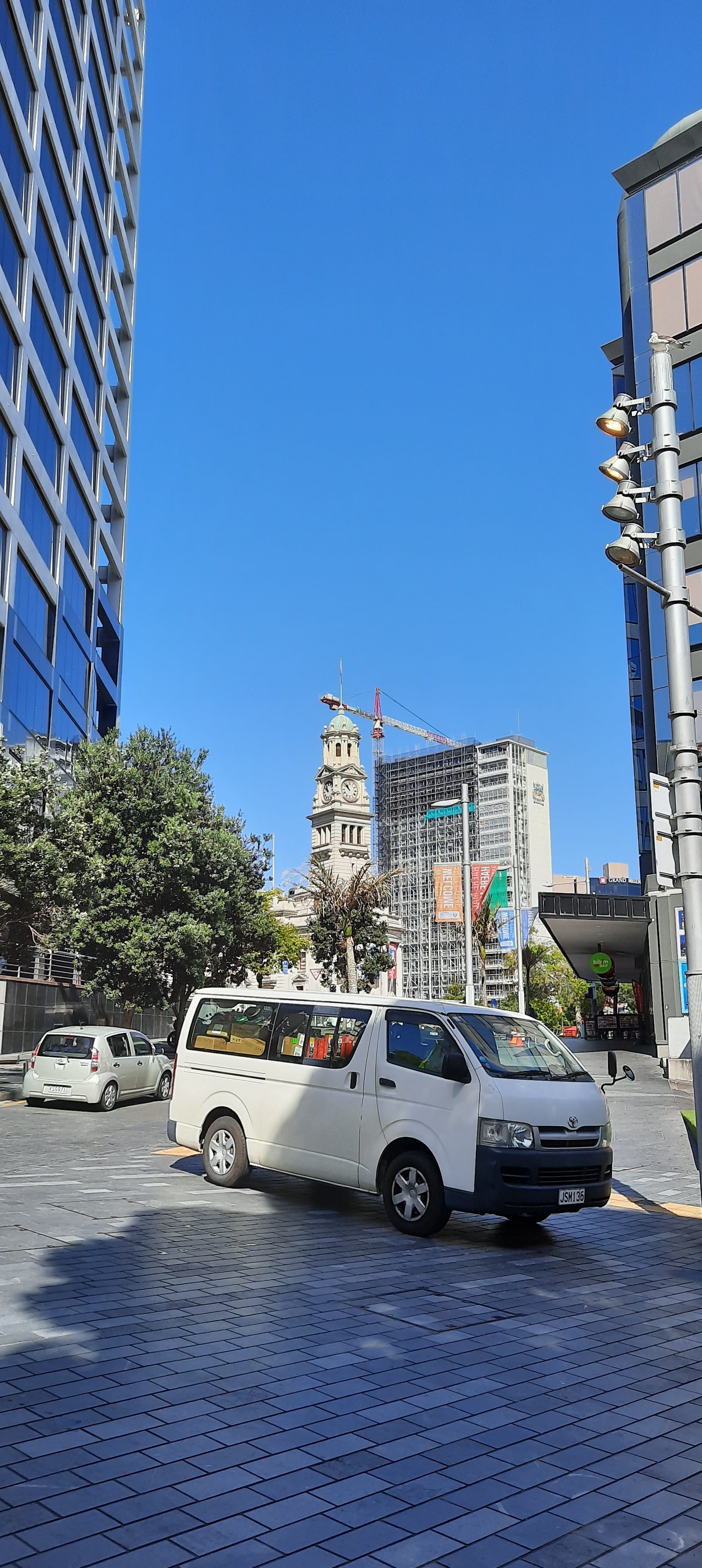
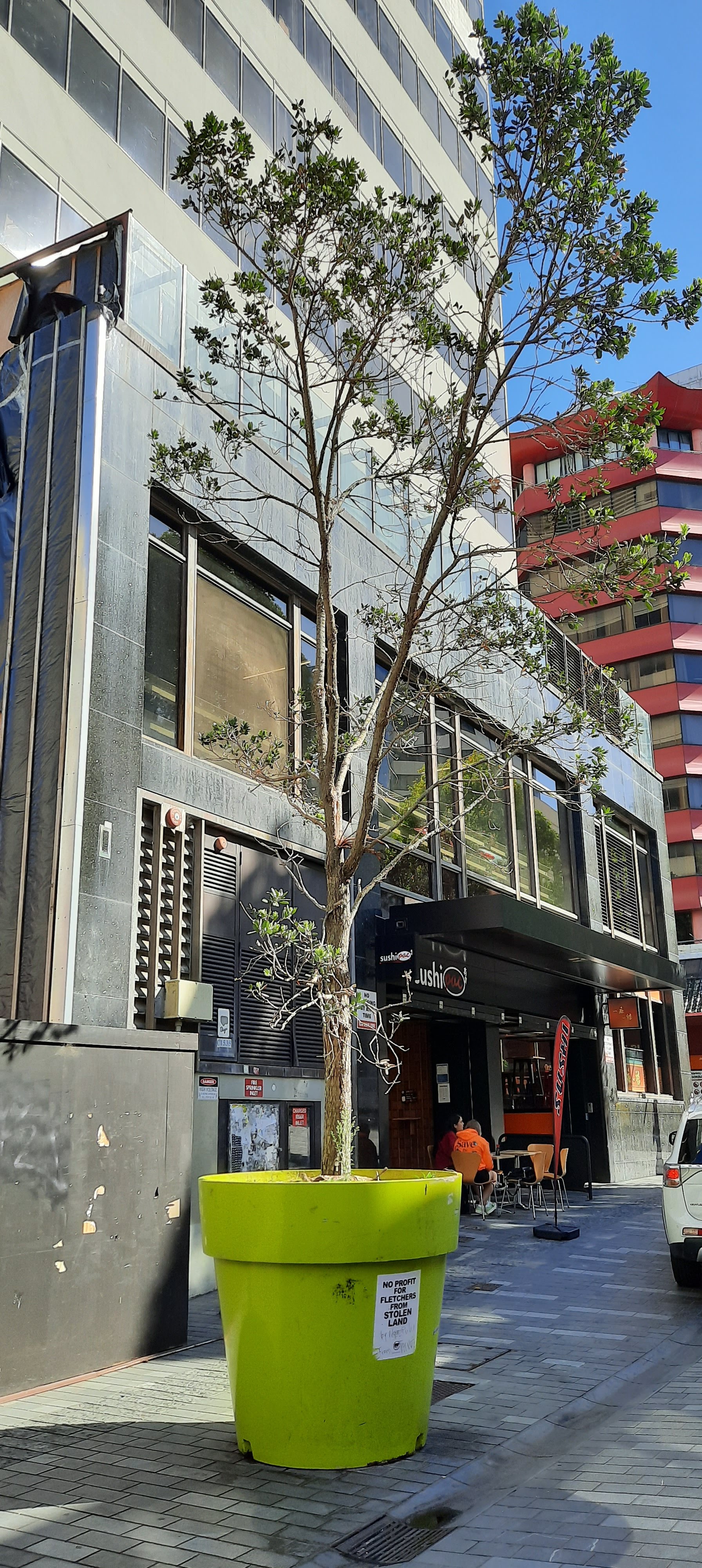
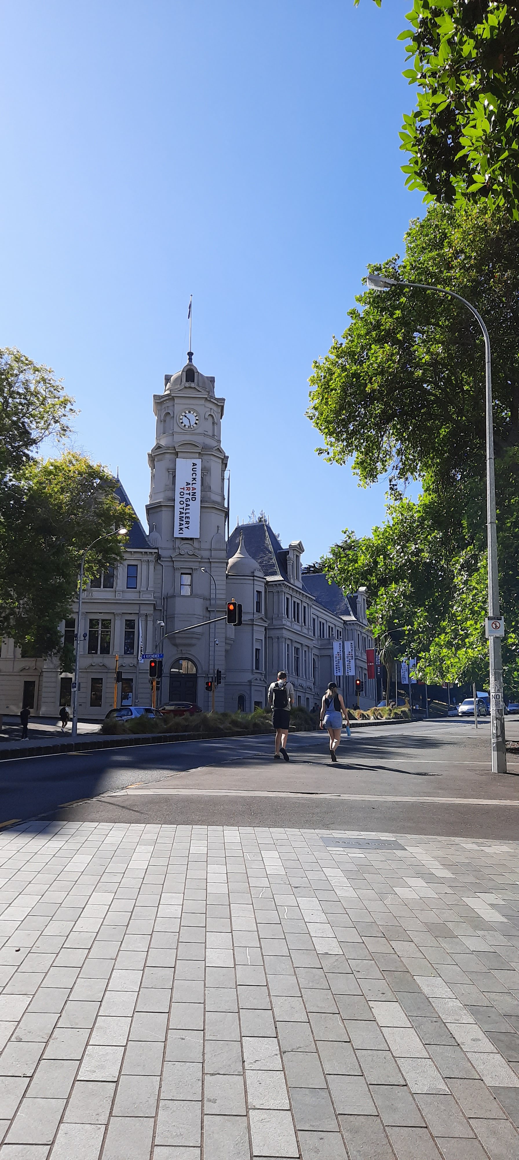
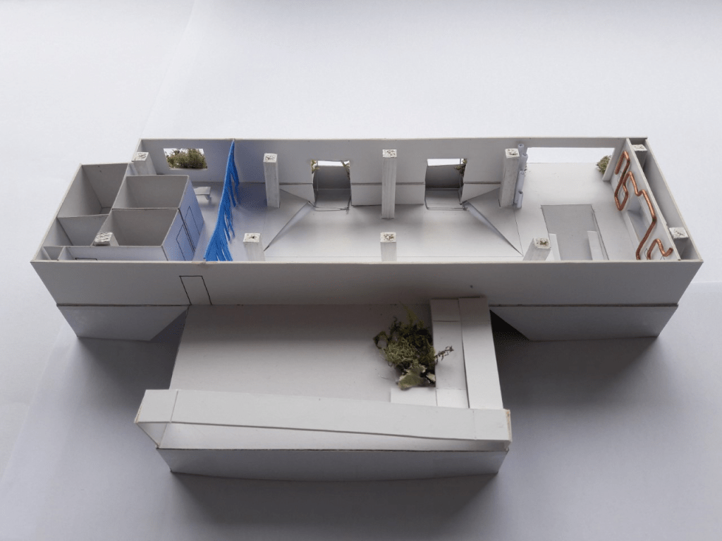
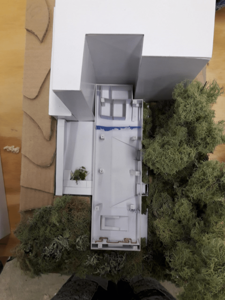
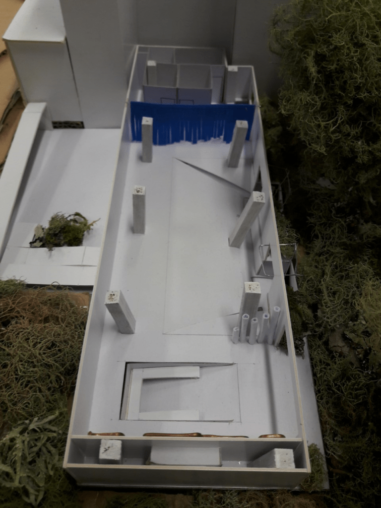
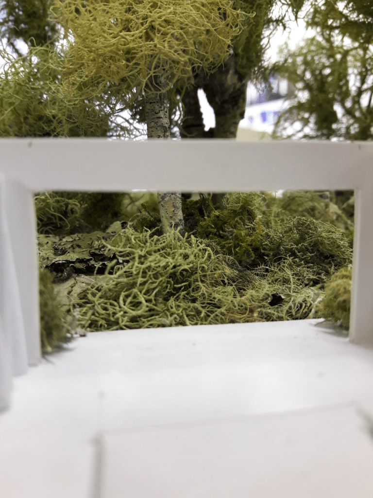
These images above are other documentations of colour around the site as well as some surrounding locators.

Week 14: Final Presentation

This week we present our final design. I have put together a slideshow with my digital modelling, plan and section along with some images of inspiration and materials.

Along with slideshow, I will also include my 1:100 model of the design and site to allow people to get a better understanding of the space.

I will also have some material samples of key design features in the space. Below are images of the layered concrete cube I made as a physical representation of the flooring and south wall of the design and the copper plate representing the physicality of the copper piping along the eastern wall. These samples will give a tactile element to my presentation.

Also, along with all this, I printed out a design report outlining my concept and presentation.

PERSONAL REVIEW
I feel that my presentation went reasonably well. I enjoyed having guest critics from the industry as well s students who have done the paper before and have a good understanding of it.

Generally I had positive feedback and the critics really liked my concrete cube material sample. The only main pointer they gave me for development was exploring the use and design of the ceiling which I agreed with.

I am happy and proud of my final presentation and am happy with the critics’ responses and feedback.