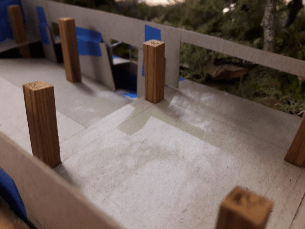
This week we made a material, texture and colour palette. This helped me to start thinking about the materiality of my design and how I could depict my concept trough my choice of materials.


I chose a neutral and natural palette to add to the sense of creating a bridge between the urban and natural environment. This mood board will initiate ideas of how I can take the materiality of the space further.
Image Reference List:
https://www.cheaptilesonline.com/product/ice-stone-white-internal-satin-matte-tiles-600×1200/
https://www.shutterstock.com/search/polished+concrete
https://www.expressions-ltd.com/products/concrete-hand-texture-roller-heavy-slate-9-inch
https://3dexport.com/3dmodel-rock-texture-100204.htm
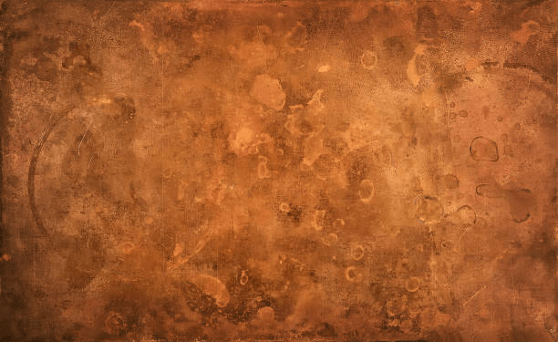
https://www.istockphoto.com/nz/photos/copper?sort=mostpopular&mediatype=photography&phrase=copper
http://yklmetalrecycling.com/services/brass/brass-bg/
https://protectaqua.com/Page/7/What-is-wood
https://ardec.ca/en/p/209/brio-wooden-walls-and-ceilings-oil