Final Submission

Presentation:

Recorded Pitch:

Pitch Transcript:

Social behaviour and societal perceptions influence the way in which a space is experienced. My design intervention aims to investigate, challenge, influence, alter and create a connection between the subconscious and conscious mind and an awareness of the influence societal expectations has on the way we move, act and think in terms of space. 

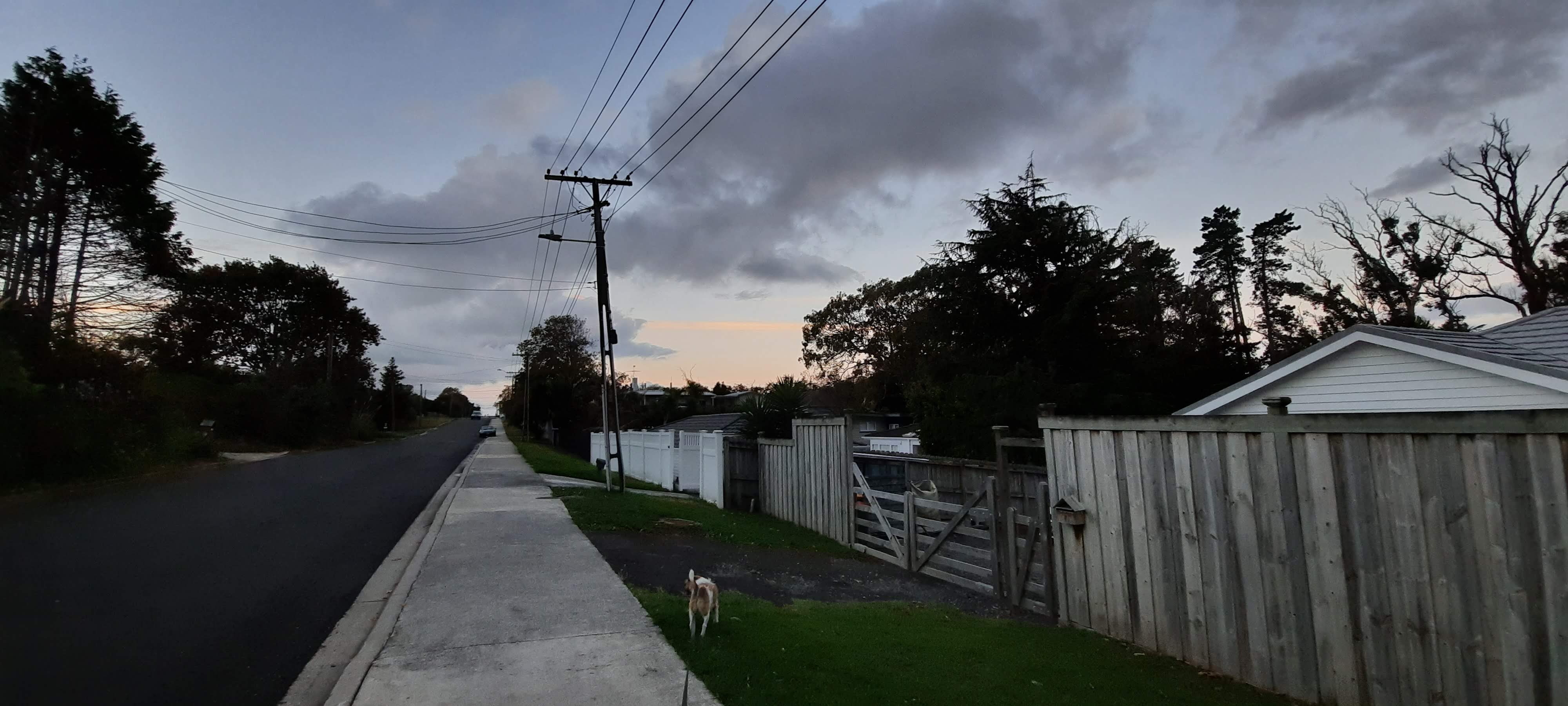
My design intervention has grown from my observation and fascination with the city’s unspoken rule and expectation of physical existence without social interaction. We spend so much time looking down and avoiding eye contact with strangers that we cease to notice the landscape above our heads, something many city goers exist within, but never experience.

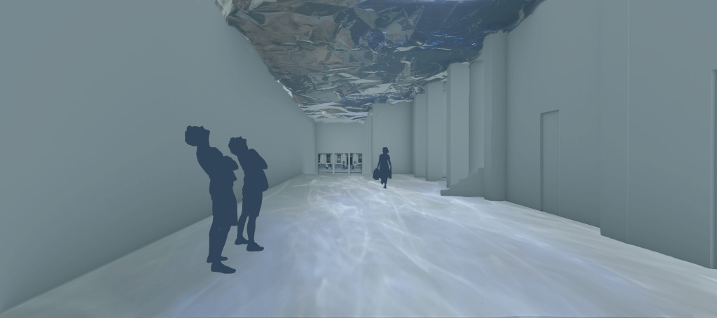
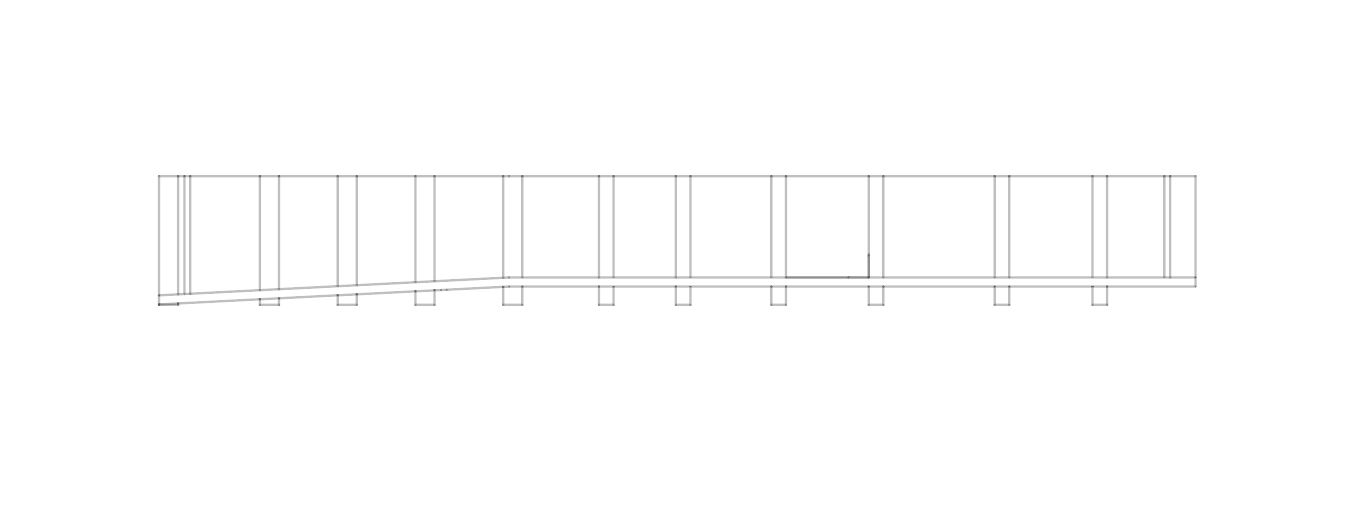
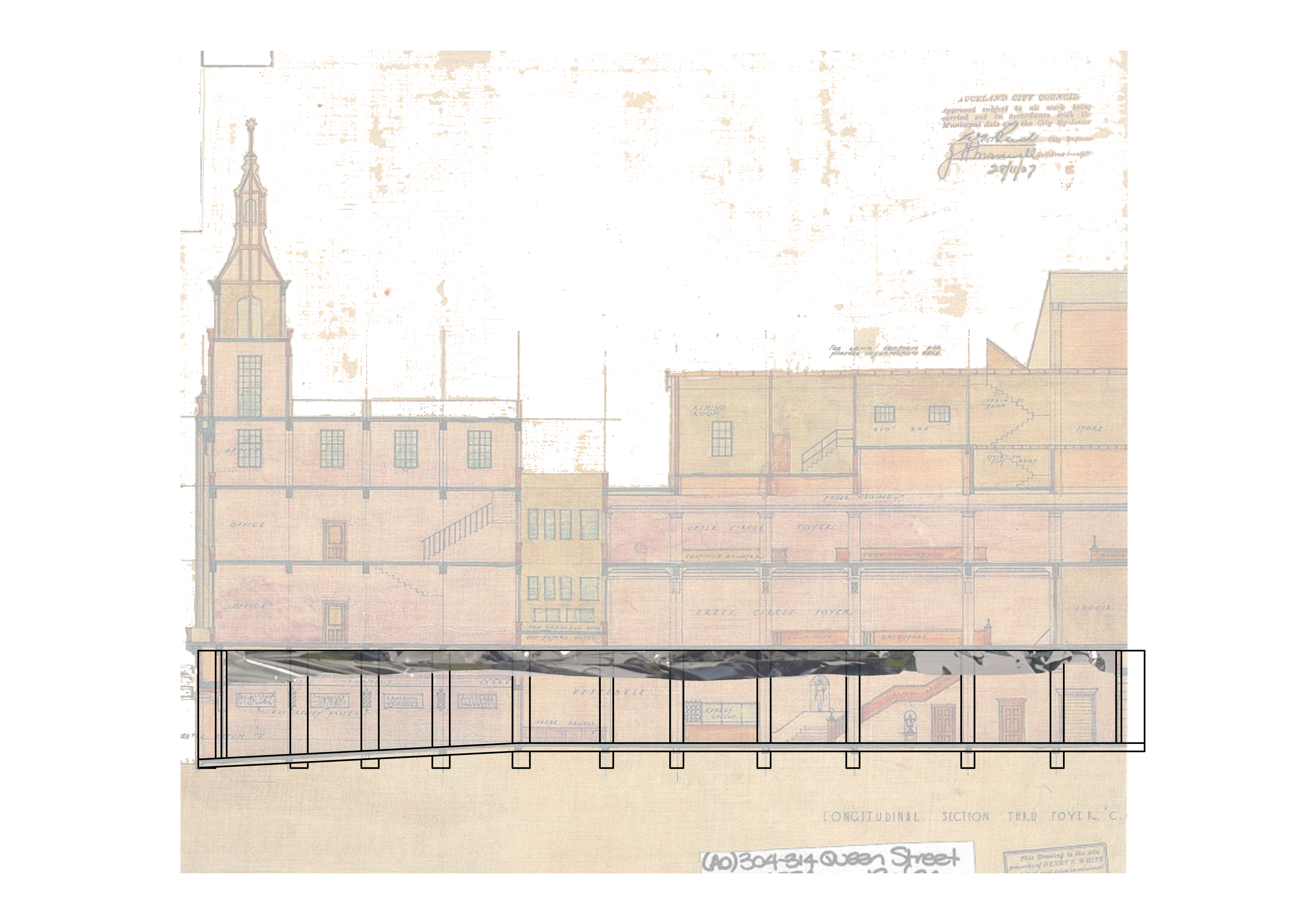
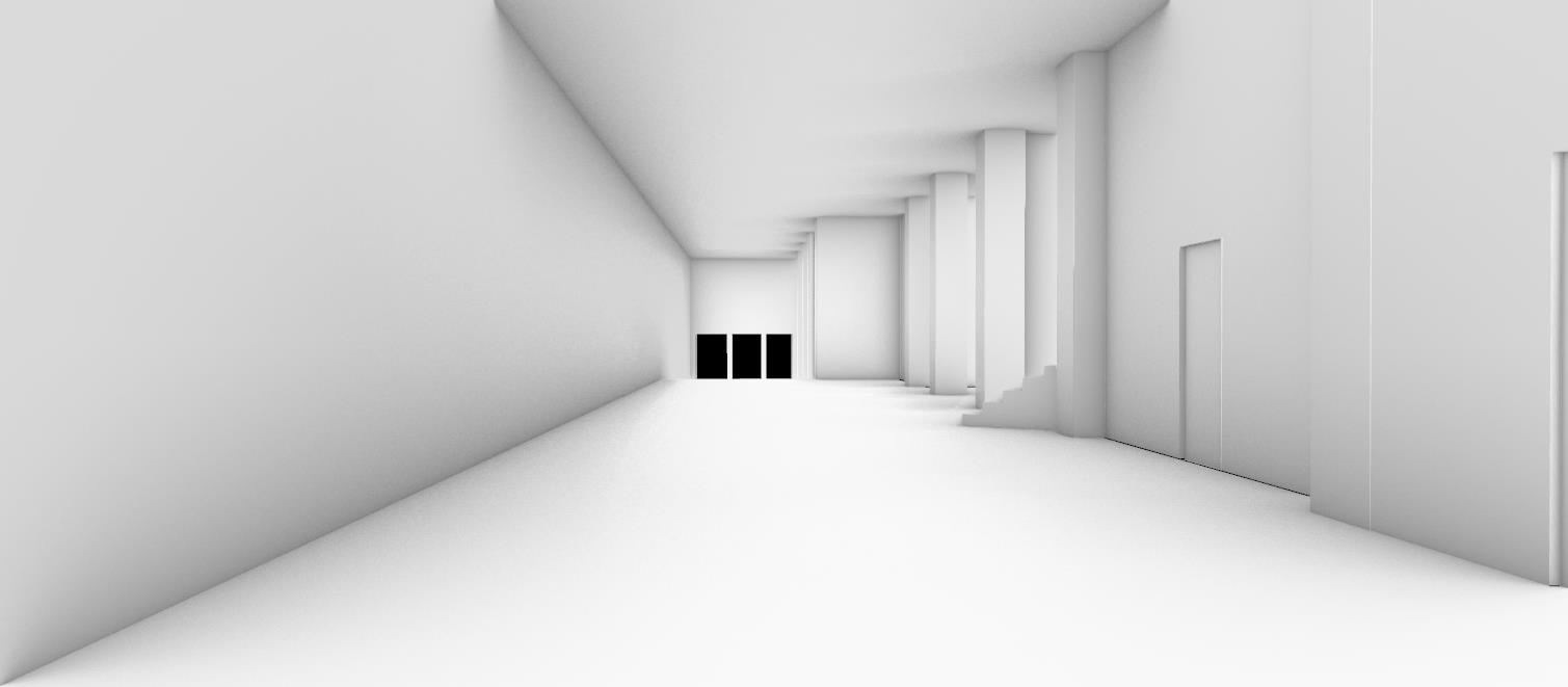
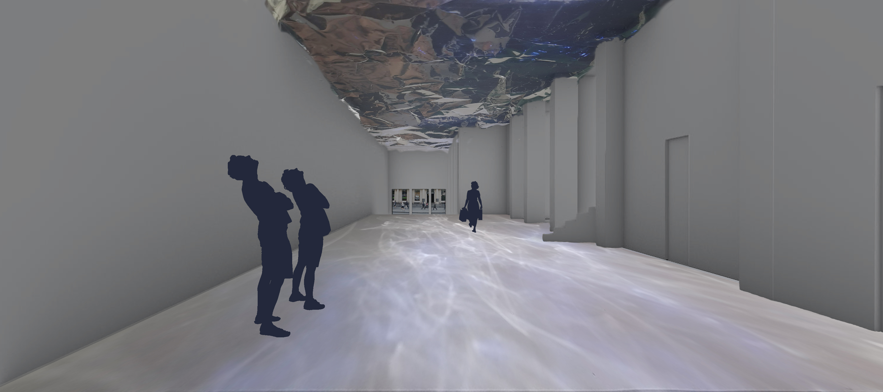
I have designed a public walkway in the St James Theatre foyer space between Queen St and Lorne St. The focus of my design was to break the expectation and habit of looking down and avoiding eye contact by subconsciously making the public gaze upwards and interact with the space.

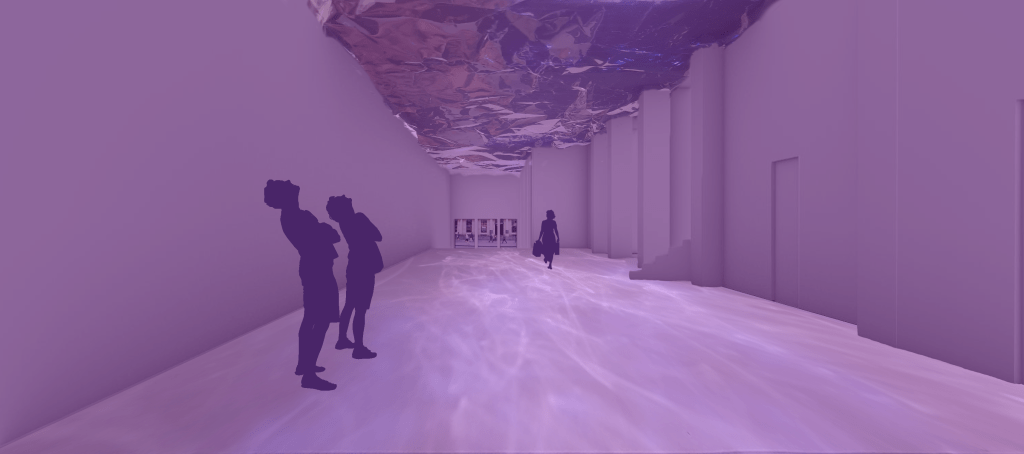
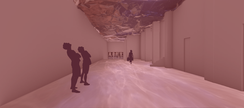
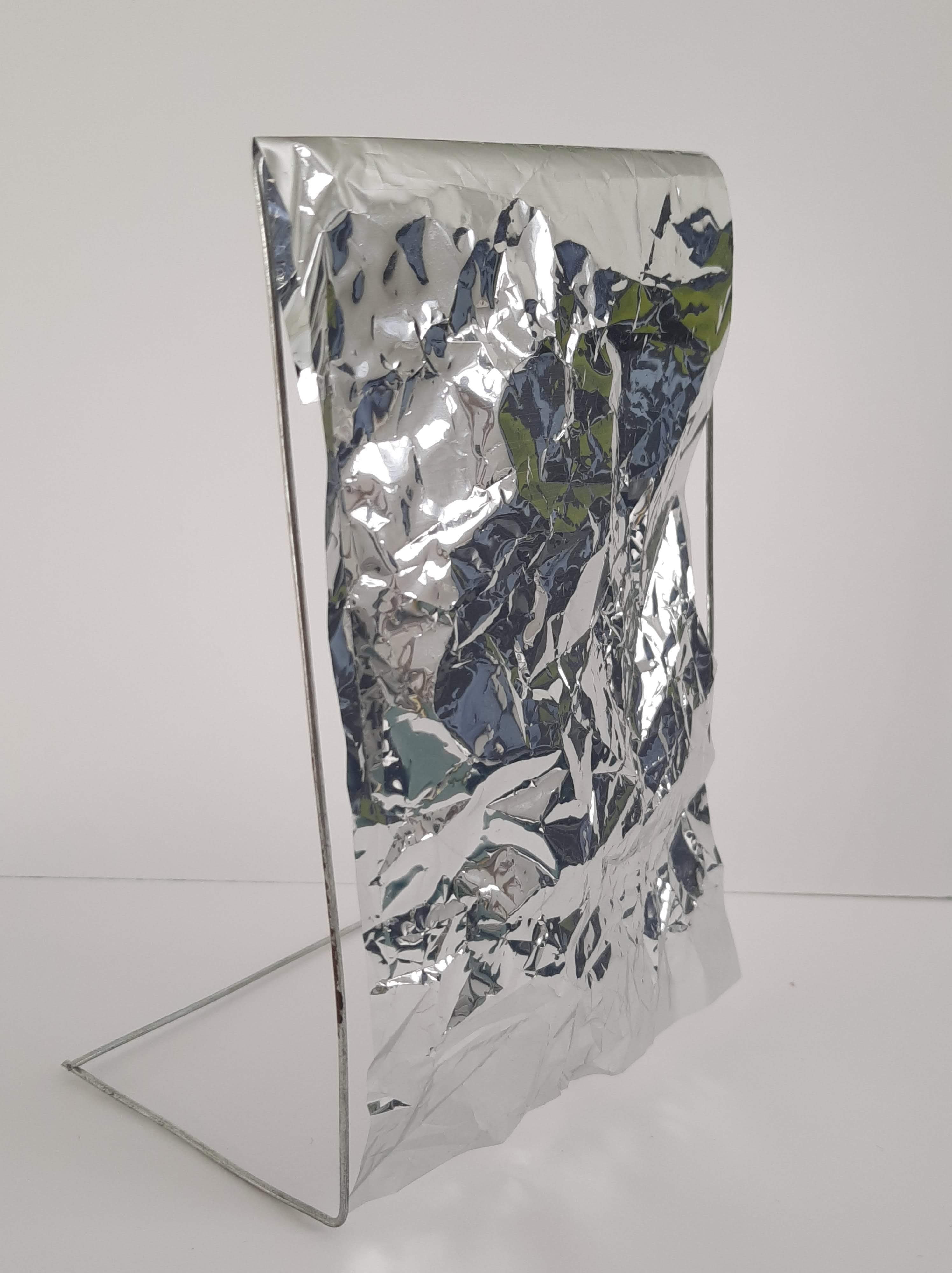
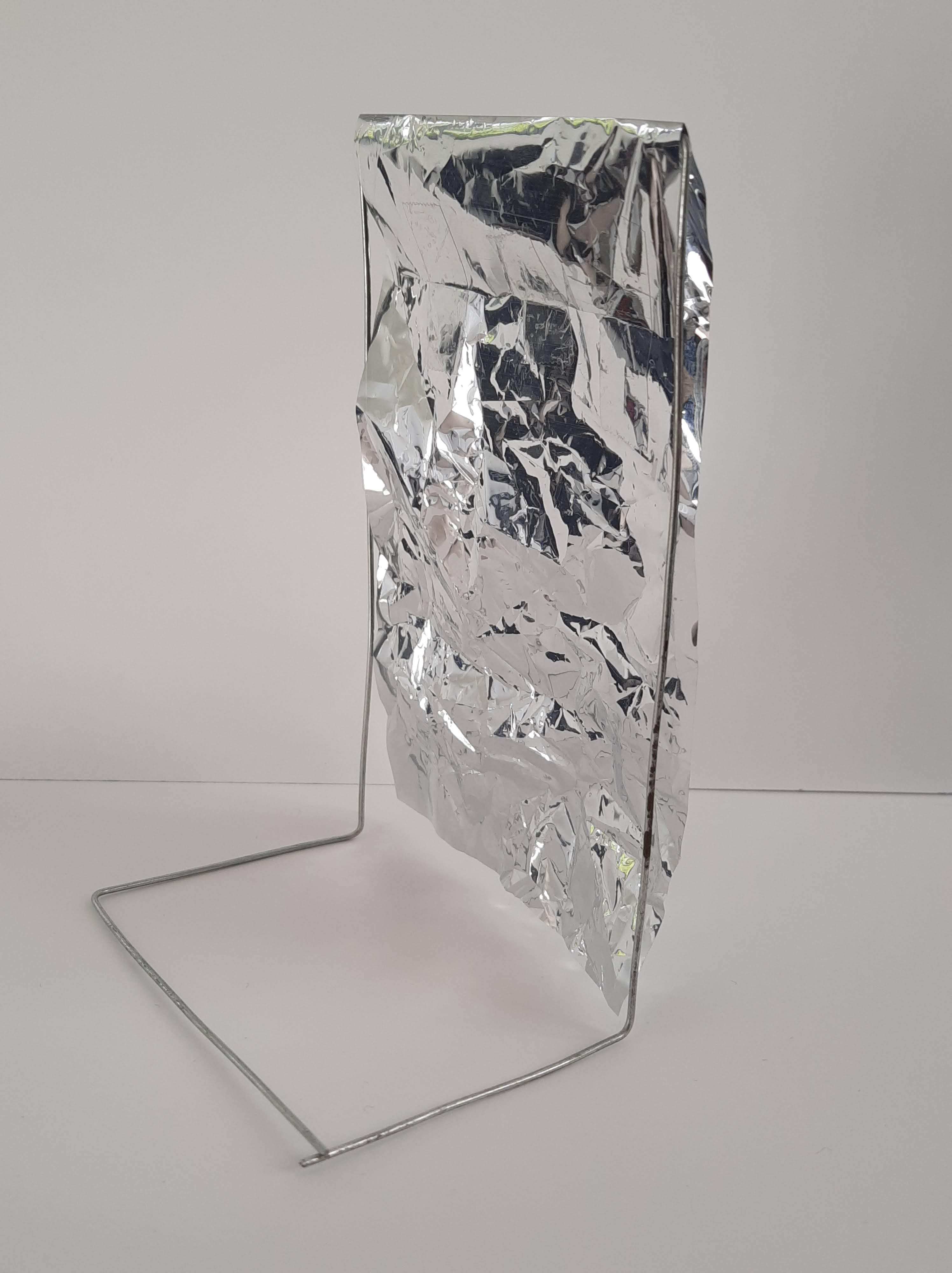
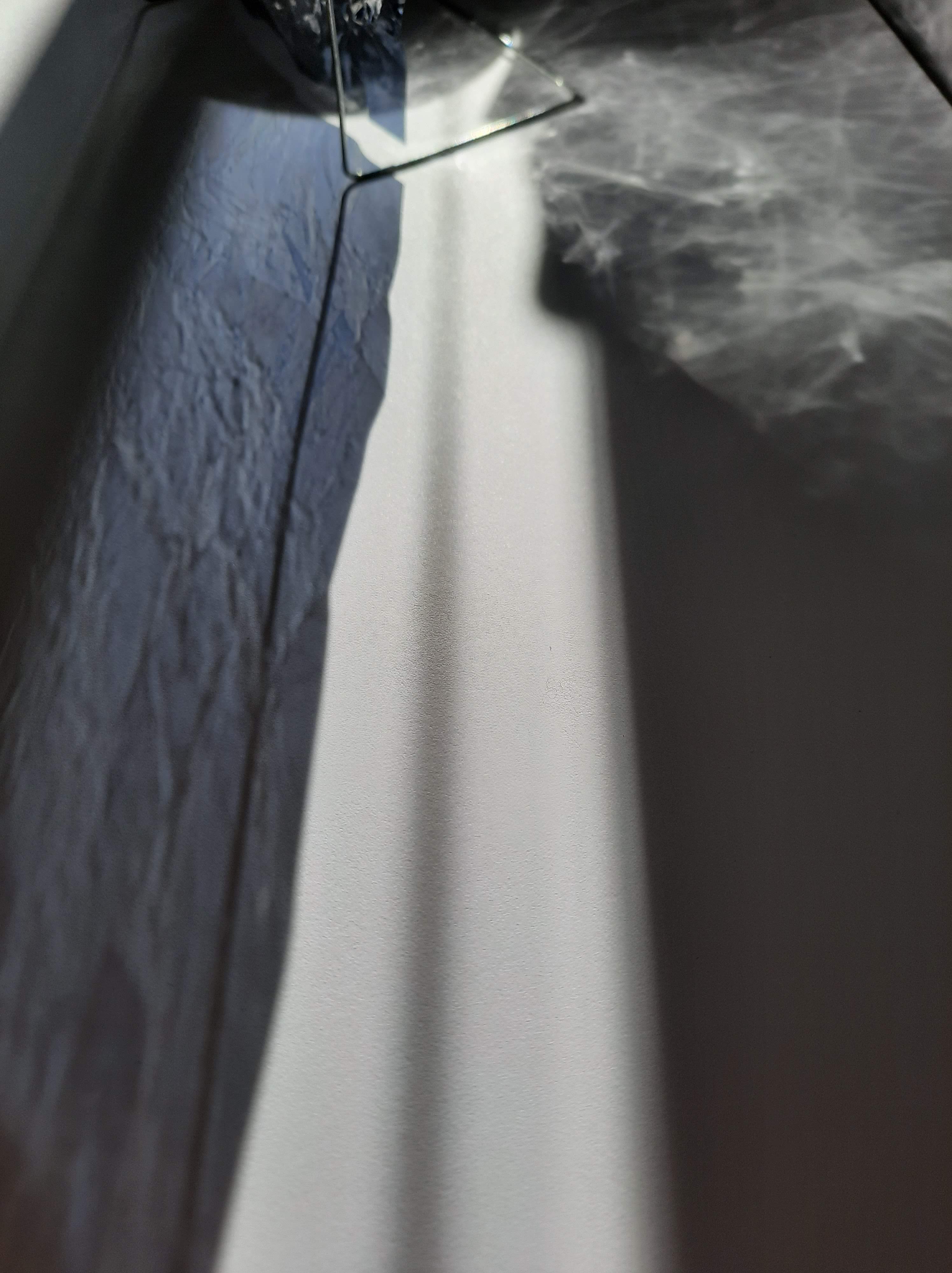
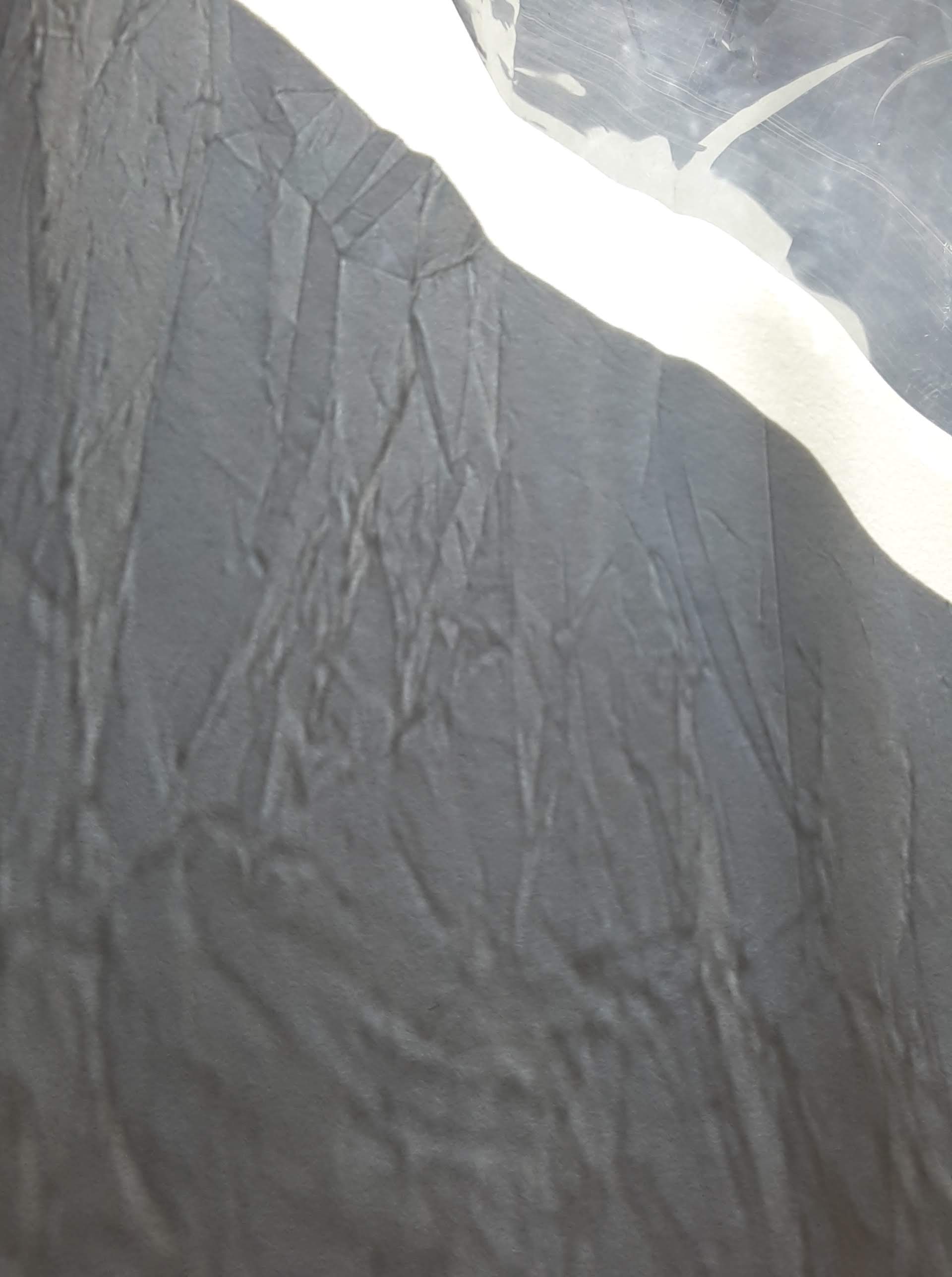
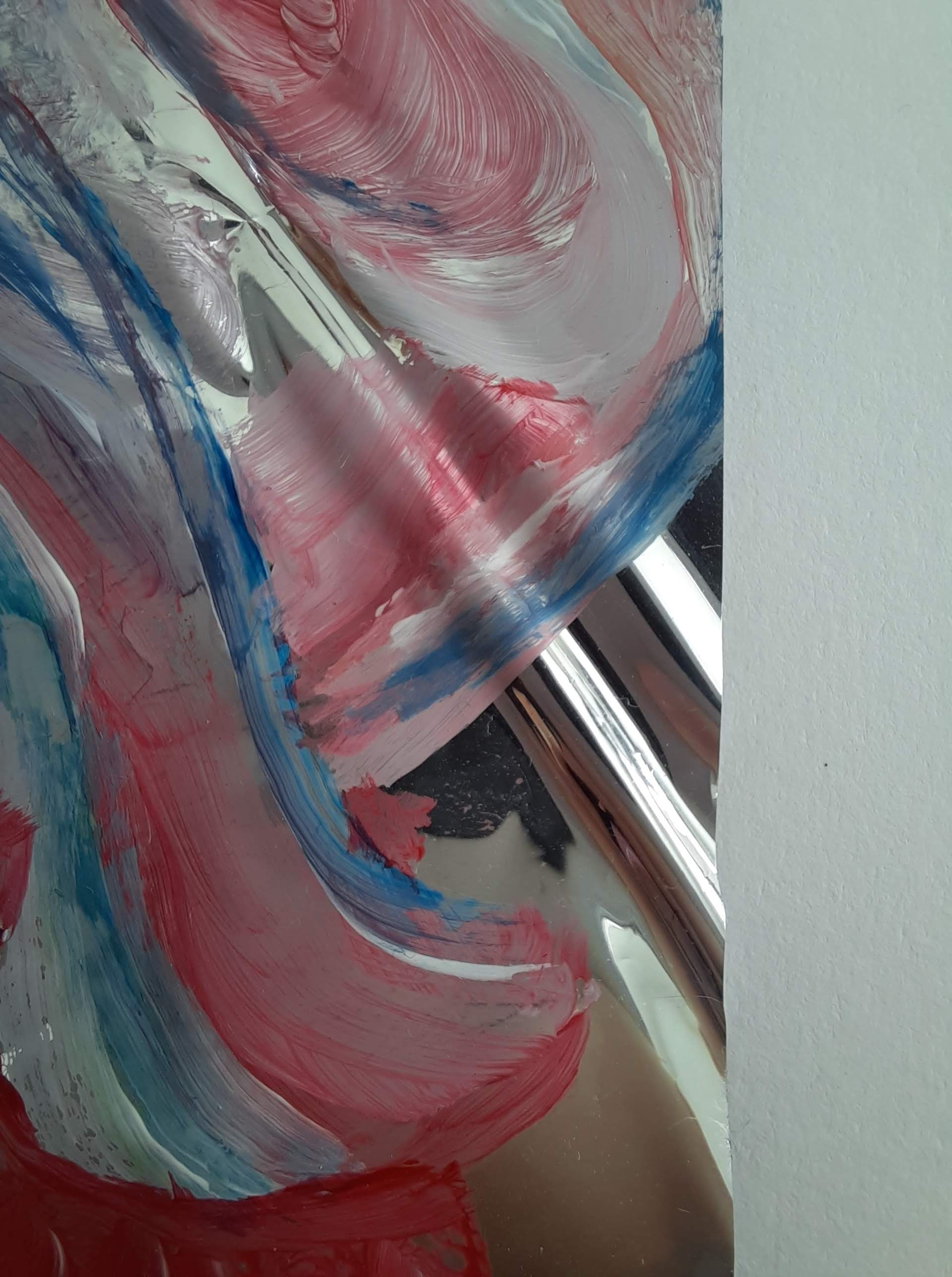
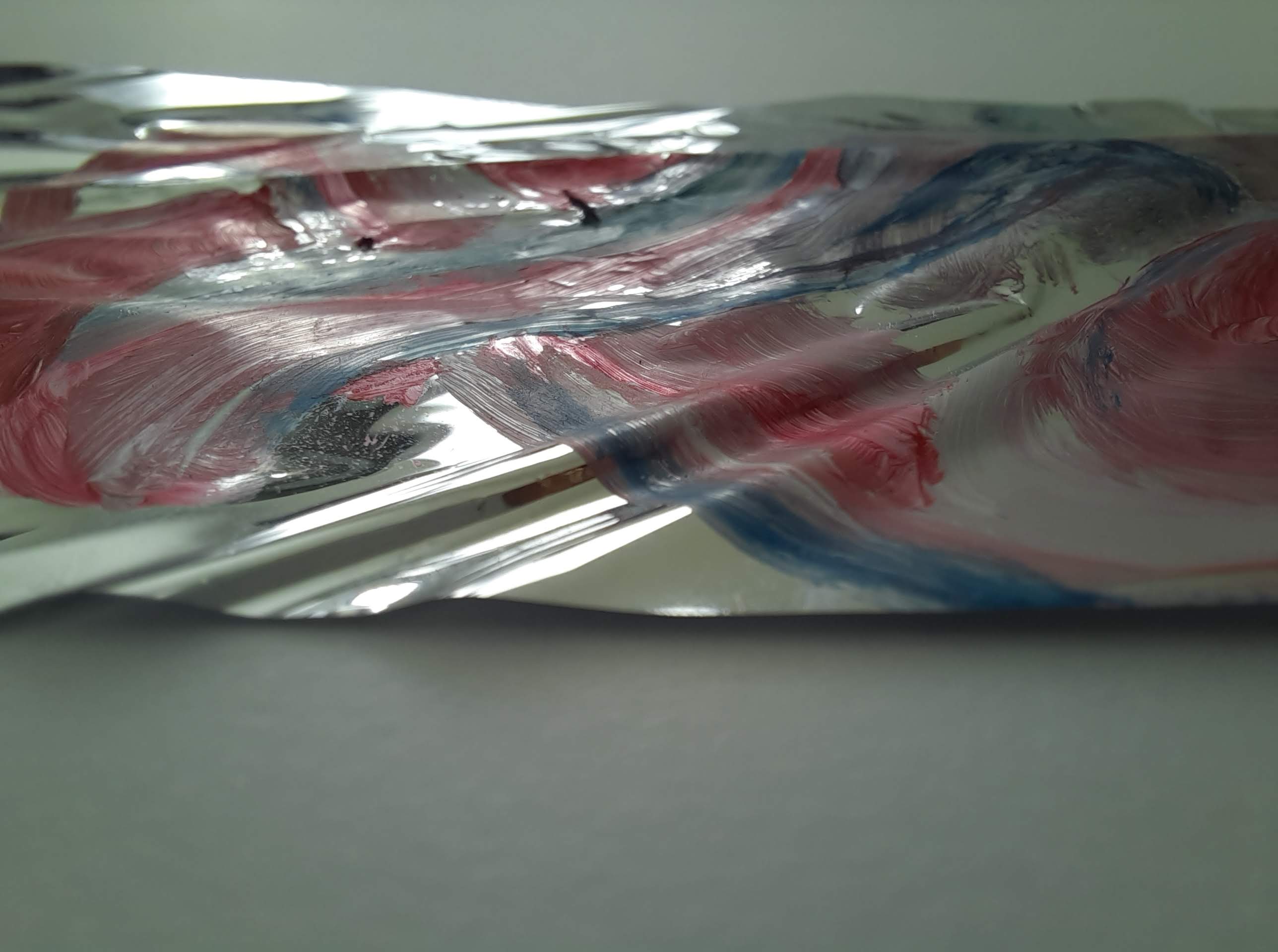
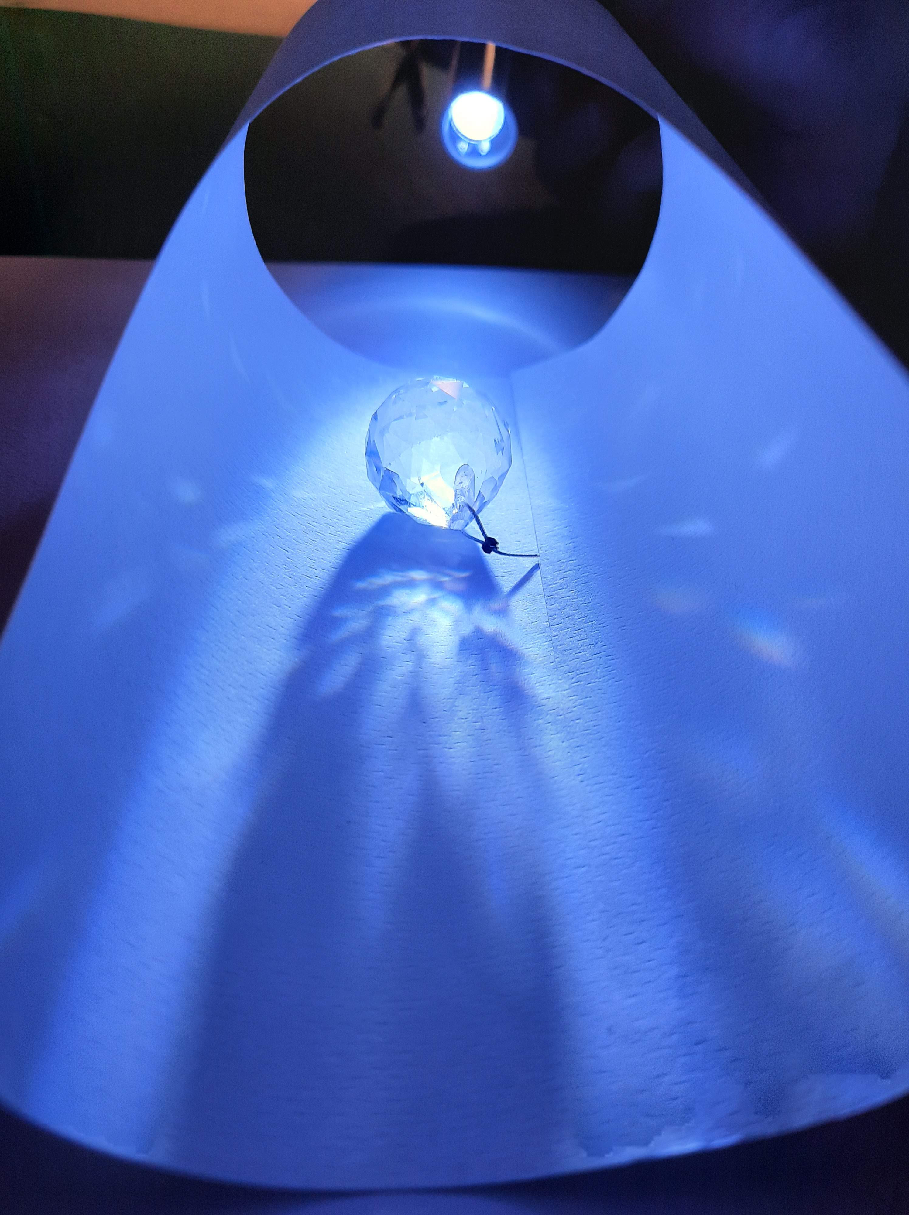
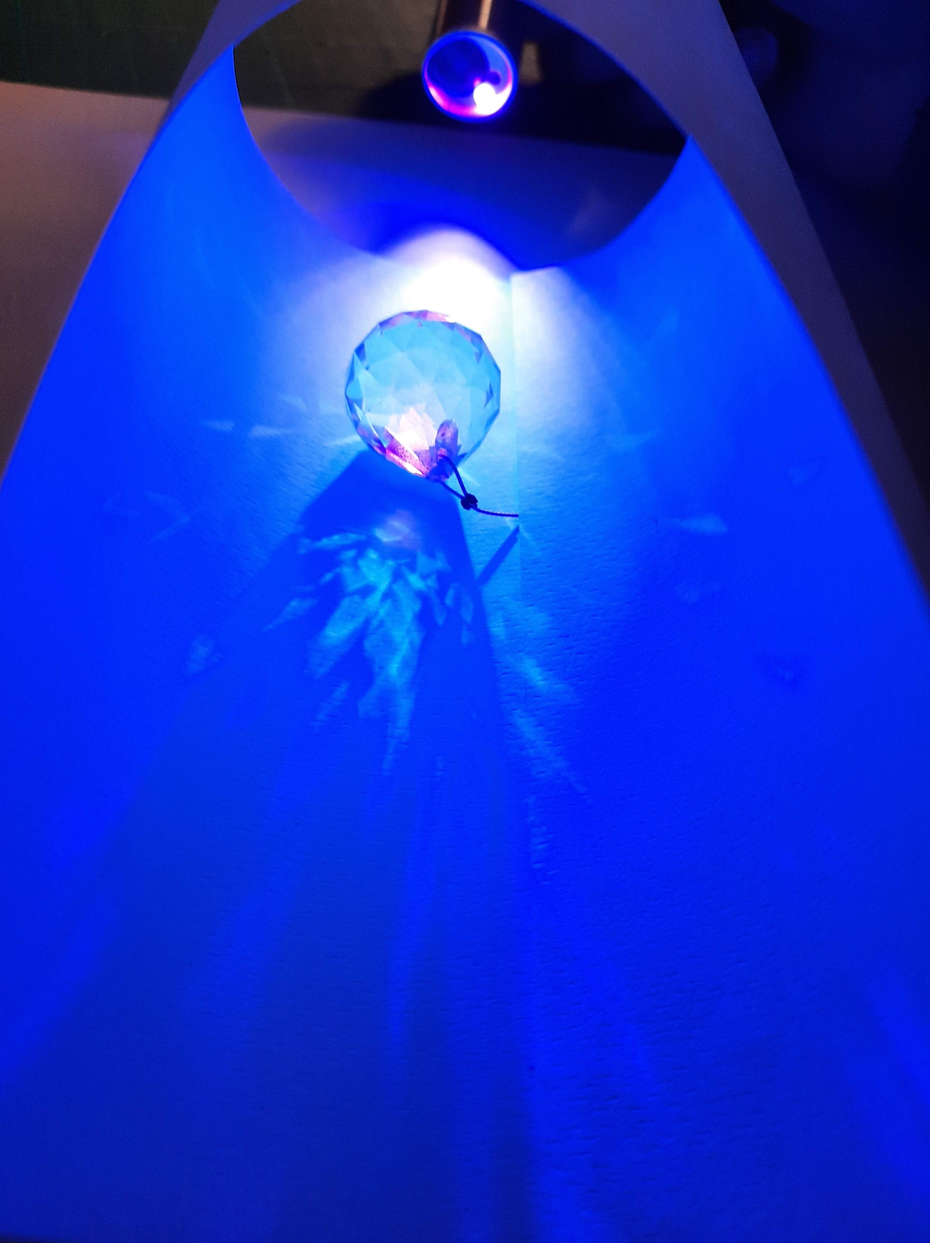
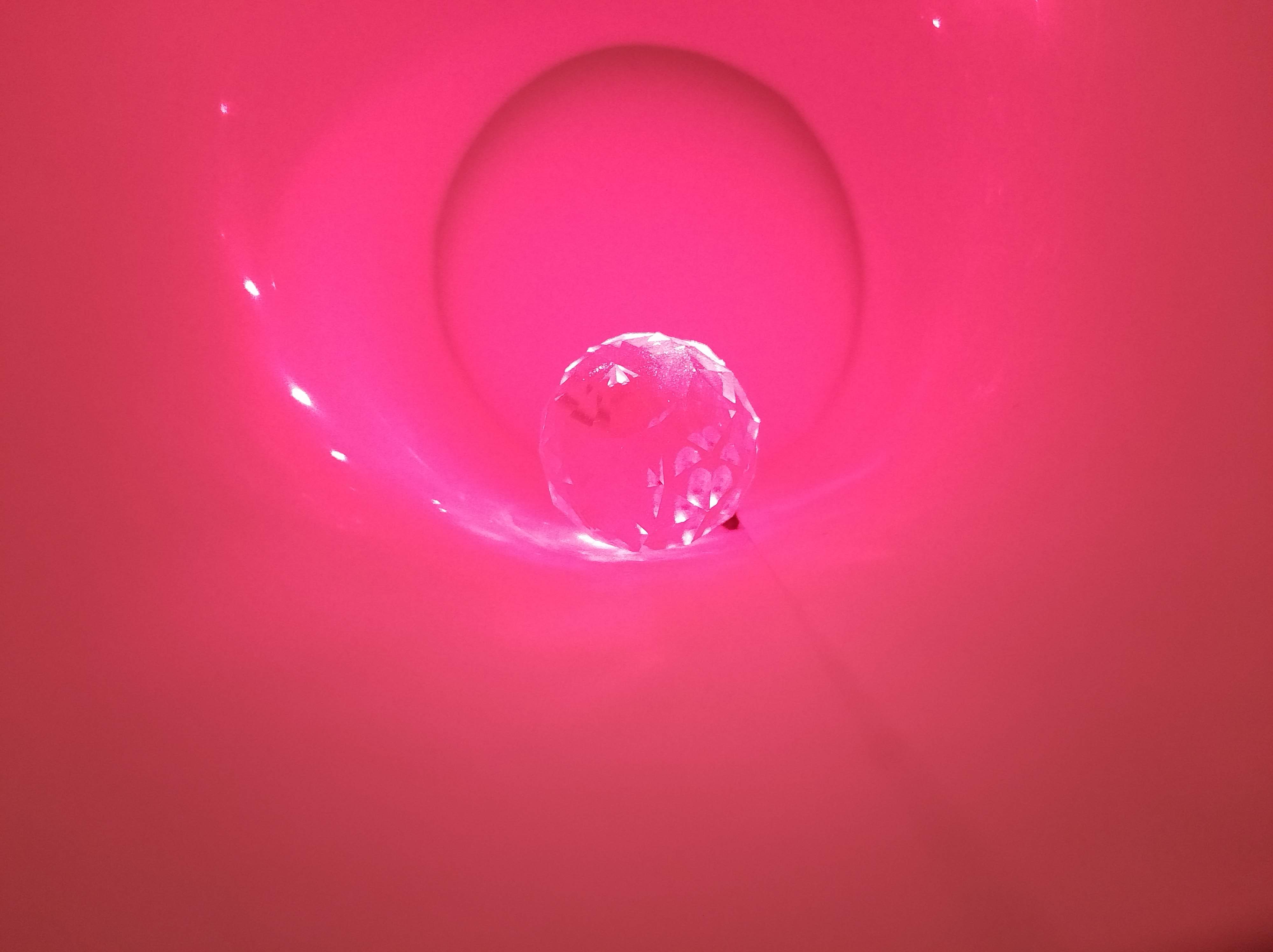
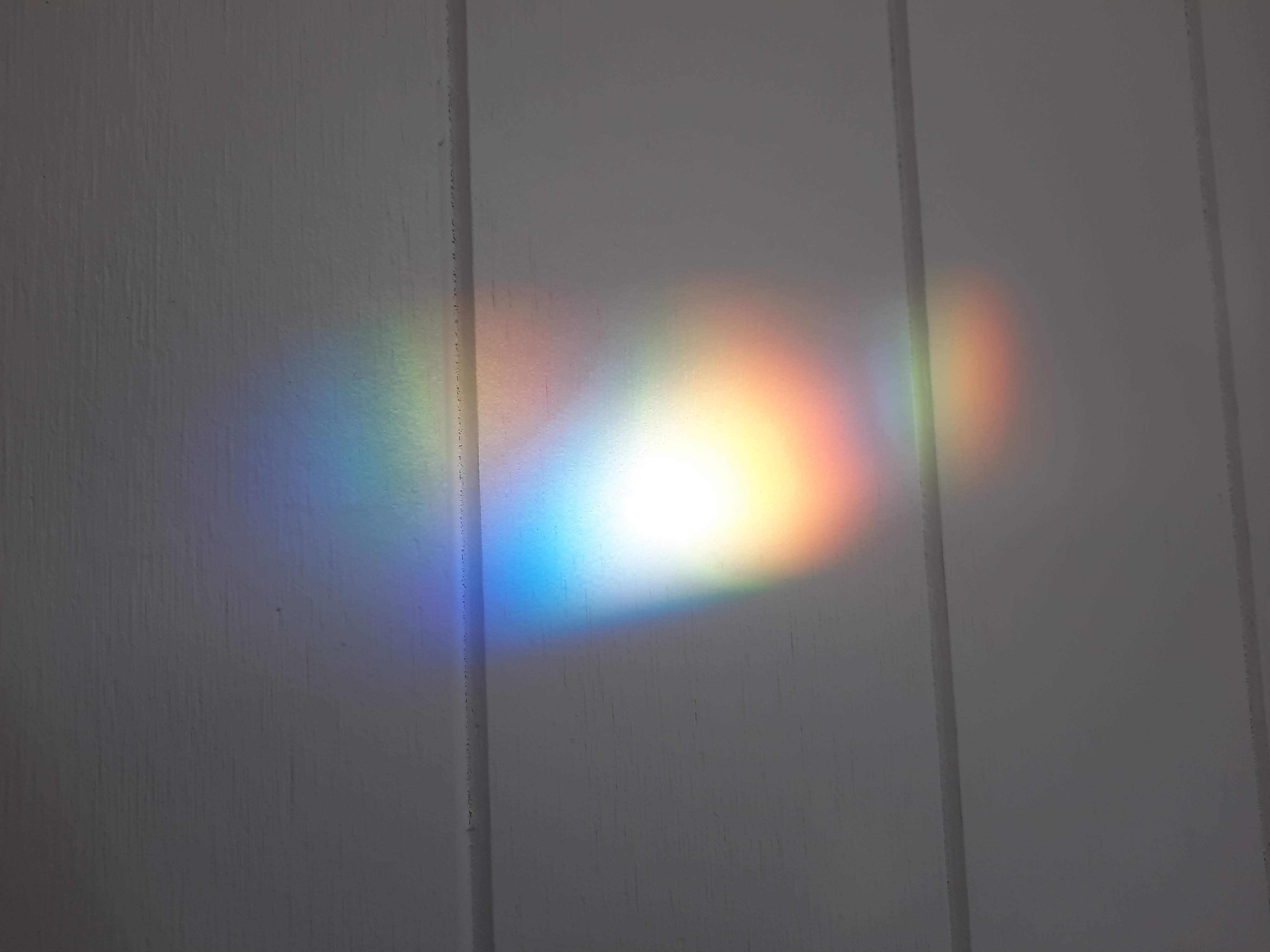
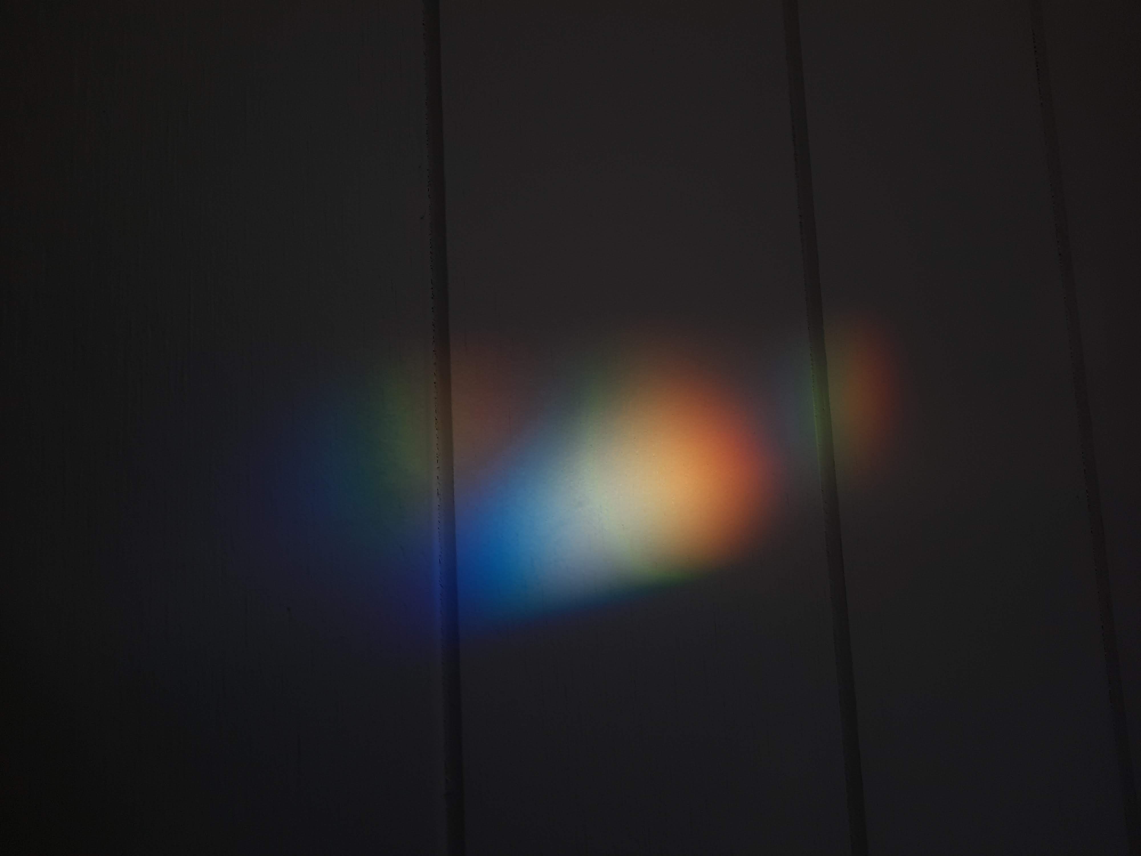
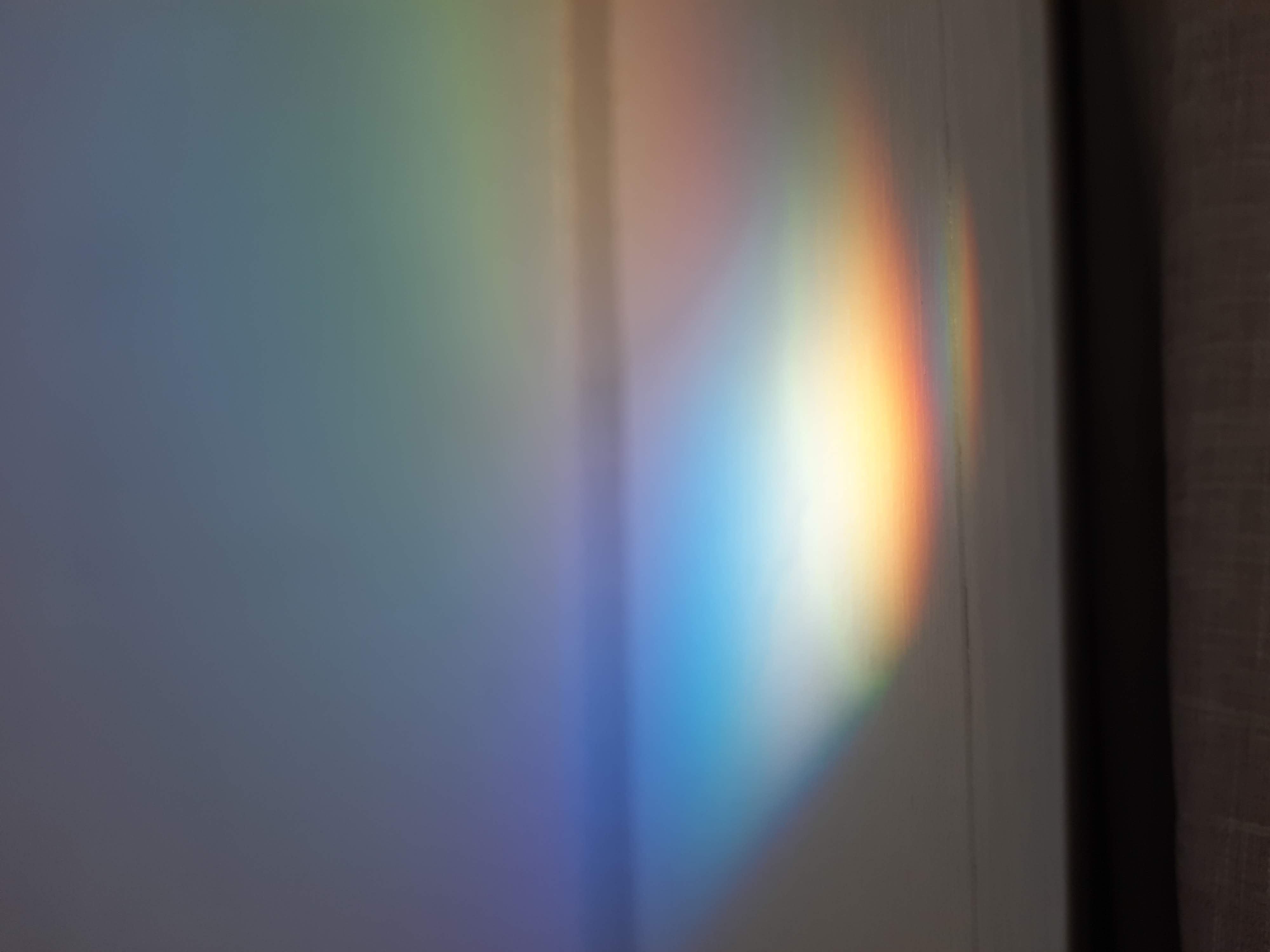
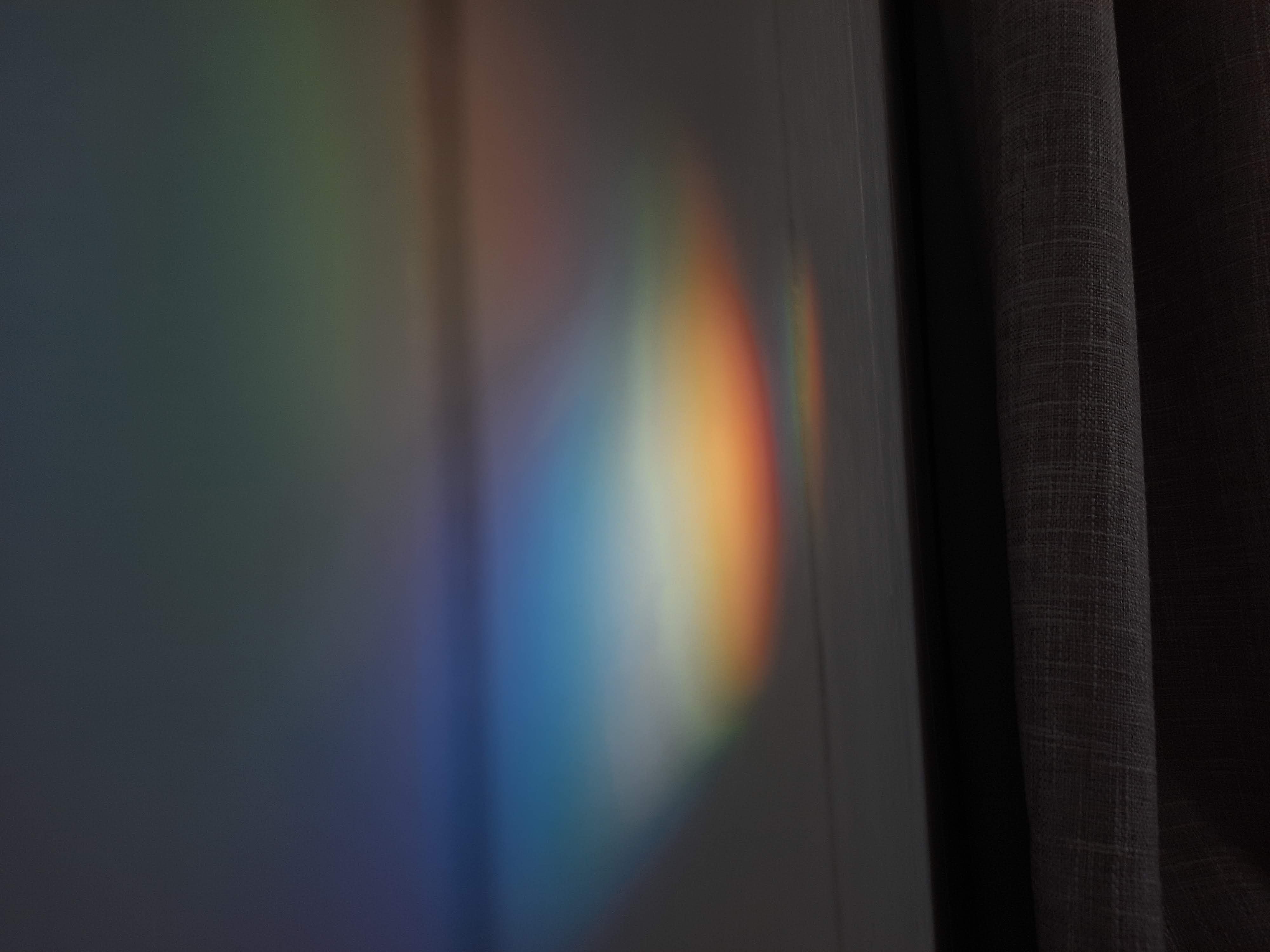
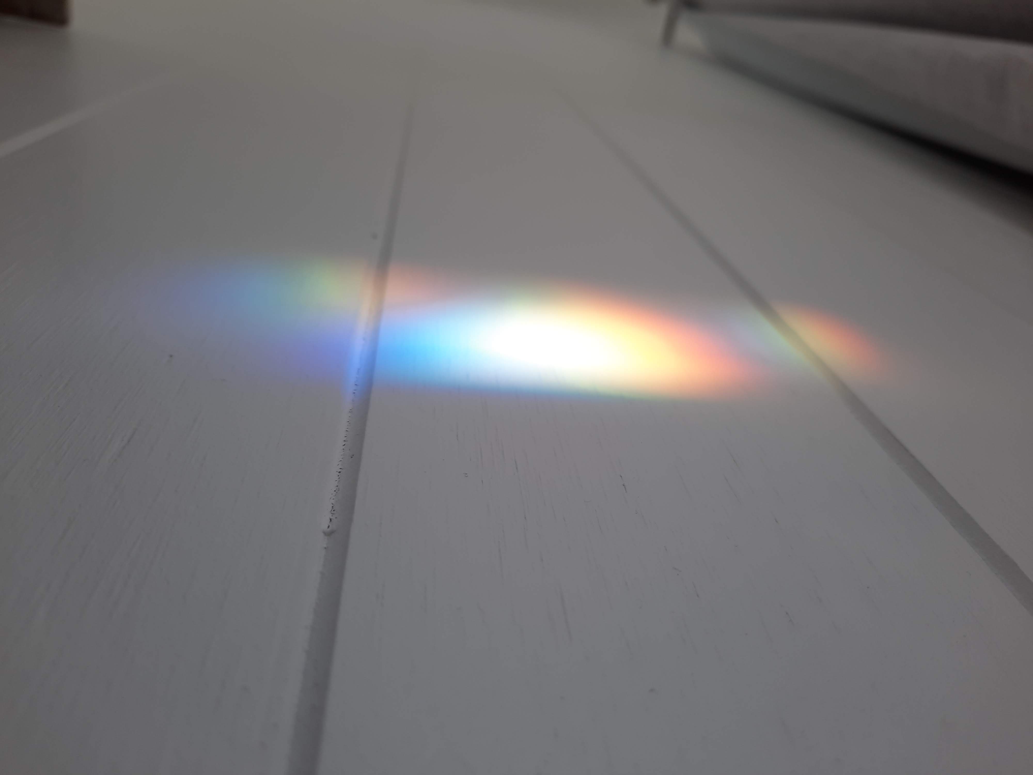
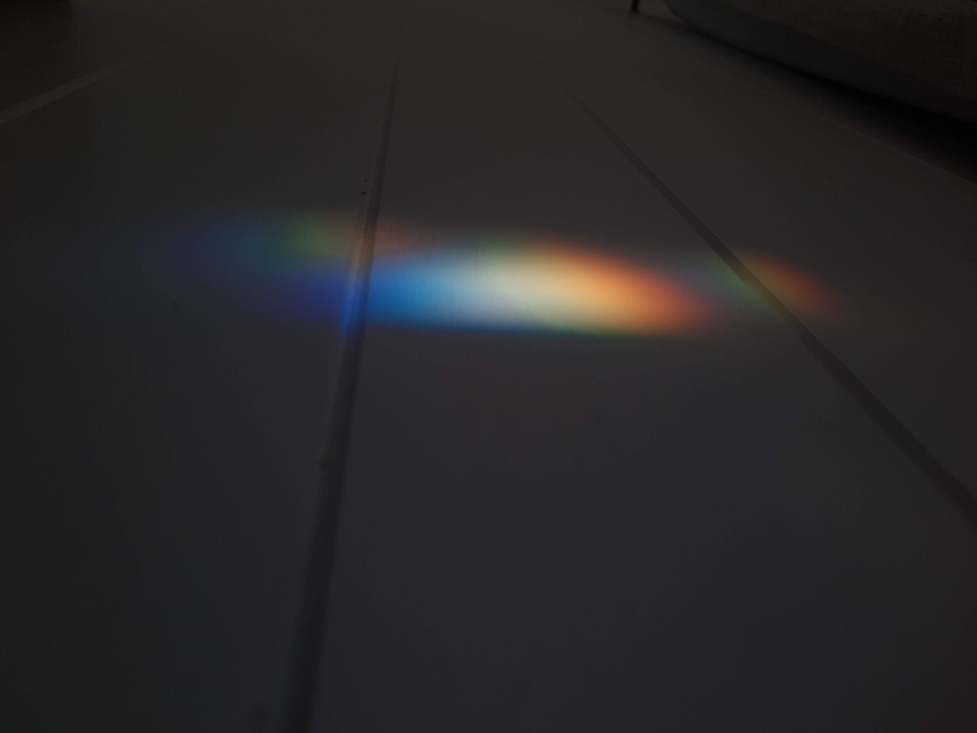
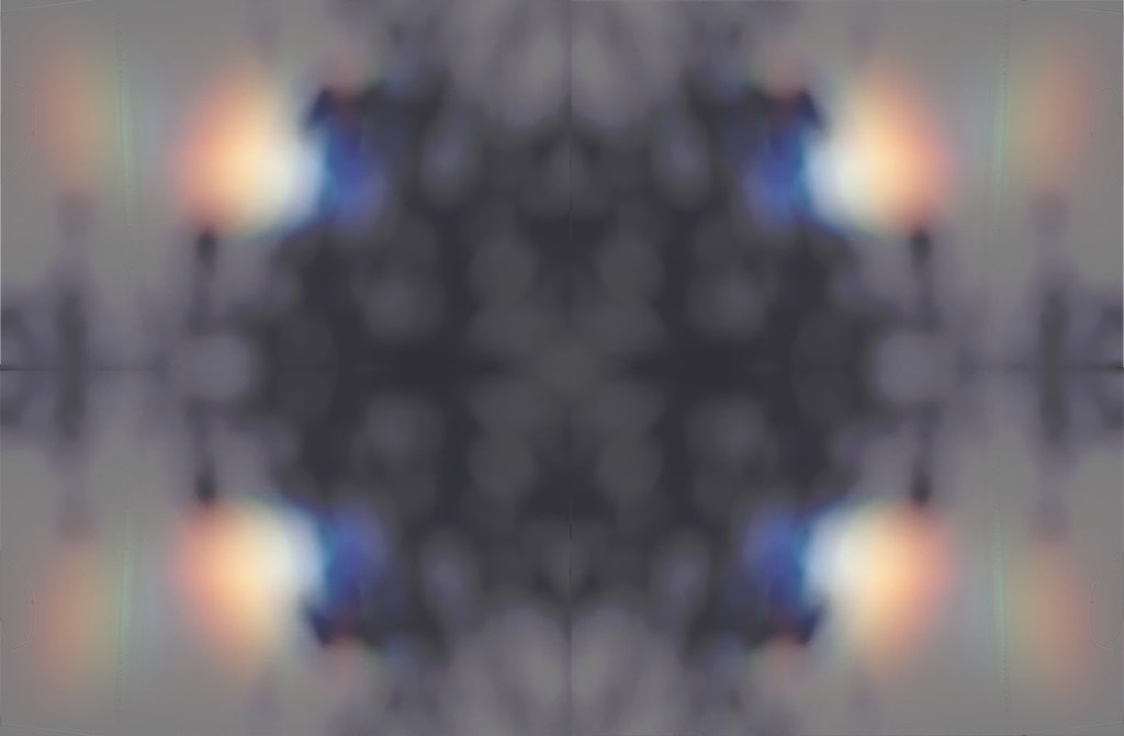
I have done this with a focus on the ceiling feature. A reflective film is suspended from the ceiling which flows down into a series of free-flowing drapes. Lights are positioned along the opposite wall which allows the fluid light reflection to project onto the floor. This was inspired by Anish Kapoor’s work.

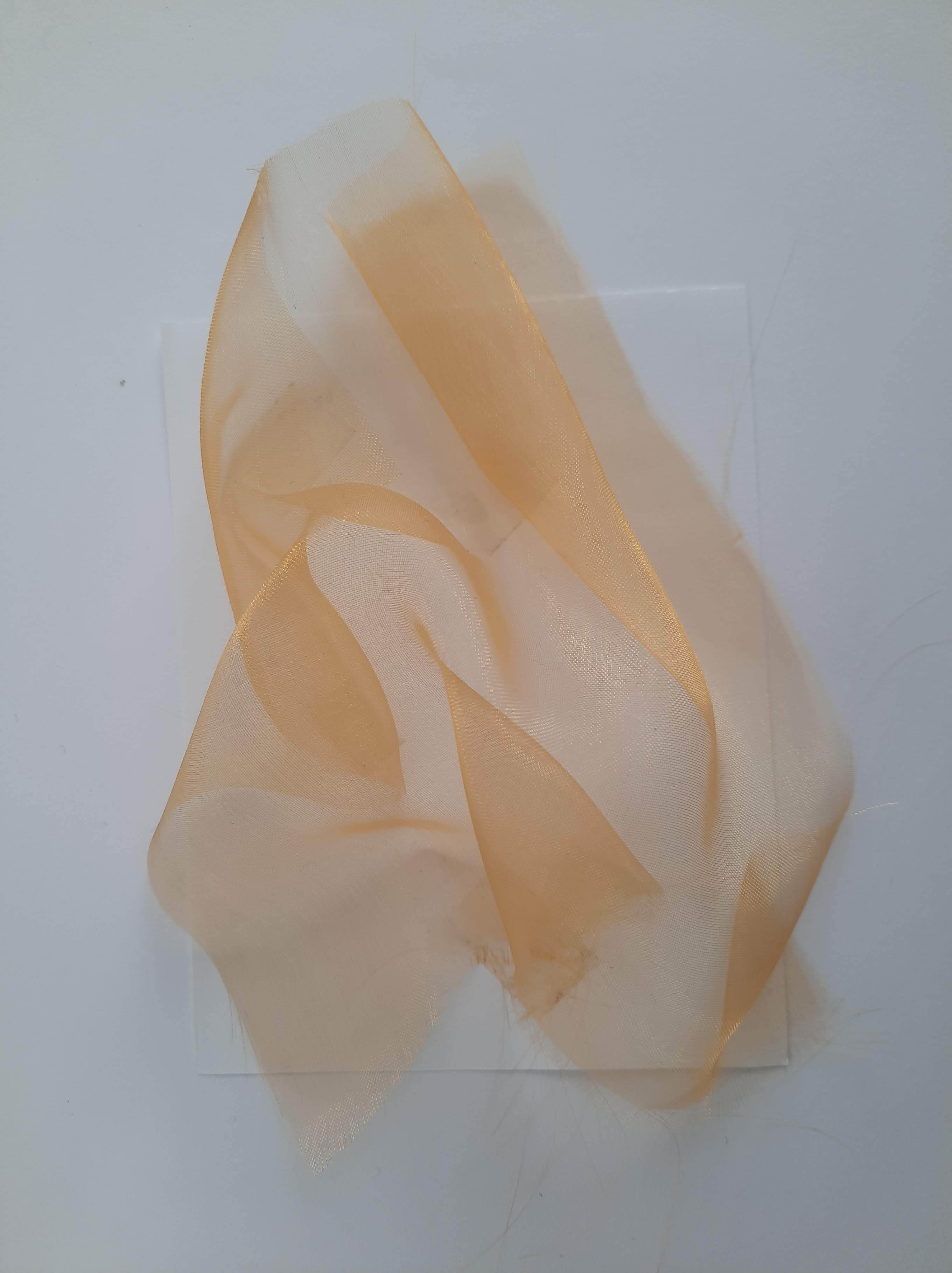
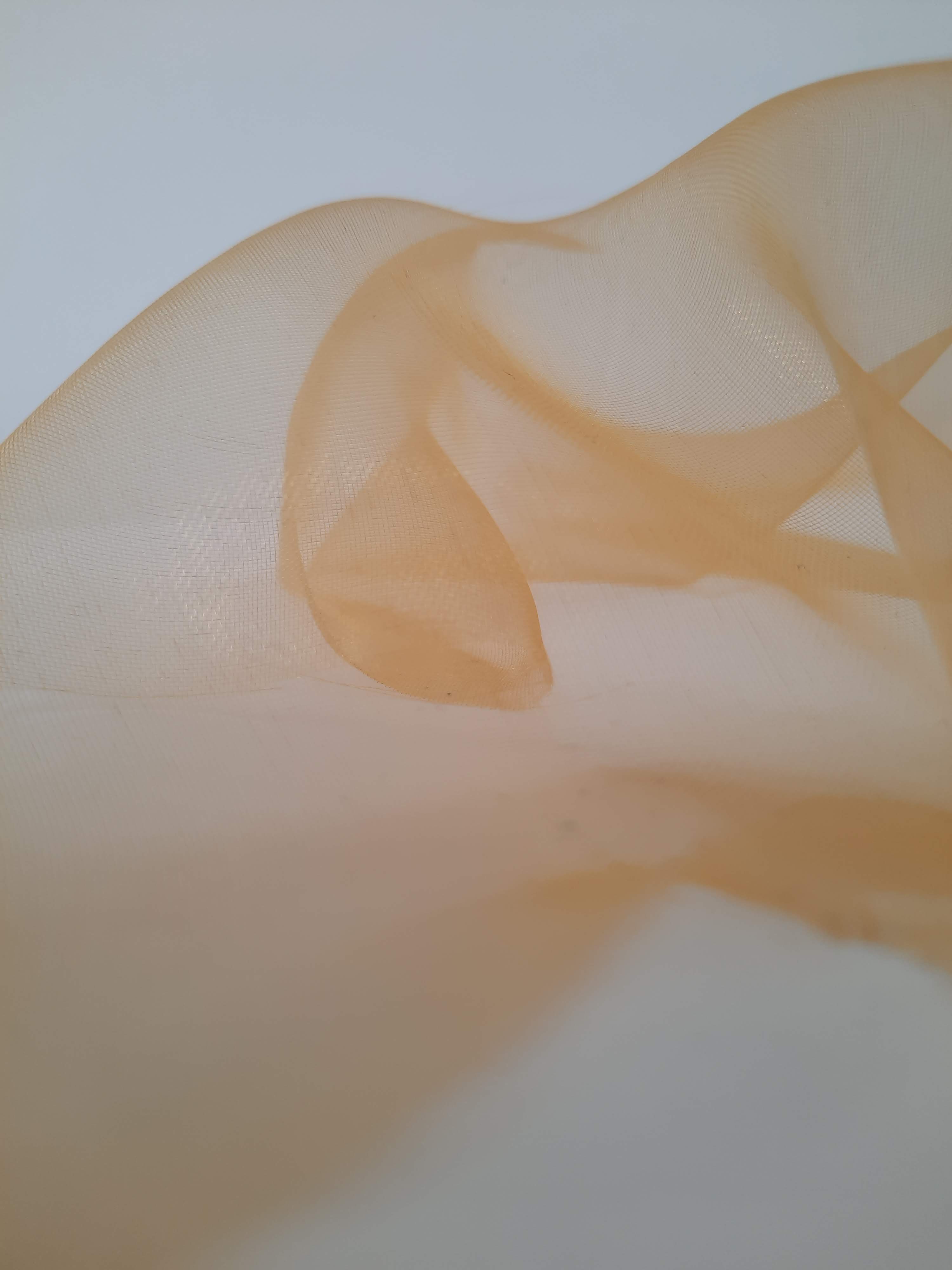
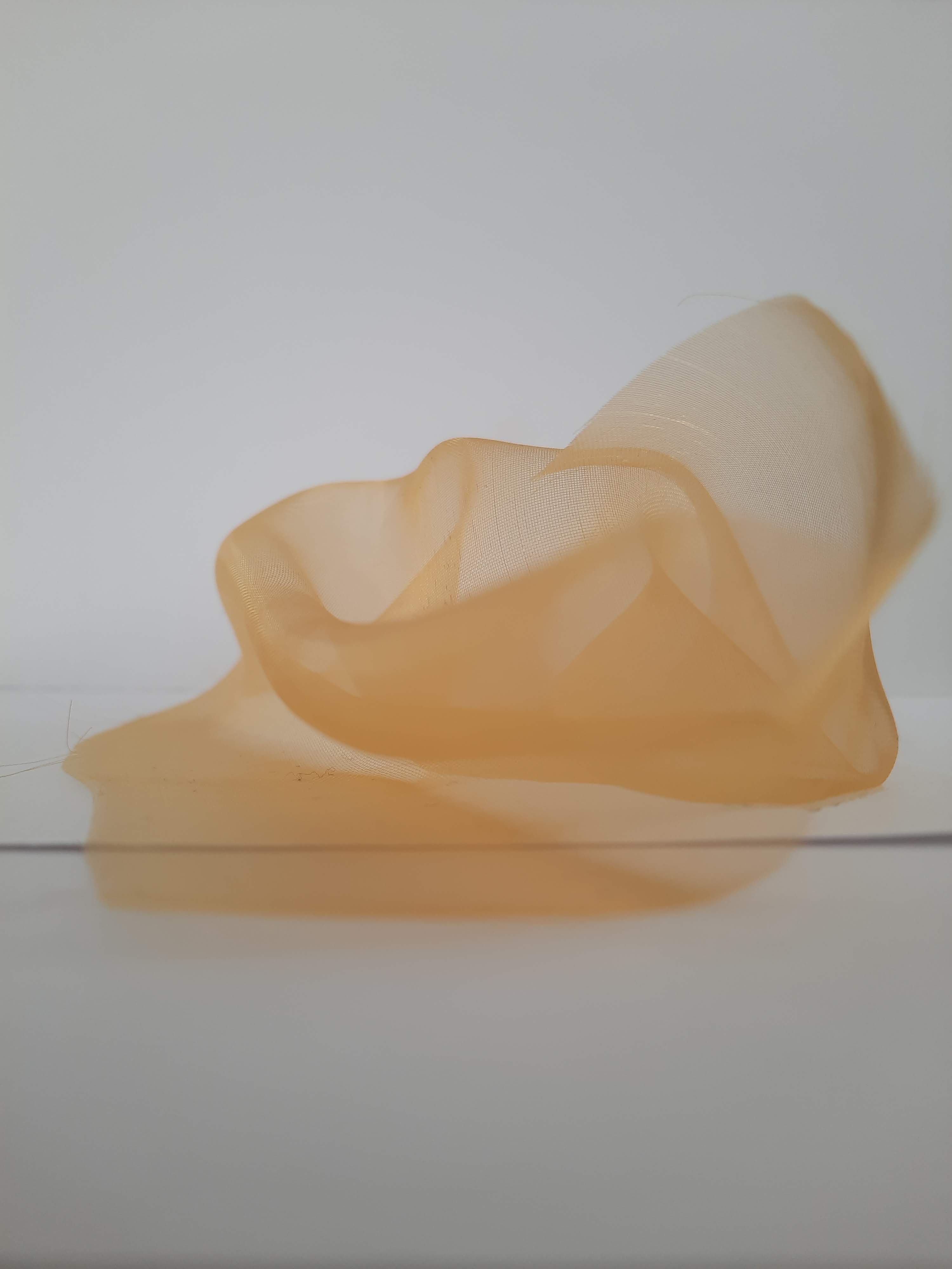
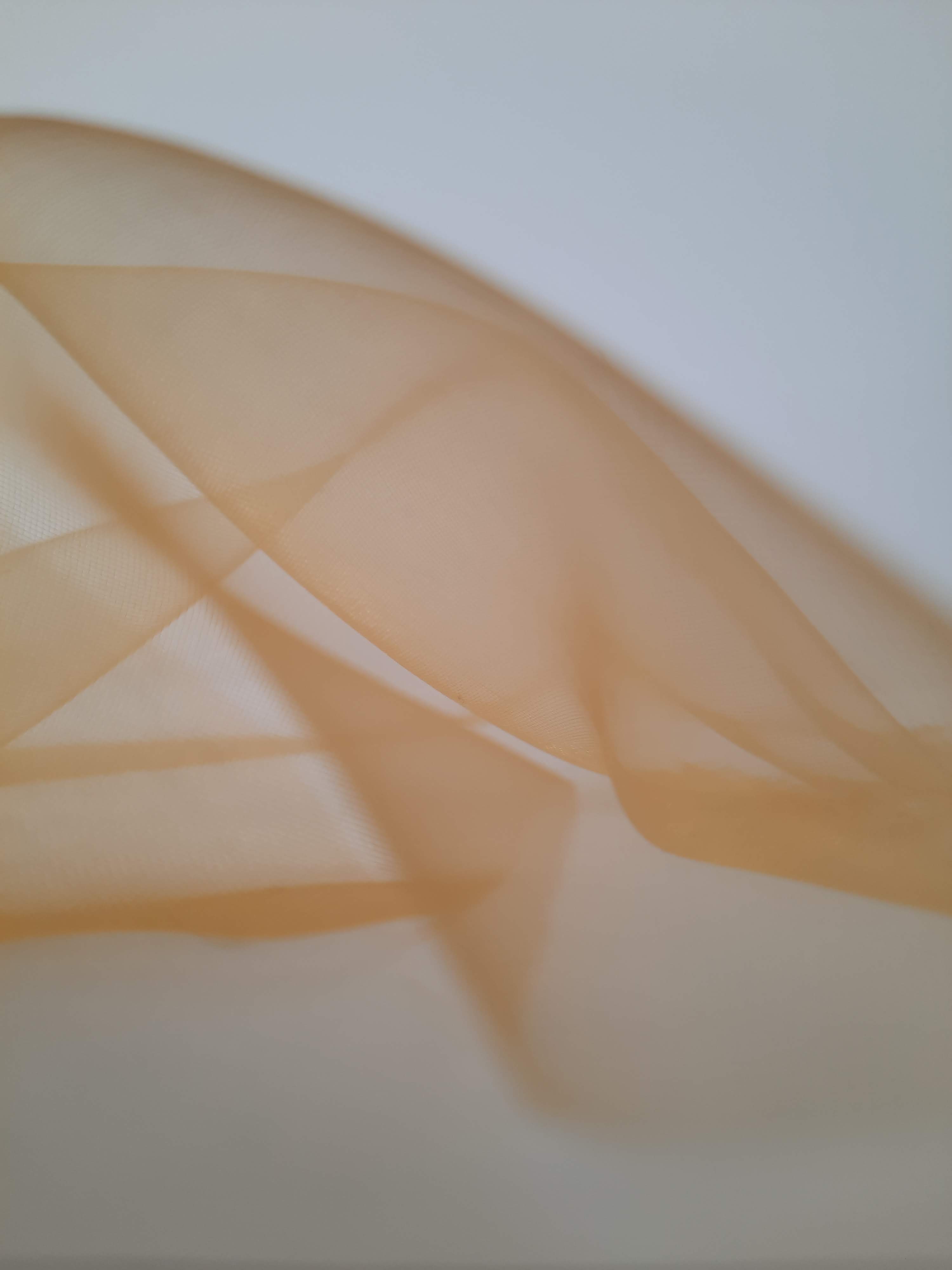
I also have a folding sheer fabric wrapping along the wall from the ceiling to the floor. This creates interest at eyelevel as well as allowing momentary interaction with the space. This feature was heavily inspired by Georgia O’Keeffe. The reflective drapes not only allow interaction with the space, but their moving light projections connect strangers through their innocent movements.

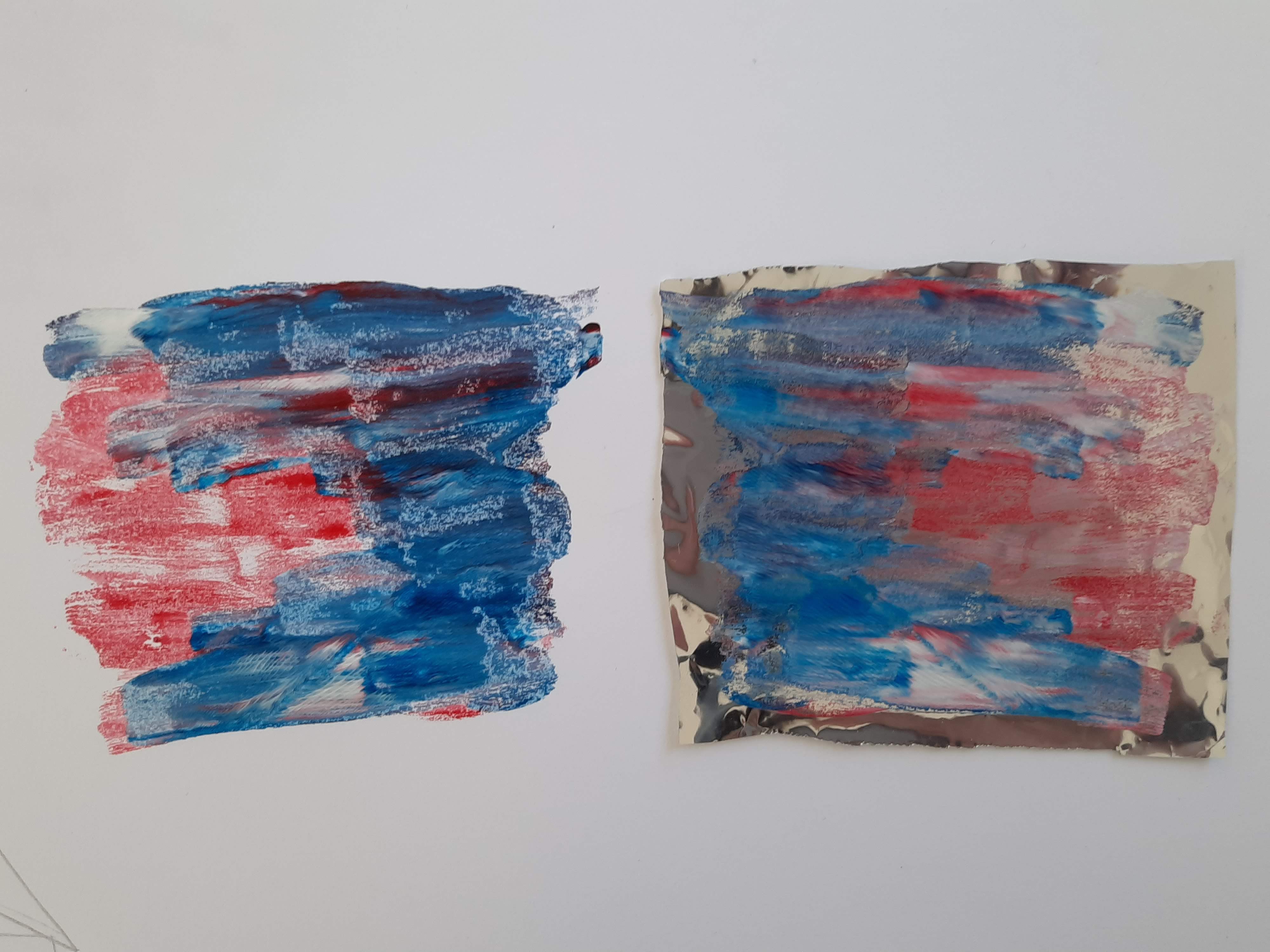
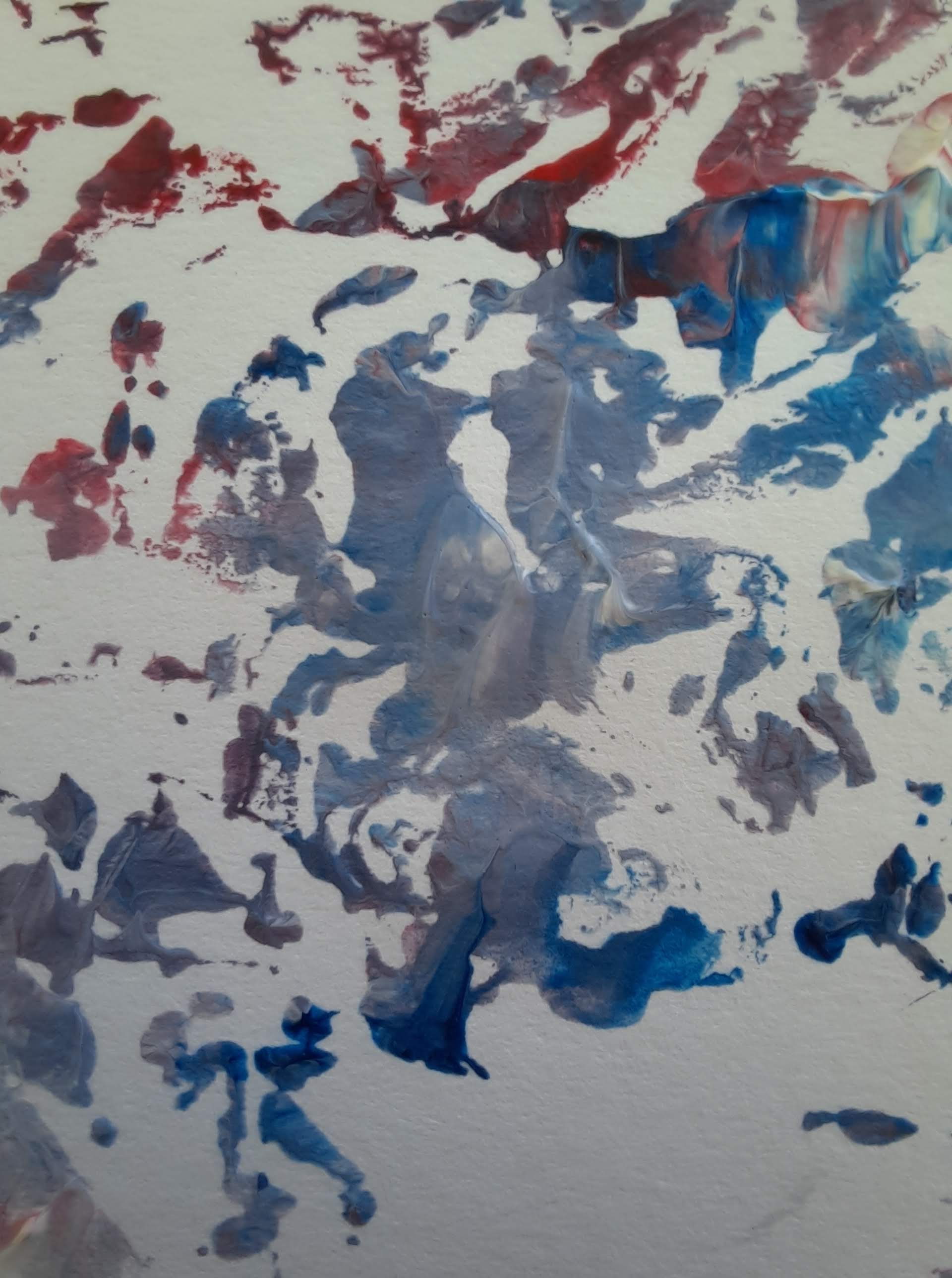
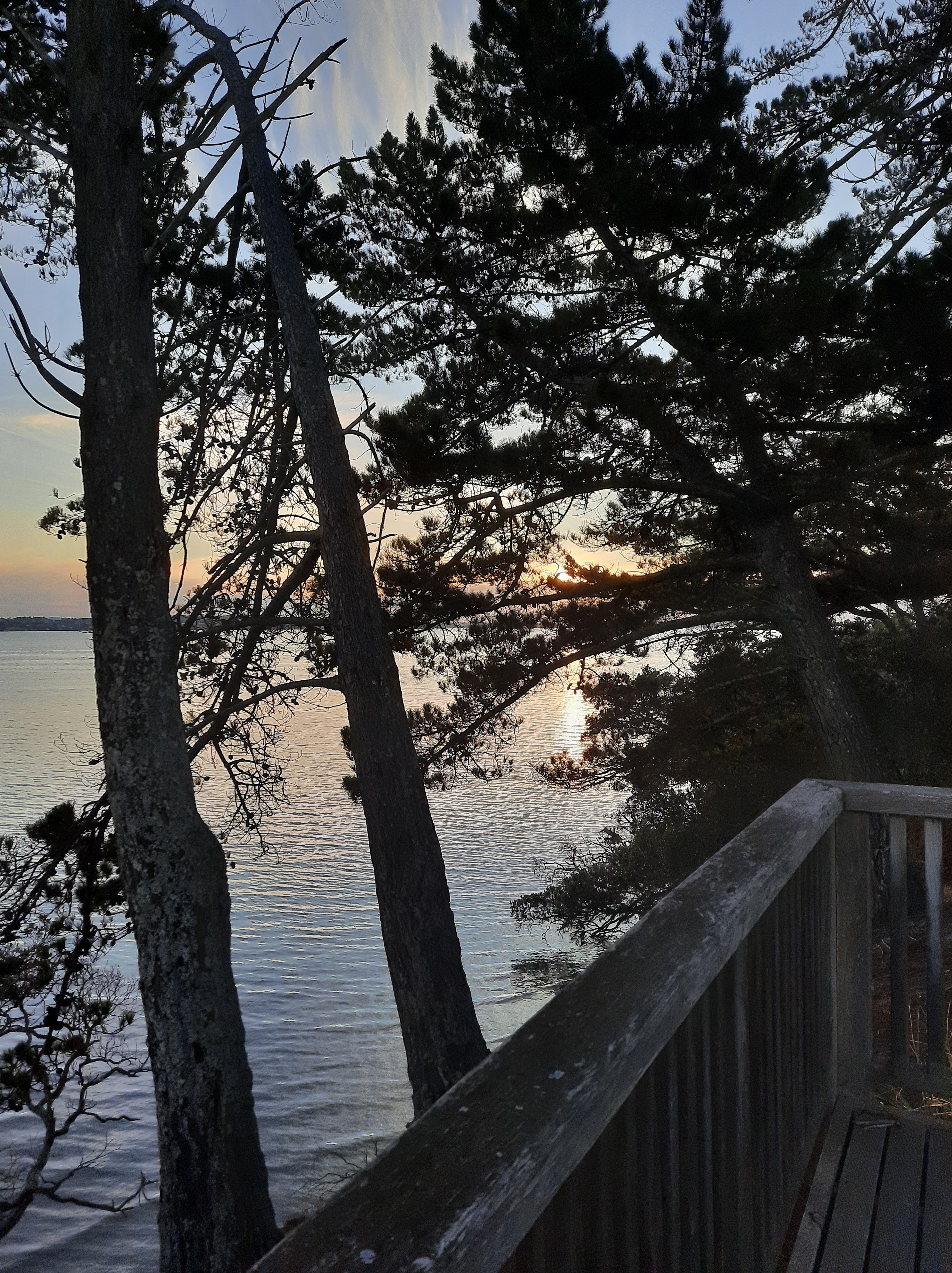
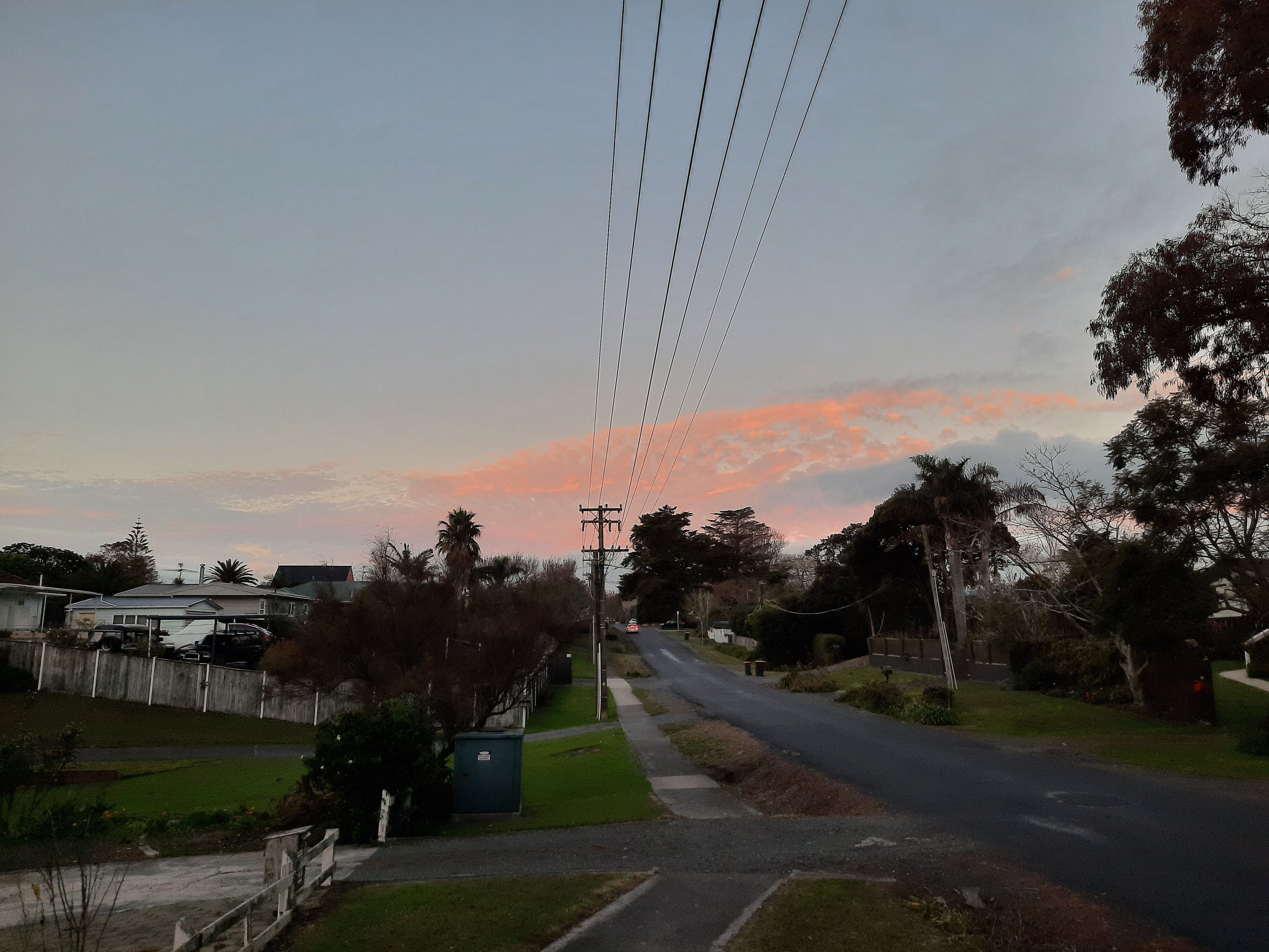
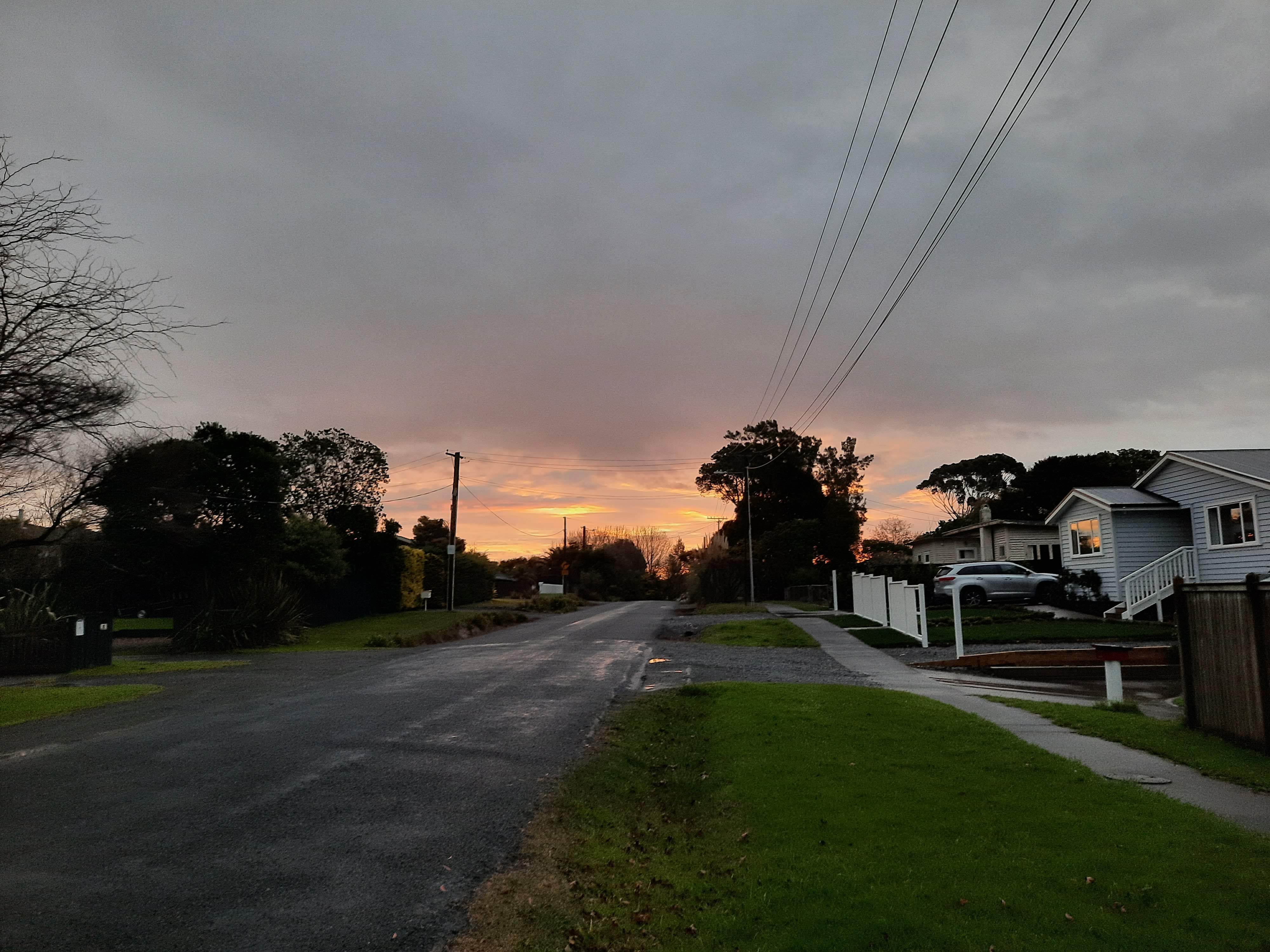
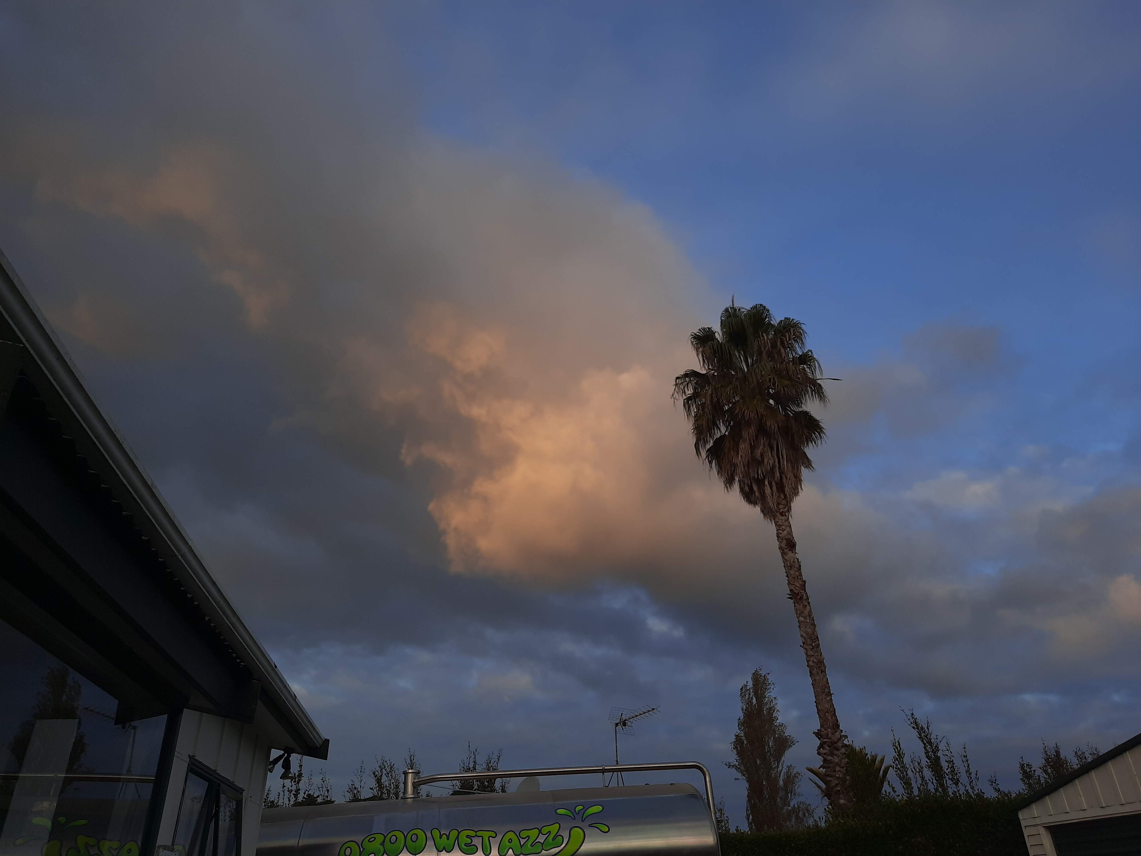
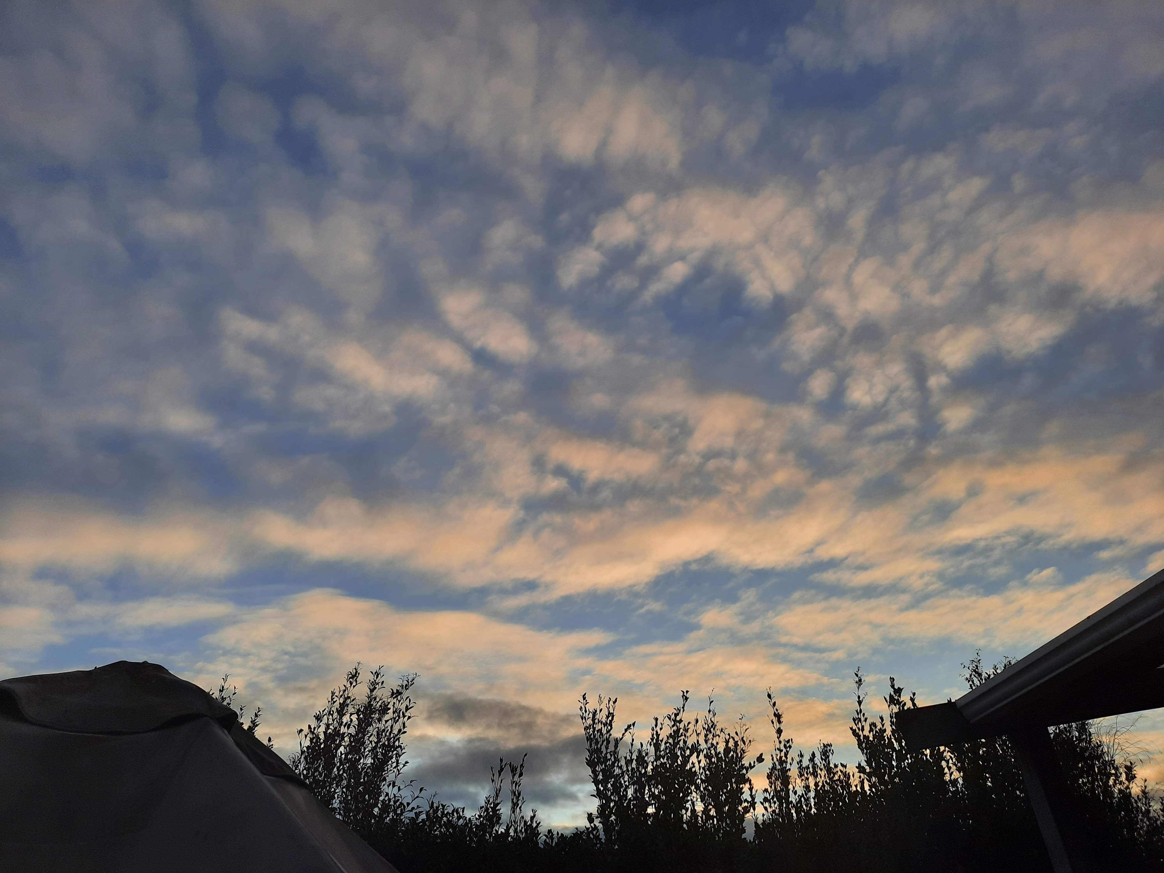
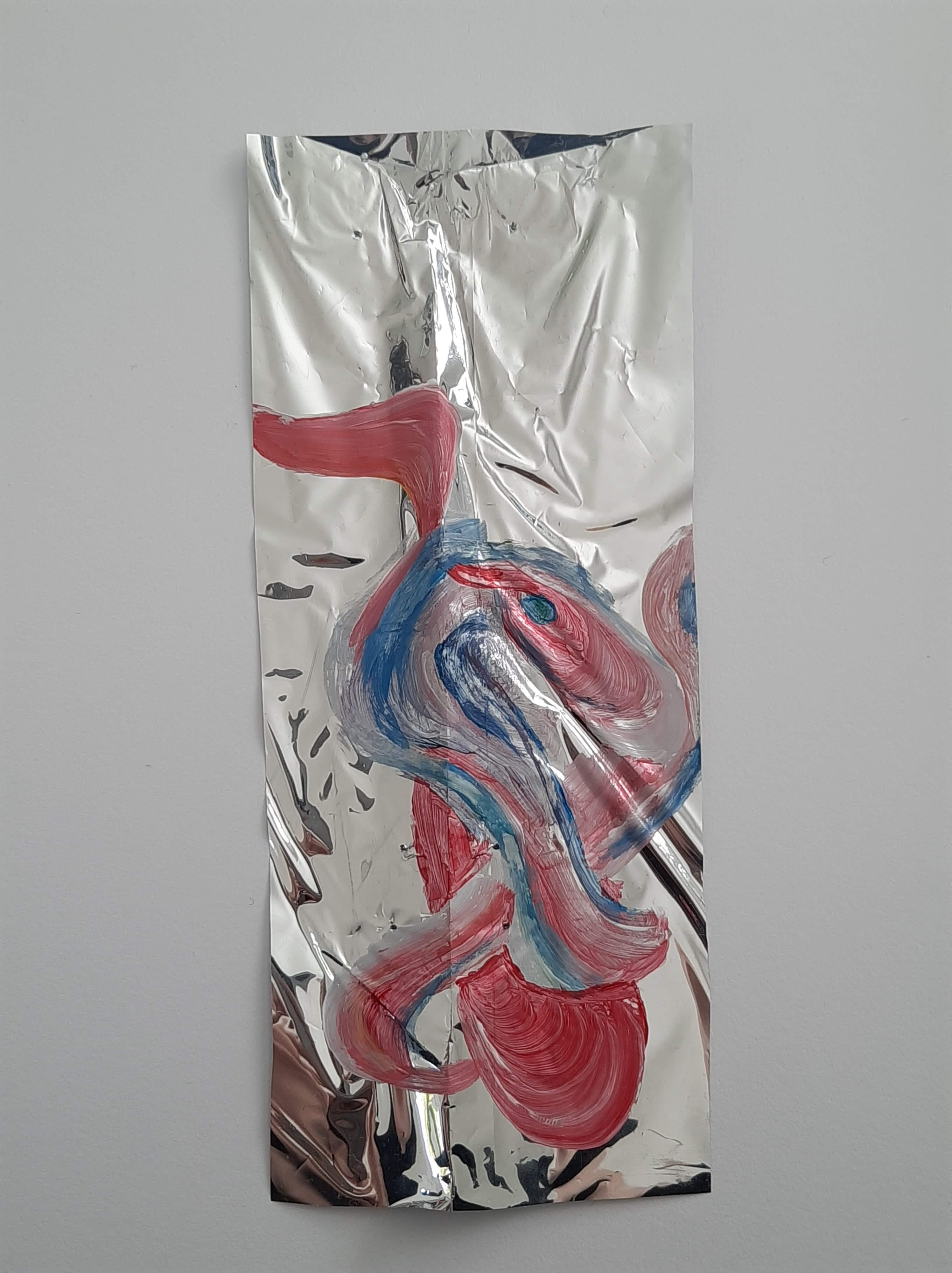
My colour palette was inspired by my own fascination with the world above my mind and my adoration for cloudy evening skies, just before the sun sets. I have always loved the unpredictable and temporal colours cast across the sky. This is why I have chosen the soft pinks, yellows, oranges and blues as my colour palette.

Reflection:

I am really happy with my design and the way it turned out. With this said, I did find it difficult to communicate my design ideas through mainly digital means. I think that this experience has forced me to focus and work on skills that aren’t necessarily my strengths and this has allowed me to grow my abilities. Although working from home, working with limited resources and not having the ability to work alongside peers and lecturers has been very difficult, I have appreciated the experience in the sense that it allows me to grow and adapt as a designer.

Week 11: Design Development

Along with my colour experiments, this week I have also explored how to further develop my surface design. I really liked the concept of my surface design but I have been feeling like I have hit a brick wall in developing it. It also didn’t demonstrate Georgia O’Keeffe’s influence on my work very clearly. To help me generate ideas. I printed off a perspective view of my digital model onto A4 pages and began sketching different ideas into the space.

In my first sketch, I explored creating more of a connection between the ceiling and the floor. I developed my surface design to have the reflective material curve around against the wall and then onto the floor. My surface design had a certain sense of separation between the ground and the floor and this design creates a solution.

Below is my second sketch. One of my focuses in this design is making the public a part of the space rather than a viewer of it. I wanted to do this through interaction with the space through movement as it is a public walkway where people will constantly be moving through. This second design explores how I could develop my surface design idea to incorporate this by extending the ceiling material and letting it drape down towards the floor.

In my third design (below), I have explored flipping my second design so the material would drape on the same side of the passage as the stairs. The reason why I did this was because I am design a public walkway. I don’t want to block off the rest of the space, stairs and doorways but I wanted to create a certain level of separation between the two to allow the flow of public with limited disturbance to the rest of the building and its uses.

My fourth design (below), explores how I could create more interaction with the space and other people passing through the walkway. I am not as sure about this design because it would make the flow of people more disjointed but I do like how it allows more influential movement in the space.

My fifth and final design (below) explores space interaction and partitioning the best. In this design, I have demonstrated the reflective film on the ceiling which is covered by the sheer fabric I have used previously in model making. The reflective film is suspended from the ceiling with a series of drapes extending off it to not only create a change in space between the walkway and the rest of the building, but to also allow the public to influence its movements and light projections on the floor. This passing on of movement creates subconscious connections between strangers in the space. The folding sheer fabric is also suspended from the ceiling, over the top of the reflective film, and curves down the wall. This is inspired by the flowing form, folds and depth of Georgia O’Keeffe’s work. The surface volume draws attention as well as interaction. Its flexibility allows public to shape, mold and manipulate the surface. I chose the sheer fabric not only because of its ability to be folded and manipulated, but also because o its soft, warm yellow-orange colour. This colour demonstrates and articulates my chosen colour palette.

I think that my last design best communicates my ideas and intentions with this project. I am now going to focus on creating a presentation with this concept.

Week 10: Colour Exploration

This week, after discussing my work and my next steps with Ceili, I have conducted a series of exercises to push myself and further develop my project. One of the main dead ends I have hit was picking a specific colour palette. From the beginning of this project, I have been interested in explore colour in the sense of reflection, light and shadow instead of the ‘normal’ sense. Because of this, I explored different colour affects on my surface design perspective to hopefully get some ideas flowing. Below are the images of my exercise.

I really liked the magenta when I did this exercise. It started me thinking about ‘sky-blue-pink’, the colour of the sky and the clouds in the early evening before the sun sets. I have always loved and had a fascination with the sky. I love how something so consistent is so temporal and forever changing. I love the unpredictability of its beauty. My favourite time to look up at the sky is when it’s ‘sky-blue-pink’. My project is all about my own interest in the social behaviours and expectations and how i can influence and encourage people to look up and admire and experience the beauty I see. My colour palette can reflect this by demonstrating the beauty that is above my mind.

I also did some experiments with quick drawings (below). I experimented with pencil drawings as well as drawings with acrylic paint and water colours as these were common medium used by one of my artist models, Georgia O’Keeffe.

Below are some images I did with acrylic paints. I painted on a smooth piece of reflective film and then pressed that onto the paper. I was quite fascinated with the texture that was created on the paper.

I did the same with watercolours (below). I liked the way the colour blended with each other to create a smooth transition.

I then did the same experiment with acrylic paint, but this time I scrunched up the film before I applied the paint. I really liked the colour that occurred when the paint mixed together in the press. The texture was also really interesting.

I then conducted the same experiment with the watercolour. I liked how organic the press turned out.

Through these experiments and explorations, I have come to decide my colour palette. I think by having a collection of soft pinks, yellows, oranges and blues, I can create the landscape that many people are too blind to experience and enjoy. This colour palette will allow my to show people the beauty of the world above their heads.

Below are some images to demonstrate the colour palette I am focusing on.

Week 9: Group Discussion

On Tuesdays class this week I had a group discussion with a breakout group about my work. I have still be struggling to get a sense of how I am going to further develop and what ideas I could bring to my design so the group discussion was good to get some outside perspective and suggestions.

I showed my work from the A3 surface exercise we did in Week 6 and also went over my key concepts and ideas I am wanting to achieve with my design. A point brought up was that the walls in the space were very plain. I showed them some images of my artist models and talked about the aspects of their work that I am interested in and how I am using them to influence my own work. A suggestion was to have some kind of illusionary affect on the walls. The ceiling and floor create this abstract and illusionary mood already so further exploring this and how it could grab the viewers attention to look around could work with my project. With this idea I could possibly play with and explore the use of the pillars in the space as they are a structural feature and ignoring and disregarding them would defeat the purpose of my design.

The only thing to consider when exploring an illusionary affect is the level of distractedness the wall would create. My concept is to draw attention upwards as the ceiling is the main feature; I don’t want to keep the public looking at eye-level as this destroys the purpose of the space and makes its direction in development confusing.

An observation made by the group was that the projection of light on the floor was similar to that of a gently disturbed water surface. A suggestion was made to possibly explore this further in my design. This was an interesting suggestion because I have previously considered the reflection affect through water and had considered using this in my design. The article How to Encounter a Puddle By Anny Li and her exploration and documentation of puddles in New York City was what triggered this brief idea and concept. I had considered having a thin layer of water to create a reflective affect but considered the cold atmosphere it would create with the public travelling through water in a dark space and I wasn’t quite sure if this was the affect I wanted to create.

This suggestion from the group made me reconsider this idea. I don’t necessarily have to incorporate water in the sense I had considered before but it could visually enact my concepts, ideas and purpose for my design. Water not only has a reflective element to it (Anish Kapoor), but it also has fluid and rounded form and movement (Georgia O’Keeffe). If it were to be considered as an element on the floor of the space, it could also act as and element of manipulating conscious movement and actions within the space and creates a connection between the public moving through the foyer and the qualities of the space itself. The public would also carry a part of the design with them, in a temporal sense. The public leave their mark on the space (wet footprints) and he space leaves its mark on the public.

Another observation by my group was the horizontal and vertical relationship. My design focuses on the movement of the public on a horizontal axis but also the eye-line and attention of the public on a vertical axis. In some way I need to explore the relationship between the two so that they work together and not against each other.

It was also brought to my attention the work of Japanese architect, Junya Ishigami. Below is a picture of his work, Balloon, which is made from aluminium, weighing over a ton, but is suspended in the air like a balloon because it is filled with helium.

(http://fullinsight.com/blog/2012/10/cuboid-ballon-by-junya-ishigami)

Ishigami, J. (2007). Balloon. Museum of Contemporary Art, Tokyo.
http://fullinsight.com/blog/2012/10/cuboid-ballon-by-junya-ishigami

Not only i the slightly warped reflection of its surroundings interesting and resonate with my design, but also its combination of structure and form with fluidity and movement. It amazes me how something that large and heavy is a creating a sense of floating and defying gravity.

(https://www.iconeye.com/diary/item/3544-junya-ishigami?cpnb_method=cpnbCookiesAccepted)

Week 8: Pitch

Below is my written pitch that explains the ideas explored in my design.

The World Above Our Minds

Social behaviour and societal perceptions influence the way in which a space is experienced. My design intervention aims to investigate, challenge, influence, alter and create a connection between the subconscious and conscious mind and an awareness of the influence societal expectations has on the way we move, act and think in terms of space. 

My design intends to bring to the foreground the behavioural expectation within the city to watch where you are going and looking, avoid eye contact with strangers and keep to yourself. As a person who travels from a small community to the city each day and walk up Queen Street from the Ferry Building to university, I have noticed this odd unspoken rule and expectation of physical existence without social interaction. On what would be called New Zealand’s busiest street in terms of foot traffic and people, there is this communal perception to act as if you are walking down the street alone, as if the strangers you pass by and walk along side are a tree, a rock, a moving obstacle in which to manoeuvre around. With this said, sometimes there is a smile returned, often by those stationary on the banks of the flowing stream of people. It’s often those with an instrument, a microphone, a sign asking for spare change that I can depend on for a sense of humanity in the moving rush of obstacles.  

People are afraid to look at someone they don’t know. There is a sense of social fear. This is why, especially in a cityscape, we tend to always look down, avert eyes and blend in with the crowd. But often we see beauty when we take the chance to look up. Studying in the city and experiencing both the interior and exterior of the St James Theatre space, I have come to notice the impact of looking up and experiencing the landscape, environment and world that exists just above our heads, above our line of sight and the beauty of angle, view and perception that many city goers exist within, but do not experience. 

My design is aiming to change social behaviour in the city by encouraging people to look upwards with lighting, shadow and reflection through fluidity, form and depth within the St James Theatre foyer space. The space will be designed as an installation public walk way between Queen Street and Lorne Street as a way to make the general public aware and consider the way they act, move and think not only within the space of the walkway, but in term of the city. The design is a way to highlight, challenge and alter peoples’ social interactions. We don’t exist in a world by ourselves. My design is based around people being a part of the space and altering it with their existence, creating a sense of temporality, chance and interaction, rather than people viewing the space as if it was a framed painting placed in a gallery. 

As I am working on this project from home and have limited resources, I plan on making the most of the resources I have access to as well as taking this opportunity to broaden and expand my skills, especially in terms of digital design skills. I plan to use a combination of model making and photography to capture effective and realistic lighting affects as it is a main factor in my intervention. Along with this, I will also iterate ideas through drawings in pencil, pen, acrylic paints and water colours as I find this a more effective way of portraying my ideas than digital drawings. With this said, I am going to make the most of my access to digital tools and use programs such as Photoshop to further edit my hand drawings and photographs. I plan to use Rhino only as a canvas in which I can test ideas in terms of how they will be viewed in the space by an occupant as I don’t have the resources to build my own site model. This tool will give me a sense of scale in my work. I am going to mainly focus on my strong points in terms of making and presenting and use other skills to support my work in its digital presentation.  

Week 8: Mapping Exercise

On Tuesday we did an individual mapping exercise to help consolidate our ideas. Below is my mind map/flow chart of ideas I am exploring in my work.

Mind Map/Flow Chart of ideas

This allowed me to start thinking about key terms and ideas that are communicated and influence my work. Below is an image of my list of thoughts and key terms and ideas.

Key Terms/Thoughts/Ideas

After putting these ideas and thoughts on to paper, we were put into breakout groups where we discussed our mind maps and ideas. I took this opportunity to get some feedback and ideas on how I could move forward with my work as I have been struggling to see how I could develop my idea and design.

I mentioned that I had consider some kind of bench, to create a public feel in the space. It was mentioned that possibly a traditional bench would not be beneficial to my key ideas. It was iterated that sitting down on something such as a bench encourages a horizontal eye-line, more so than that of standing up. It was suggested to design a seating space that allows people to sit and look up, that similar of places such as Stardome.

Another point raised was the walls. They come across as plain and there is a lack of connection between the ceiling and the floor. It was suggested that I have an interactive aspect to my walls as my design is an experiential installation. This would also influence movement and actions within the space and would create positive interactions with the space and the other occupants of the space.

Another suggestion was creating some kind of interaction with the ceiling material. I want the space to have movement as well as the people passing though it and an important part of my design is connecting the public with the space. Not only is a connection made by allowing interaction between the occupants and the main feature of the space, but it also encourages people to look up and consider their movements and actions within the space.

One point that I have been struggling with is by colour palette and choice of colour in the space. Since the beginning of this project, my focus has been on the colour applied by shadow, light and reflection of surroundings. With this said, having artificial lighting forces me to choose and by not making a choice, I am making a decision on colour. A suggestion made by my group was to consider the site colour palette as it already exists. Although my design is not solely based around the history of the site, I do want to allow it to influence some of my decisions as my design won’t exist by itself without any context, impact or consideration of the past, present and future of the site. This is definitely something I will look into and the mood and atmosphere it will create in the space. I also need to define the exact mood I am wanting to create.

A design suggested by one of my group members to have a look at was the Tokyu Plaza Omotesando Harajuku main entrance in Tokyo, Japan designed by Japanese architect, Hiroshi Nakamura.

What I like about this design is the way it incorporates reflection and angles to distort, manipulate and confuse light, image and colour. This is a similar affect to my approach by creating form and volume with the reflective film.

Week 7: Surface Exercise – Group Presentation

On Thursdays class we presented our surface designs and A3 exercise to our breakout groups. I was able to get some good feedback from this and also different input and ideas that I had not yet considered.

One point mentioned was having the reflected light creep up the walls. This not only would make more sense in a more a physical and realistic sense but it would also help iterate my design purpose. By having the lighting affect projected on the walls as well as the floor, it would encourage the public’s eye-level to subconsciously travel upwards, towards the ceiling.

Another point raised was the lighting. Because the foyer space is dark and has little natural light entering the space, there is a need for artificial lighting. My design didn’t xpress where the light source was and this was raised in the group presentation. We discussed the best placing for the lighting, and with the help of the group, I decided that it was better to place the lighting high up on the walls, projecting upwards. It was brought up that if the lighting was to be placed in the floor, it would create a distraction and would defeat the purpose of my design; it would draw the public to look down.

As my design is an experiential lighting installation, the consideration and application of it is an important next step in my design process. The lighting will allow me to explore colour, mood, atmosphere and social behavior further.

The last suggestion made was to make a physical model to experiment with lighting qualities and what it would actually look like in real life, not just digitally. This would also allow me to experiment with different lighting qualities and outcomes that I could possible explore in my design.

Week 6: Surface Exercise

This week we began individual exercises based around exploring and designing a surface for the St Jame Theater foyer space. Based on my previous surface designs, I want to further explore reflection, manipulation and projection of light and shadow. My concept is to have a reflective ceiling with lighting that is projected onto the ceiling creating a similar affect from my previous experiments on the floor.

I have decided that I want to explore the entire foyer space, including the Queen St half that has now been demolished. I have decided that I want the foyer space to act as a public walkway between Queen St and Lorne St. The reason I have chosen this is because I have continuously mentioned and investigated the social behavior and customs in Auckland City and how they have influenced my view and experience of the site. By designing a public walkway, I am able to address, influence, and create social behavior with those who create and enact it. Not only this, but the space acted in this way prior to its closure.

The main social behavior that I have noticed and investigated is this need to look down, avoid eye contact and not interact with the hundreds of people around us if not necessary. My aim in my design is to bring this to peoples’ conscious mind and influence them to change such habits. This is why I have decided to design a surface on the ceiling; to get people to look up. The reflected light is a way to catch the attention of city-goers and encourage their gaze to travel upwards and explore the ceiling surface.

The reflective surface would be shaped to create a volume, like that of my previous surface model. The reason why I have chosen to do this is because I don’t want to create a direct reflection; I want to explore distortion and manipulation of light and image to not only create a more effective projection on the floor that has fluid, moving form, but also to create more interest in the public passing through.

I used Daniel’s base model in Rhino as a starting point. From there I made some alterations. I decided that a plan would not best display my surface idea and location and therefore I focused on getting the line work for a section. After I had finished modelling some further details to help articulate my design and idea, I was able to take the section line work and also a perspective of the space looking from Lorne St entrance towards Queen St entrance. Because this was only an exercise and I don’t have the ability to best get atmospheric perspectives through Rhino, I explored on how I could iterate my design through Photoshop while keeping in mind to make it look as realistic as possible. I used a range of photos of the reflective film, my previous models and the light projected to create an atmospheric perspective from a simple, basic an plain Rhino model. I actually quite enjoyed this technique and found it a lot less tedious, stressful and time consuming than fully rendering in Rhino and found it to be a lot more expressive.

After layering and editing the photos in Photoshop, I created an A3 page and put them together to create my finished surface design.

Below are some of my process work images.

Below is my final A3 surface design page.

I decided to keep the space as it was and not change anything structural because it is acting as a public passageway. Not only this, but I am focusing on one specific surface in this exercise and moving, changing or getting rid of walls doesn’t affect what I am trying to achieve. With this said, I am keeping an open mind as to how I can explore this to best benefit my design further into the design process.

Week 5: Further Surface Design

After creating surface designs from by observed surface of the blinds, I revisited my artist models and the aspects of their work that interests and influences me and my work. We were split into groups where we discussed our ideas and how we wanted to approach them. Some of the advice and ideas I was given in the group included exploring the use of a holographic material as well as creating and capturing forms of fabrics through mold making. I quite liked this idea because it expanded my concept of modelling to using fabric to create a form rather than using the fabric as a form.

After class, I designed a series of new surfaces that were influenced by the aspects of my artist models that interest me. I first created a surface to explore the form and elegant and soft movement created through Georgia O’Keeffe’s work.

I really liked the depth and form this design expressed and the softness of curves and colour. Although this colour is not what I am necessarily wanting to explore, it iterates the softness and gentleness of Georgia O’Keeffe’s work well. Some of the photographs turned out well with the blending of the background into the surface design.

With my second surface design I wanted to explore the manipulation of light and image through reflection, similar to that of Anish Kapoor’s work.

With this design, the surface can be depicted as either the reflective film or the surface in which the light is being projected onto. Unlike my previous models where I used this reflective film, I decided to scrunch it up to create more structured forms in the material and see what impact this had on the light. I noticed that it made the projected light more distorted and I quite liked this affect. After reviewing this design, I realised that it also incorporated aspects of O’Keeffe’s work. Although the film is structured and harsh, the light projected has a soft, flowing movement and ambiance to it. I found this surface design experiment very successful.

In the images above, I applied an artificial light (torch) to the reflective film to create the light projection. A few days after making this model, it was sitting on my desk and I noticed how the natural morning light bounced off it and projected onto my wall. It was interesting to see the different impacts that different types of light had on the surface and the projection.

For my third design, I wanted to incorporate both artist models into one. I did this by taking their own art mediums and combining them. I experimented with acrylic paint on reflective film.

I didn’t find this experiment very successful. Although interesting, it didn’t create any desired affect and I couldn’t see it evolving in my work. With this said, I’m glad I experimented with it, I just think that this isn’t the way I want to approach incorporating my two artist models; it feels very forced and unnatural.

After creating my surface designs, myself, Moira, Fran and Georgia met in Group Collaborate to discuss our work and give each other pointers.

I explained to them about how I didn’t like my last design with the acrylics on the film but they made a good suggestion about experimenting with light in the surface and whether the acrylic paints have an affect. This would be a could way to incorporate a reoccurring theme of artificial lighting in work and it could possibly create new ideas. It’s nice getting feedback and pointers from others because what I thought was a failed experiment could possibly be just another opportunity for experimentation.

Week 5: Surface Design

After studying the blinds in my room on Tuesday, I designed three surfaces inspired by my observations.

My first design was inspired by the form and movement of the projected light from the crystal sun-catcher. I noticed the consistency of triangular shapes forming on the blind as the natural sunlight was refracted through the sun-catcher. I also liked the temporality of the projection and its ability to change through the movement of the sun-catcher.

This design captures the coexisting fluidity and structure through movement and shape.

My second design played more on the idea of the projection and application of light onto a surface rather than the physicality of a surface. I also explored the refraction of different light sources through this design and the manipulation of surface through movement. This design consists of a white paper tube with my crystal sun-catcher positioned in the middle.

Below is my experiment with a white light torch.

I found the projection of triangular shapes onto the white surface very distinct and effective. I was slightly disappointed with the lack of movement in the projected light. I thought that maybe moving the light source would create more movement in the shapes cast. I think that to create more movement in the projection I would have to move the sun-catcher rather than the light source.

Below is my experiment with a black light torch.

I found the black light not as effective as the white light in refracting and casting projections on the surface. Although this said, it did cast a nice deep blue colour which, although I am not exploring in this experiment, might be useful for other experiments down the track.

Below is my experiment with a red laser.

I am not surprised my the lack of projected forms of light on the surface just because the light source was very direct and narrow. With this said, I did like how in some angles, the laser cast a speckled affect.

In my third design I really wanted to explore different methods and techniques while I have restrictions around what I can use to design. Because of this, I explored creating a surface digitally to also broaden my skills. With this surface I explored the affects of filtrated light through the the already existing aspects of my bedroom.

Above is an image of the shadow cast into my room from a hedge outside my window in the afternoon.

These are images of the afternoon light being refracted through another sun-catcher and projected onto my wall.

In Photoshop I explored different tools to combine these images into one. I then played around with rotation, mirroring and duplication of this image. Below is the result.

After creating these surfaces, myself, Fran, Moira and Georgia met in Group Collaborate and discussed our work with each other.

It was really helpful to discus my ideas with other people as I find when designing by yourself in an isolated environment, you can miss out and be blind to other perspectives and ideas on your work.