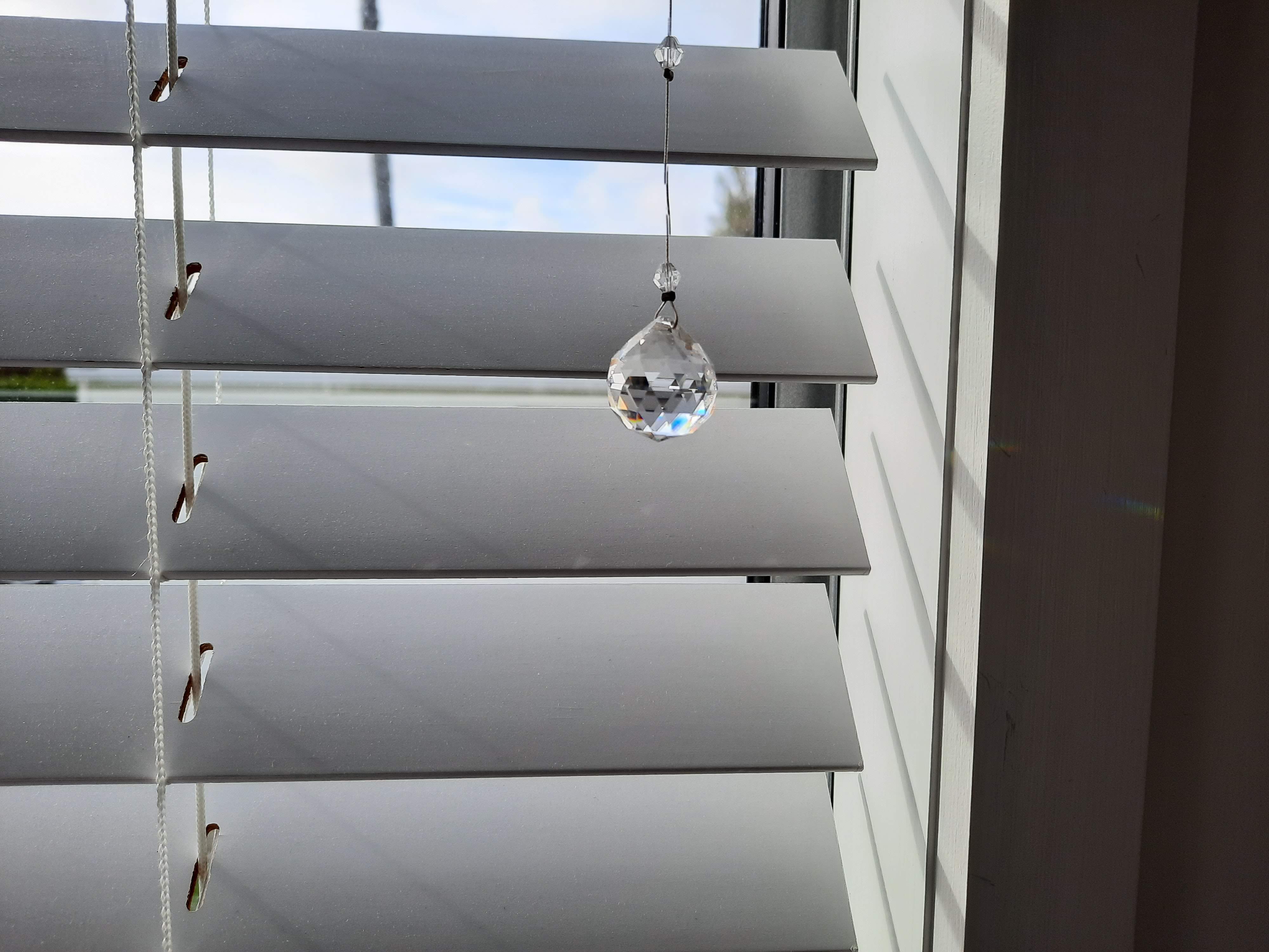
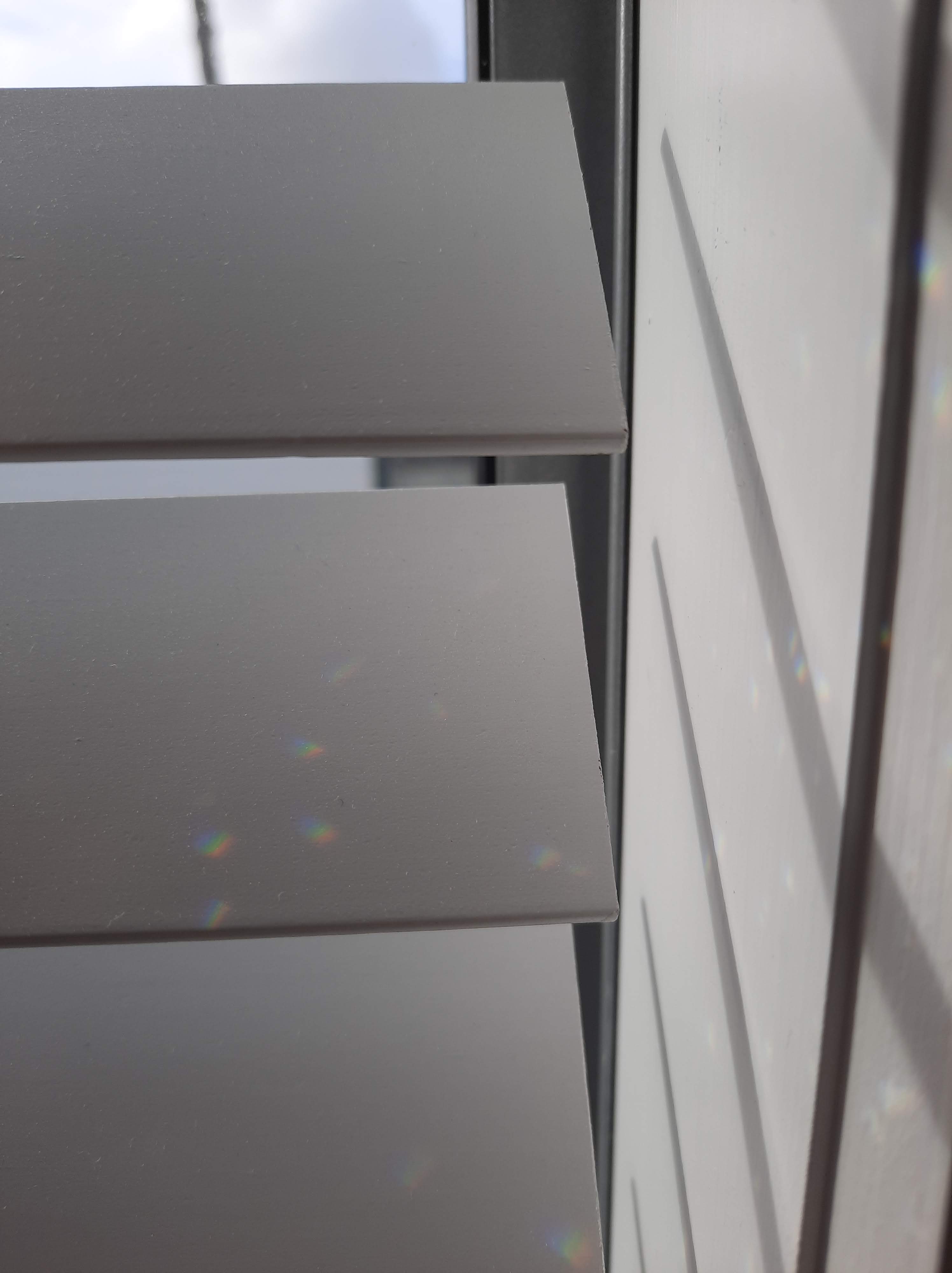
This week was the first week of online learning. We began with a Virtual Studio exercise where we explored and observed a surface in our study space for 15 minutes. I chose to study the blinds next to my desk. The window is a East facing window, and as we did this exercise around 9:30am, I had the morning sun shining in through the blinds.
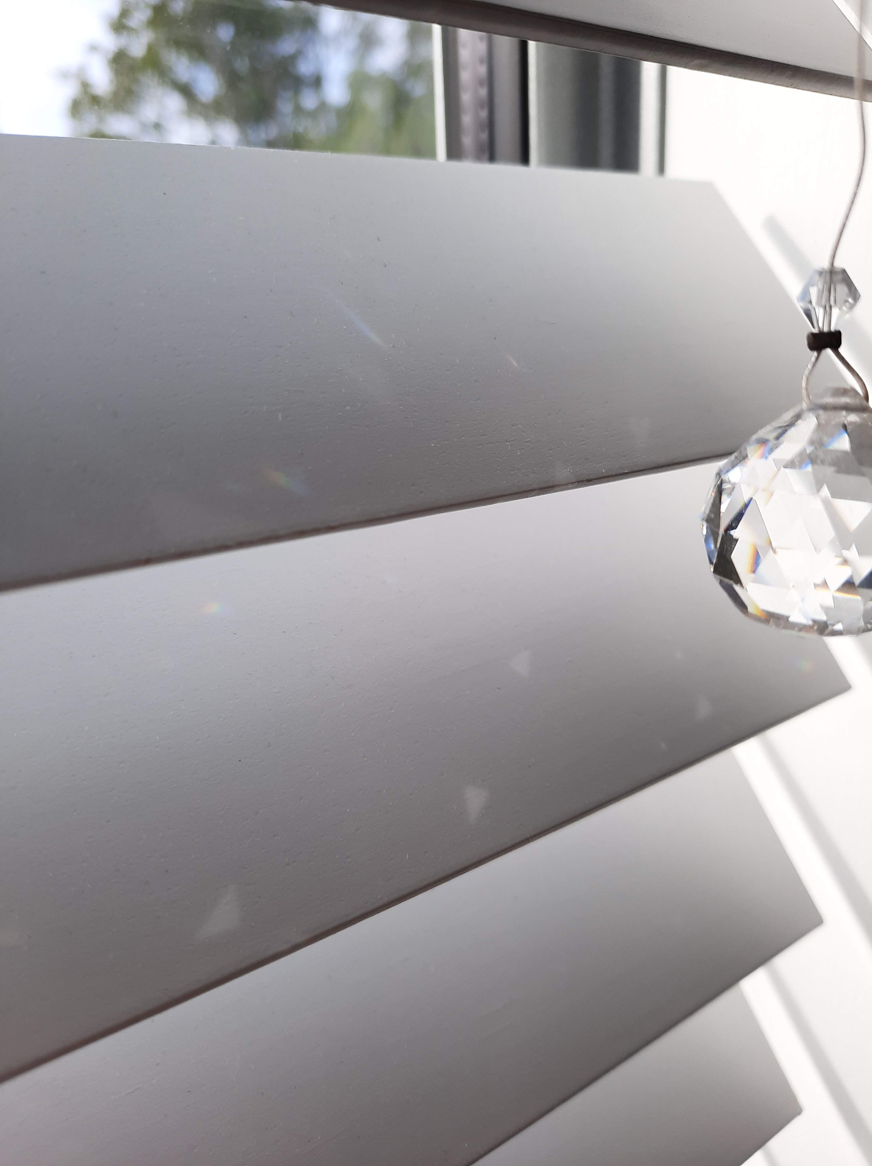
I chose the spot where I have a crystal sun-catcher hanging so that I could observe how the changing and manipulation of light over time and movement would impact the surface of the blinds.
What I found interesting was the triangular shapes the sun-catcher cast on the blinds along with the varying colours. I also liked how the movement of the sun-catcher imprinted movement on the surface. Below is a drawing of my observations.
When I was undertaking this observation of the blinds, it was quite overcast outside. Throughout the 15 minutes, the light from the sun was constantly brightening and dimming as clouds covered and uncovered the sun, exposing more and less light. This impacted the blinds as the surface not only lightened and darkened, but the projection from the sun-catcher faded in and out.
After individually observing our surfaces, we were put into randomly combined groups of four. In my group we discussed each of our surfaces and what we found interesting about them. What was fascinating was how we had all gravitated towards a surface involving a window.
After discussing our surfaces, we experimented with Blackboard Collaborate to see if we could create a collection of our images. After finding we could only share one image at a time, we created a group document and organised our images together.
It was quite interesting to see how, although we worked by ourselves without the influence of each other, all of our images had a similar aesthetic, lighting qualities and mood. It is quite fascinating how all of our images linked to each other unintentionally.
Continuig from my artist/designer reasearch, I created 3 model based off Georgia O’Keeffe and Anish Kapoor’s techniques and styles in Thursdays class.
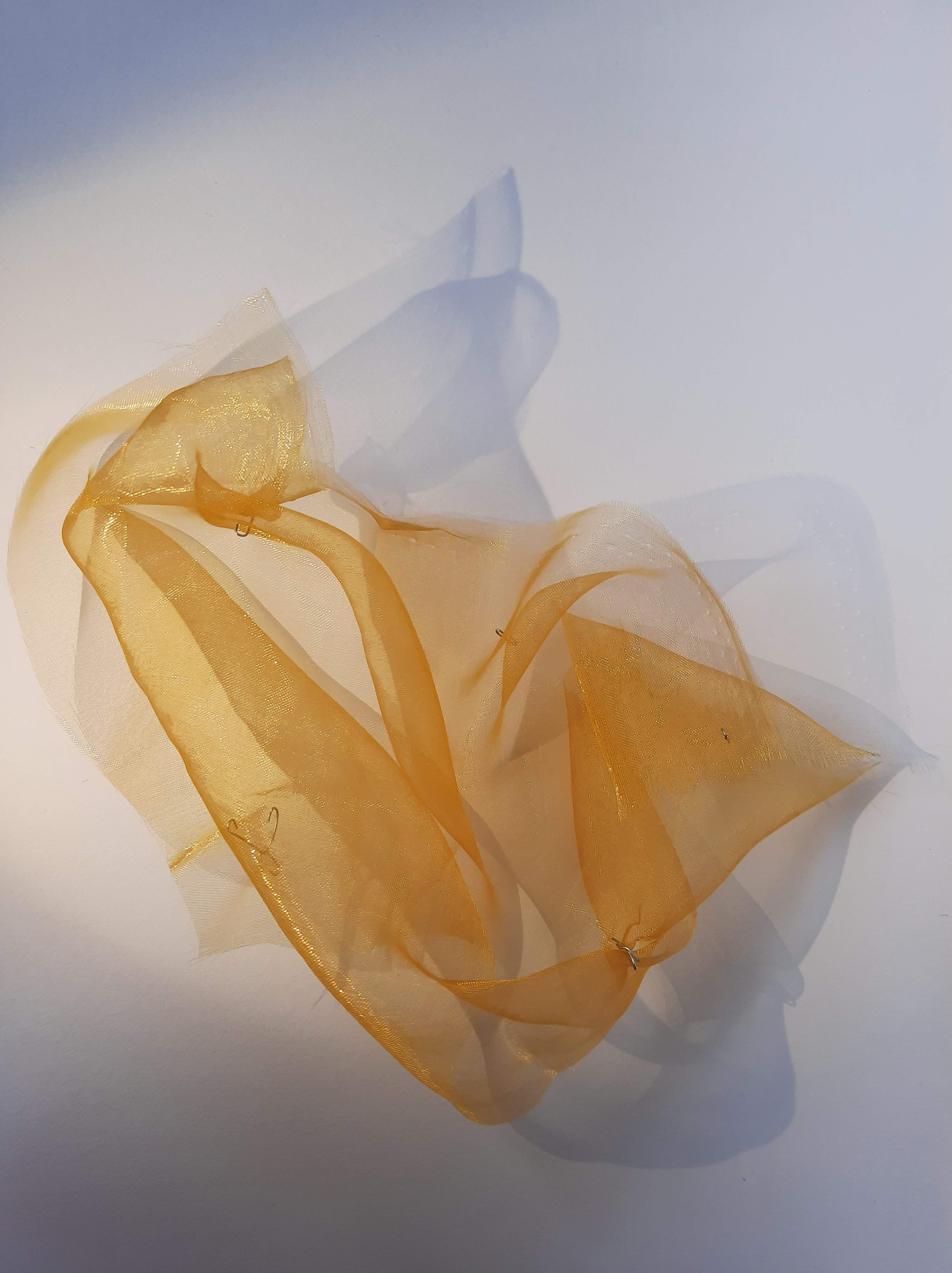
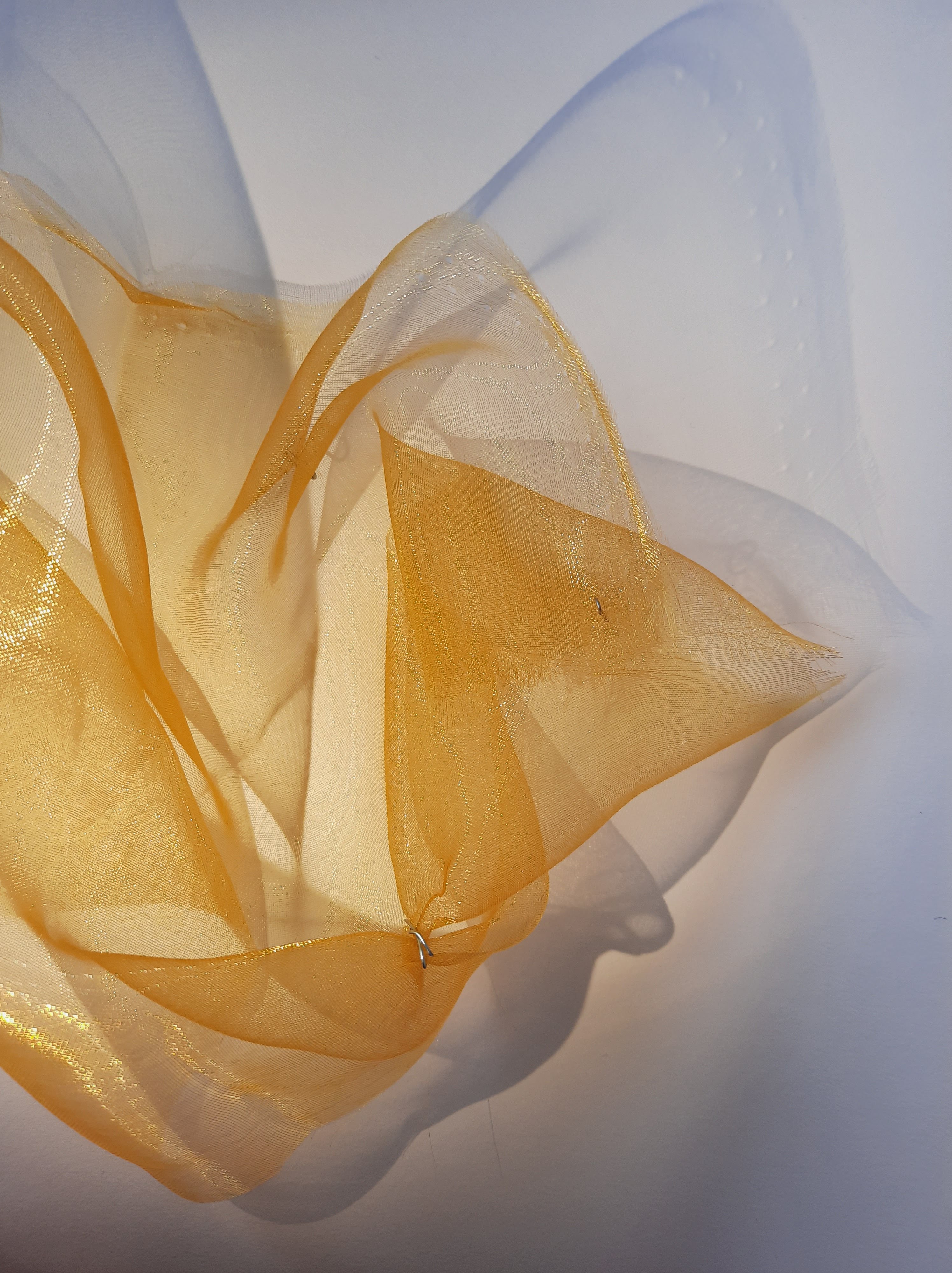
Below is my first model. This model explores the intersection of colour volumes and light.
This model mainly focuses on the techniques and style of O’Keeffe. With this model, I explored the fluid form and depth that O’Keeffe focuses her work around. This model is made to be temporal, as it is moved its form changes. The fabric I used was a sheer chiffon-like fabric. the transparency of the material allows a depth of layering in the shadow cast. The overlaying fabric creates a darker shadow whereas the single film of fabric creates a light and sot shadow. I chose the colour of the fabric to correlate with O’Keeffe’s colour palettes in her paintings.
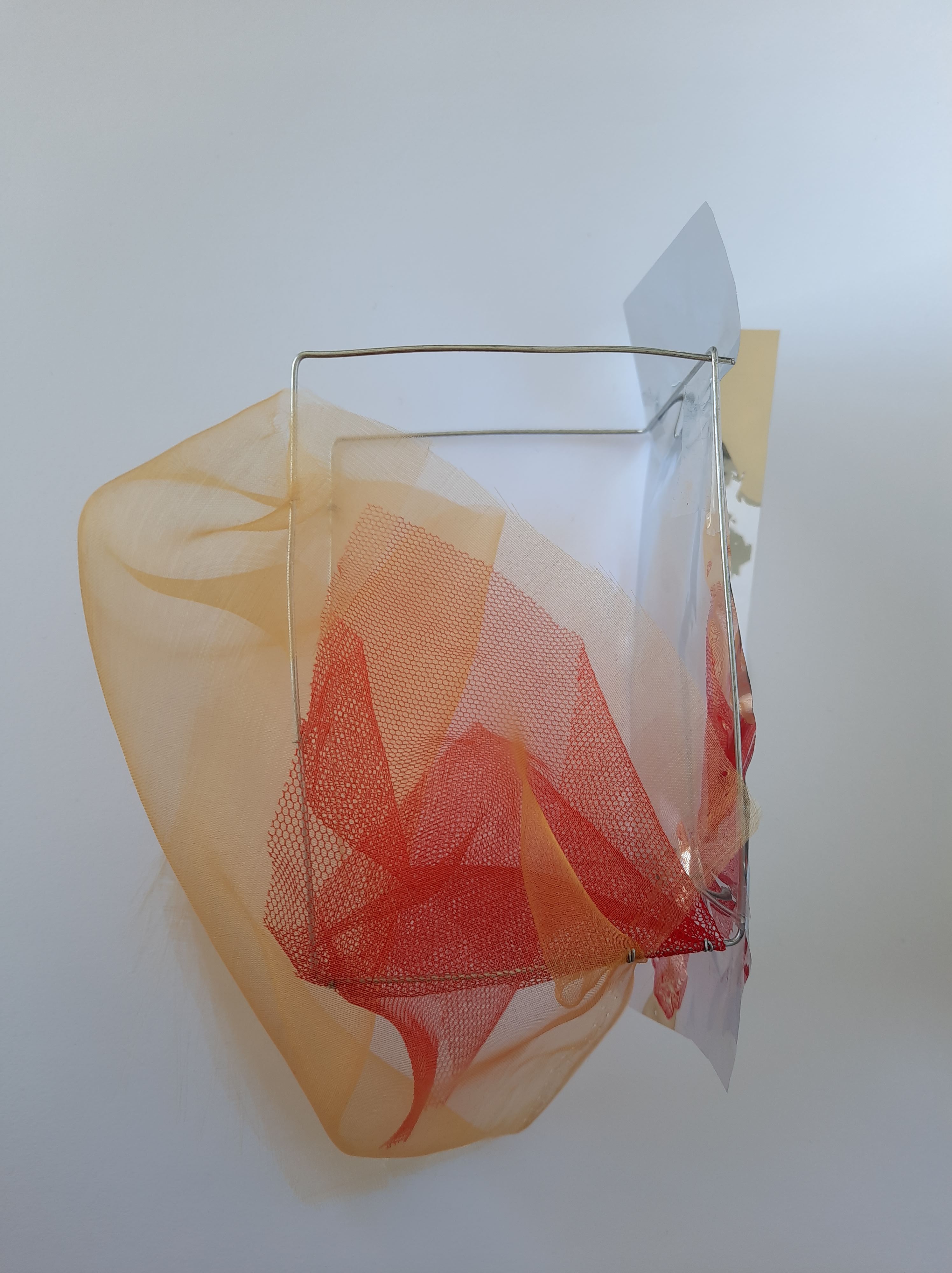
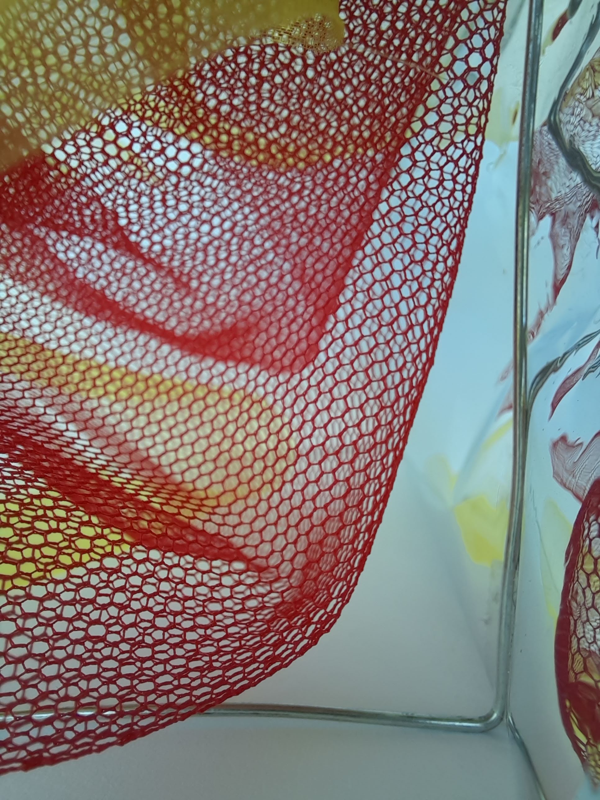
Below is my second model. This model explores surface textures and shadow.
With this model I explore the different texture and form created by different fabrics and material and how they interact with each other, specifically in relation to light. The wire used created structure. Although not an essential part of my study, Kapoor’s work has a large focus on structure and I wanted to include this in my model without it being overpowering. The intertwined chiffon and tulle fabrics reflections were distorted through the glossy, reflective film. The reaction to light was quite interesting. Like the first model, the shadow cast by the fabrics created a layered shadow. If studied closely, the shadow from the tulle expressed the texture of the fabric into a form of print on the white surface. Scattered through the shadow form was a fluid, water-like reflection of light from the reflective film. the model expressed depth not only in its physical form, but also in its reaction and imprint of light.
Below is my third and final model. This model connects the first and second model, producing a series of thresholds or transitions between.
This is my third model. This model combines my first and second model together. I noticed in my second model the fluid form and movement of the reflective film. This above model explores the manipulation of light through distorted reflection and the soft, fluid form that this projection creates. Although the wire brings back a sense of structure. this model is constructed to allow me to photograph the affects of lighting and its reaction to the fluid reflective film against a plain curved surface.
Above is Kapoor’s Cloud Gate located in Chicago, Illinois. This is a reflective stainless steel structure that is 10m x 20m x 12.8m in dimensions. The sculpture has become a well known tourist attraction for the city of Chicago.
Kapoor’s C-Curve is a sculpture that has been installed in many different locations over the years. The sculpture, like a lot of Kapoor’s work, is made from reflective stainless steel. The dimensions of this piece are 220cm x 770cm x 300cm.
Above is Kapoor’s Sky Mirror (for Hendrik), another sculpture made from stainless steel. Kapoor designed and created a range of different Sky Mirrors located all around the world. This specific Sky Mirror is 6.5m x 2.5m x 2m.
Kapoor manipulates and plays with light and image in this reflective sculpture. He uses the changing and temporal light and colour in the surrounding environment to create the piece. The surrounding environment is the sculpture, it acts as the paint on the canvas of the stainless steel.
Suh most frequently uses a sheer translucent fabric as seen above in his work Passage/s. This piece can be found at the Victoria Miro Gallery in London. Passage/s is a combination of spacial sections that replicate his homes and studios he has lived and worked in around the world. The transparent fabric creates a ghostly and nostalgic impression of the space that the Suh once occupied. The impressions of Suh’s environment directly influences his designs and creative practice.
Above is one of Hatoum’s pieces of work that I found most interesting and inspiring. This is called Light Sentence, created in 1992. It is 198 cm x 185 cm x 490 cm in dimensions and is made up of galvanized wire mesh lockers, an electric motor and light bulb. I have become increasingly interested in the affect of light and shadow in creating an atmosphere, mood and experience. I find it fascinating how the shadow engulfs the space and even when not inside of the ‘cage’, there is a sense of encapsulation and surrounding. The shadow and light create a sense of space and structure outside of the physical structure of the lockers.
Hatoum’s work is structured, simple yet effective. Her work creates a sense of space in the surroundings and environment of her work; they don’t sit alone in a vacuum, but have an impact and create meaning and atmosphere in the spaces in between, where her work doesn’t physically exist.
Olafur Eliasson is a Danish-Icelandic artist born in Copenhagen, Denmark in 1967. He is well known for his large scale installations and sculptures and likes to use aspects of the elements such as water, light and air temperature.
Eliasson’s Beauty was an installation in the Tate Modern in London in 1993. The affect of the work was created by a spotlight, water, nozzles, wood, hose and pump. What I like about this work is not only its illusion-like affect, but also its ability to adapts and change depending on the way the viewer occupies, moves and observes the space. I am really interested in exploring the viewer as a part of the space in my own work.
This piece by Eliasson was an installation at the Tate Modern, London in 1995. It also appeared in many other spaces around the world over the years. The work was created with a spotlight, mirrors, projection foil, motor and tripod. This work looks more into the manipulation, transformation and projection of light. I found that it was very science and physics based and instead of showing just the final aesthetic result, Eliasson exposes the making and creation of the lighting affect. I am very interested in the organic, abstract and euphoric image projected on the screen and its visual movement.
Although the image above was taken at Studio Olafur Eliasson in Berlin in 2010, Your uncertain shadow (colour) was installed also at the Tate Modern in London. The installation consists of HMI lamps (green, orange, blue, magenta), glass, aluminium and transformers. What is intriguing about this work is the influence that the viewer has over the design and space. Something that will carried through to my own design from this work is the element of interaction between the viewer/occupant and the space.
What is most inspiring about Eliasson’s work is the way he incorporates the viewer into the design to create a more immersive experience. By leaving some of the creation up to the viewer, it gives the design a sense of chance and temporality which is something I am considering exploring in y own work.
Above is one of Millar’s pieces that I found most interesting. The painting consists of acrylic and oil paints on paper. What I like about this painting and also Millar’s style is the sense of depth and form through her dark line-work. I also like this specific colour palette; the pastel colours are given depth through the application of a darker colour such as black. The colours are soft and aren’t in your face.
Yayoi Kusama is a Japanese contemporay artist who is most well known for her installation art. With this said, she also practices in sculpture, painting, fashion, film, performance and poetry. She was born in Matsumoto, Japan in 1929.
Infinity rooms is a collection of installations by Kusama that have appeared in galleries all around the world. The rooms are a combination of mirrors, acrylic, plastic and lighting. The Infinity mirror rooms were an application of her repetitiveness in her paintings into the form of an experiential space.
What I find most interesting and inspiring about Kusama’s work is the way she uses reflection and light to create an illusionary sense of space and depth. The repetition of image creates a immersive sense of calm, peace and serenity.
Georgia O’Keeffe was one of the first American artists to explore pure abstraction. Born in Wisconsin in 1887, O’Keeffe lived and worked in New York and New Mexico. It was in New Mexico where she drew her inspiration from during the majority of her career. In the mid 1950’s, she traveled internationally to draw inspiration from places such as Peru and Mt Fuji. O’Keeffe painted her last unassisted painting in 1972 due to failing eyesight before her death in 1986.
Black Iris Georgia O’Keeffe 1926 Oil on canvas 91.4 cm x 75.9 cm
We were given a series of questions to answer in relation to our artist model research. Because I have done previous studies and paintings inspired by Georgia O’Keeffe and am a fan of her work, I decided to start with answering the questions in relation to her and her work.
Find out when and where they produced their work.
O’Keeffe produced majority of her work from her successful years in northern New Mexico from mid-late 1920’s until her death in 1986. Her work was not only inspired by the landscape, indigenous at and adobe architecture, but also her abstracted style inspired by Arthur Wesley Dow as opposed to a realism approach.
2. Identify the key conceptual ideas that underpin their work.
O’Keeffe creates layering affects using tones and shades of similar colours to create a sense of depth in her work. She also, in a range of her works, explores a subject in a magnified sense and abstracting it to give the work another context.
3. Identify their critical position on colour in relation to their work (i.e. how is colour applied, in what proportions, what particular theories about colour inform the making of the work, how does colour change dependent upon the environment in which the work is viewed.
O’Keeffe applies colour to surface through mediums such as oil paints, pastels, watercolours and charcoal along with sketches in graphite. She uses a range of warm and cool colour in each work. She uses tints and lightened versions of vibrant colours, specifically focusing on blues, reds, yellows and greens. Because she uses lightened, pastel colours, the pieces still stand out and catch the eye but aren’t overwhelming. She also allows space to create depth within her work with deeper, darker versions of the colour. O’Keeffe uses complimentary colours in a hidden way. She applies white versions of complimentary colours to make the work pop and other aspects of the painting stand out without overloading on colour.
4. What type of surface treatments are used in the work? Do they use matte, satin, or gloss paints or material finishes or all of them together? Why might they do this and what is the effect of doing this?
O’Keeffe often used either oil on canvas in her works or watercolour on paper. These were her two main mediums and techniques she used. She also used charcoal and pastels, but these works aren’t as prominent.
5. What scale are the artworks you have researched? How does scale impact on how the work is experienced and how colour and materiality are perceived?
O’Keeffe’s works were often on average between 50-100 cm x 50-100 cm. This isn’t extremely large or extremely small but because of her work consisting of magnified abstracted subjects. This scale can make the painting seem larger and have more of a presence.
To further my exploration and research of O’Keeffe, I did some quick drawings to investigate aspects of her work.
Drawing 1
Drawing 2
Drawing 3
In the first drawing I explored form, depth and visual movement through the fluid abstract shape and folds. This was done with pencil on paper.
In my second drawing I explored O’Keeffe’s colour palette in some of her work. I also explored through watercolour because this was a medium that O’Keeffe sometimes used. The black outline and slight pencil shading explored form but I didn’t want to it to distract from the stud of colour.
The third drawing I tried to combine the aspects I explored in my first and second drawing. I used graphite pencil to explore form, depth and movement and applied colour by coloured pencil to highlight certain aspects. I didn’t really like the way that this drawing turned out but glad that I explored it.
RESEARCH CONCLUSION
After some indepth research into a variety of artists and designers, I have come to the decided to focus my work on Georgia O’Keeffe and Anish Kapoor.
I chose Georgia O’Keeffe because not only am I a fan of her work, but I also see similarities in my own practice with the exploration and focus on form, depth and materiality. I want to explore this further. Also, O’Keeffe’s work is created through wet media. I used to paint a lot in high school and want to take this opportunity to explore the use of paint in terms of spatial design.
The reason why I chose Anish Kapoor is because of the way he explore lights, colour and image through reflection. In previous model making exercises I explored reflective surfaces to iterate the idea of perspective changing the view of something. Ever since the walk to the site in the first week, reflection, filtration and manipulation of light, shadow, colour and image has been a focal point for me. I did do research on other artists/designers that explored their work through reflection and mirrors but what interested me most about Kapoor was how it was the environment and surrounding of his sculptures that created the sculpture; it acted as if they were dependent on each other. In my work I am focusing on highlighting the disregarded through change in movement and perspective and Kapoor’s work best correlated to my ideas.
O’Keeffe and Kapoor’s work are very different in many aspects but I think that exploring fluidity, form, depth, materiality with reflection, manipulation and filtration of light, shadow and image could create an interesting and unique combination that best explores my ideas and interests as a designer.
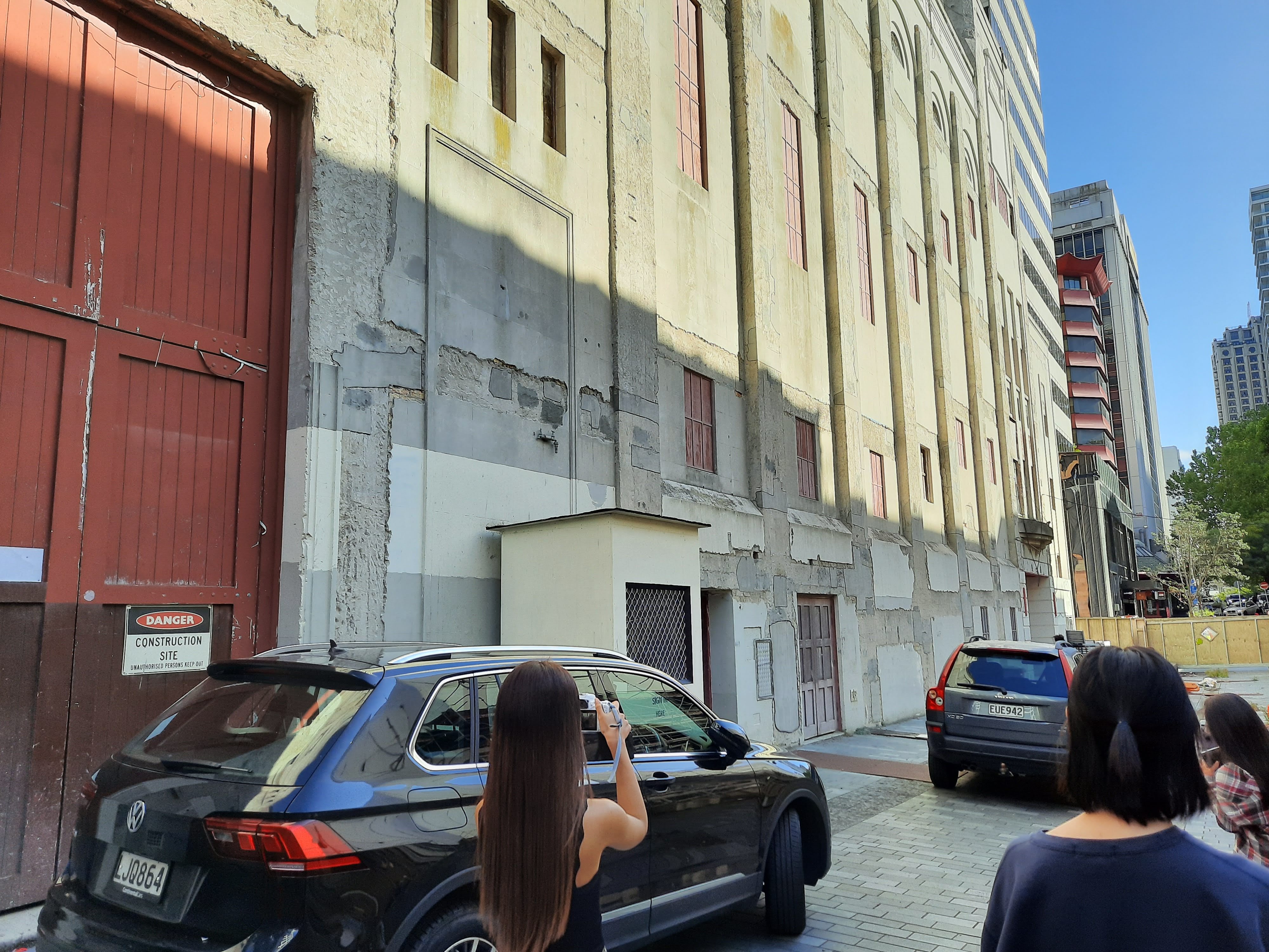
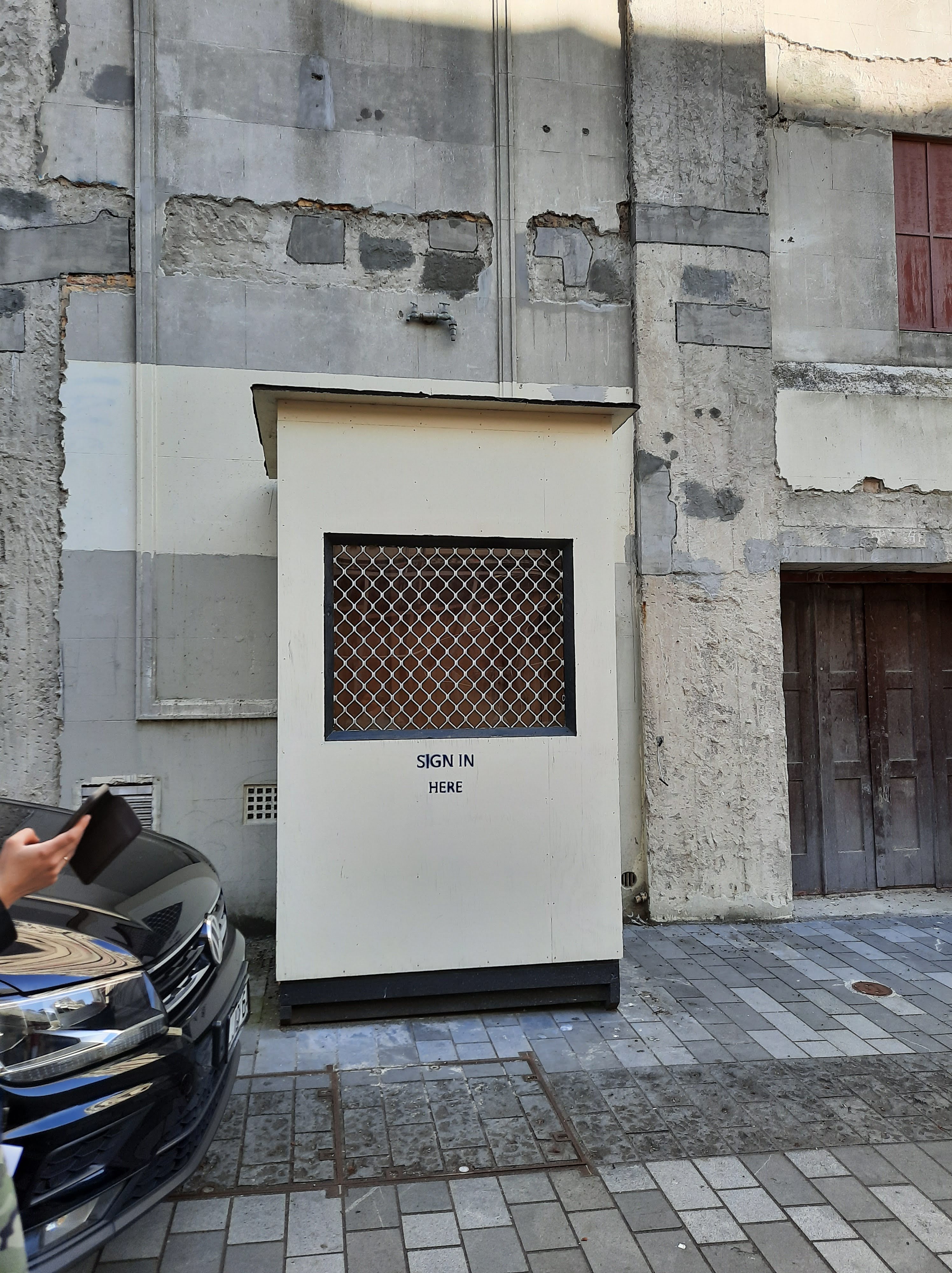
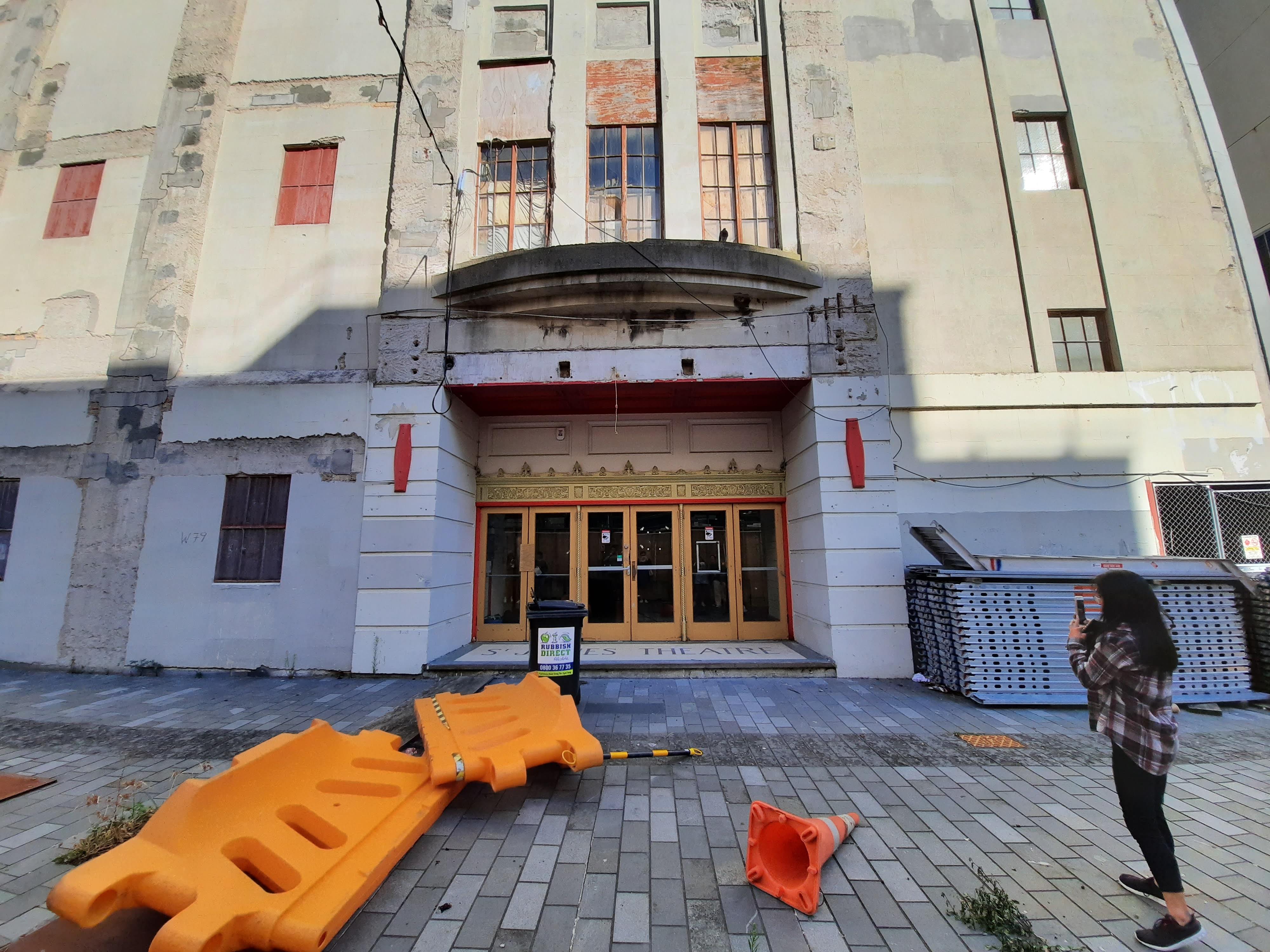
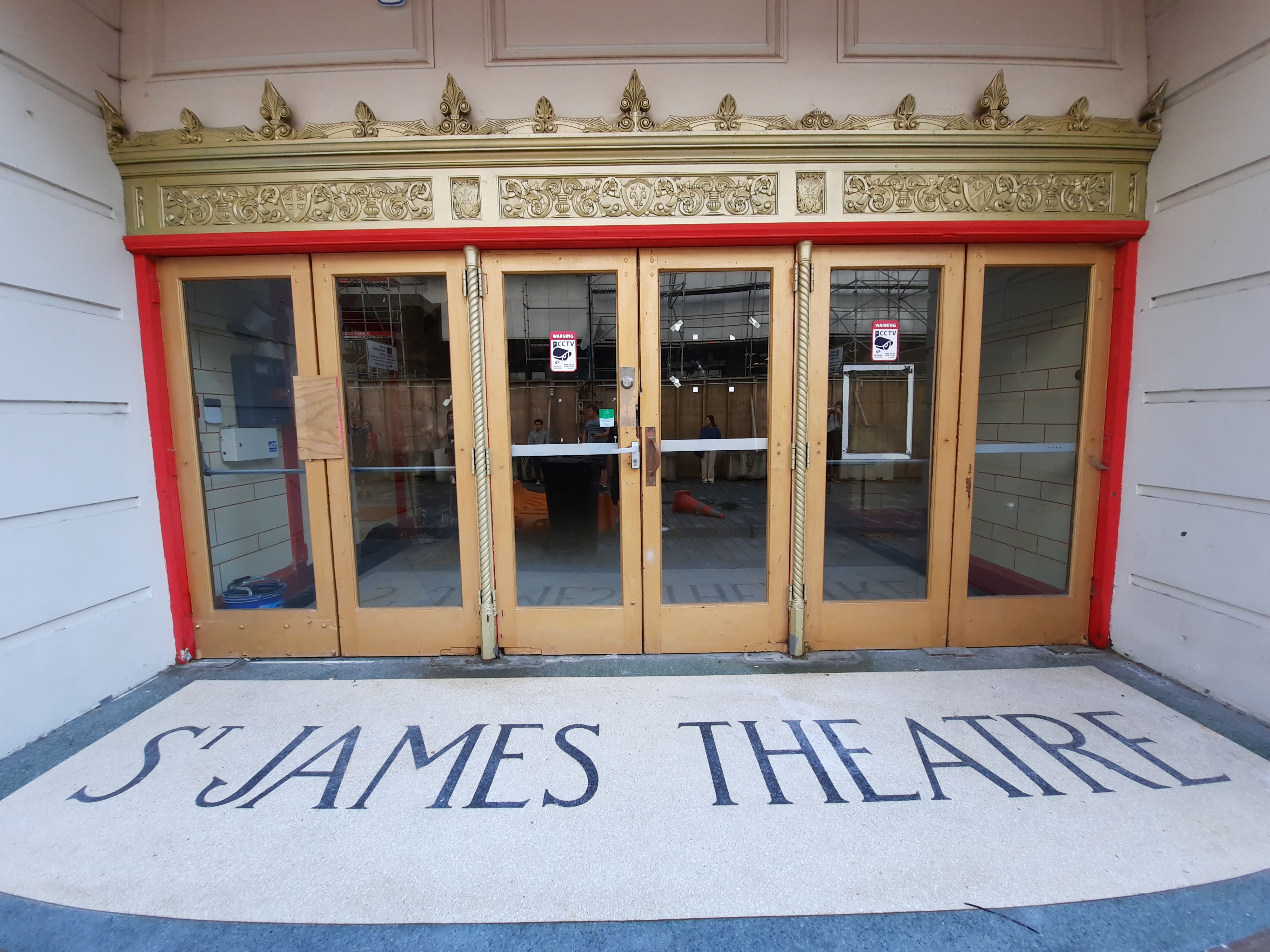
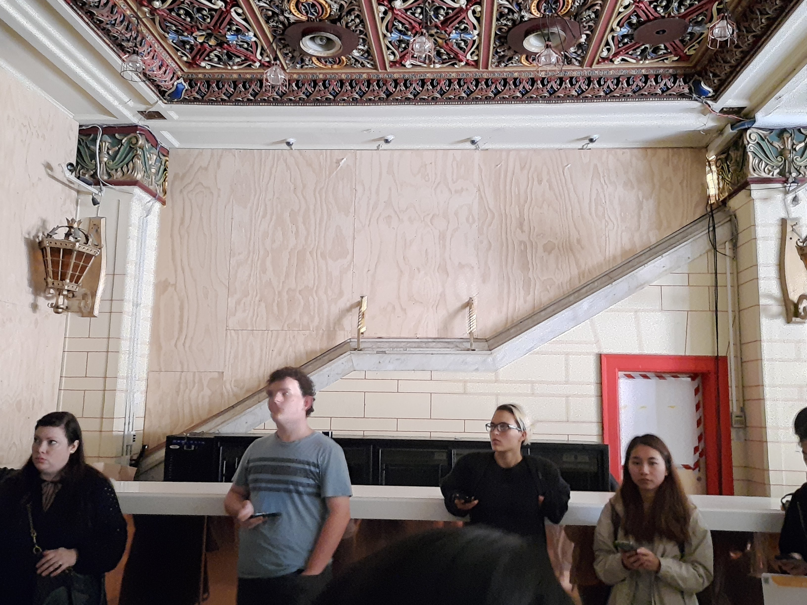
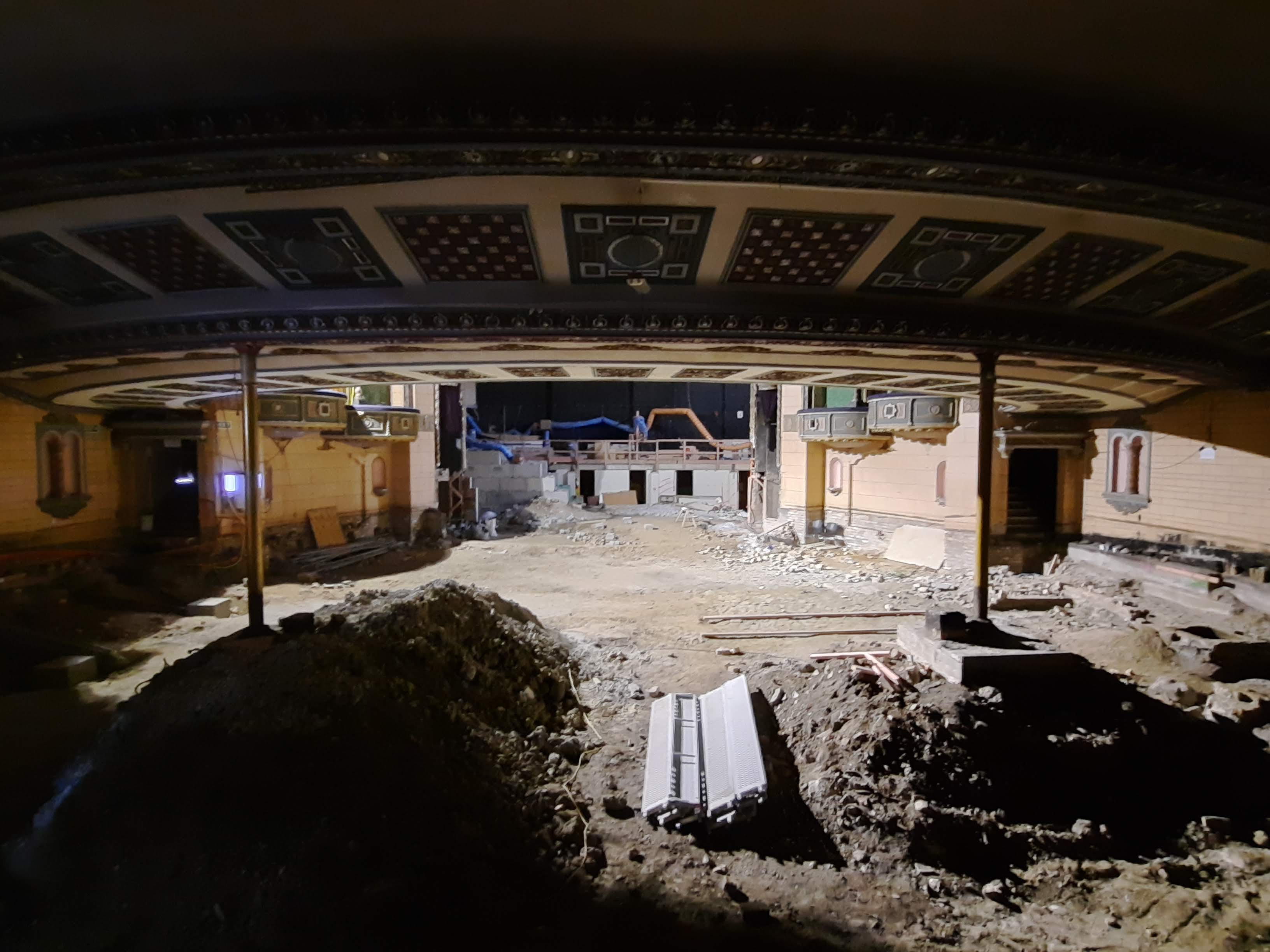
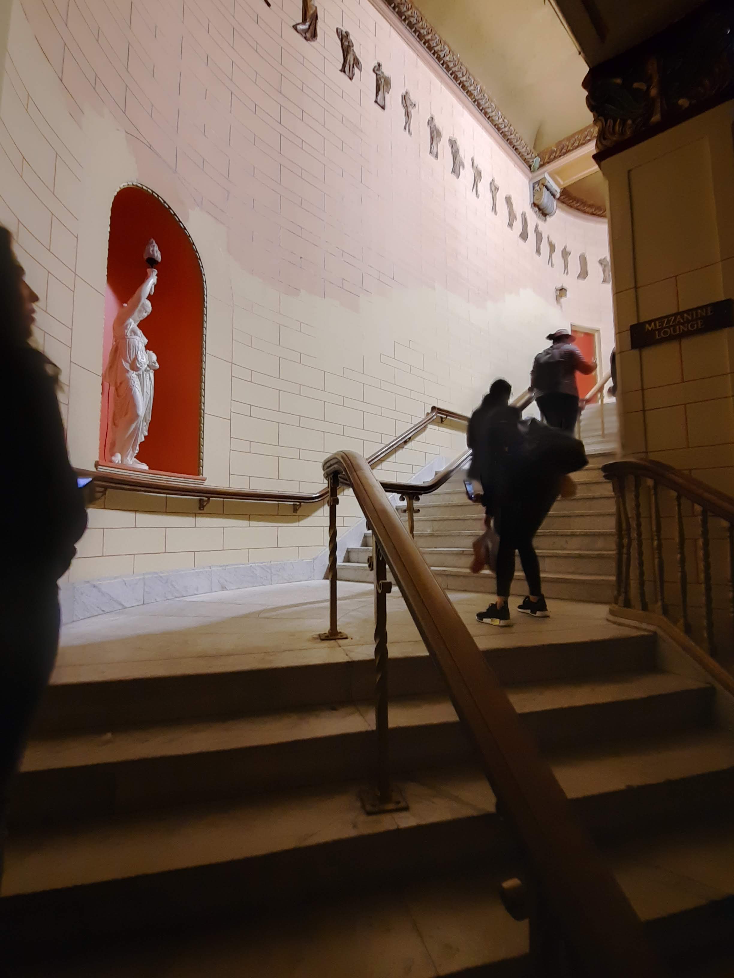
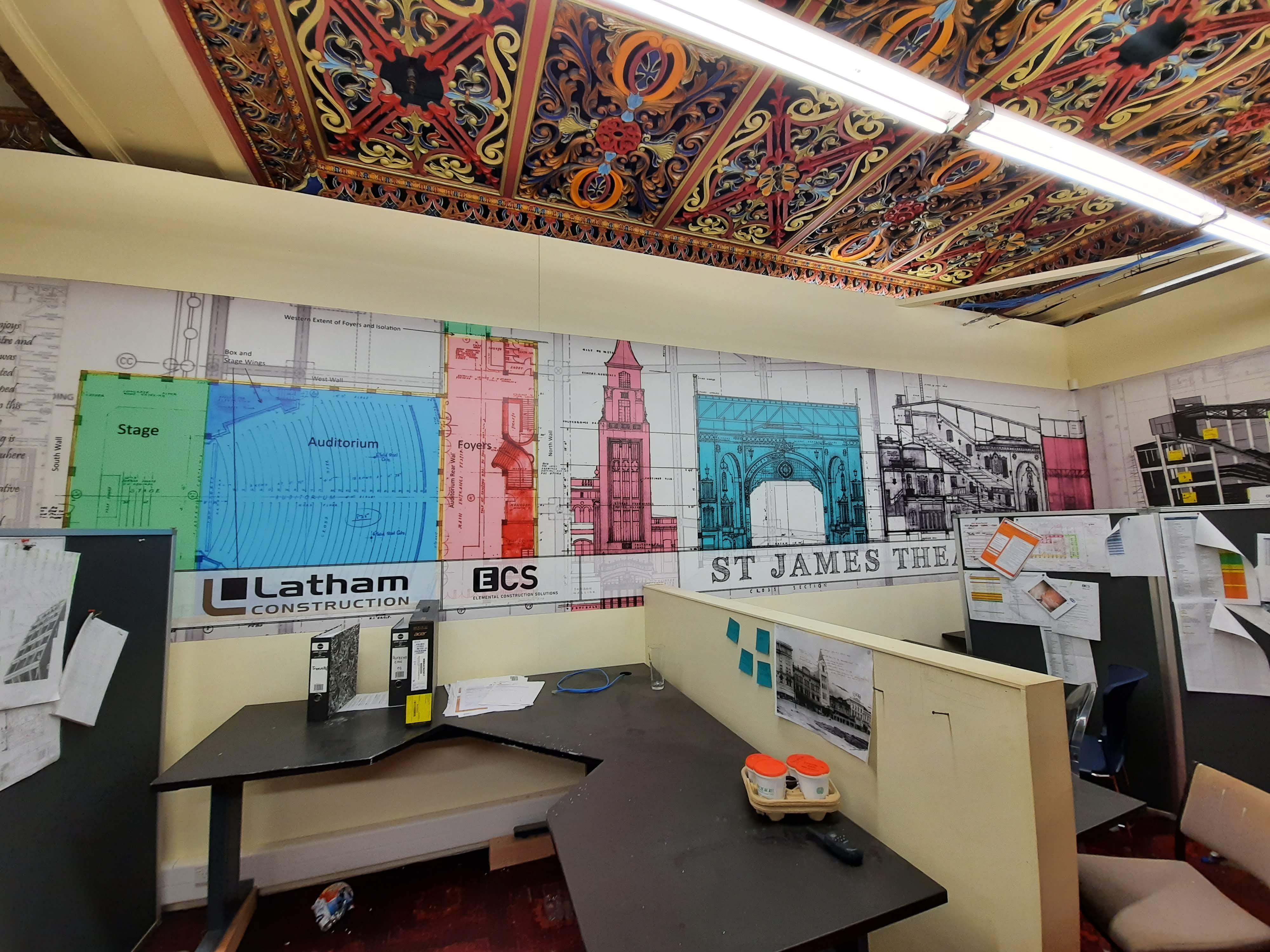
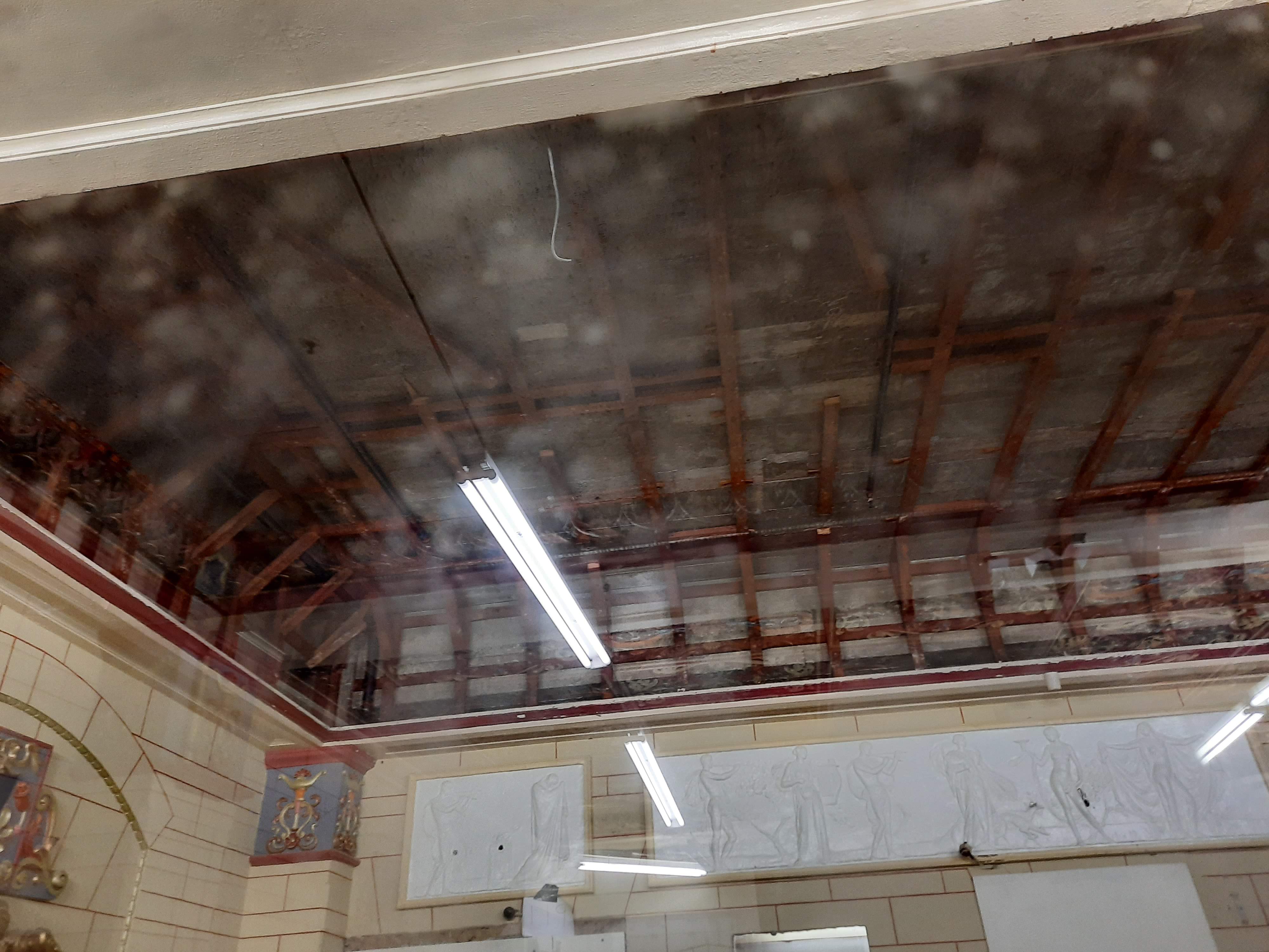
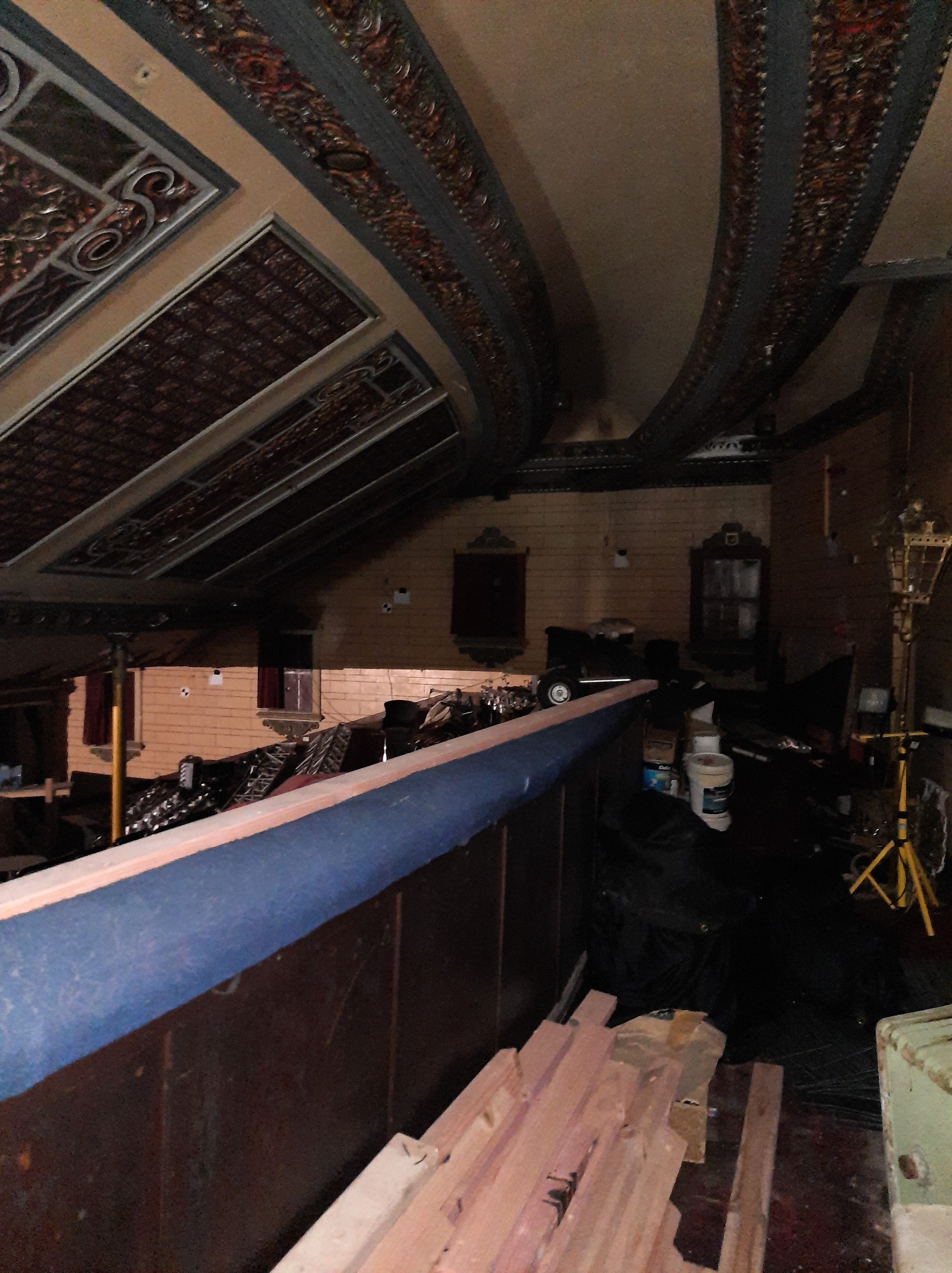
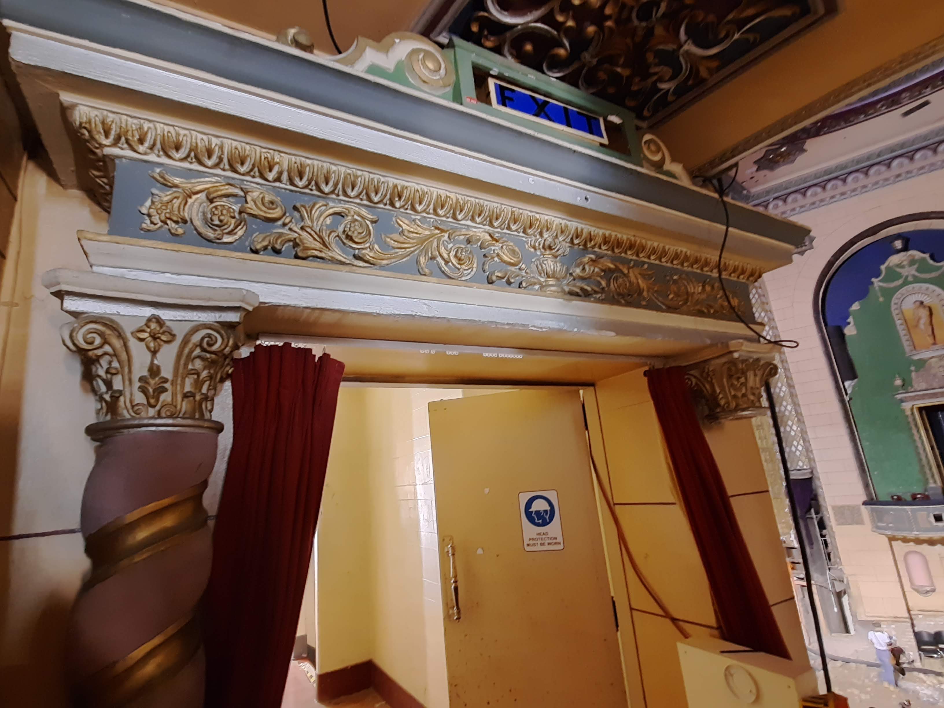
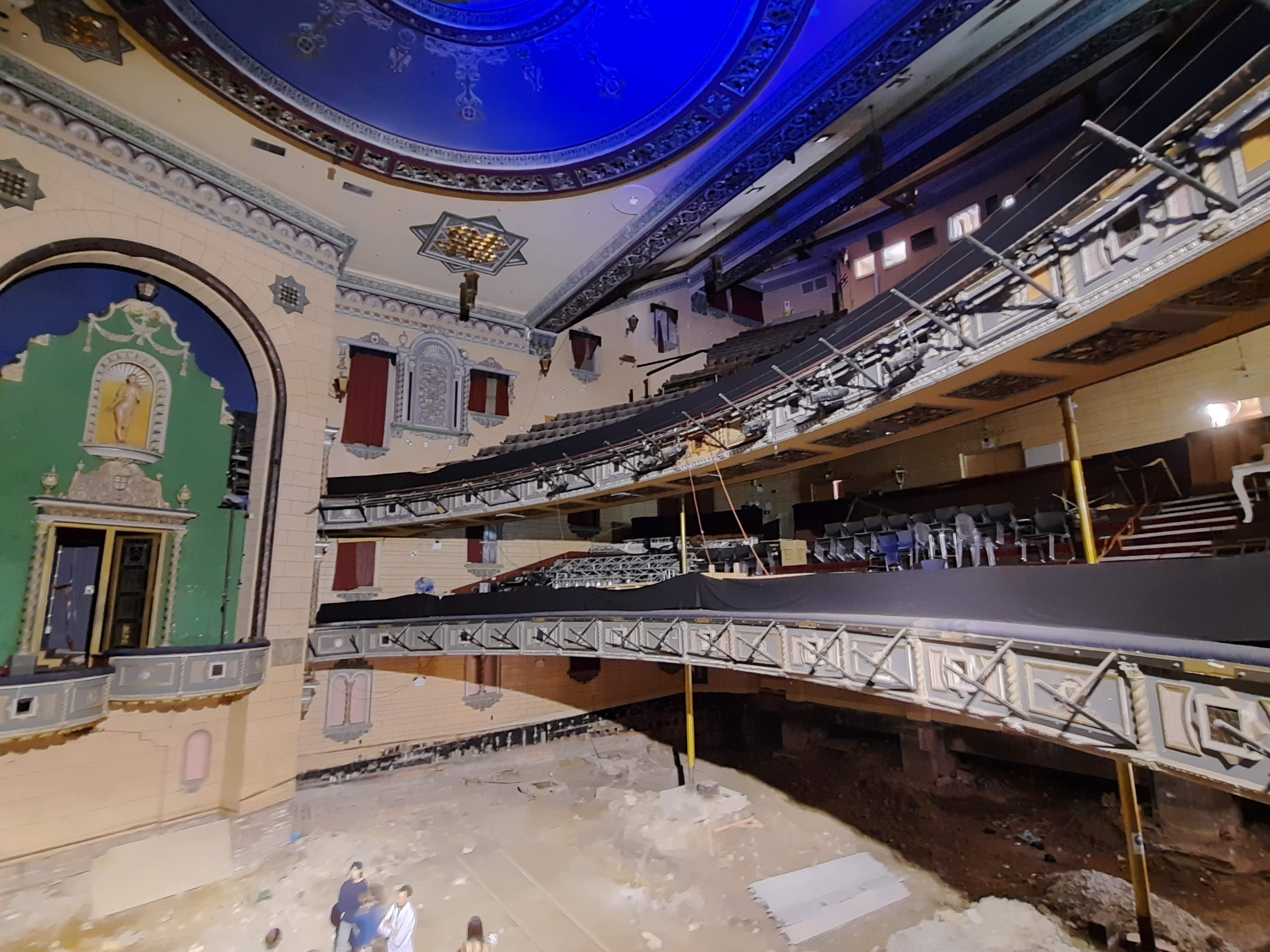
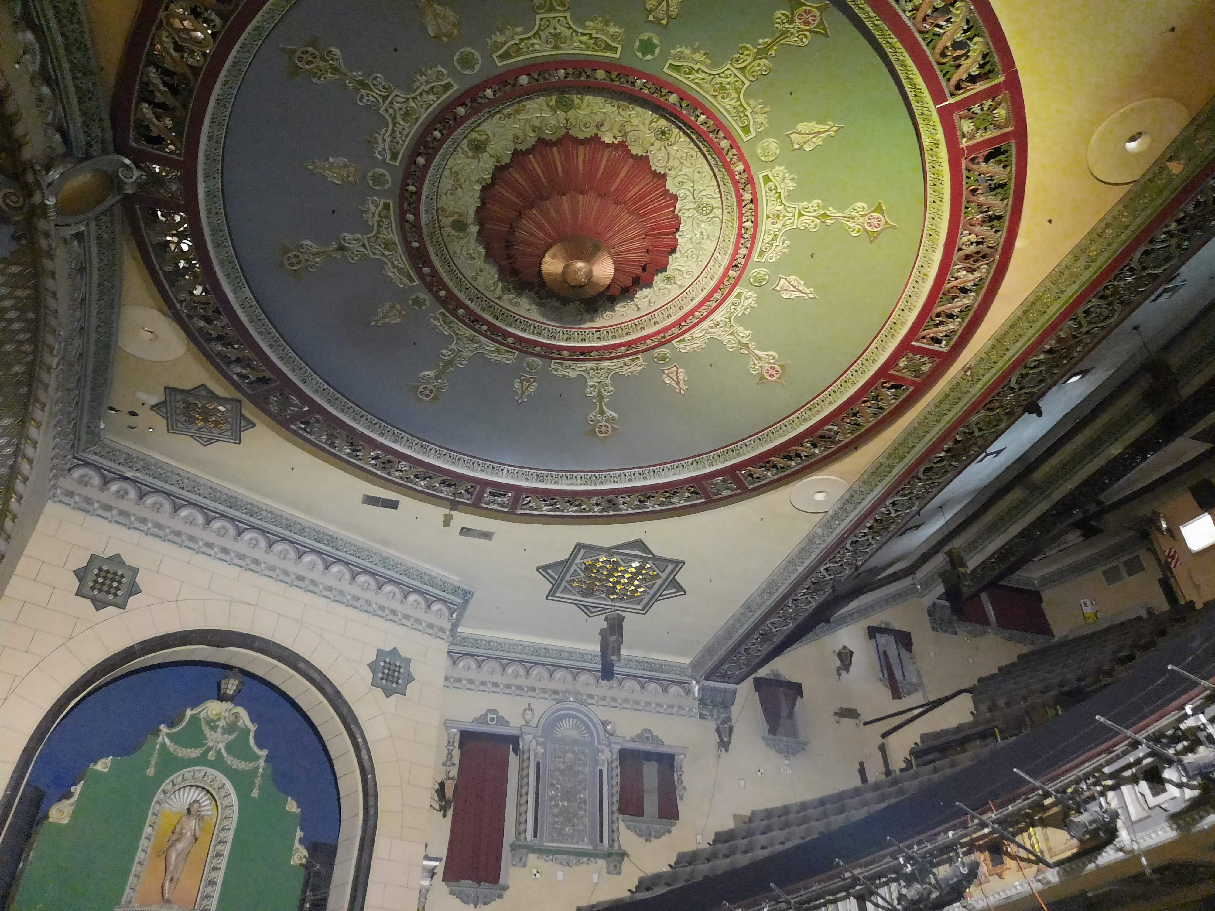
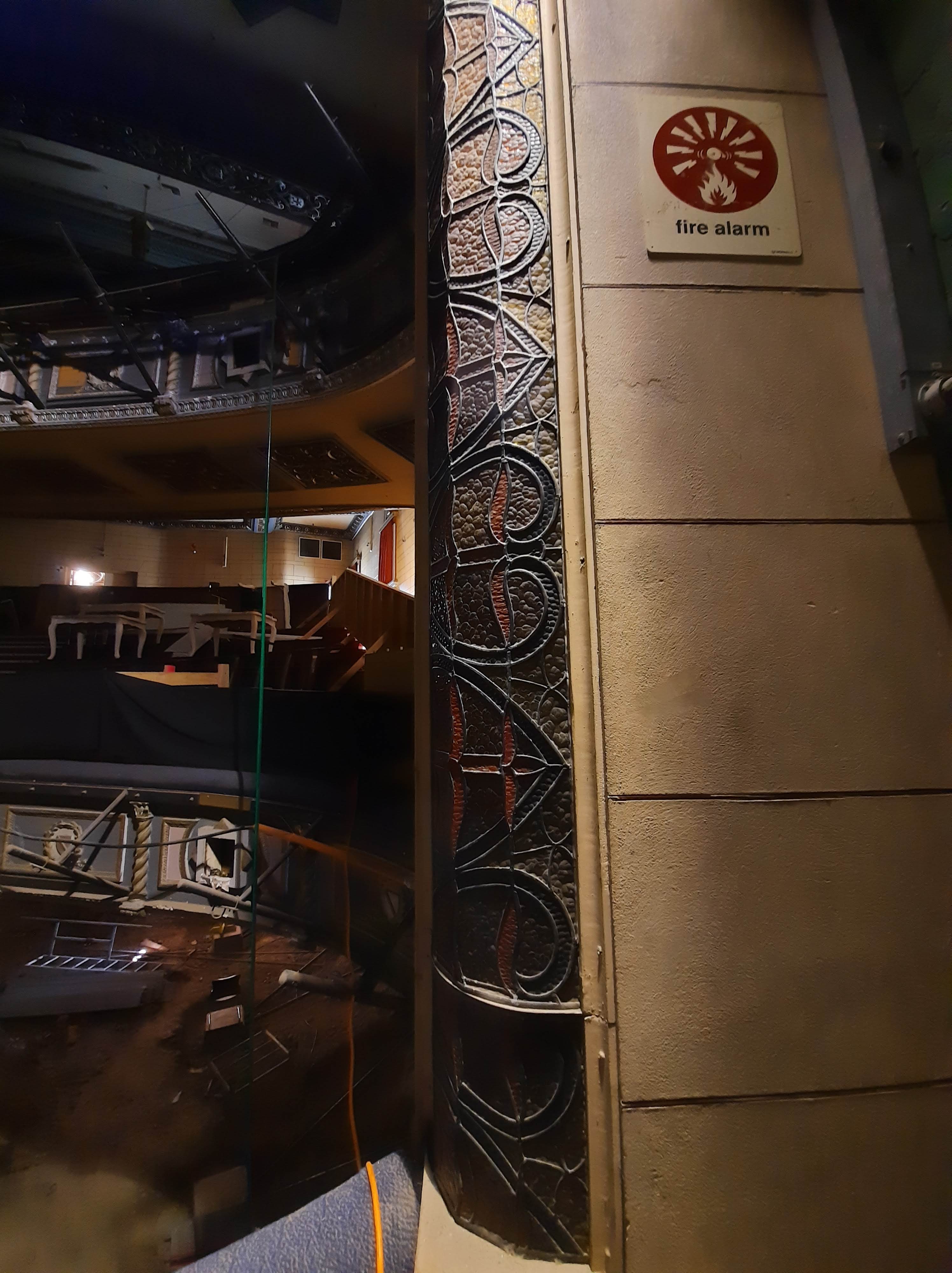
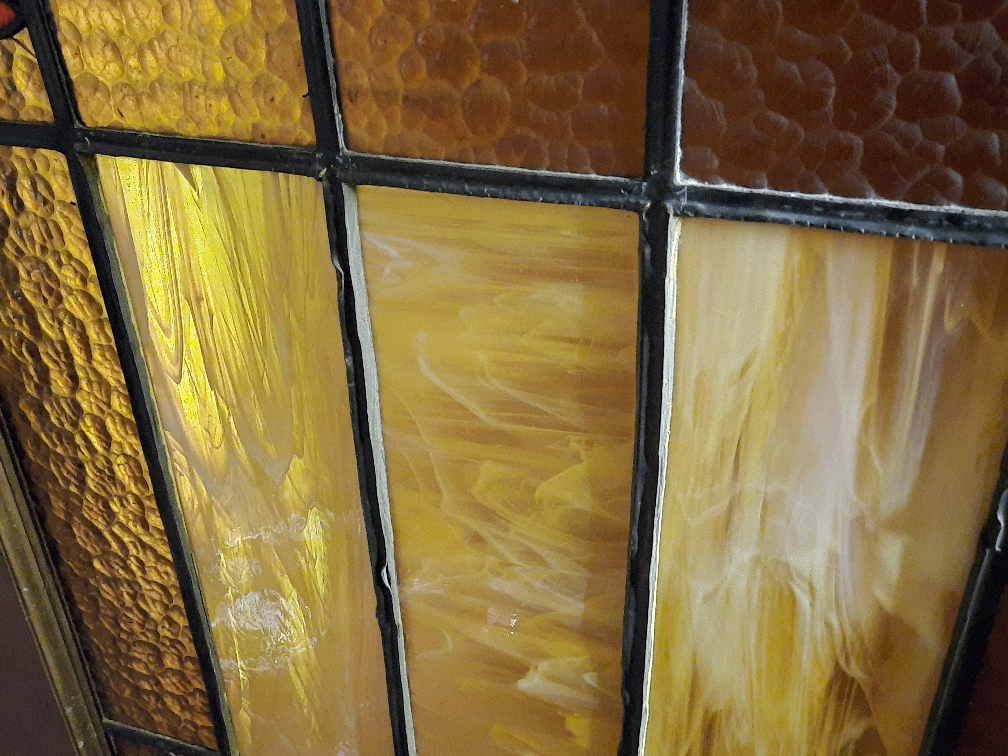
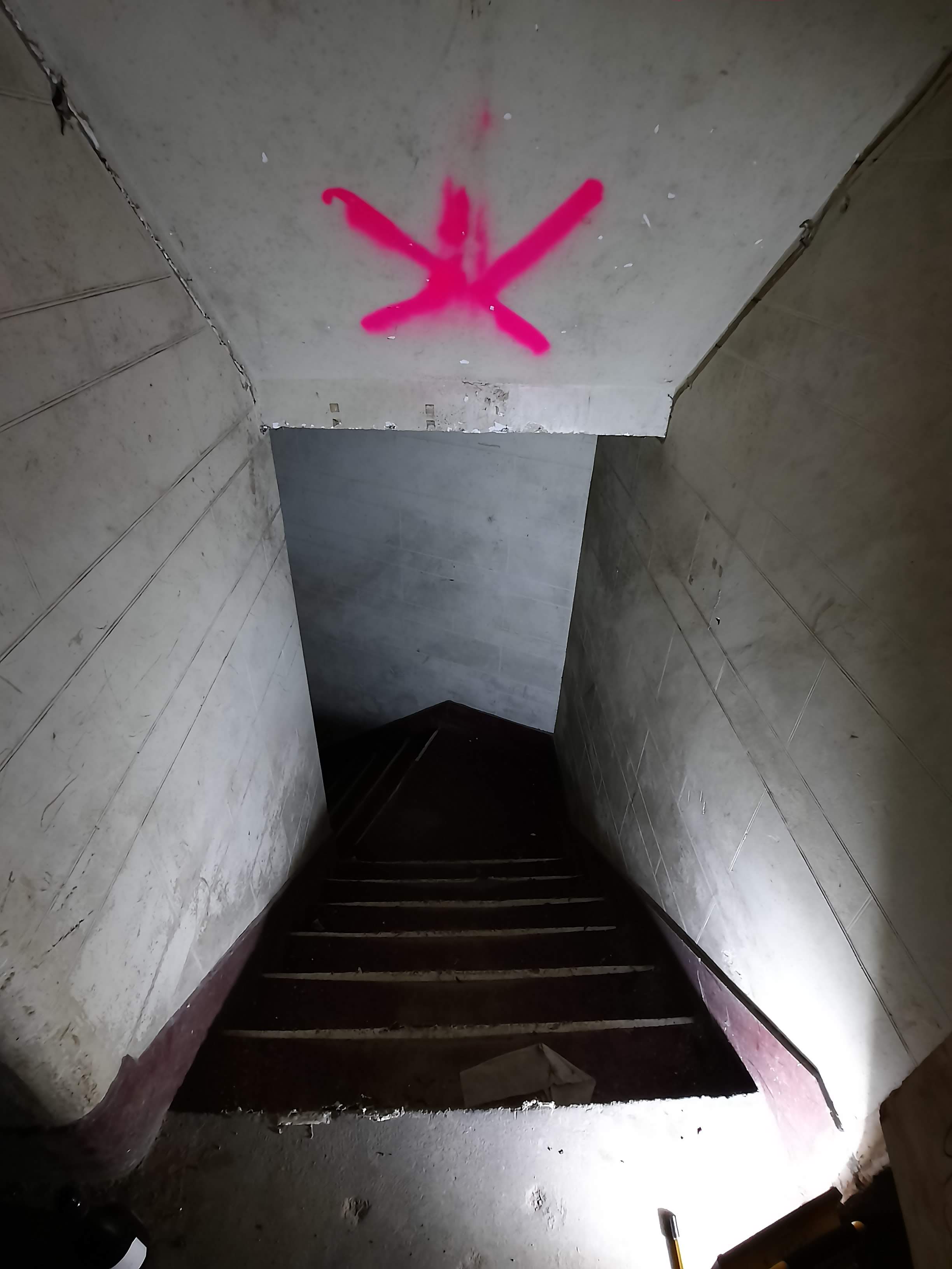
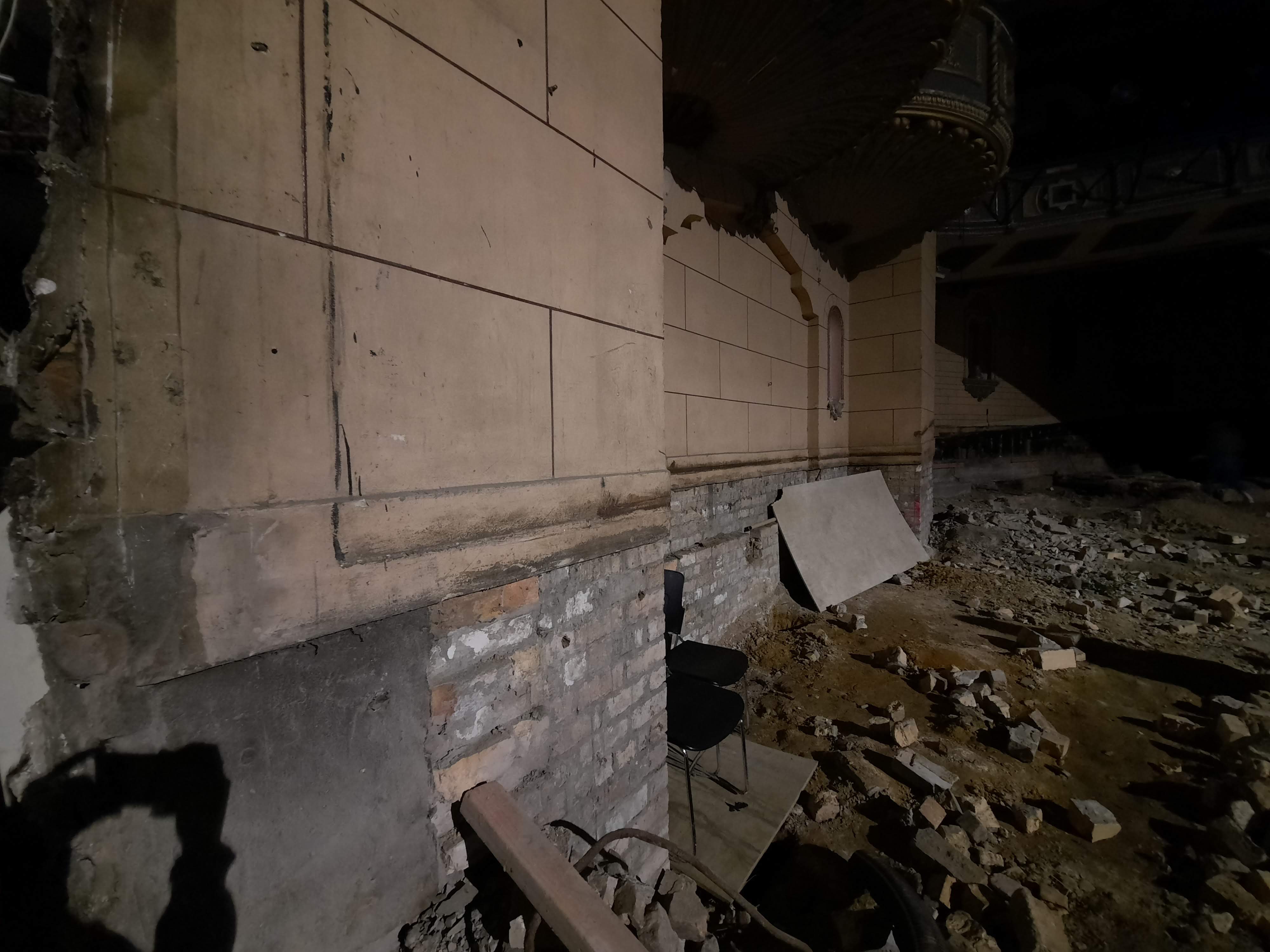
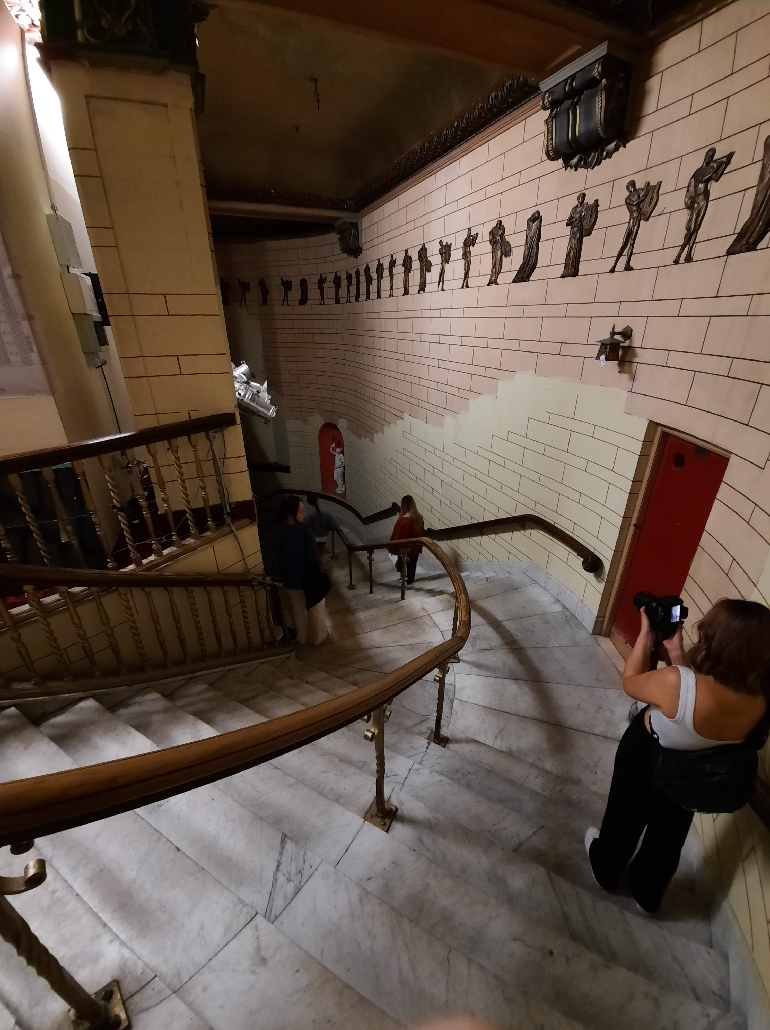
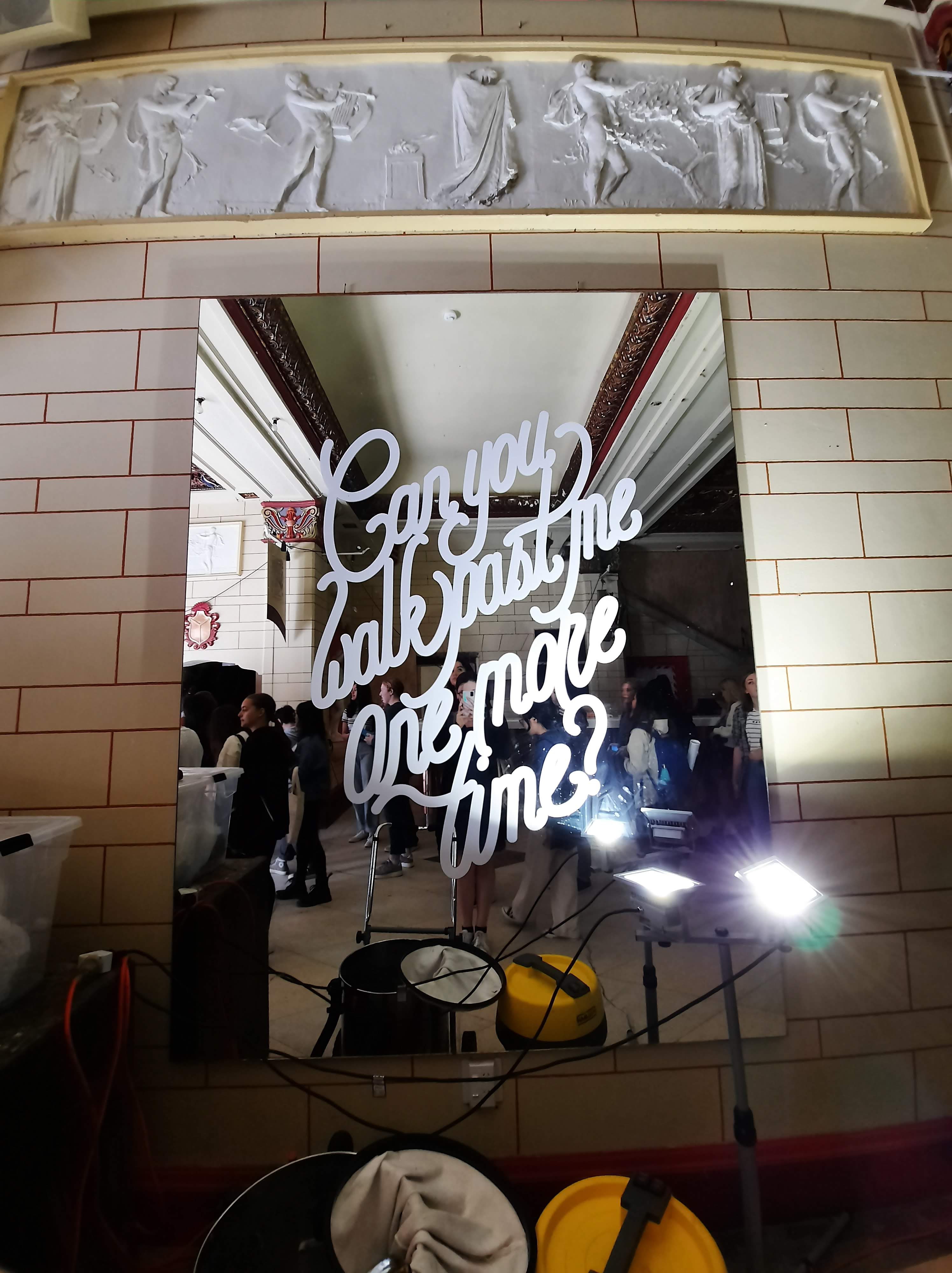
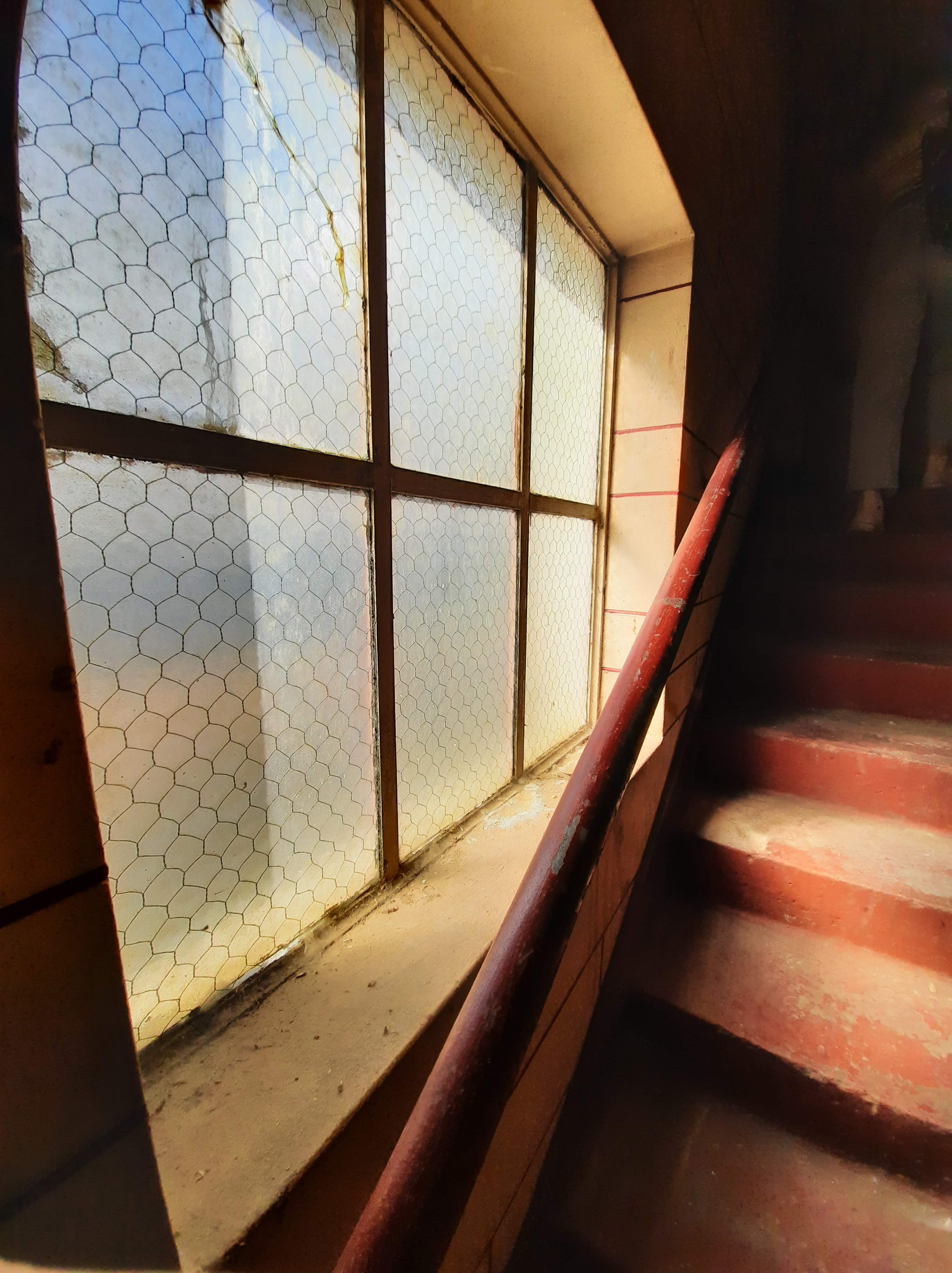
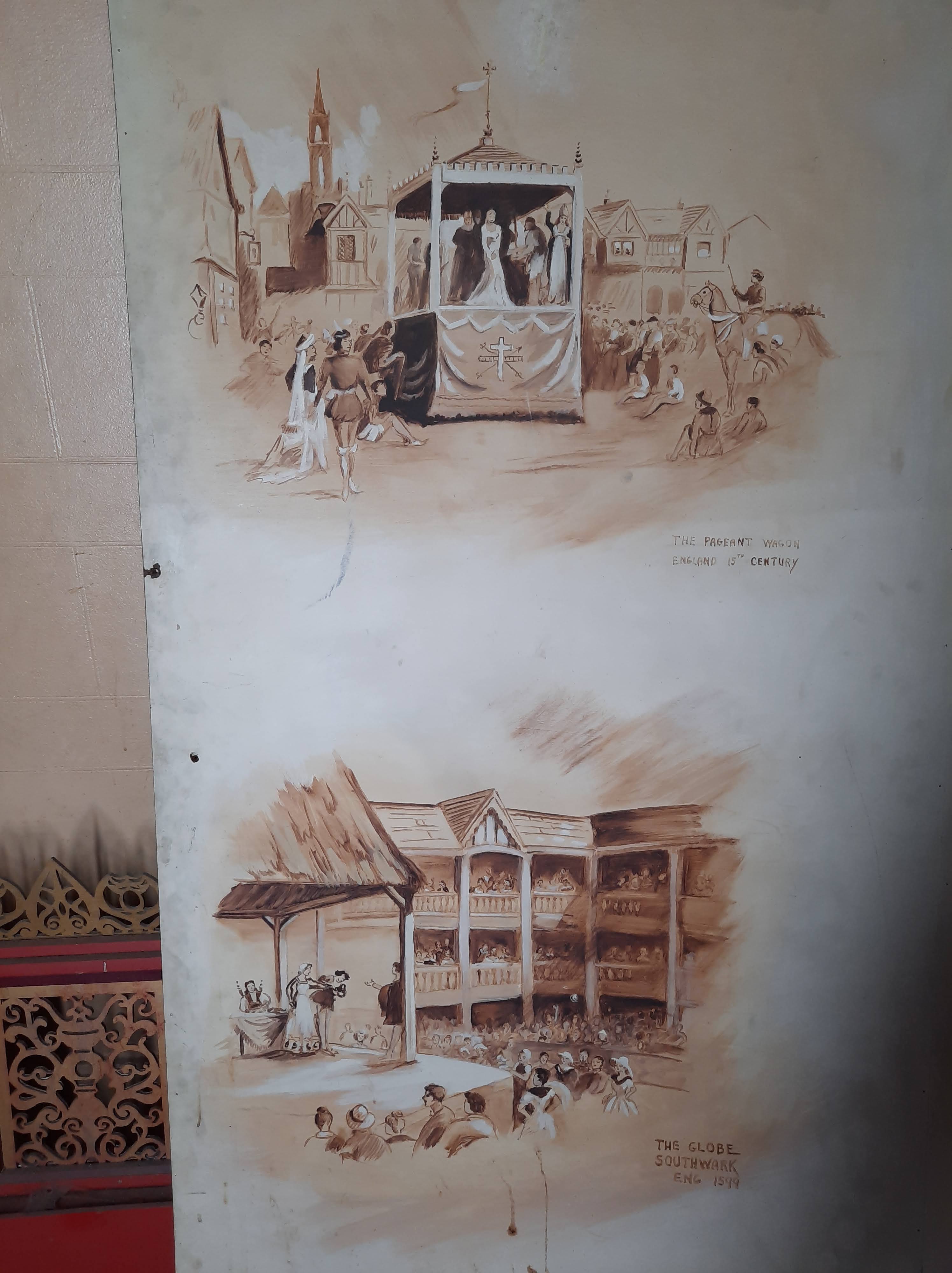
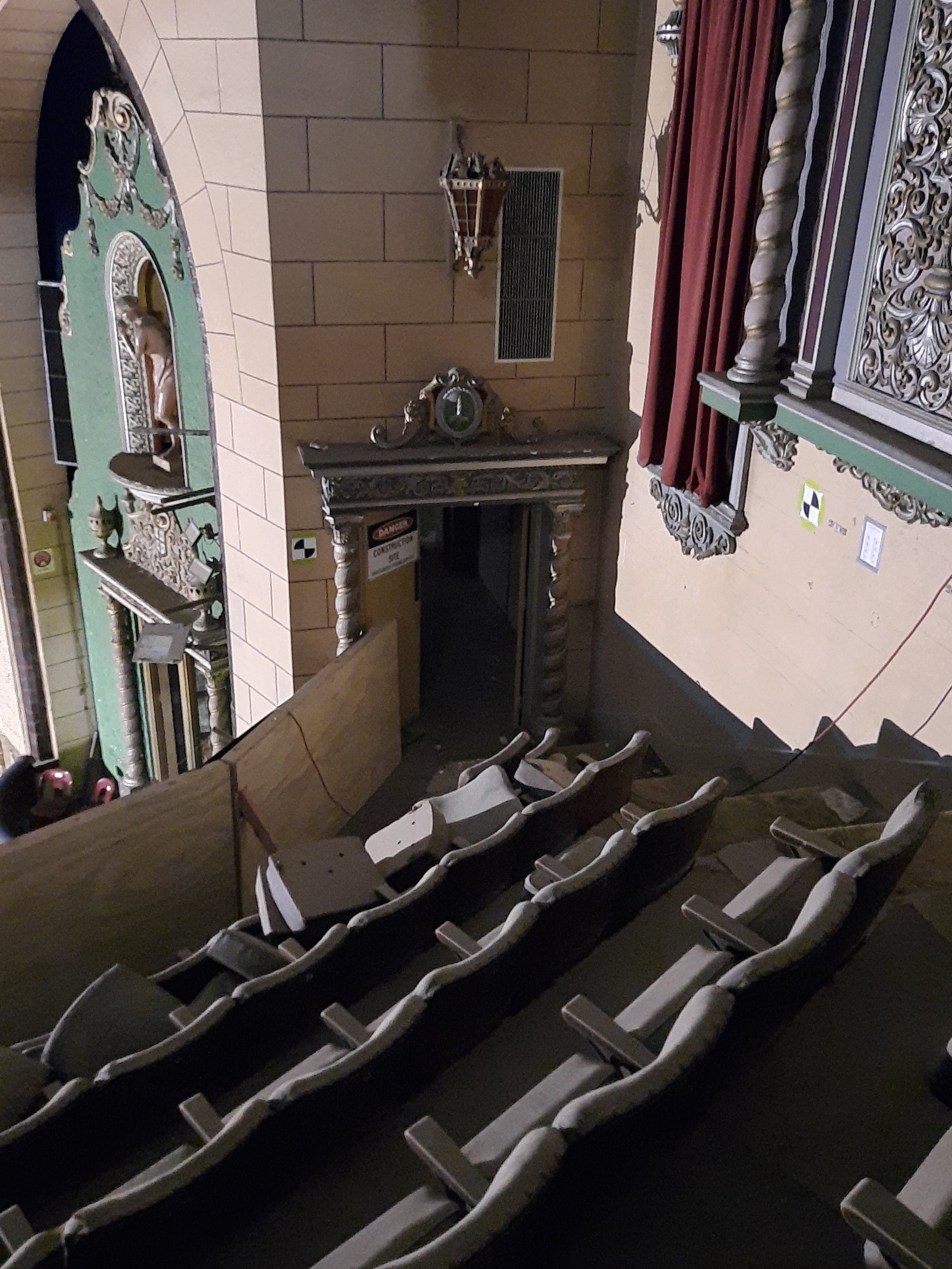
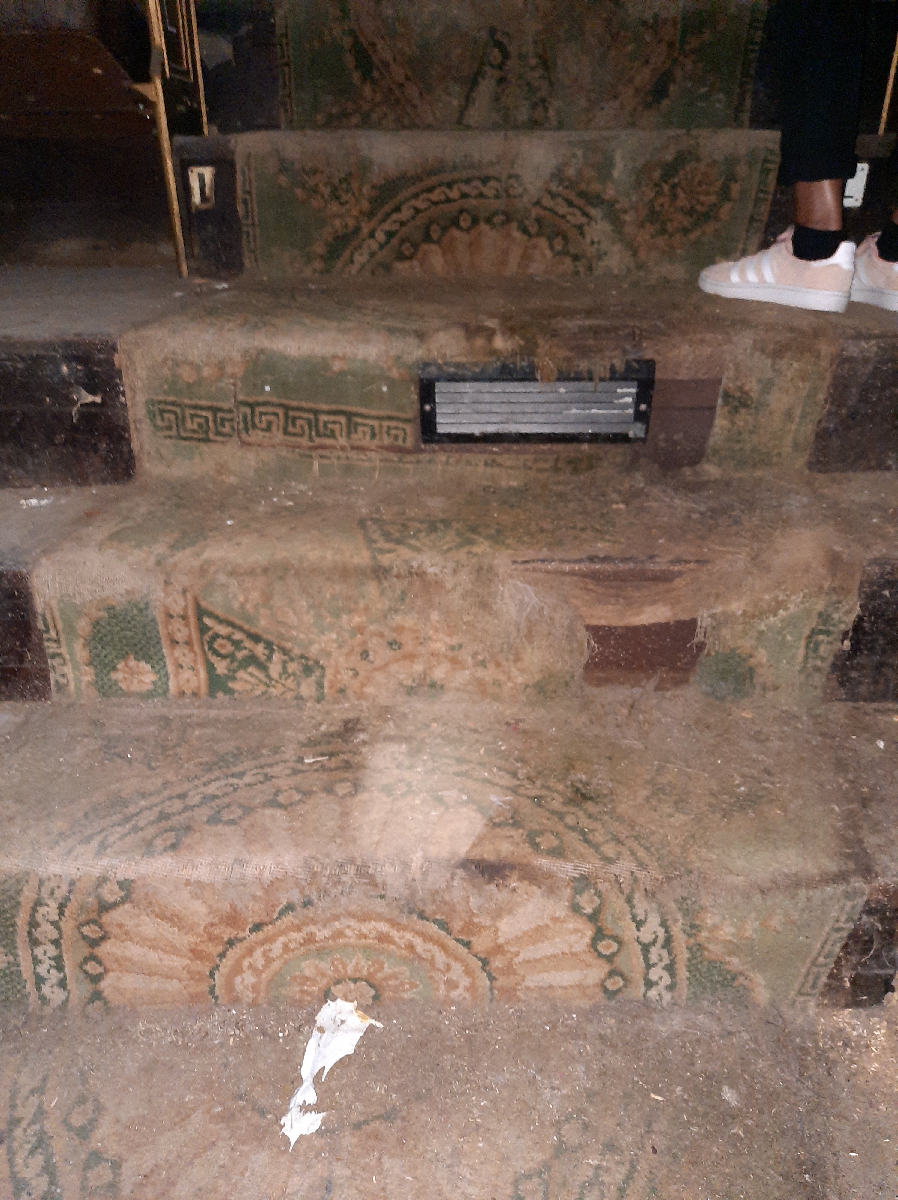
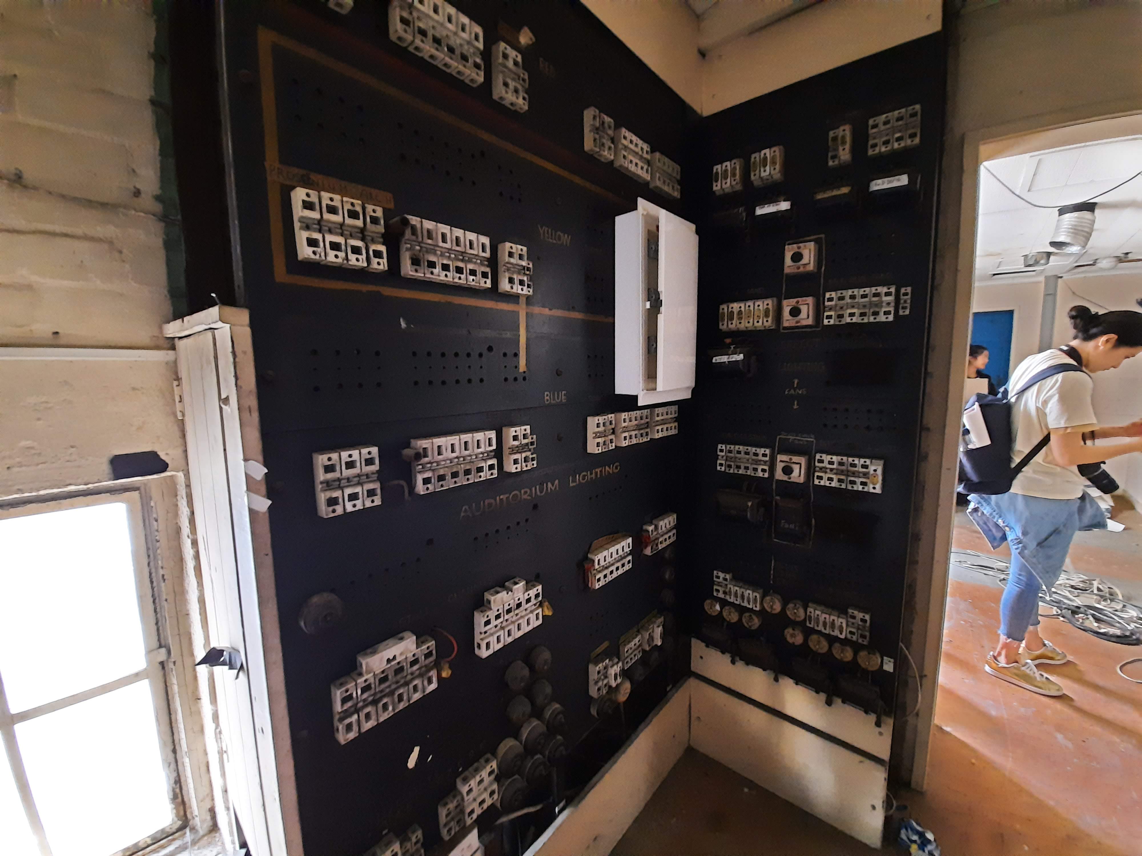
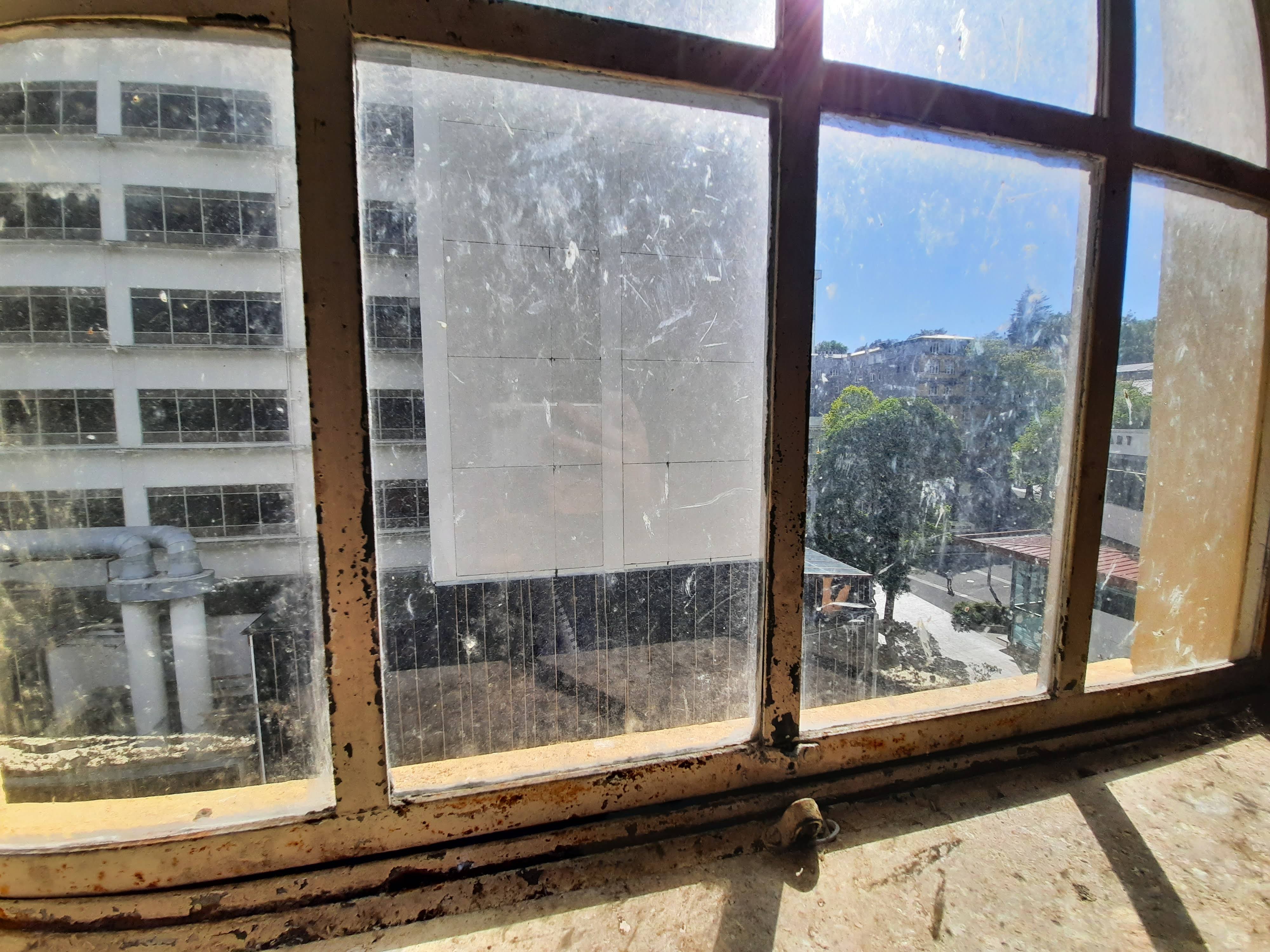
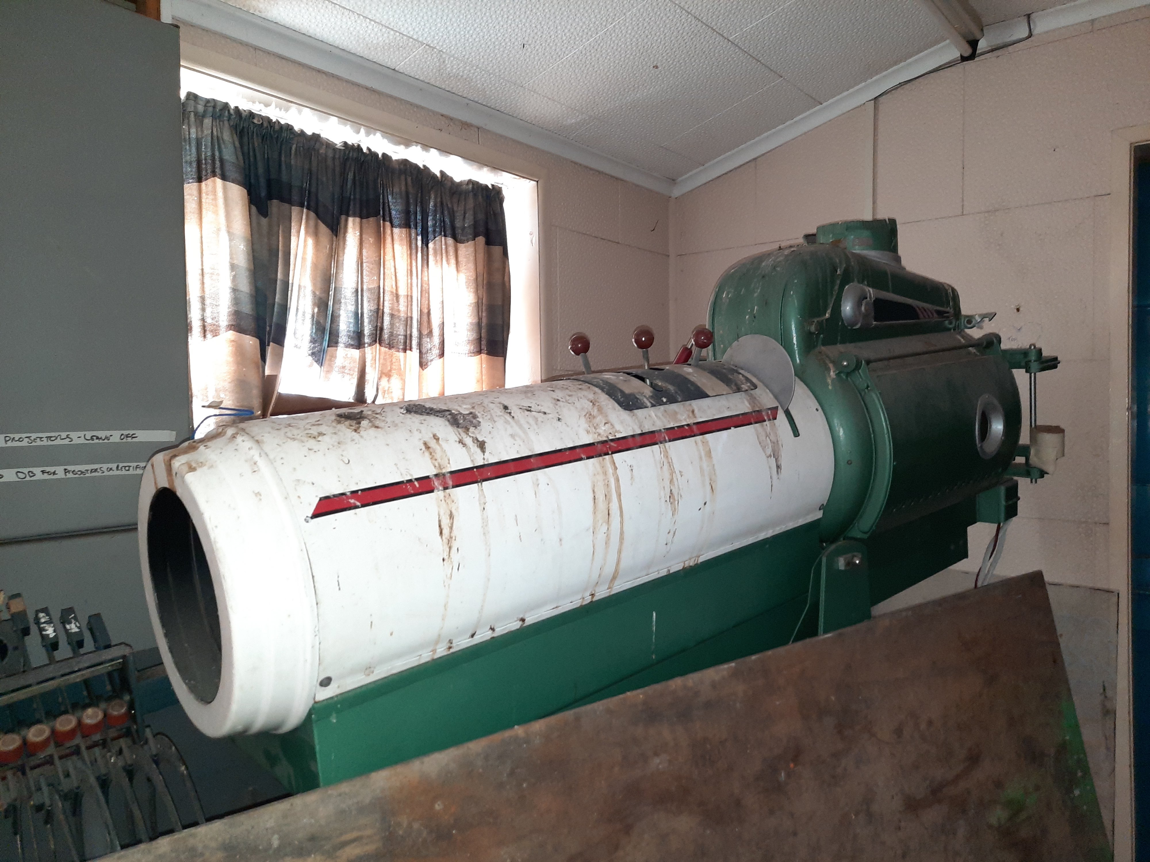
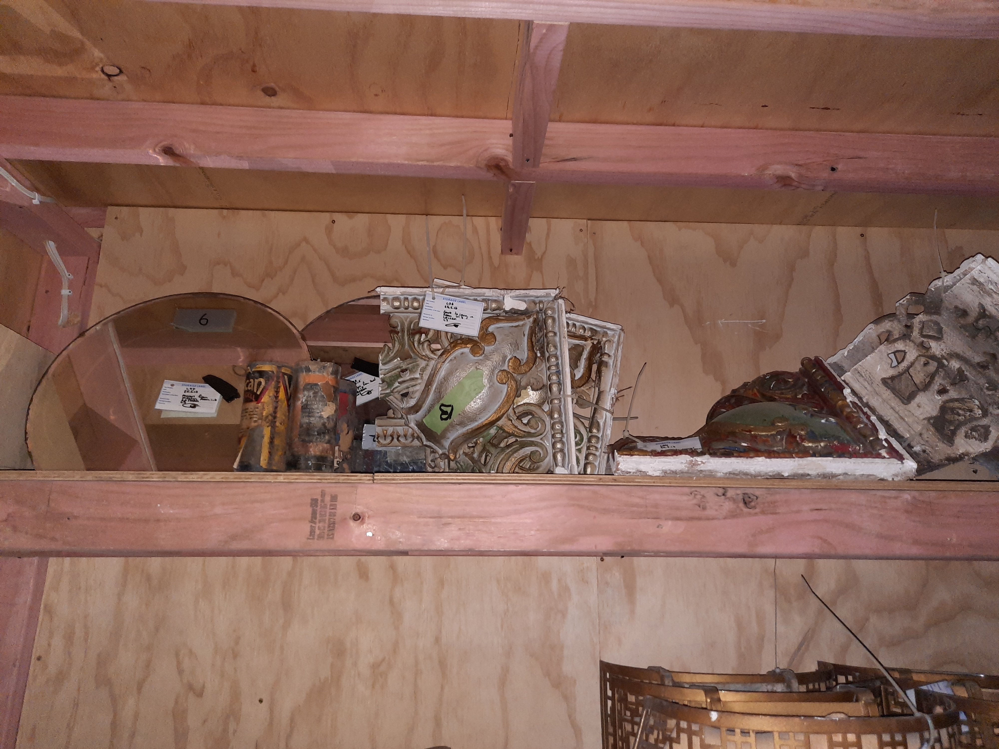
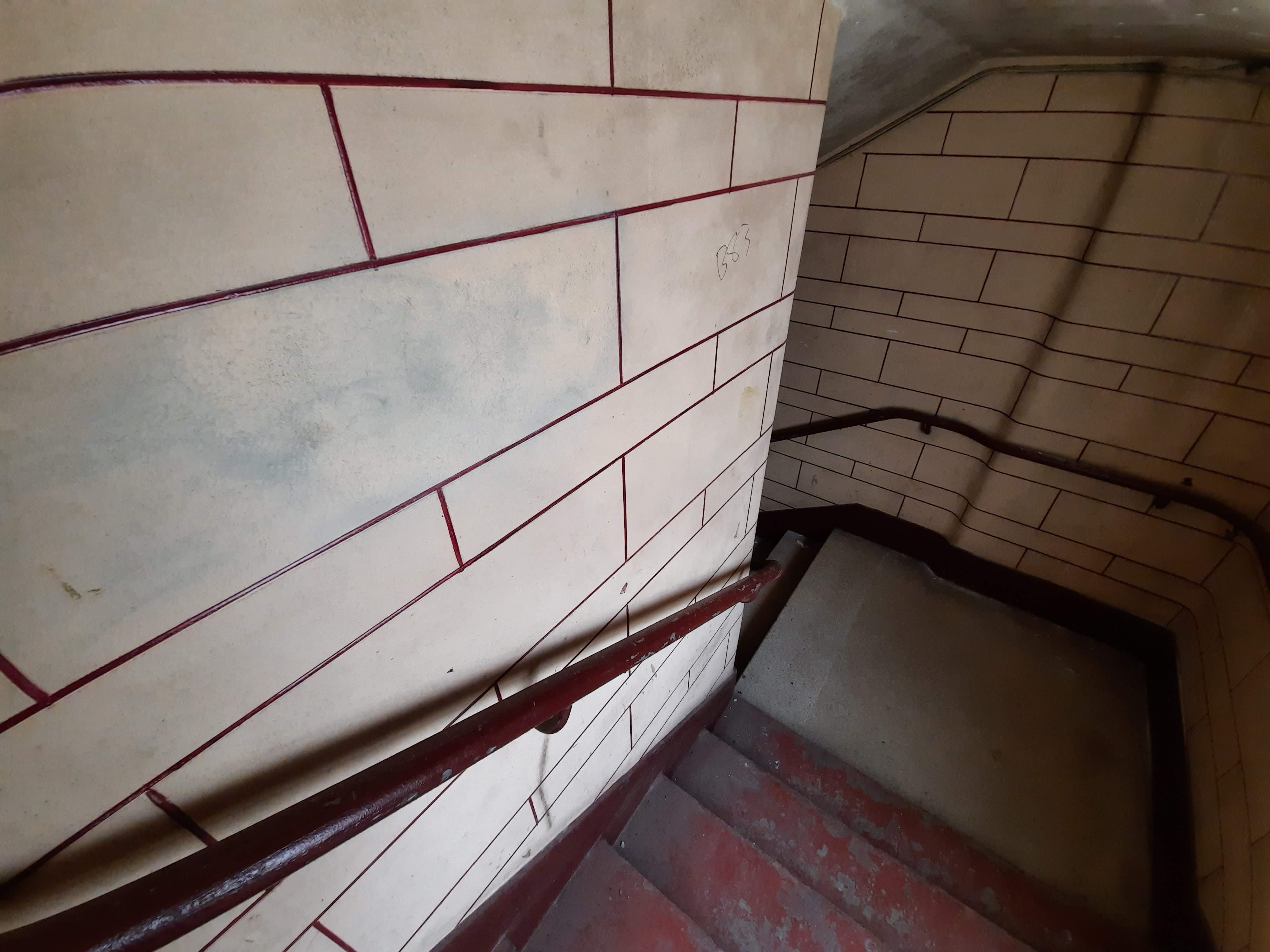
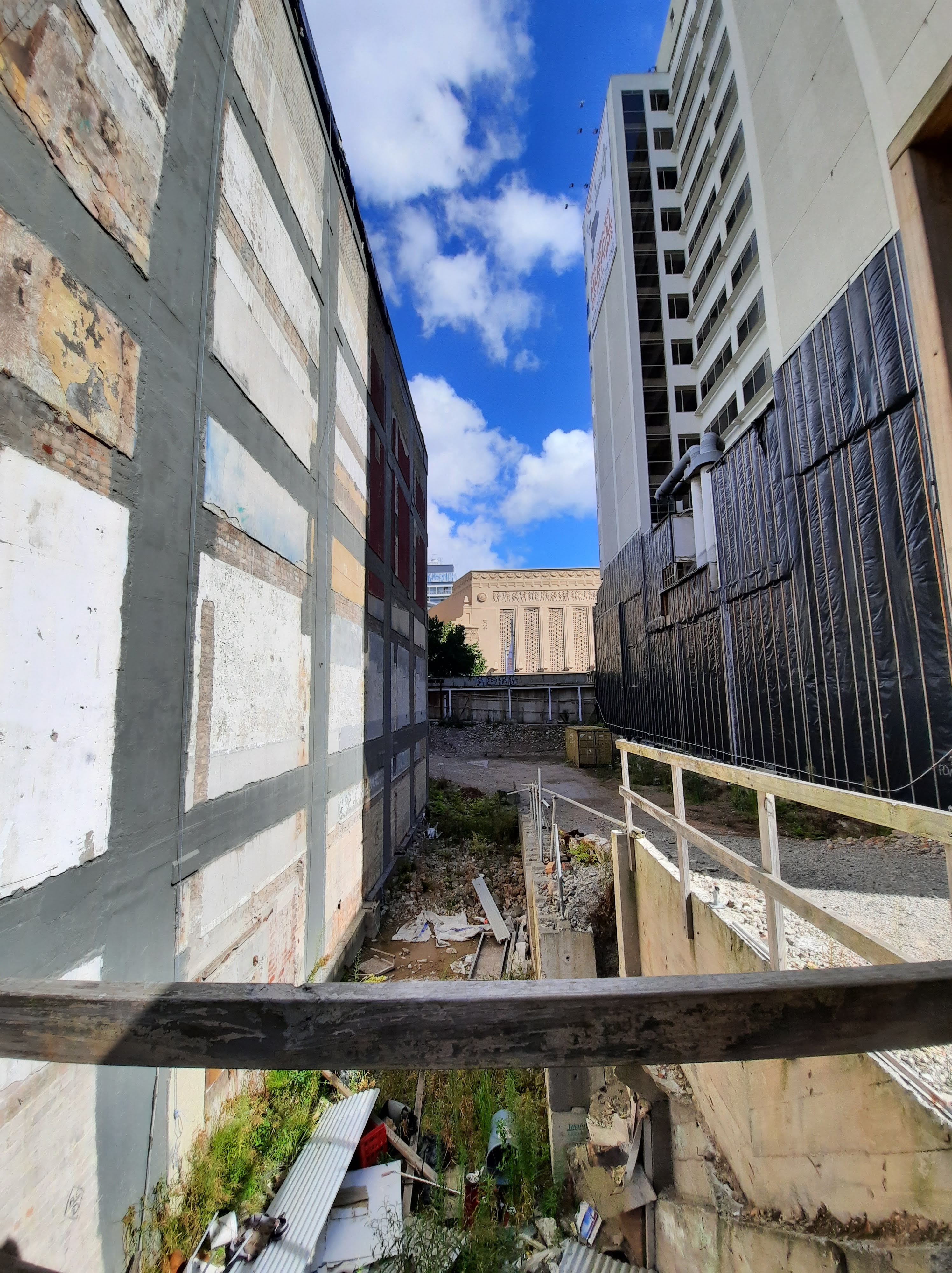
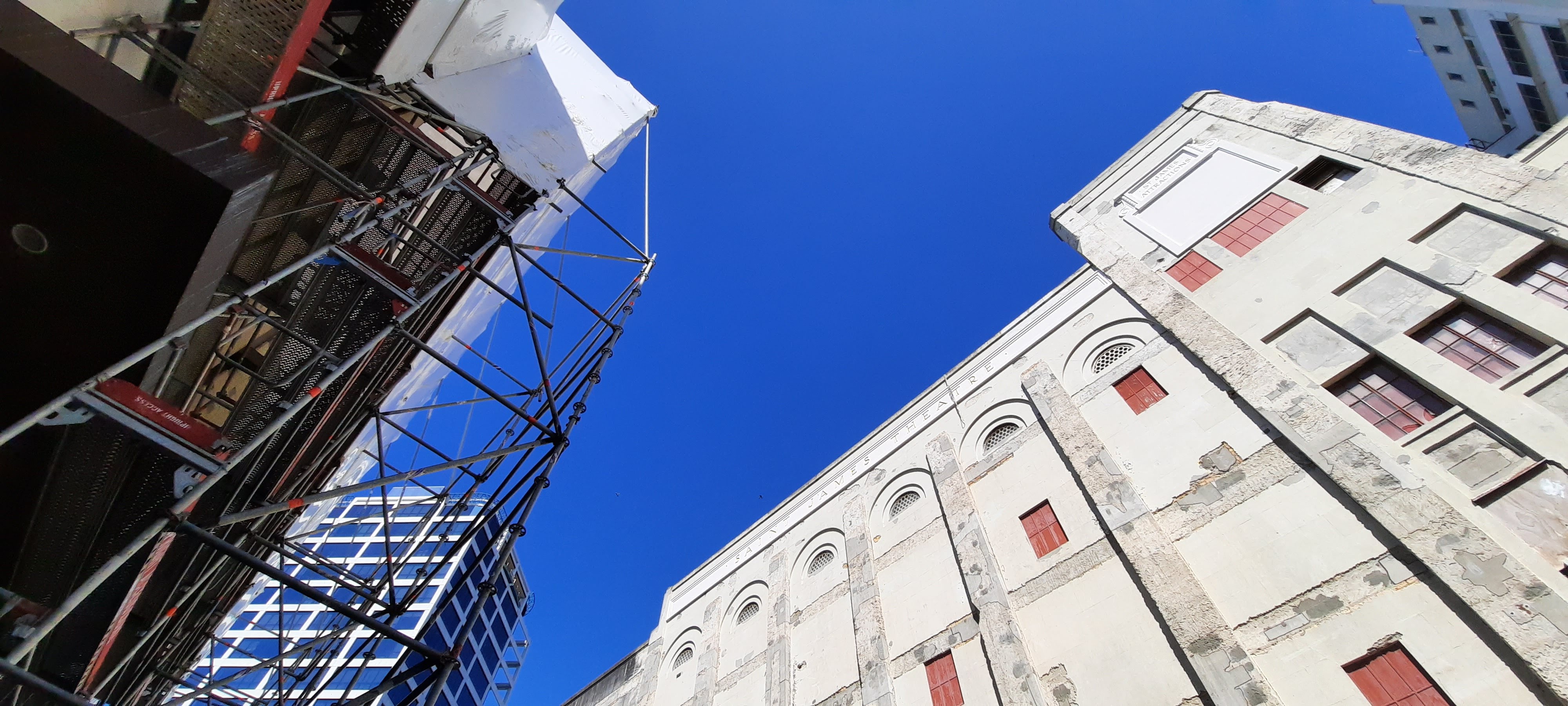
On the Thursday, we were lucky enough to visit the St James Theater and enter the building. Below are some of the photos I took.
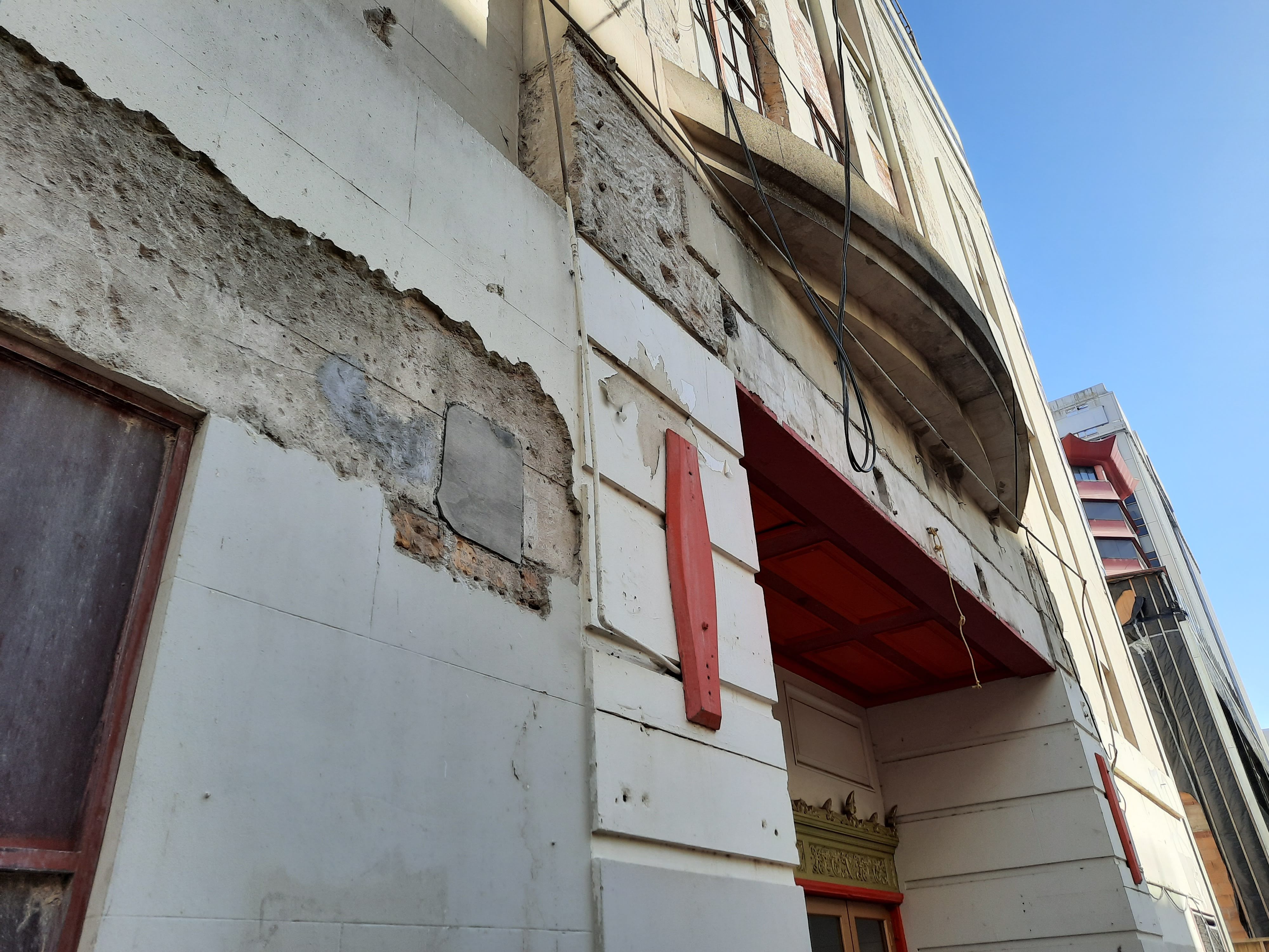
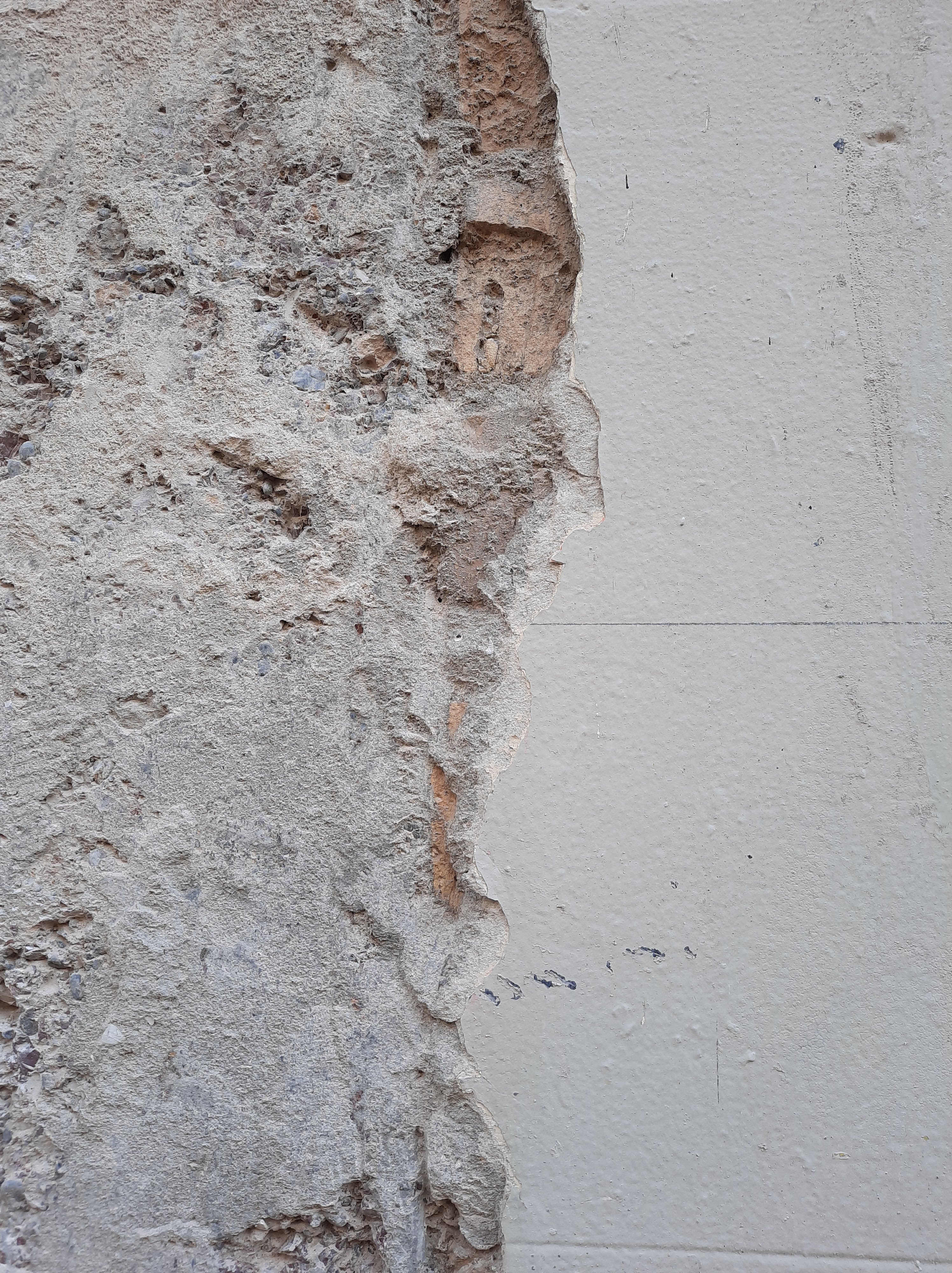
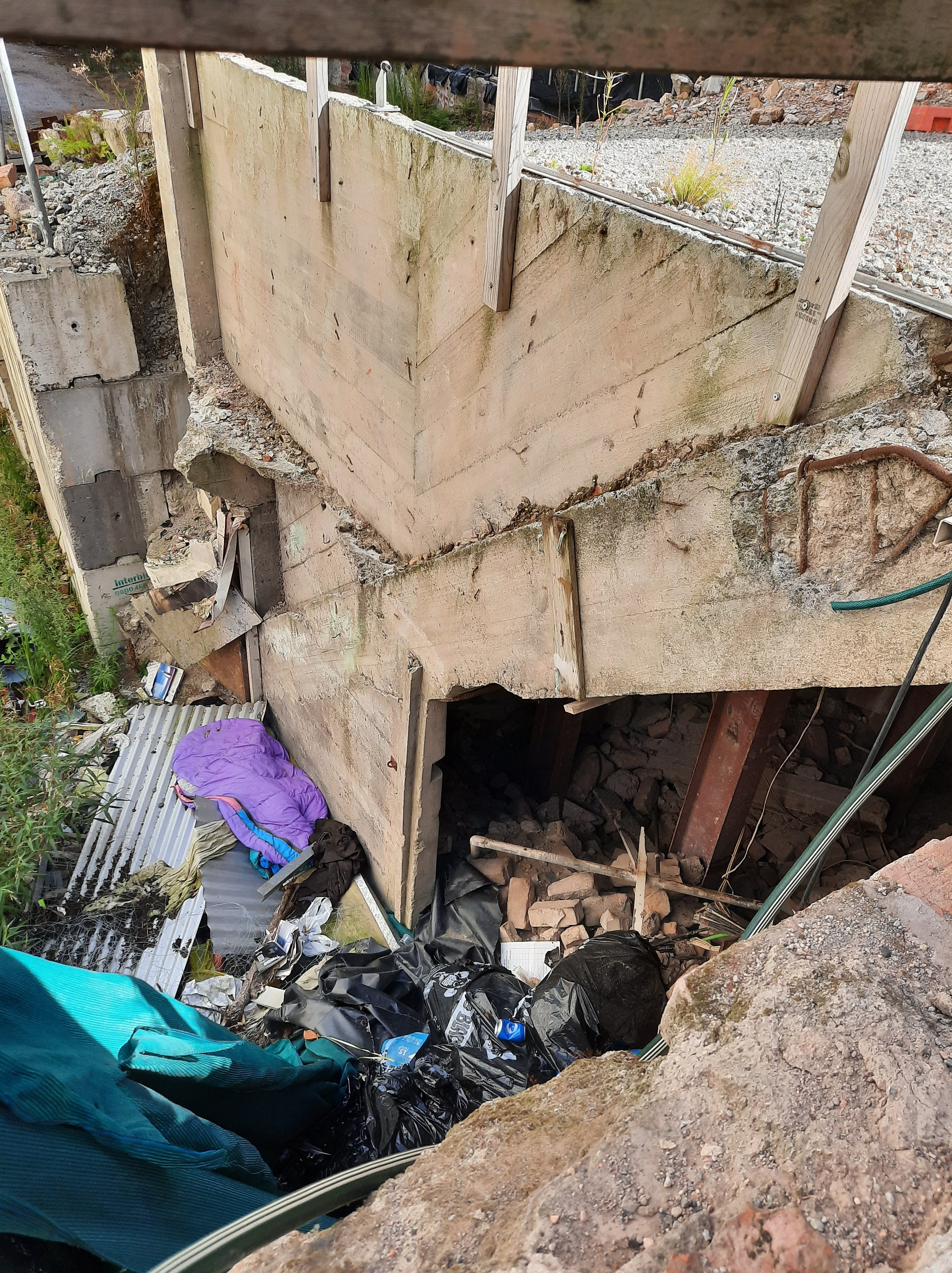
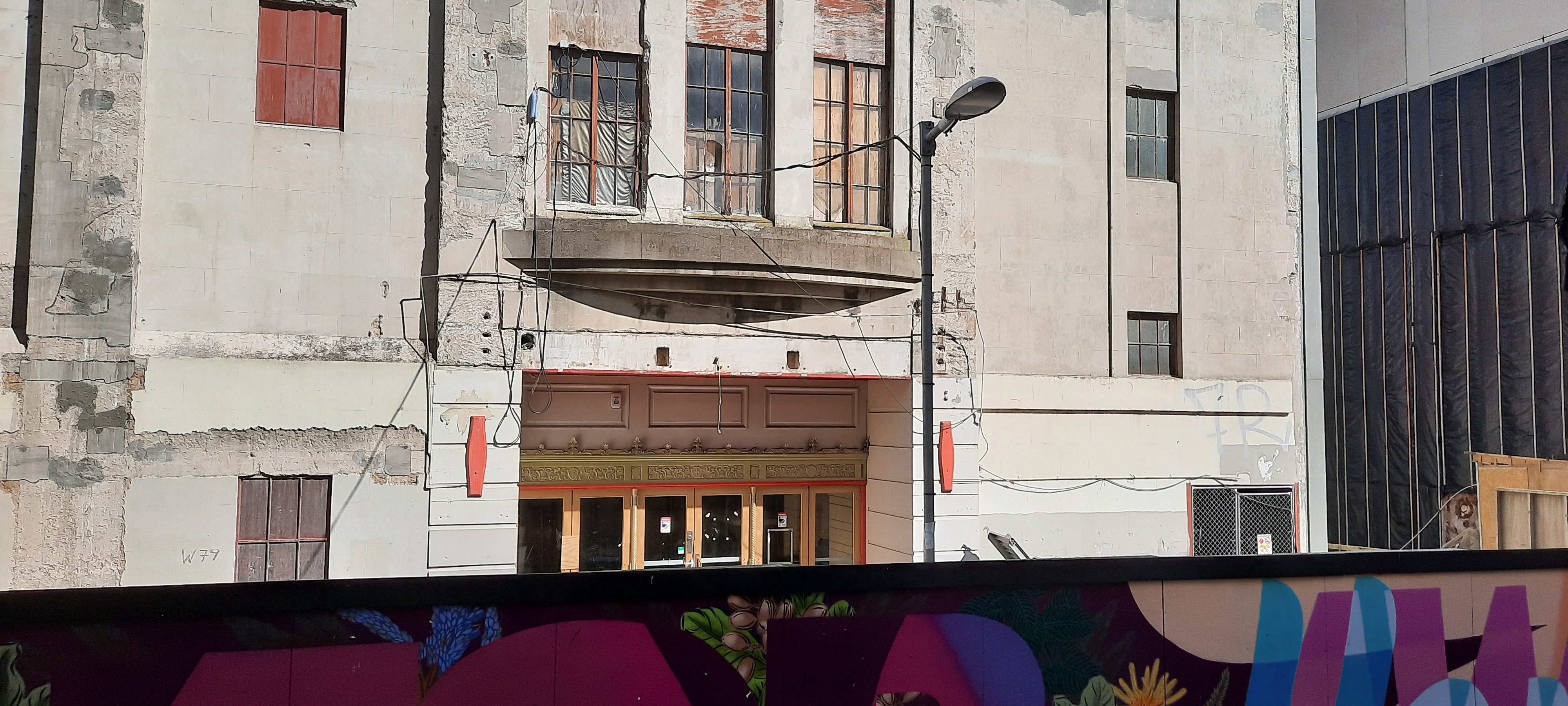
I found the tour of the theater very interesting and informative. It was fascinating to see the marks of history within the site as well as those left more recent. It was an odd collision of old and new in a grimey way, not the way you see old villas done up with a touch of modern, but in the combination of the unwanted, derelict and unimportant from different periods of time. The site had an eerie feeling about it. The dark corners, the unknown at the end of the hallway, a sense that everything had been dropped and left abruptly, an impression of mystery.
A motif carried from my observations in my first week during the exploration of the exterior of the site was the need to look up, from a different perspective, notice the happenings of above the head. The whole site included very detailed and beautifully crafted ceiling panels (as shown in the photos above). This made you stare upwards, experience the space from a different angle.
I loved the experience of visiting and exploring the site. Although I can appreciate its importance, I sometimes get a little bored with the history aspect of a site. With this said, I was fascinated and engrossed with the St James Theaters past and its evolution through societal changes.
After the visit to the theater, I created and analysis of colour within the space on a printed plan and section of the building.
Above is a printed plan view of the site. With this plan I communicated the natural light and shadow I experienced in the foyer space. The reason why only half of the foyer space is expressed through this is because currently that is the only part of the foyer that still exists. The section of the foyer leading out on to Queen St was demolished in order to create an apartment complex. Although I am possibly interested in using the whole foyer space for my intervention, I only depicted the colour I experienced in the parts of the foyer I was able to access.
Above is an overlay of butter paper onto the plan. With this layer I wanted to explore the movement that existed within the space when it was used for its built purpose. The foyer space connected Queen St and Lorne St and this allowed people to walk from Queen St through to Lorne St. I mapped the movement of people in the space as I always like to think of people as a part of the space rather than a viewer of the space.
Above is my final layer of butter paper. On this sheet I explored the colour palette of the ceiling panels through a combination of acrylic paints and water. I wanted to explore the colour of ceilings through this because I found this was the most definitive focus on colour in the foyer space. Prior to this exercise I looked into some designer and artist models. One that I am interested in is Georgia O’Keeffe. She is a painter that often uses acrylic on canvas. This is the reason I wanted to experiment with acrylics on butter paper. I also used to love to paint all the time with acrylic paints and ever since the beginning of this project I have been eager to get back into it. Not only am I inspired by O’Keeffe’s softness, form and depth in her work, but I also love the medium that she used.
On the Monday we met up and put together the information and put the last finishing details on our presentation. We presented on the Tuesday class. Below is our presentation.
Before Thursdays class I made three models exploring different parts of our research into the colour orange.
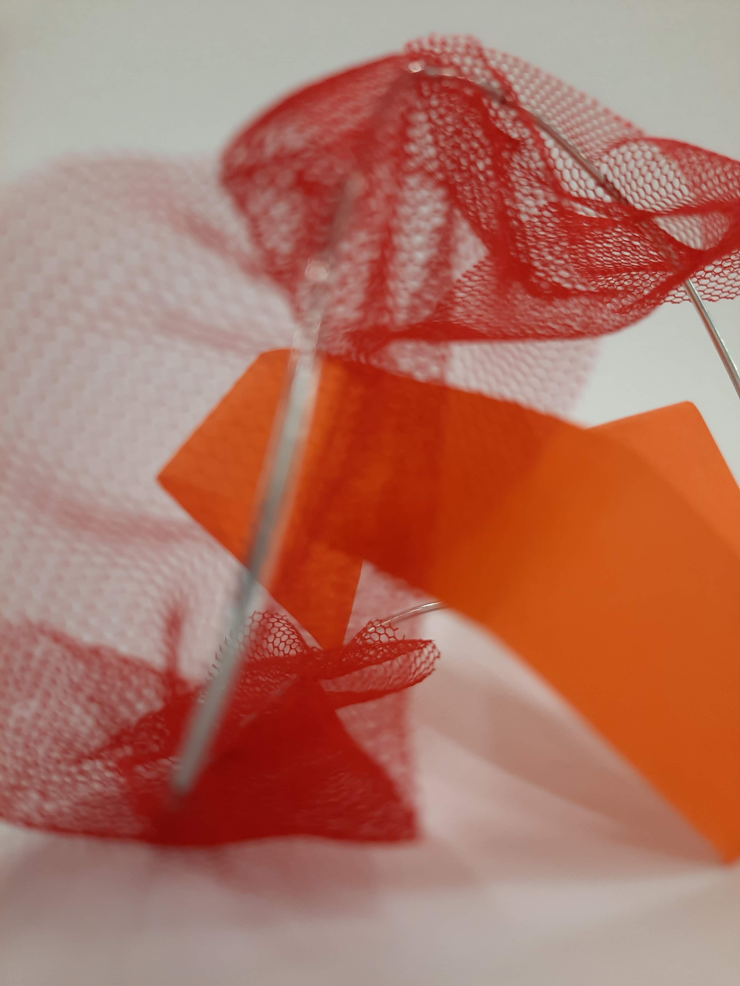
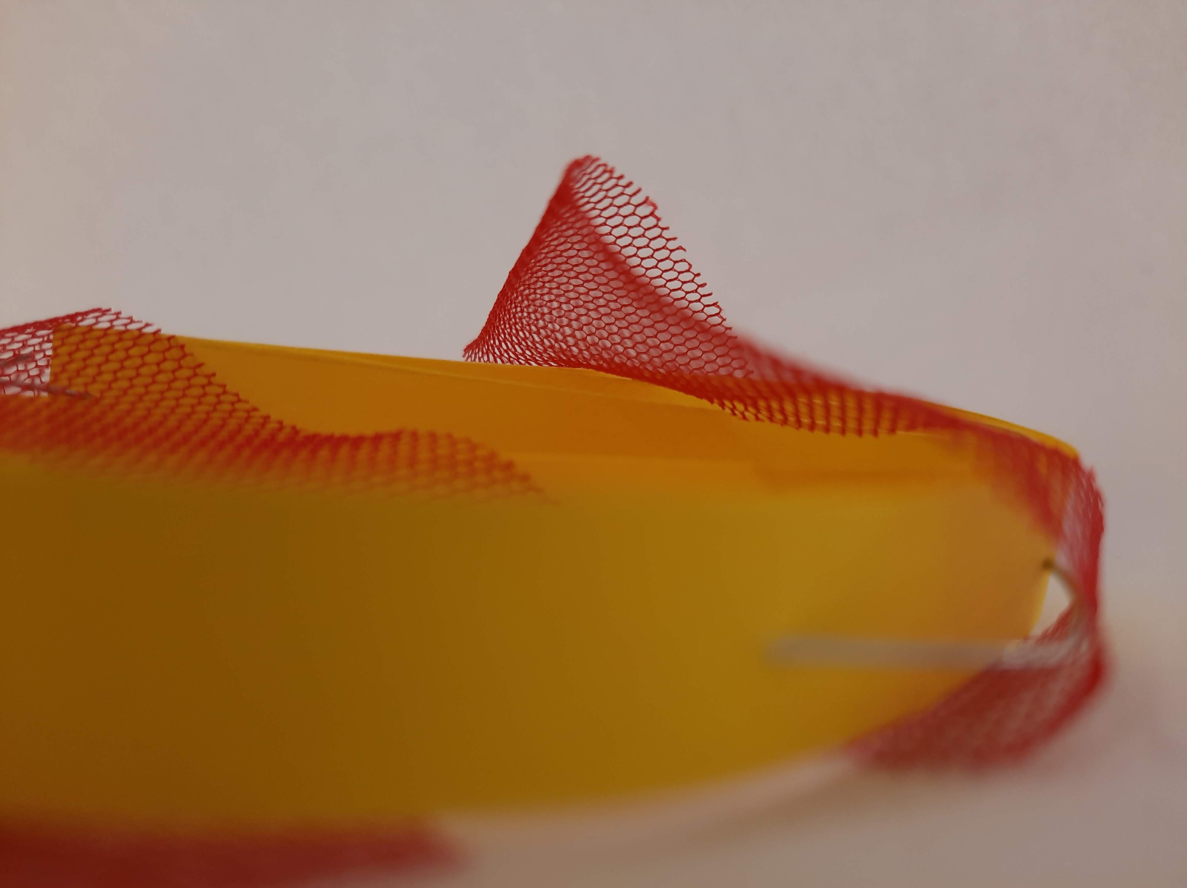
My first model (below) explores the interaction of colours.
This model explores the two primary colours (yellow and red) that create orange. The reason why I created a circular form was because through research I learnt that the colour orange was named after the fruit. This model also explores that the different amounts of red added to a yellow creates a different intensity of orange. In this instance, where the red tulle material folds and overlaps is where a deeper orange occurs.
My second model (below) explores an aspect of our seminar research.
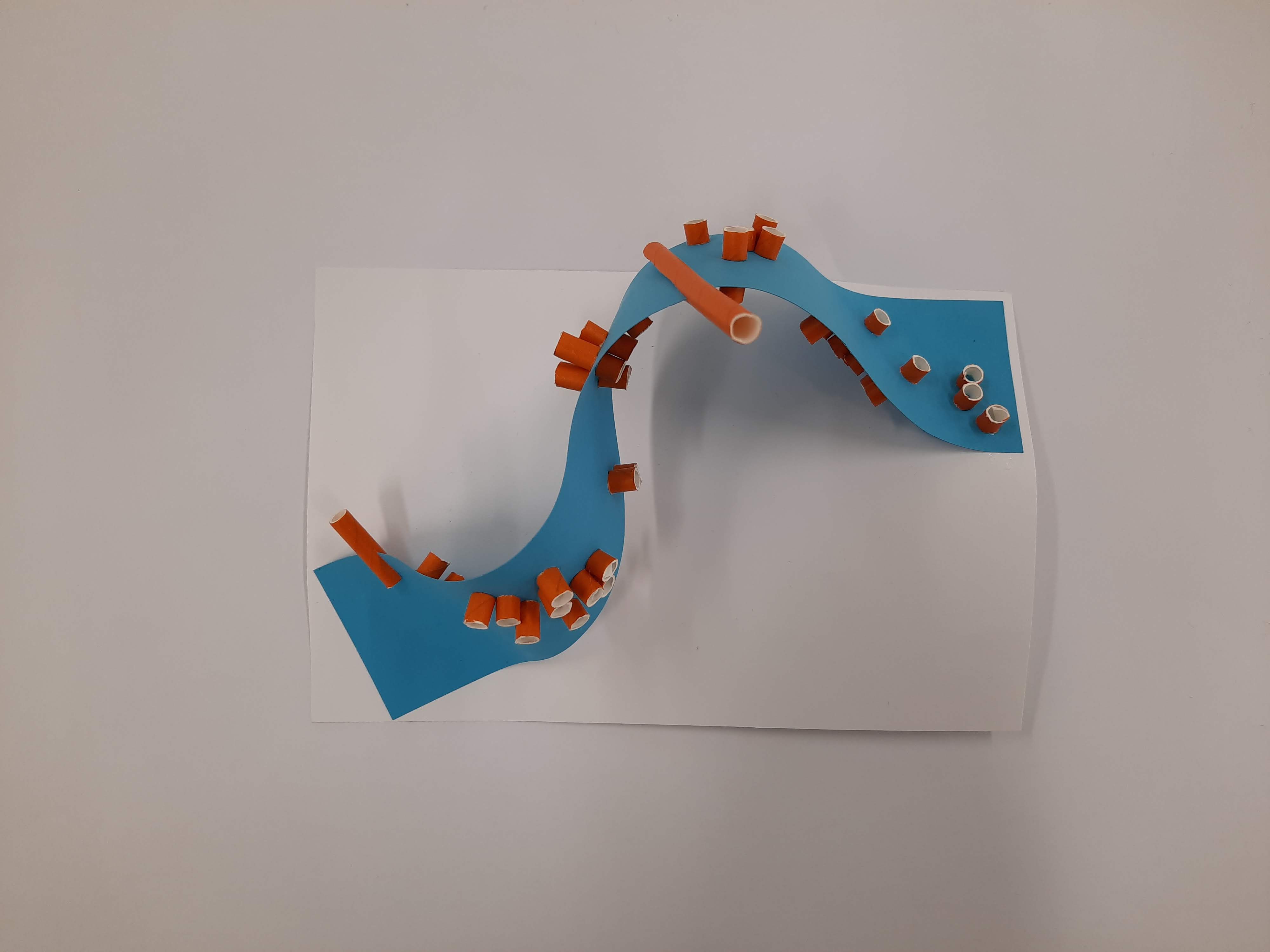
I decided to explore complementary colours through this model. Angle is a very important factor in this model; the amount of orange colour that is shown against the blue depends on the angle it is viewed from.
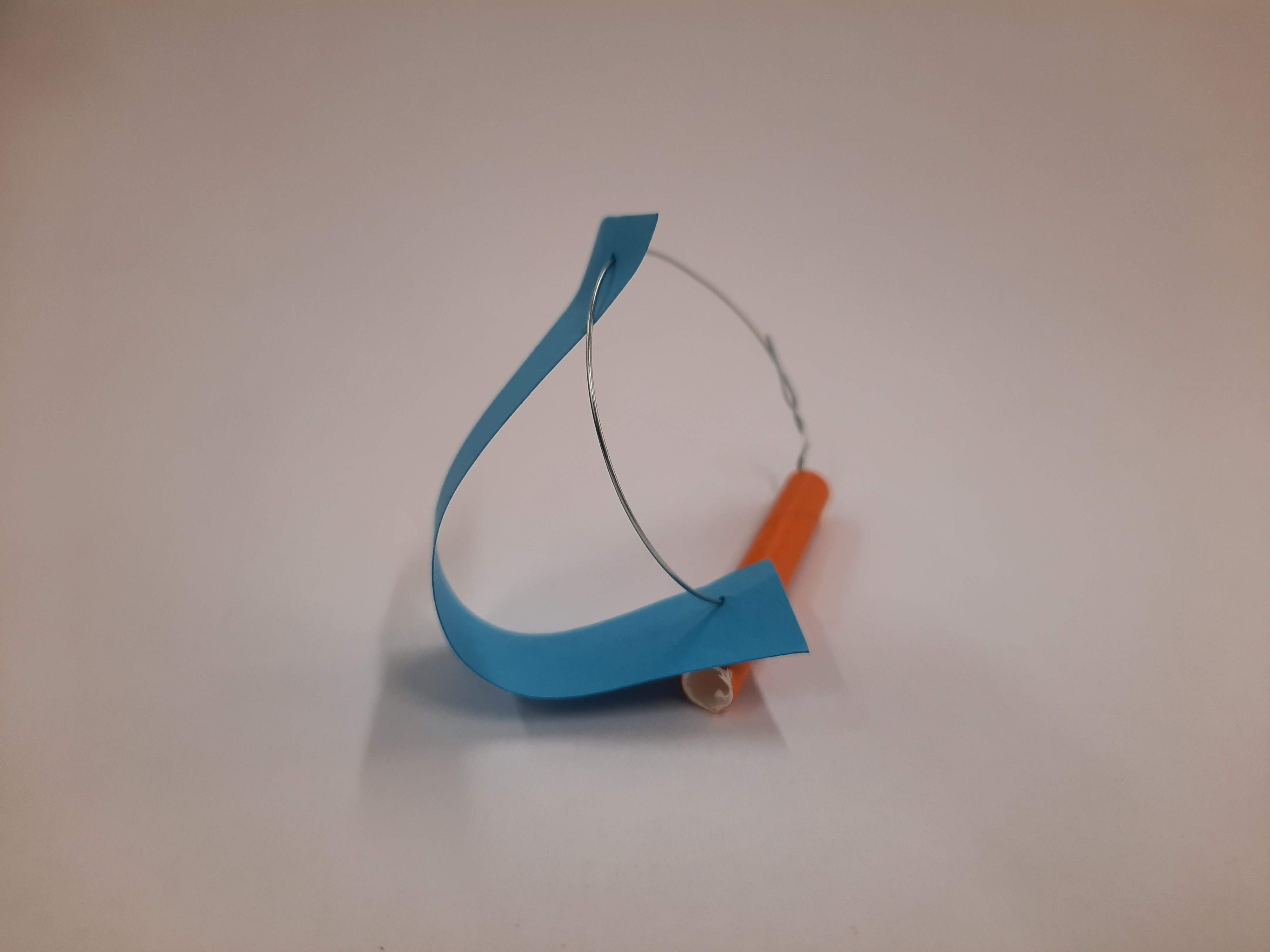
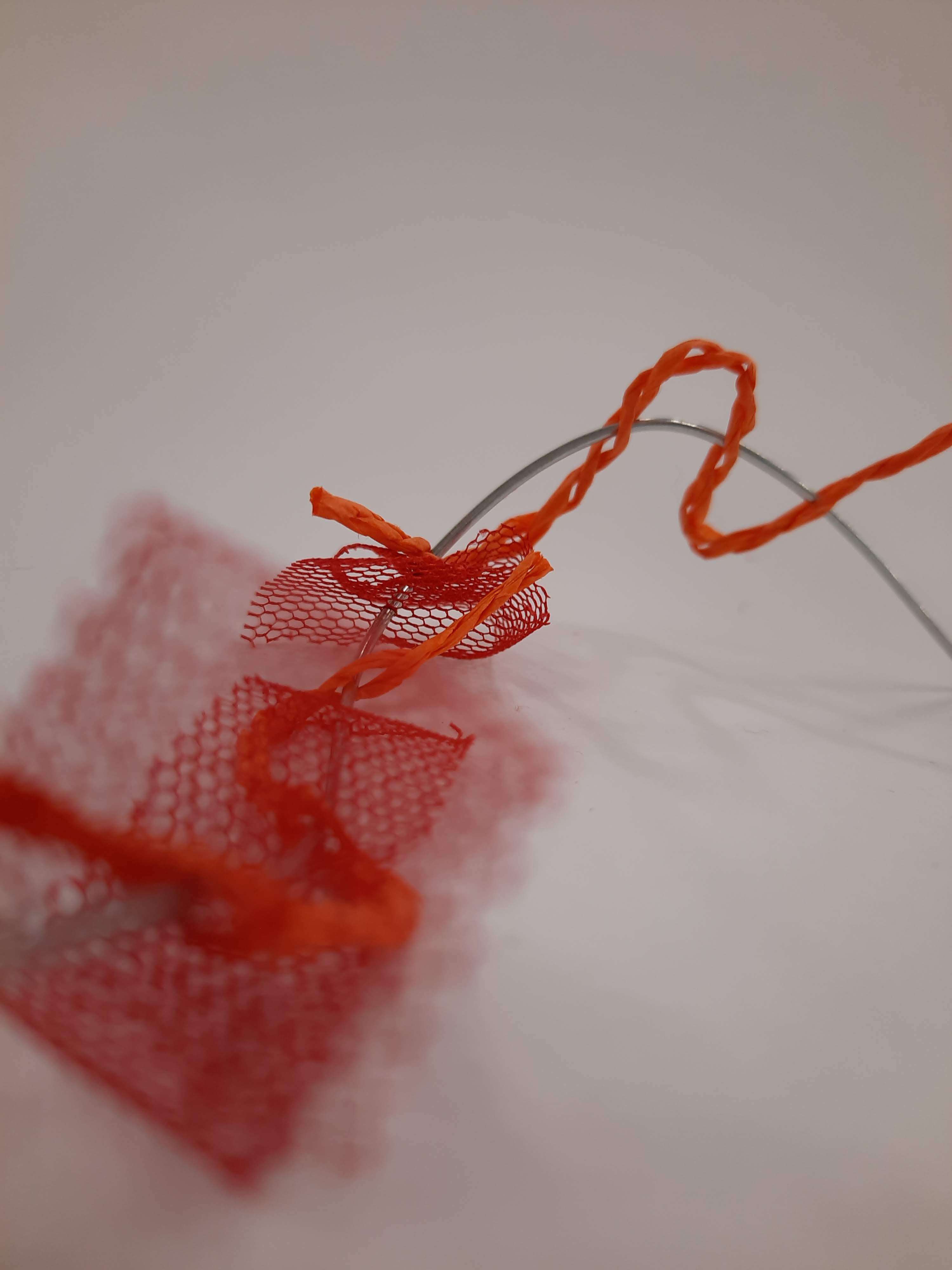
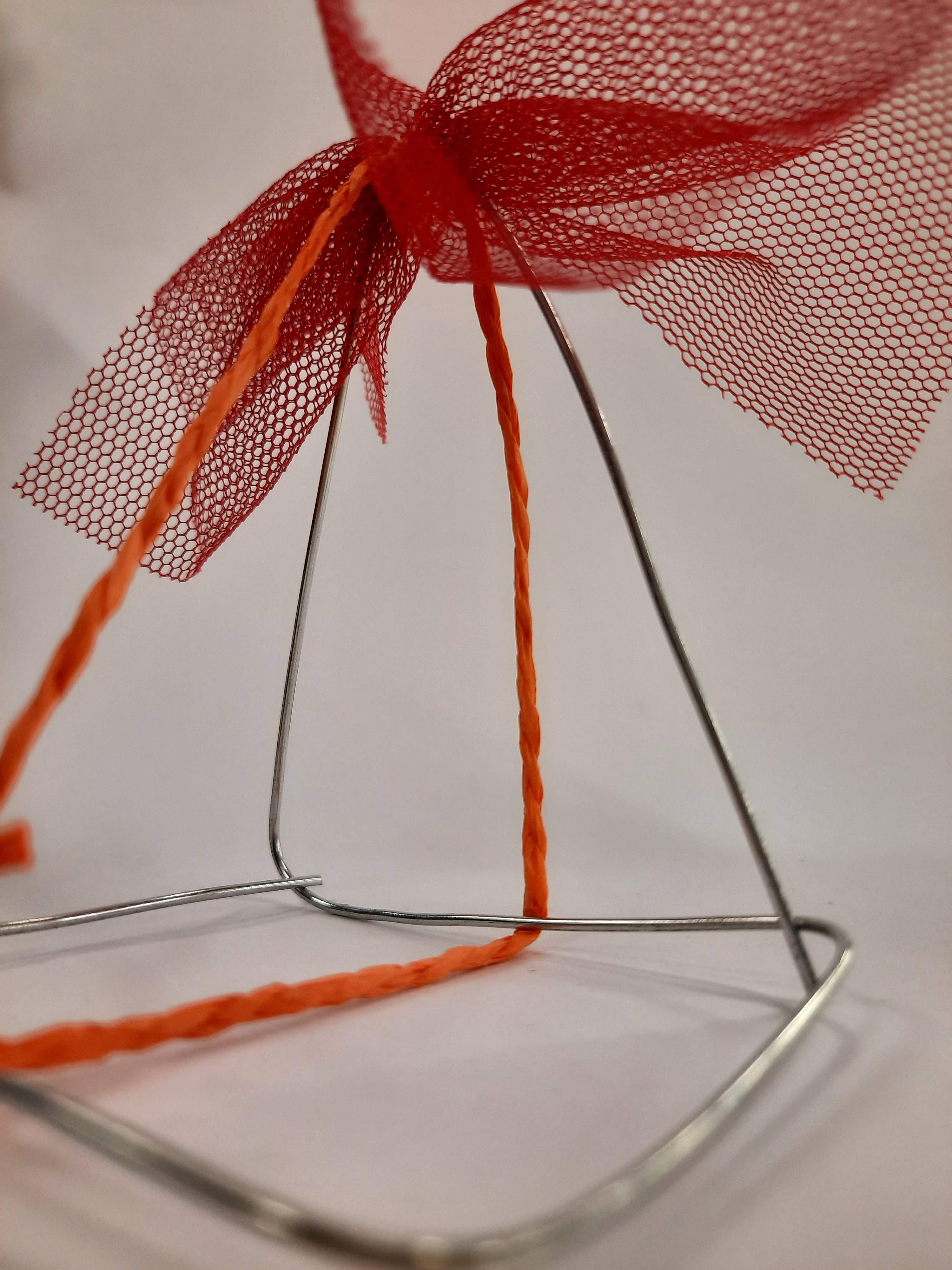
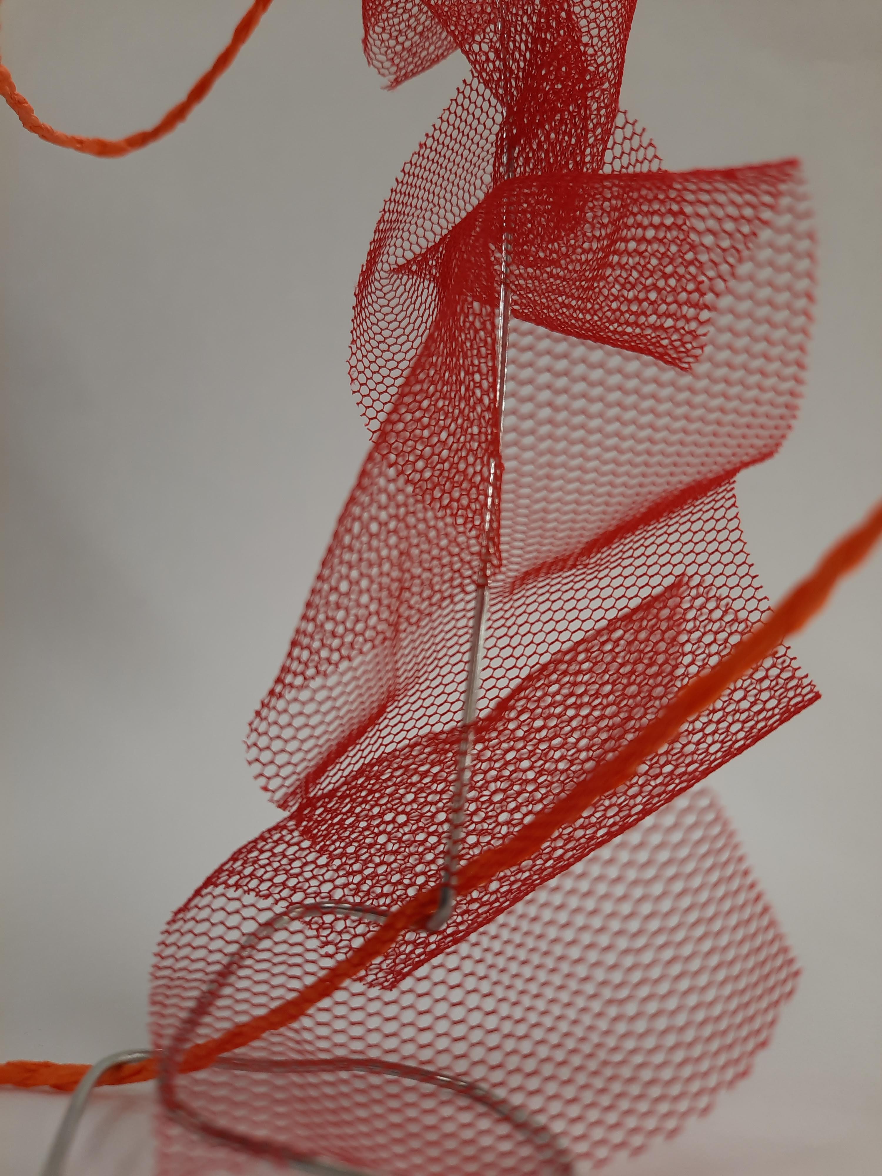
My third model (below) explores a detail.
I wasn’t quite sure what was meant by ‘explore a detail’ so I decided to take the approach of exploring orange by itself through the closeup interaction of different materials. This model I explored with weaving thin orange paper rope in and around a fixed orange paper straw and to create form I used wire.
During Thursdays class I continued making models through the cupcake exercise. The three models I had already made were positioned as three corners to a rectangle. I then began to make models that were a combination of a chosen opposite two and continued until I had 25 models. Below is an image of my models displayed.
I have also included some evocative images of some of the individual images by themselves.
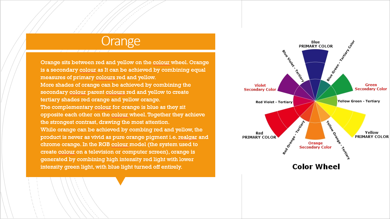
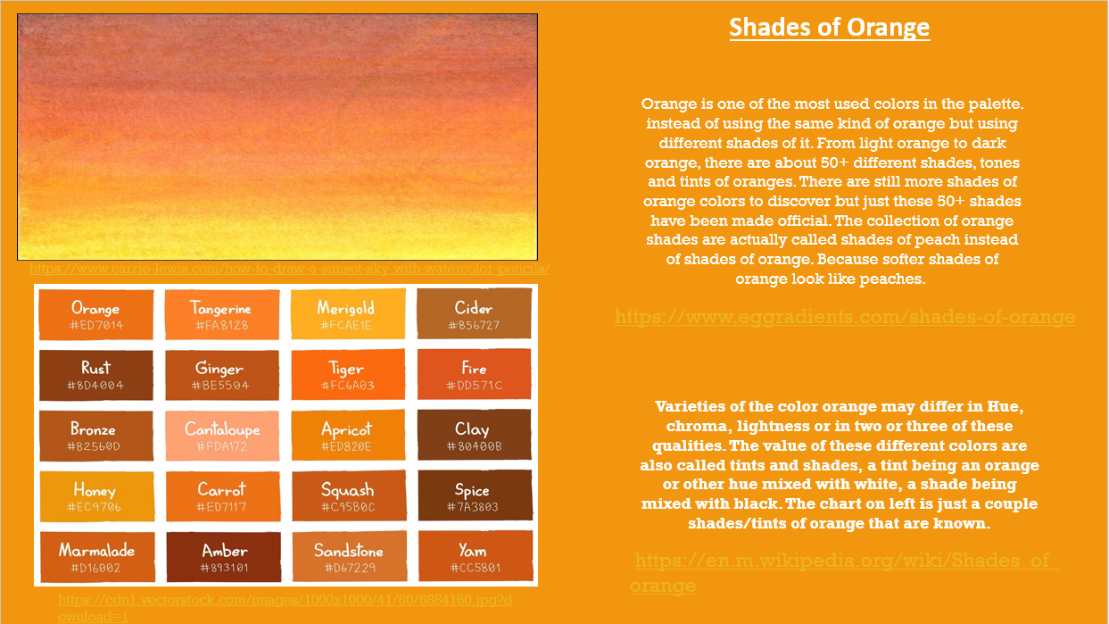
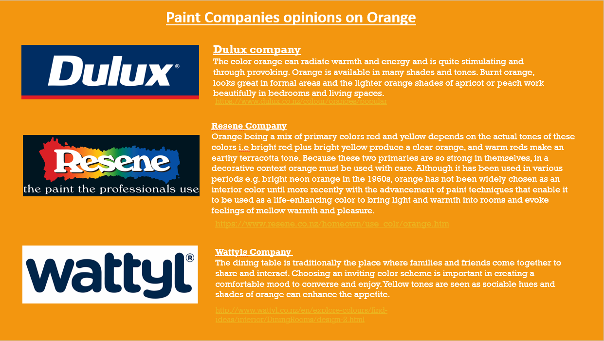
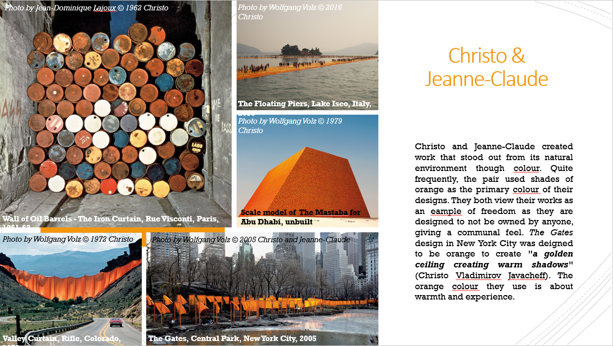
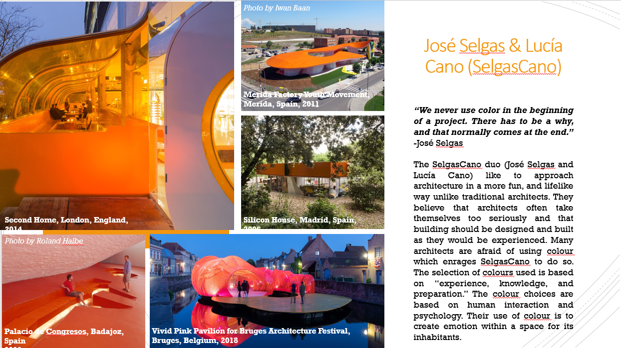
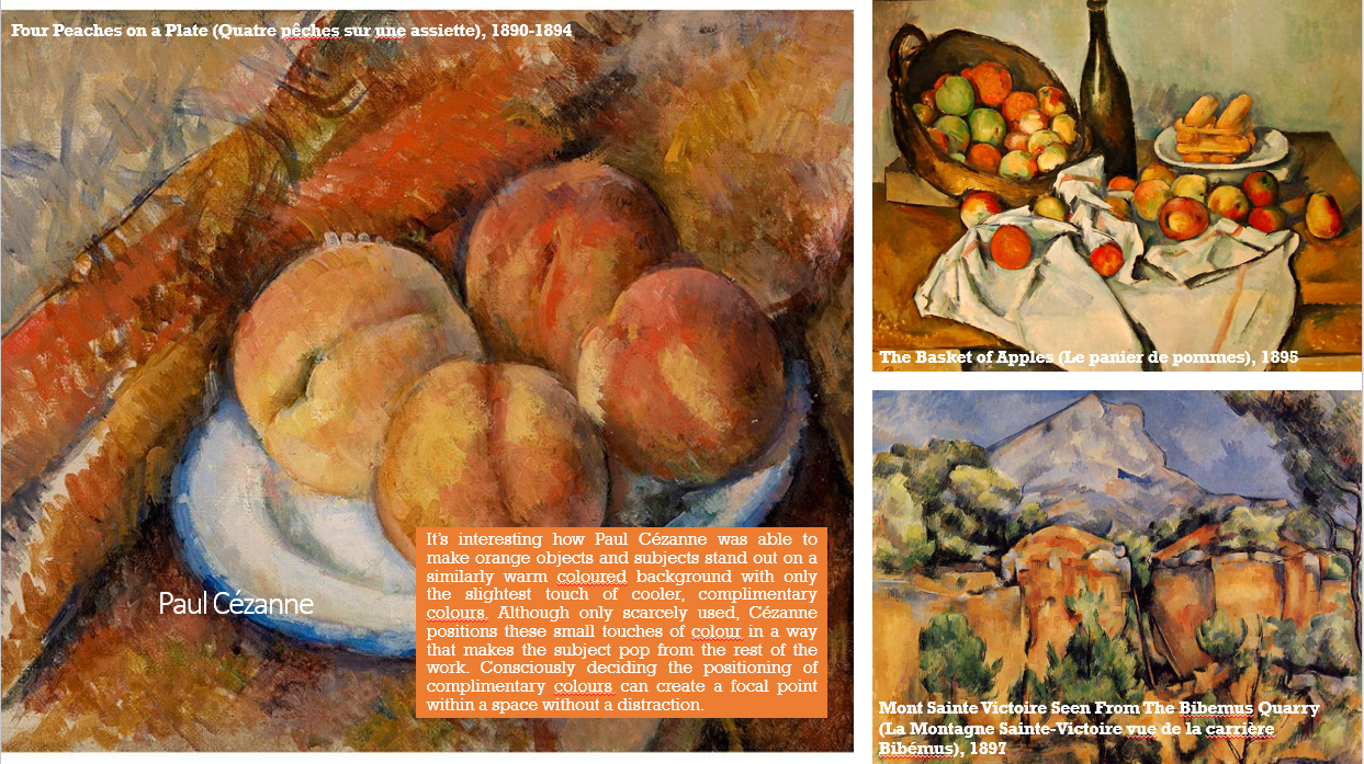
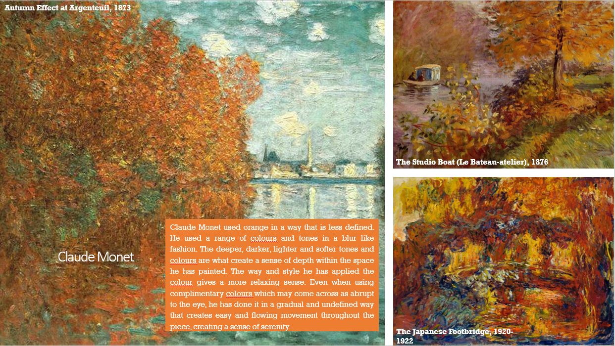
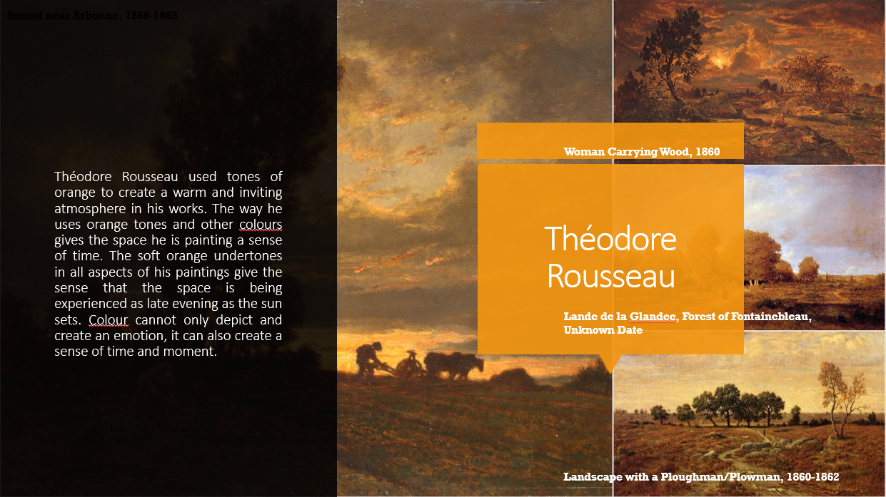
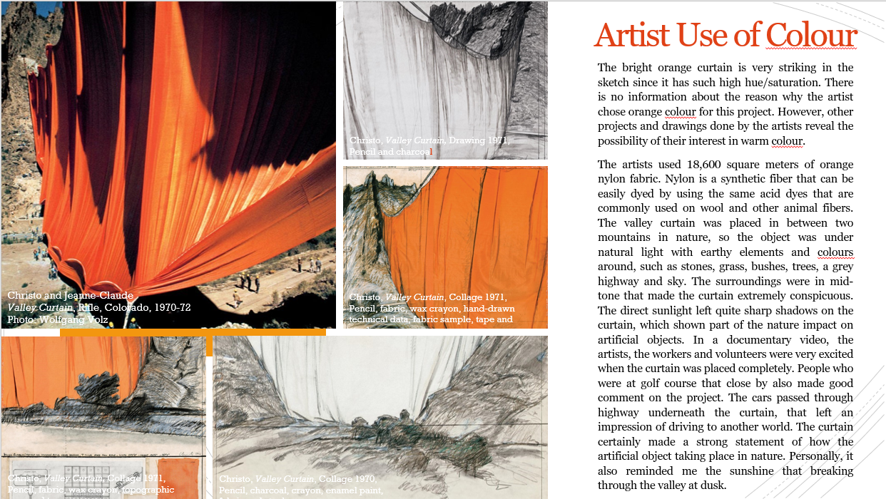
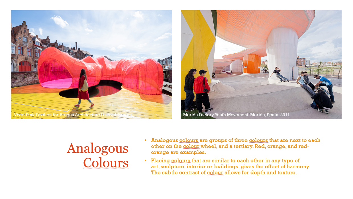
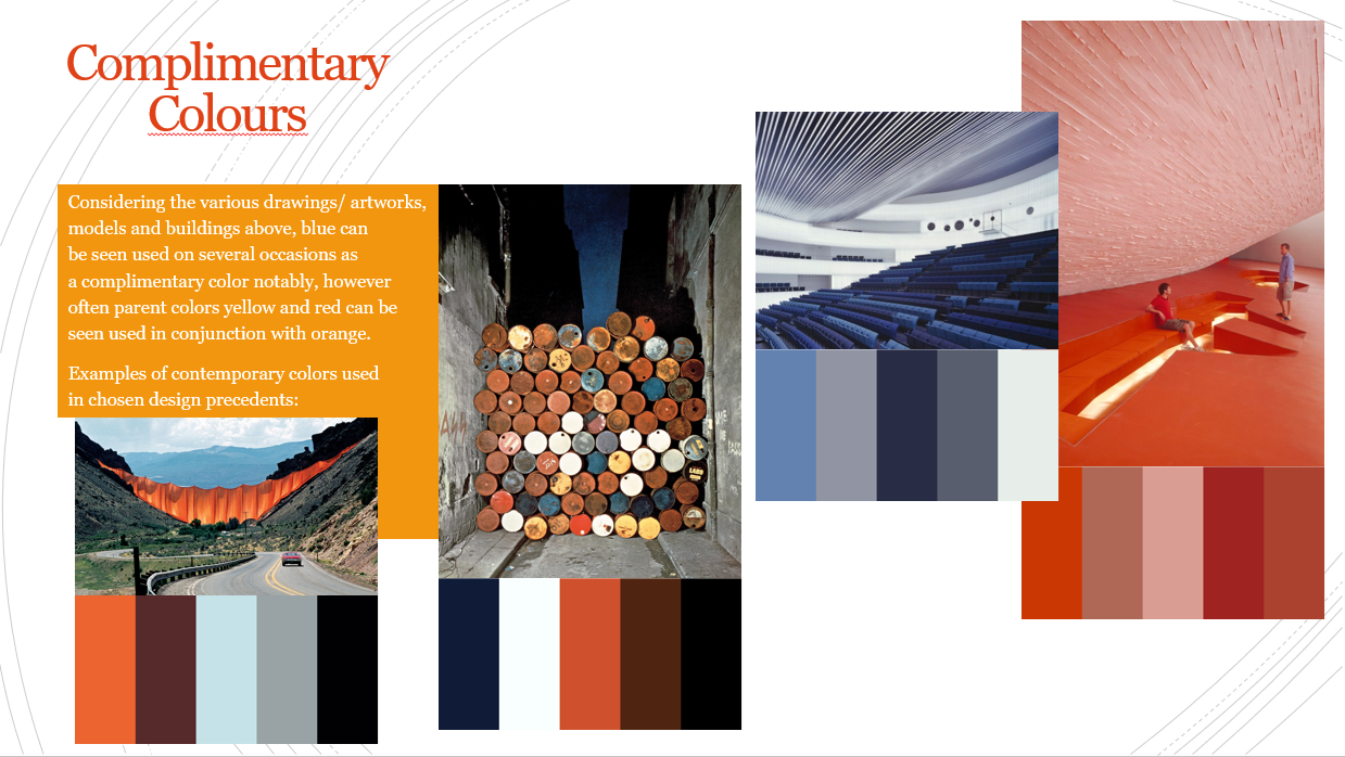
This week we created a group and started on research on the colour Orange. We split the research up into different sections for each of us in the group to work on. My research included the analysis of five key design precedents and their work, the designers/artists theories about colour and its use in terms of space, and also the consideration of complimentary colours.
From my colour collage I made a series of models through a model making exercise.
Below is my first model. This model intersects volumes of colour, light and shadow.
This model explored reflection of image and light. It communicated the need for perspective and a different view in order to see and understand what you are looking for.
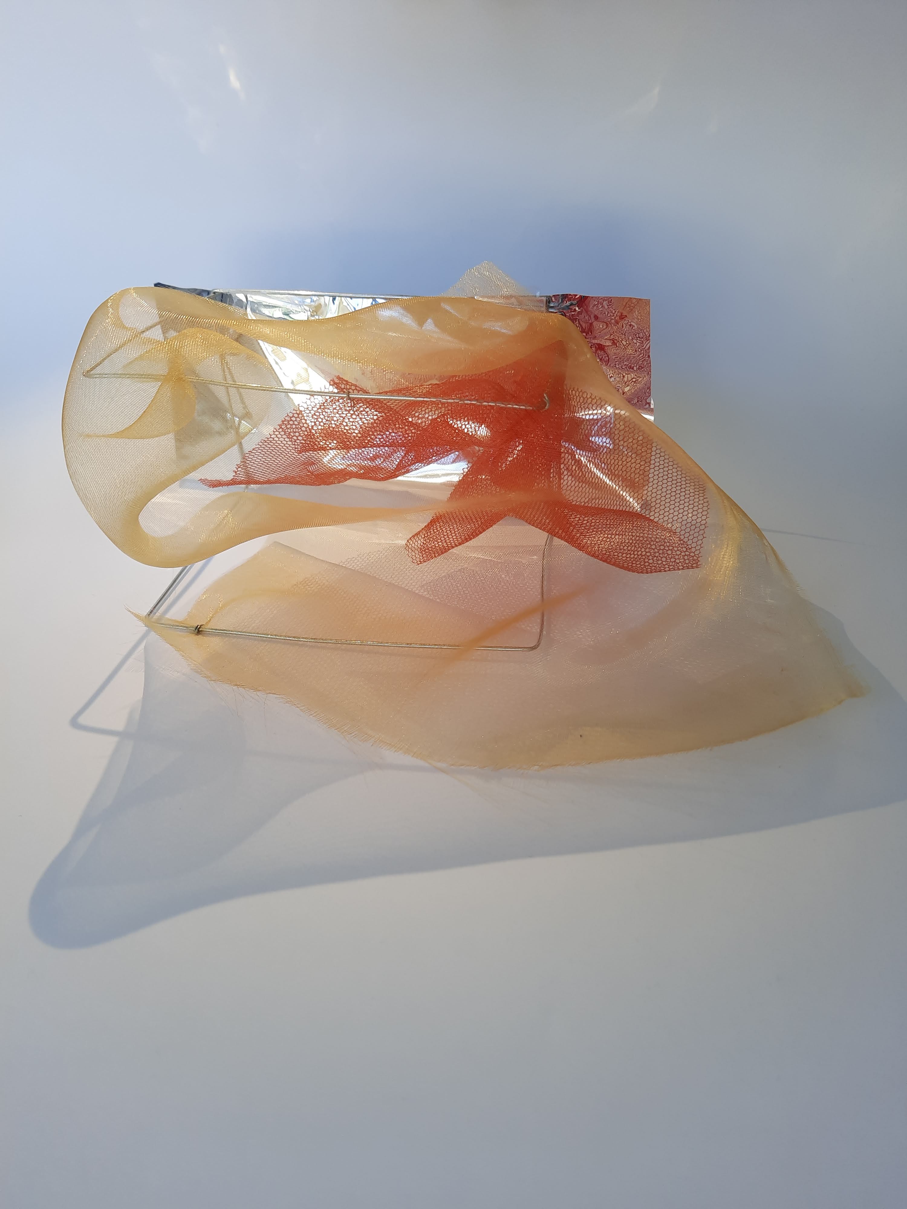
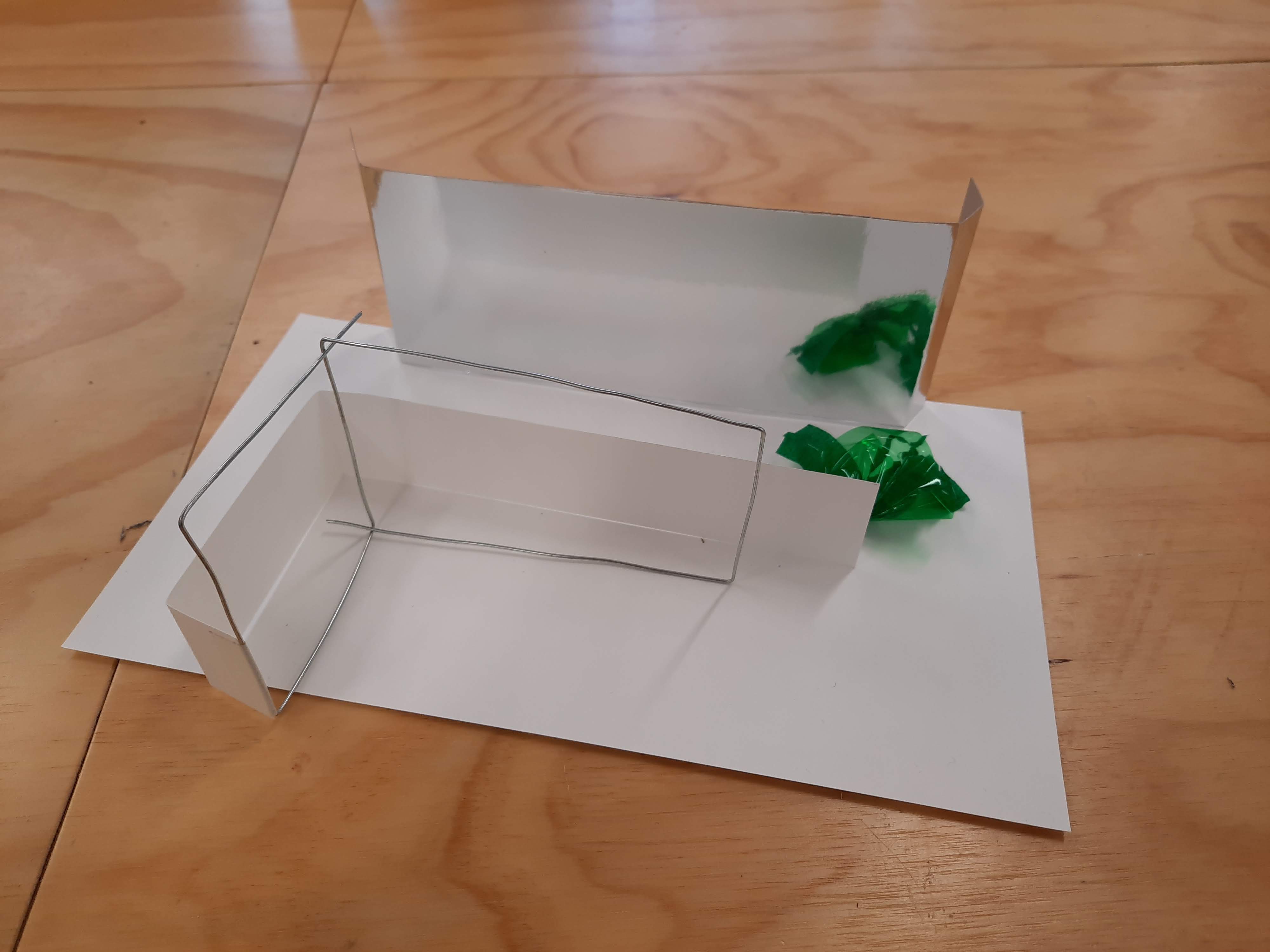
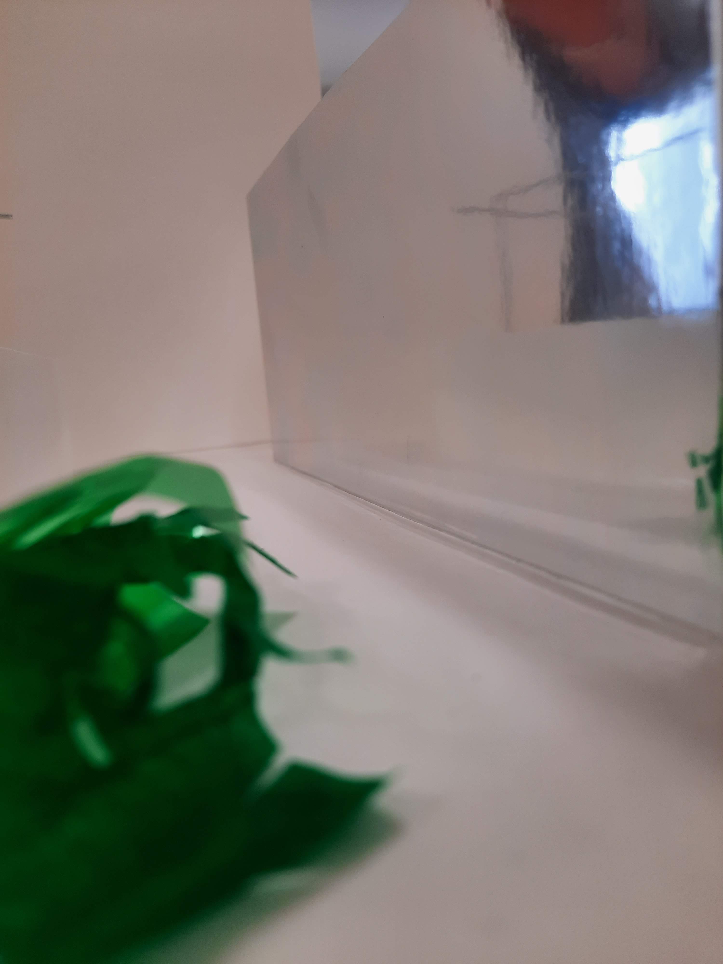
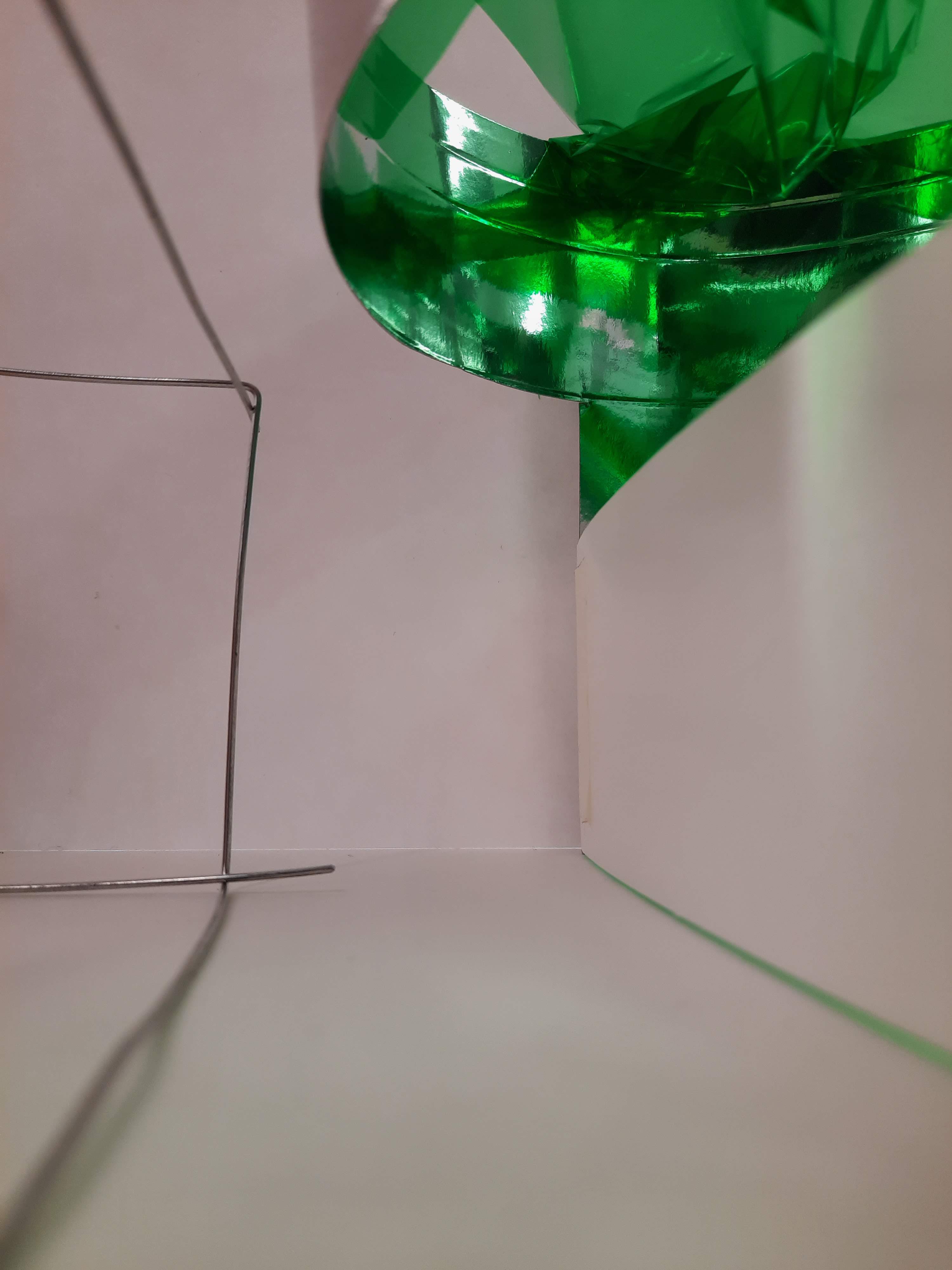
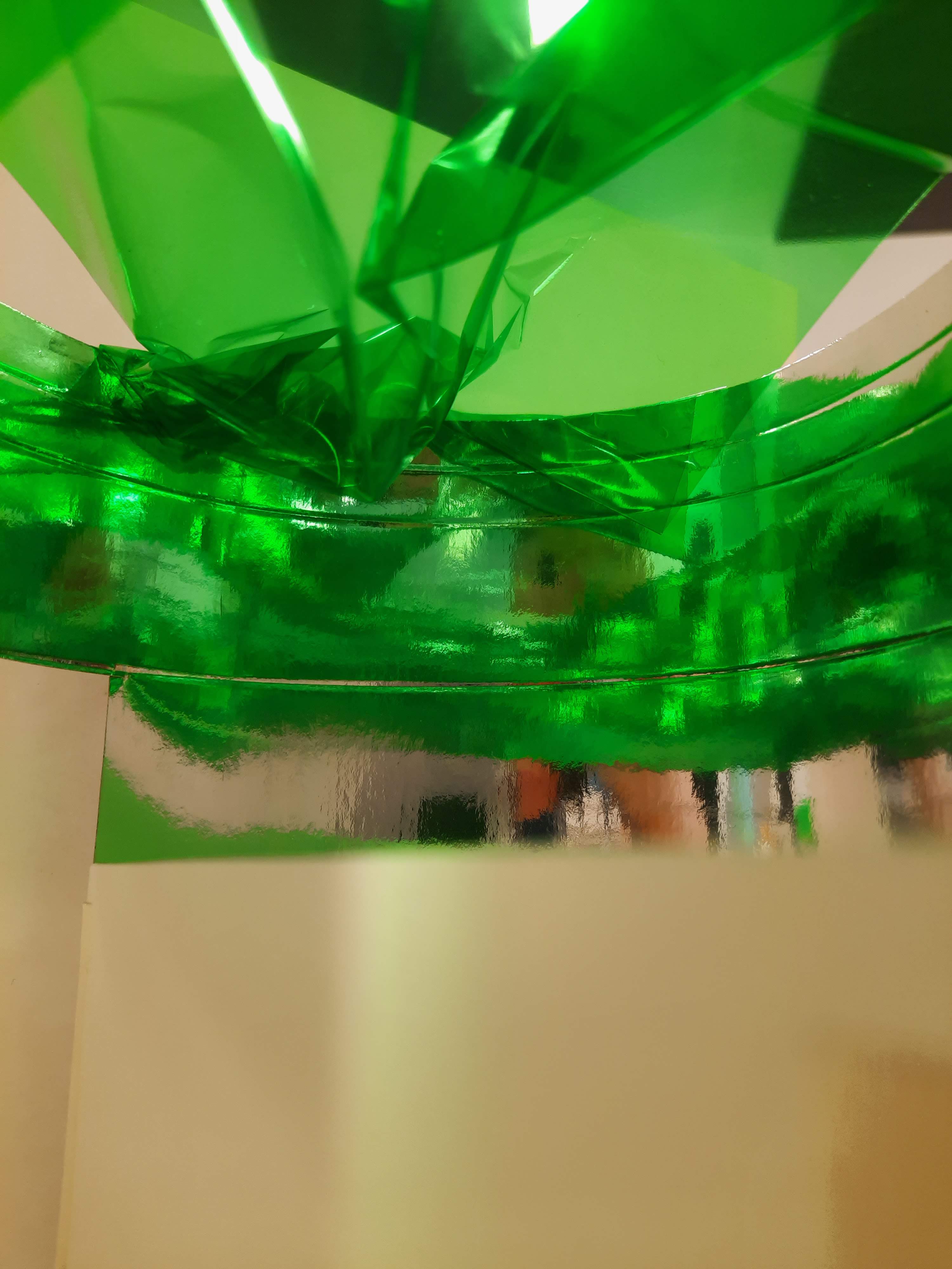
Below is my second model. This model explores surface texture and shadows
This model explores the way that the light travelling through the cellophane is manipulated and projected into the space. The crinkled affect of the cellophane gives the projection layers creating deeper colour in some areas. The reflective card explores the reflection of this projection and the effect it has.
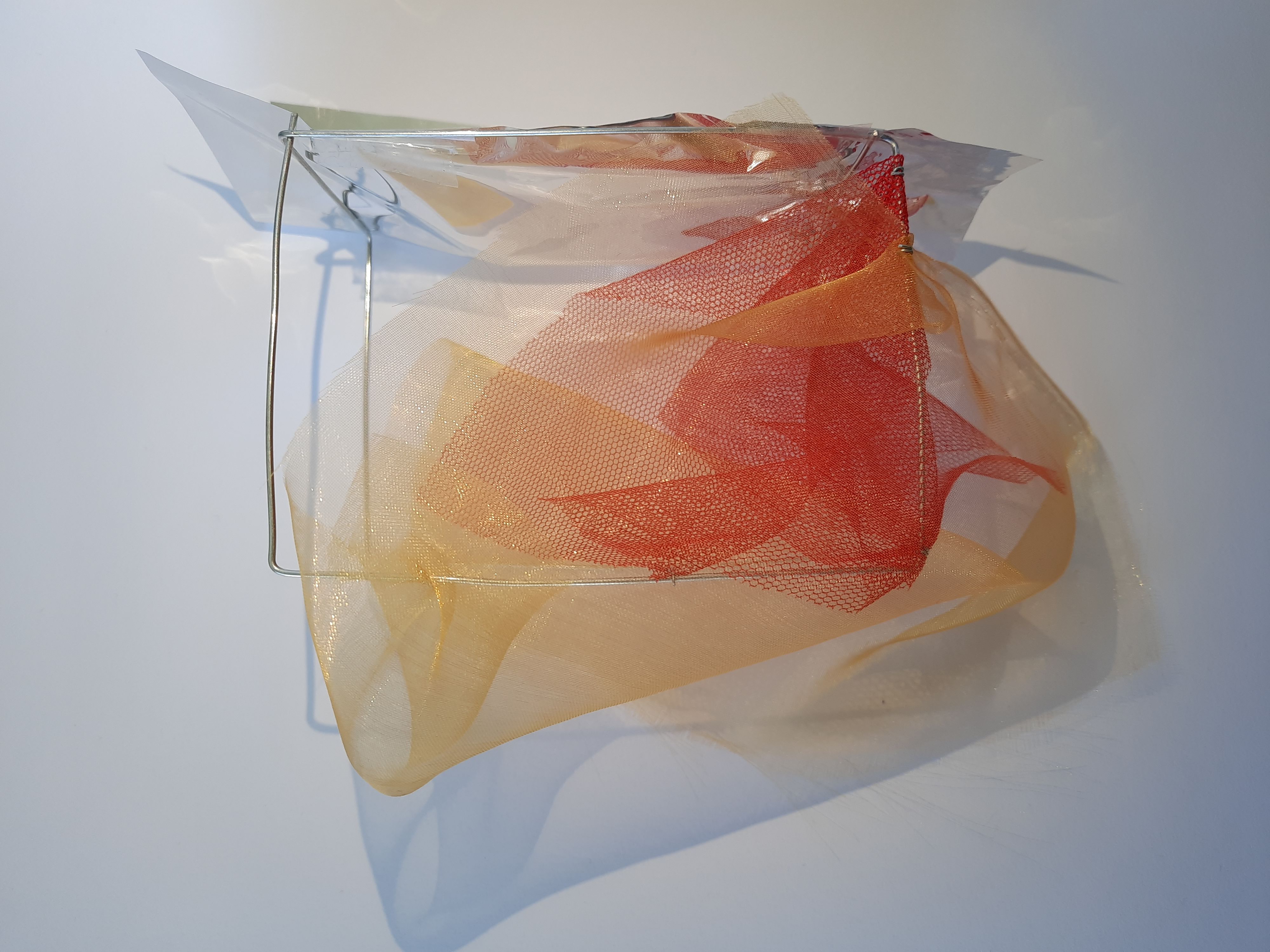
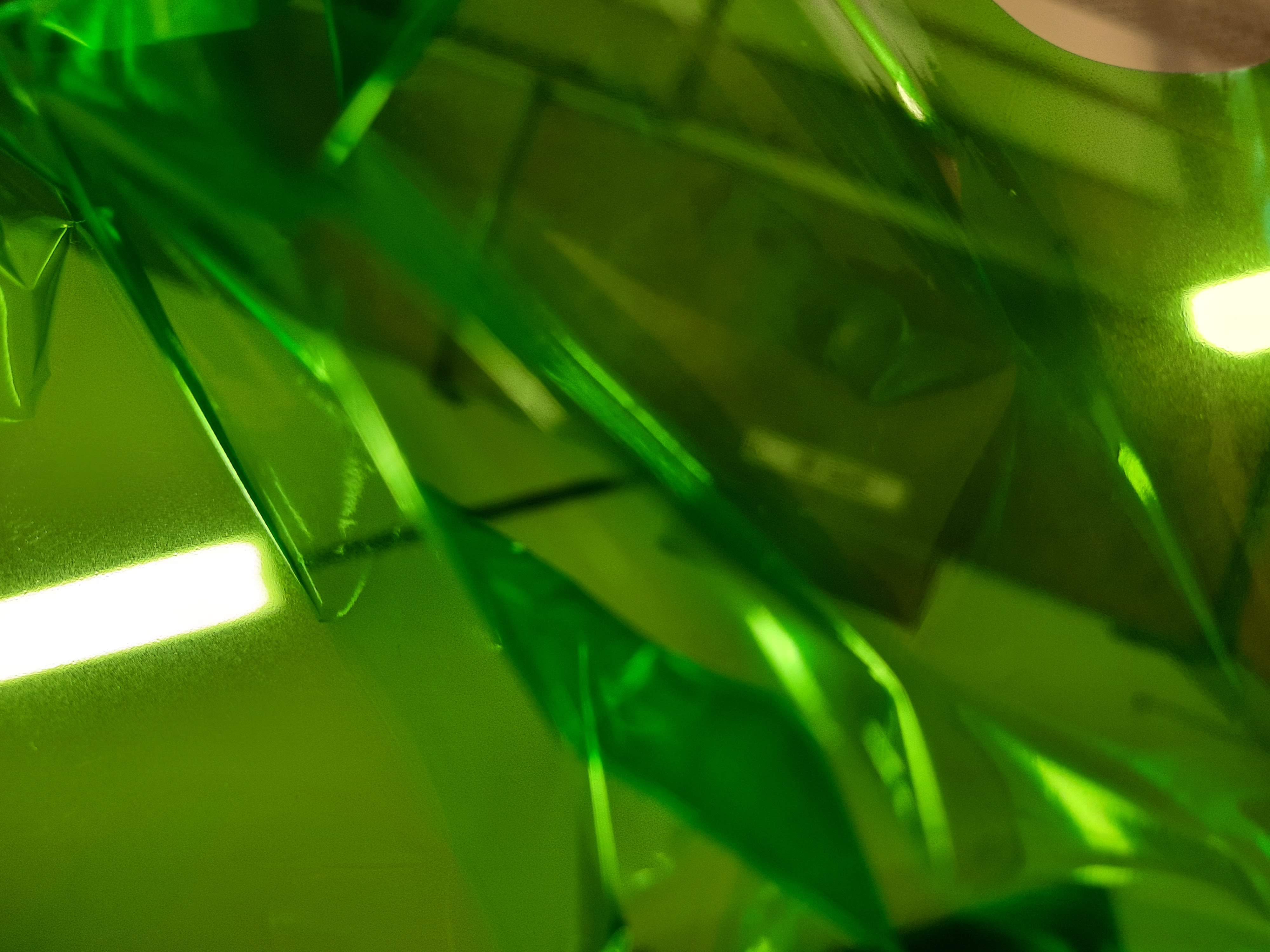
Below is my third model. This model is a connection between my first and second model.
This model explores the filtration of light through the crinkled, layered cellophane as well as the manipulation of image and light through reflection with the curved reflective card. The blocking white card reiterates the need for a changing view, perspective or angle to engage with the full affect of the model.
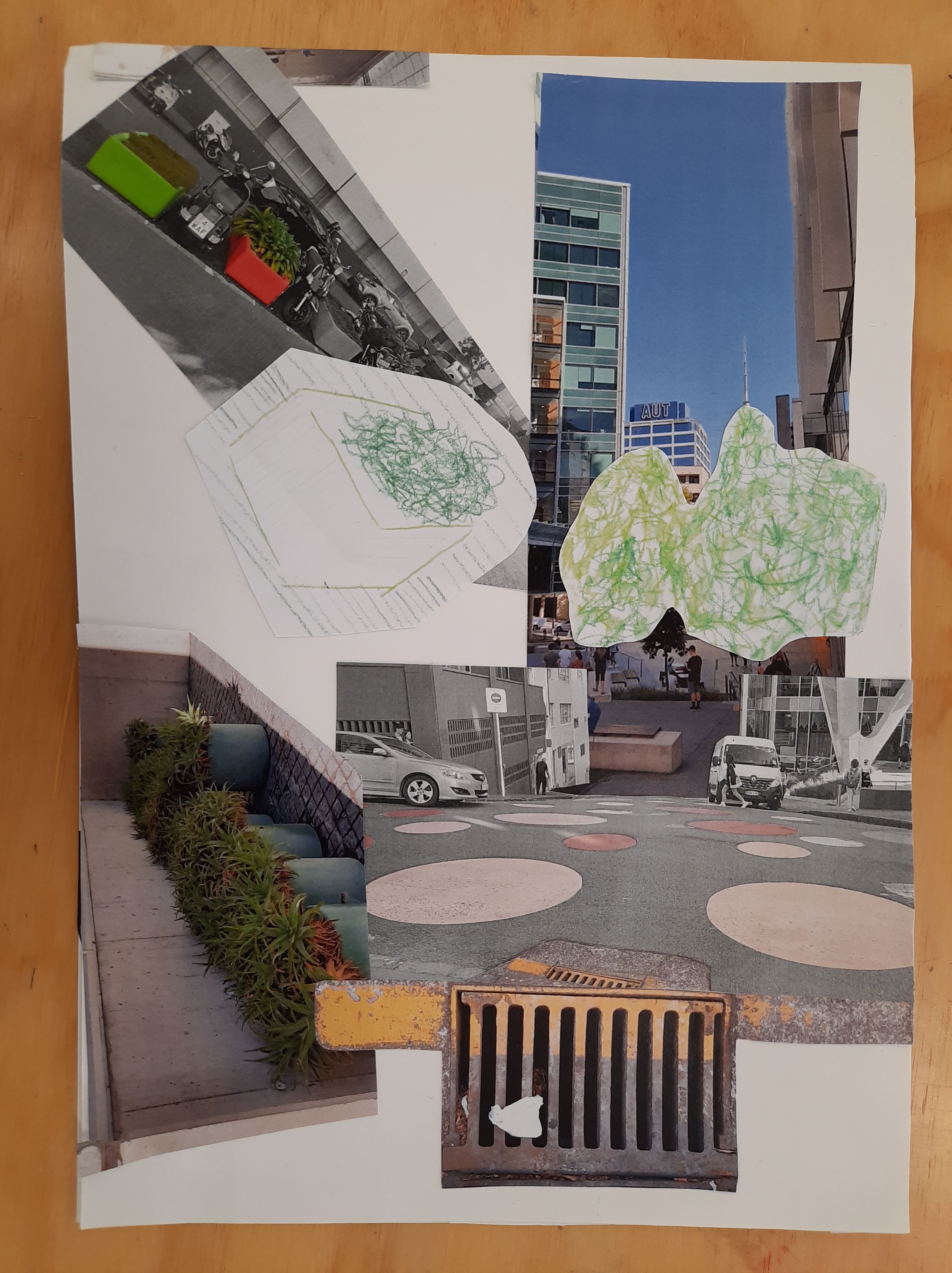
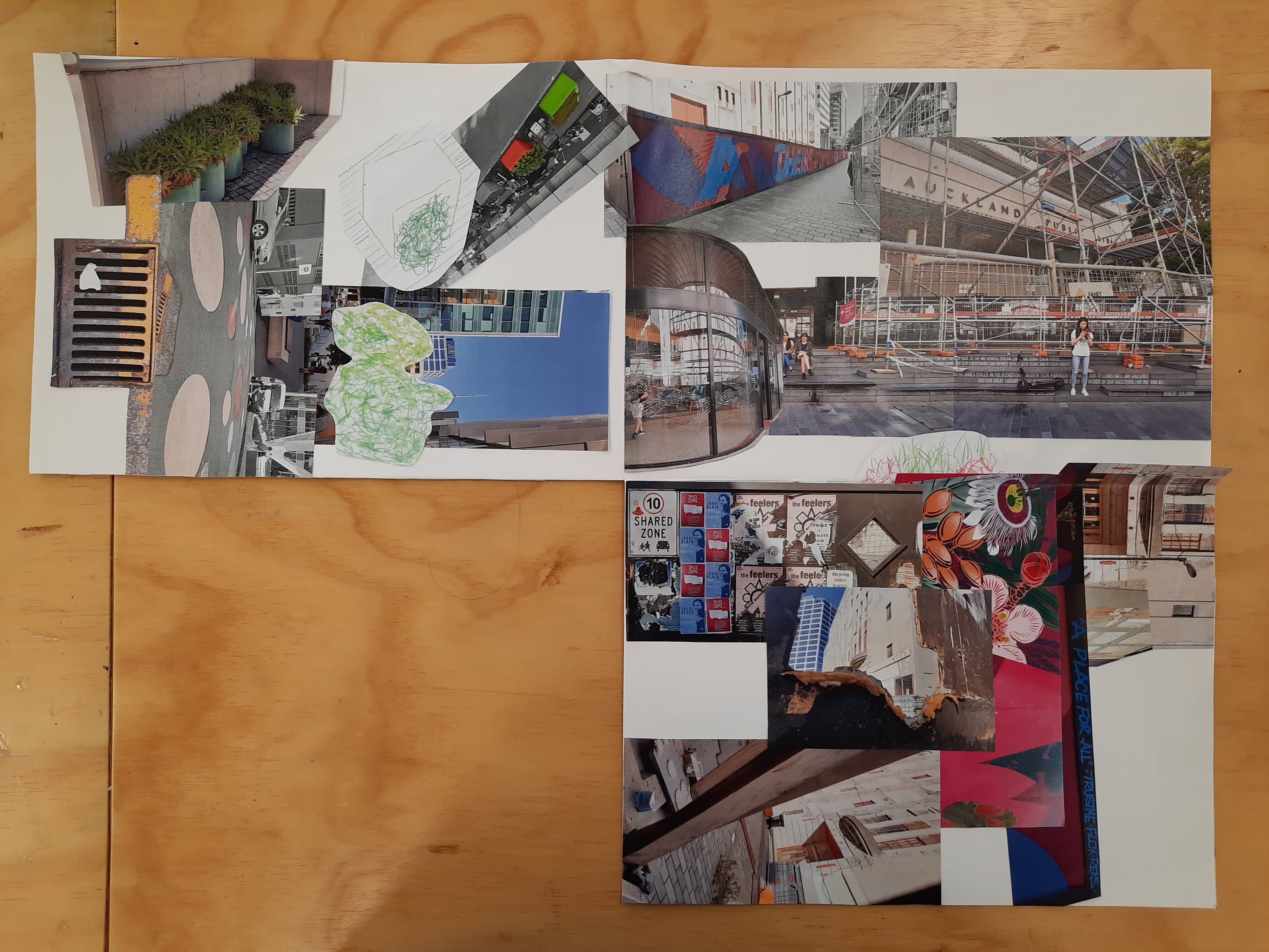
From images i collected while travelling to and exploring the surroundings of the site i created a image collage that exlored how i experienced and interpreted colour throughout the journey.
My exploration and interpretation of colour changed throughout the journey to the site. Because of this, I wanted to create a chronological order of images to display my process of thought. The reason why I created the collage to unfold is to iterate my changing perspective and view on colour. It also related to my experience of not knowing the site or where it was located until being showed it and knowing I walk past it on my way to uni everyday. The unfolding motion communicates the way that I didn’t know what was going to be around the corner.
This week we walked down to the St James Theater from our studio and explored its surroundings. Throughout the walk I recorded my observations and interpretation of colour and how it was applied to and expressed in the environment. Below are some drawings and photos I took.
These were some coloured sketches I took just outside of our Studio. I wanted to express the fluidity of the natural colours such as the plants through organic lines and the rigidness of the surrounding artificial city environment with straight lines. I started out with exploring color through its source and how I would portray this visually.
With these photographs I looked further at the contrast of ‘natural’ and ‘unnatural’ colour and also the vibrancy, impact and presence of applied colour through paint and how it interacts with its surroundings. I feel like when we talk about colour in terms of a space, we automatically consider applied colour. Although it was interesting to document and observe this colour within my surroundings, in terms of the project, I wanted to take a different approach to colour; not in the immediate response to colour.
As a traveled through campus and towards the site, I noticed the interesting shadows cast by the late morning sun, I found the shadows to be a describe-less and disregarded sense of colour that always exists within our surroundings and environment, is manipulated, altered and dependent and goes unnoticed as colour in the ‘normal’ sense.
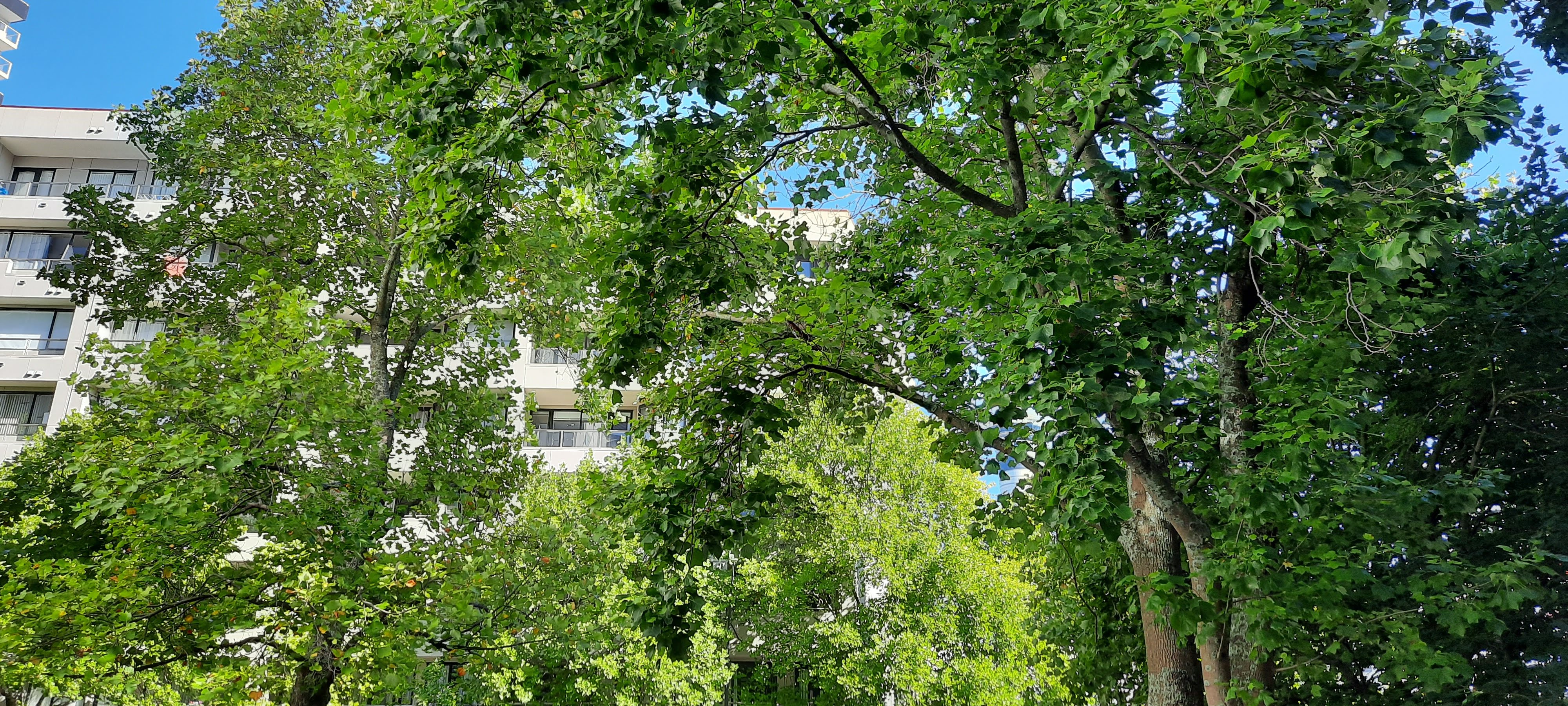
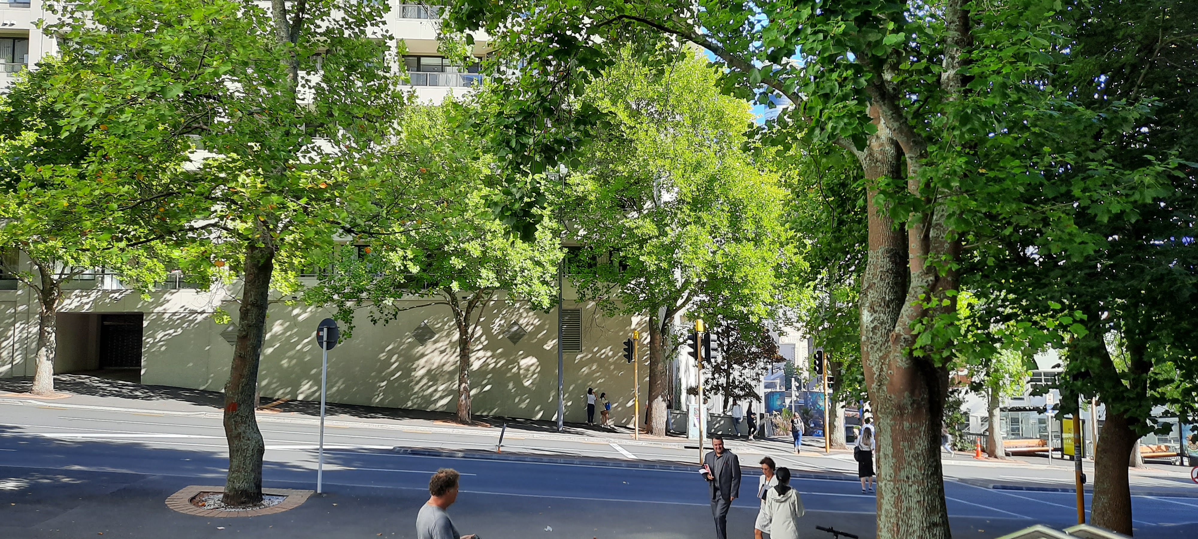
As I moved down the hill closer to Mayoral Dr, I was able to study the trees I had previously captured in a sketch closer. I was fascinated with the way the light was filtrated through the tree giving a variety of tone and depth through the leaves. The slight transparency of the leaves allowed the natural light to organically drip through the density of the trees.
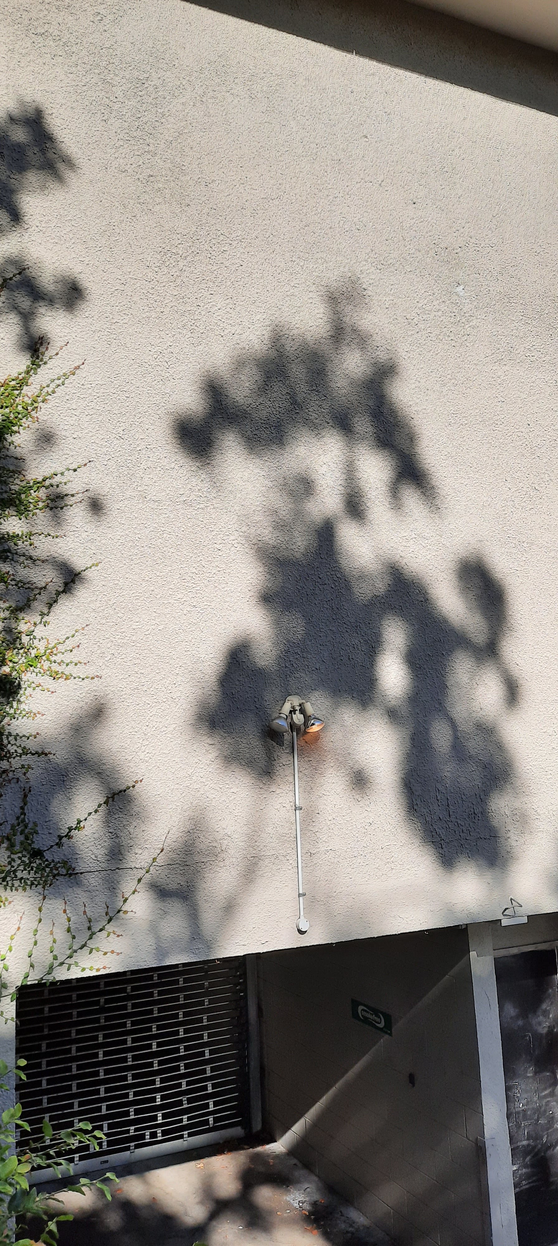
As I crossed the road, I noticed the shadows cast by the trees stretched across the walls of surrounding buildings and the concrete pathways. I yet again found this organic projection interesting. Not only its dependency on its surrounding environment but also the gentle and soft movement of the colour.
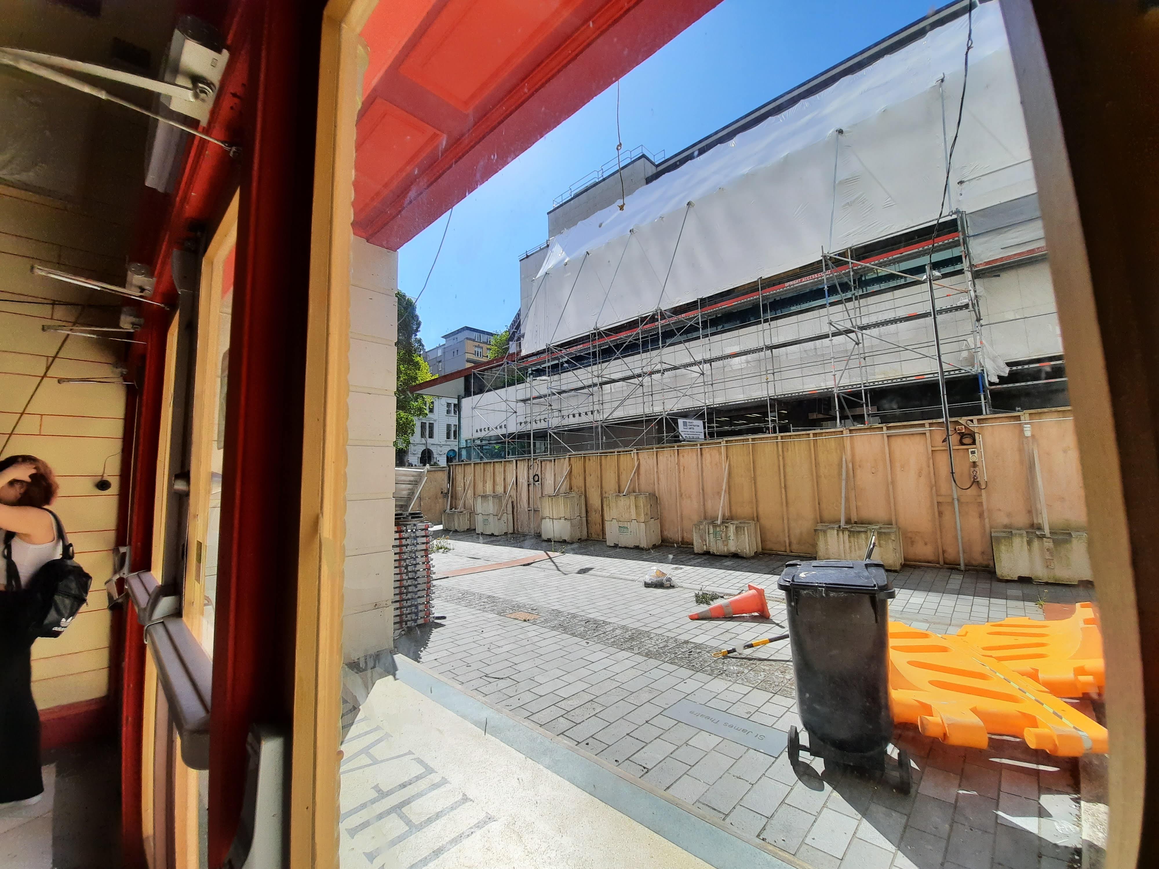
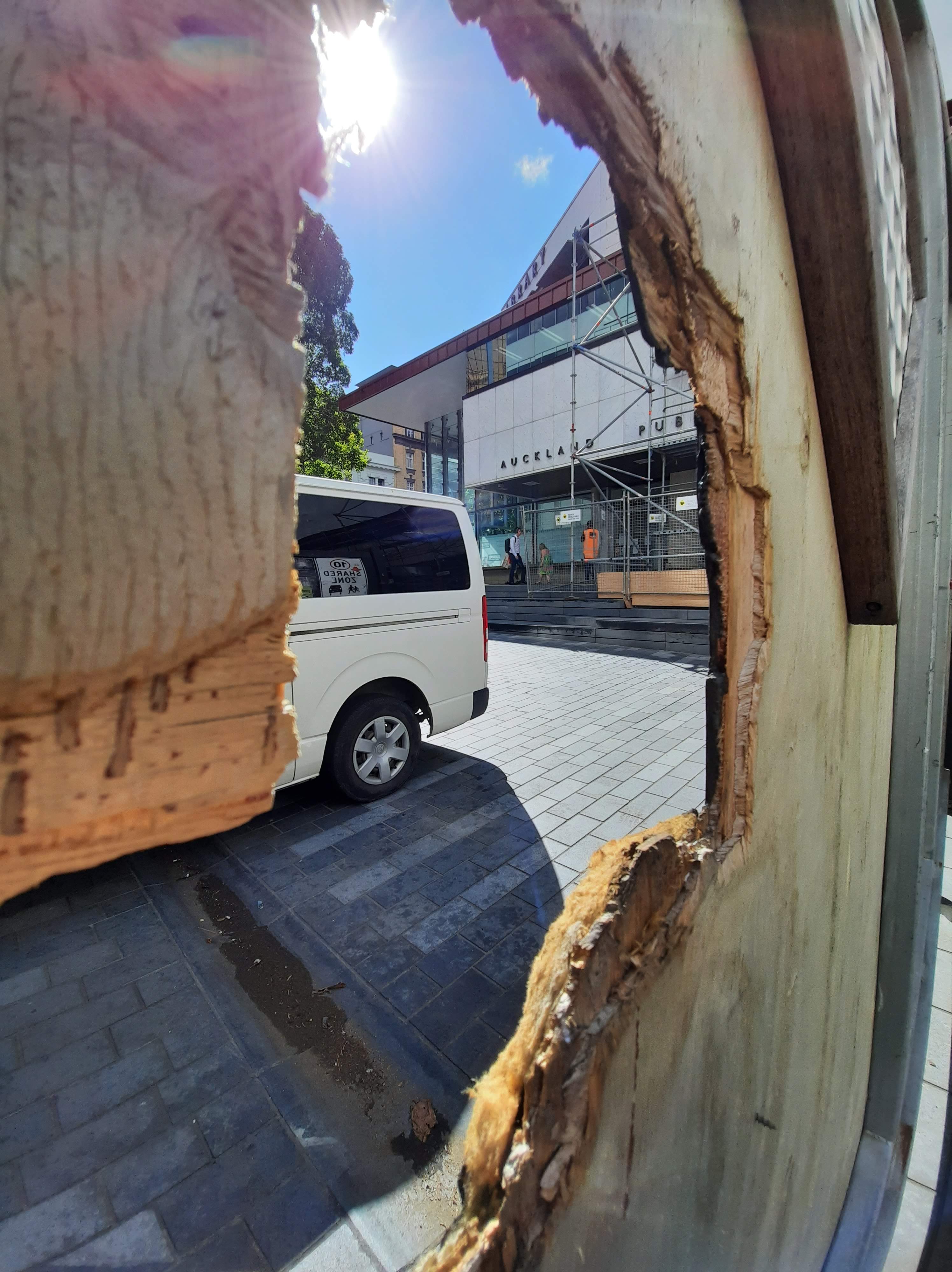
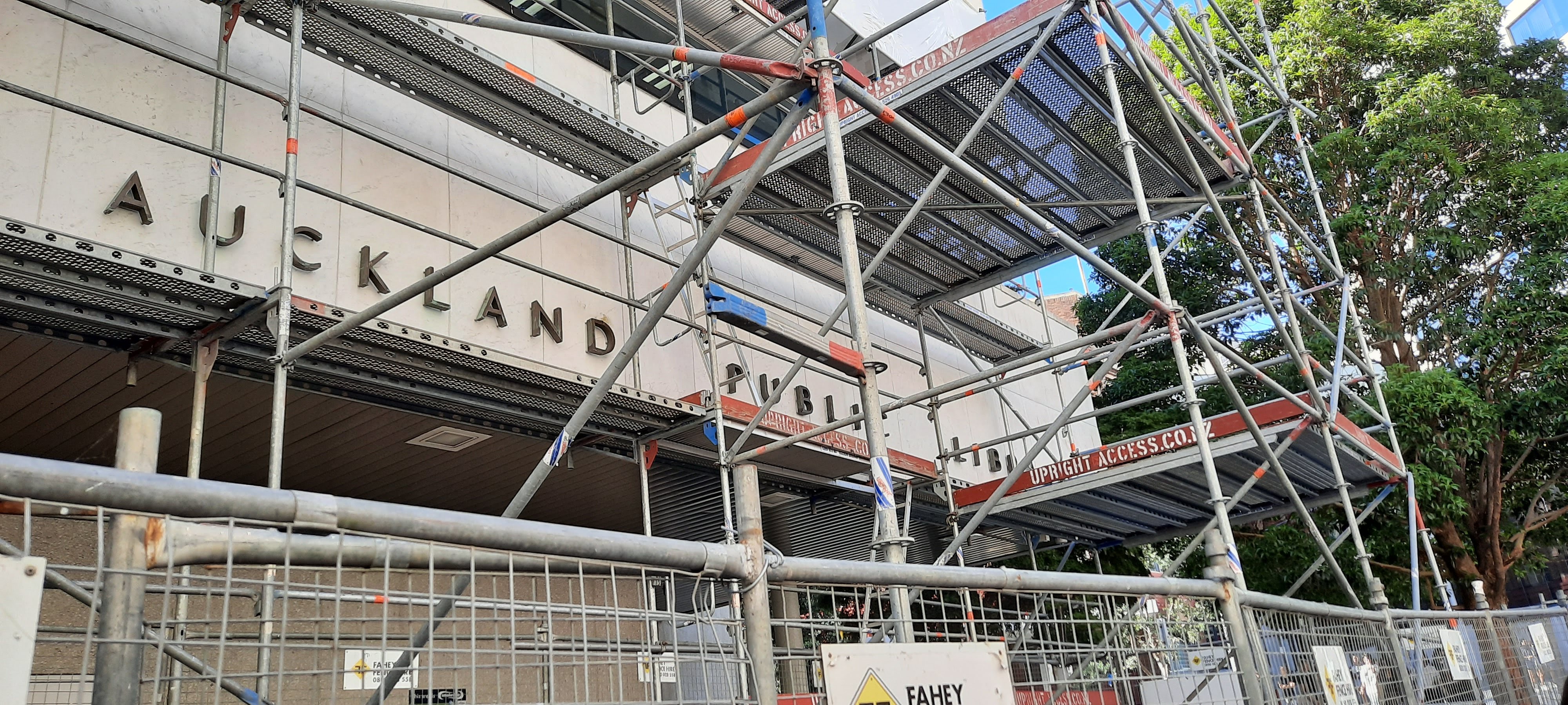
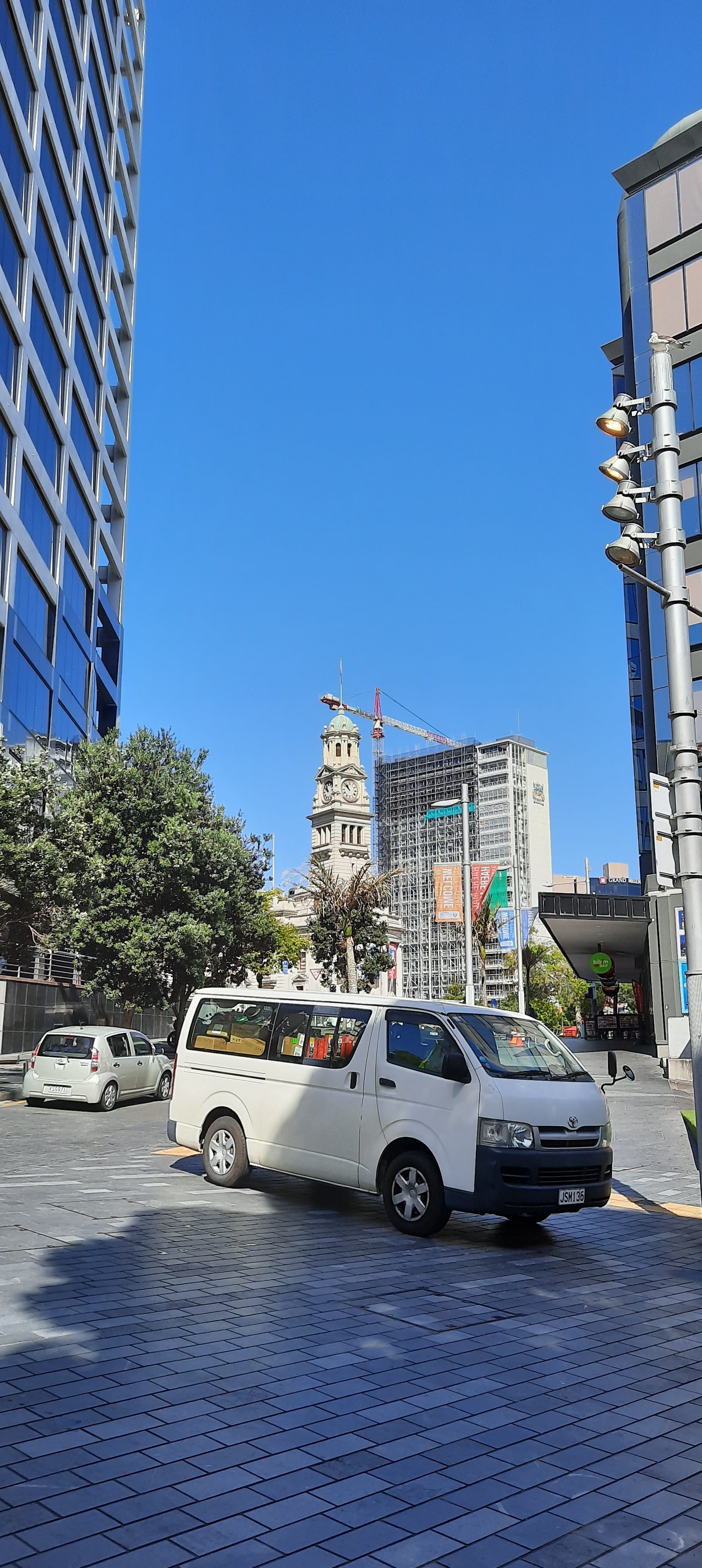
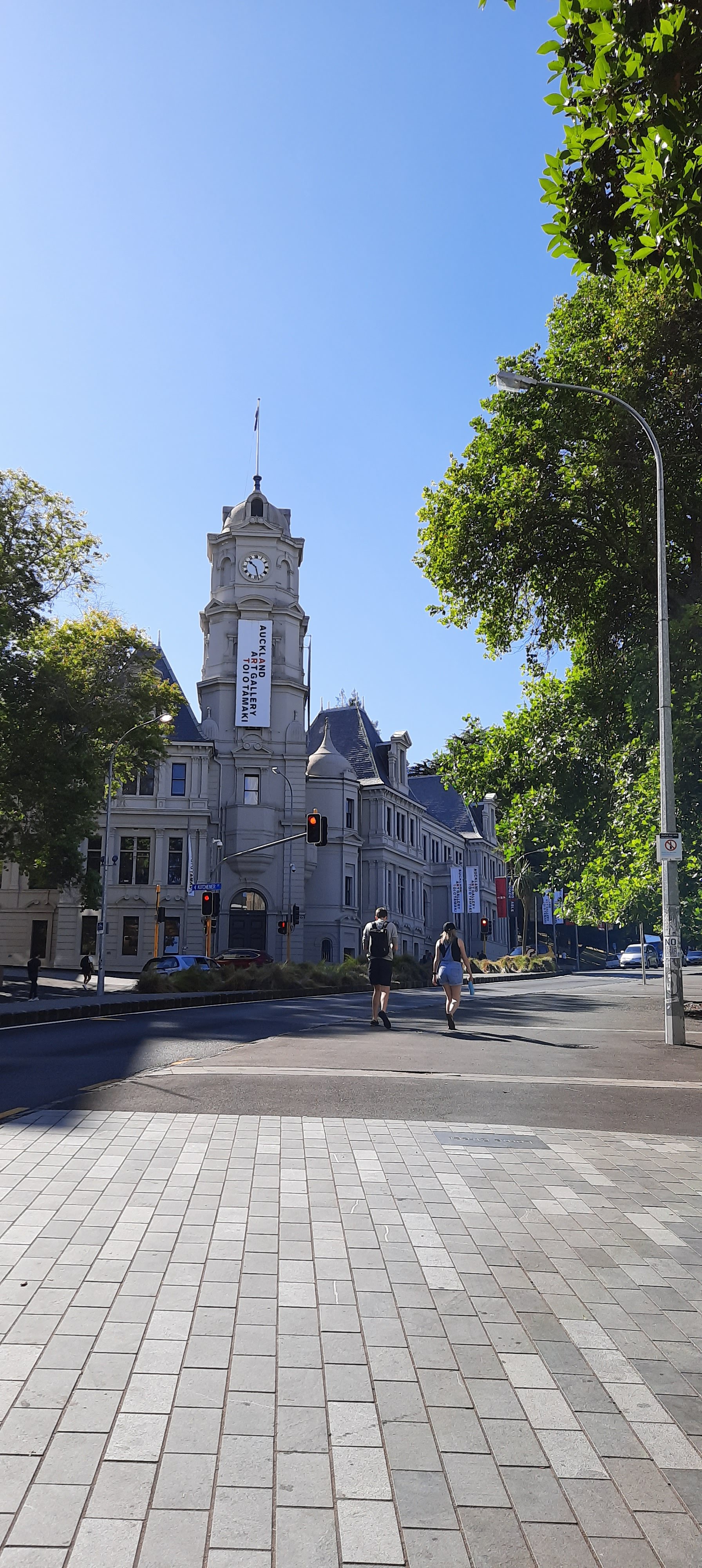
I made my way towards the site and noticed the sunlight reflection from the opposite building projected on the side of the Auckland Library. I found this projection very effective, although possibly not intention. The manipulation of the natural light casting pattern onto the building really intrigues me to look further into the light, shadow and reflection as a way of applying colour.
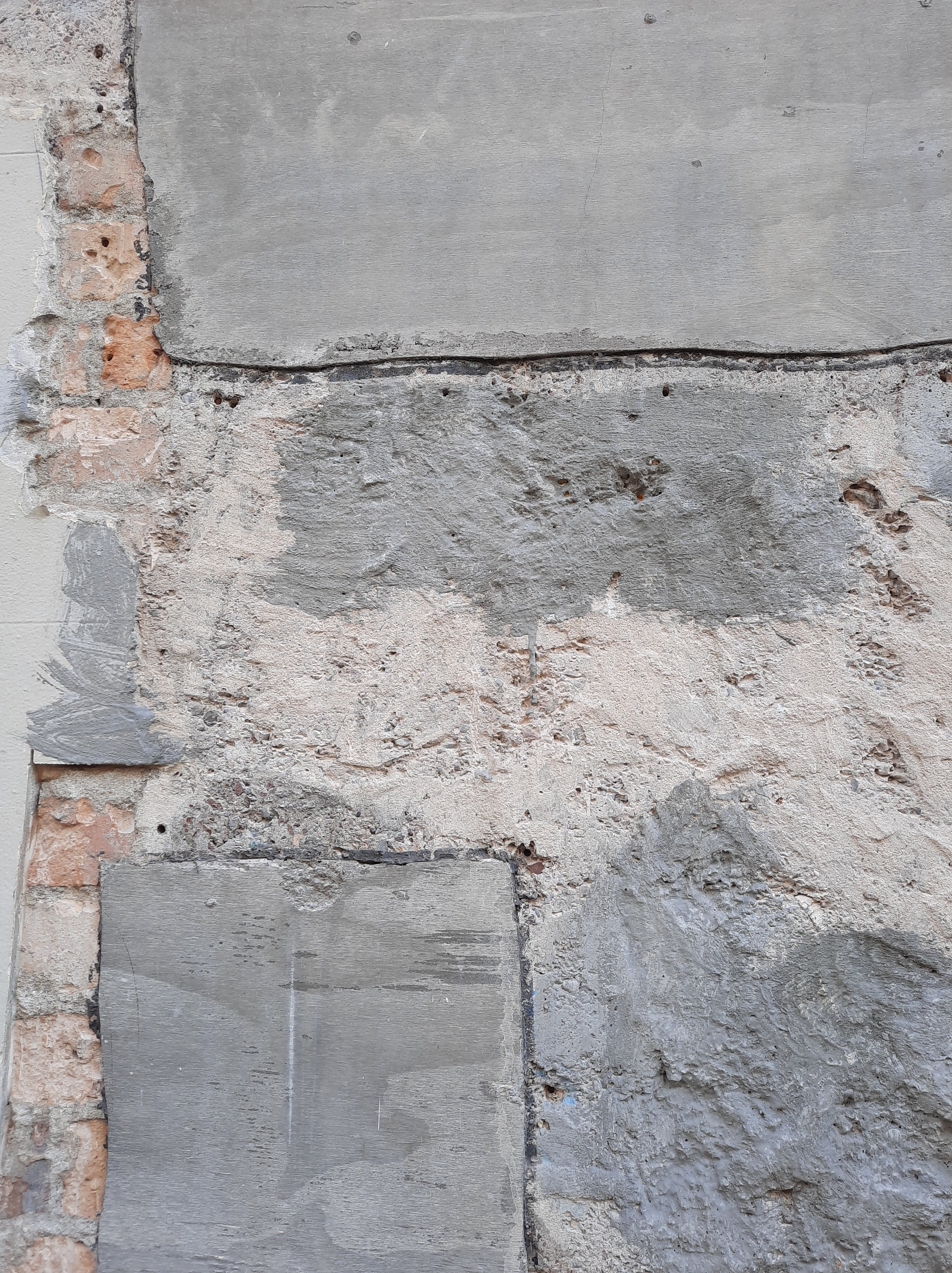
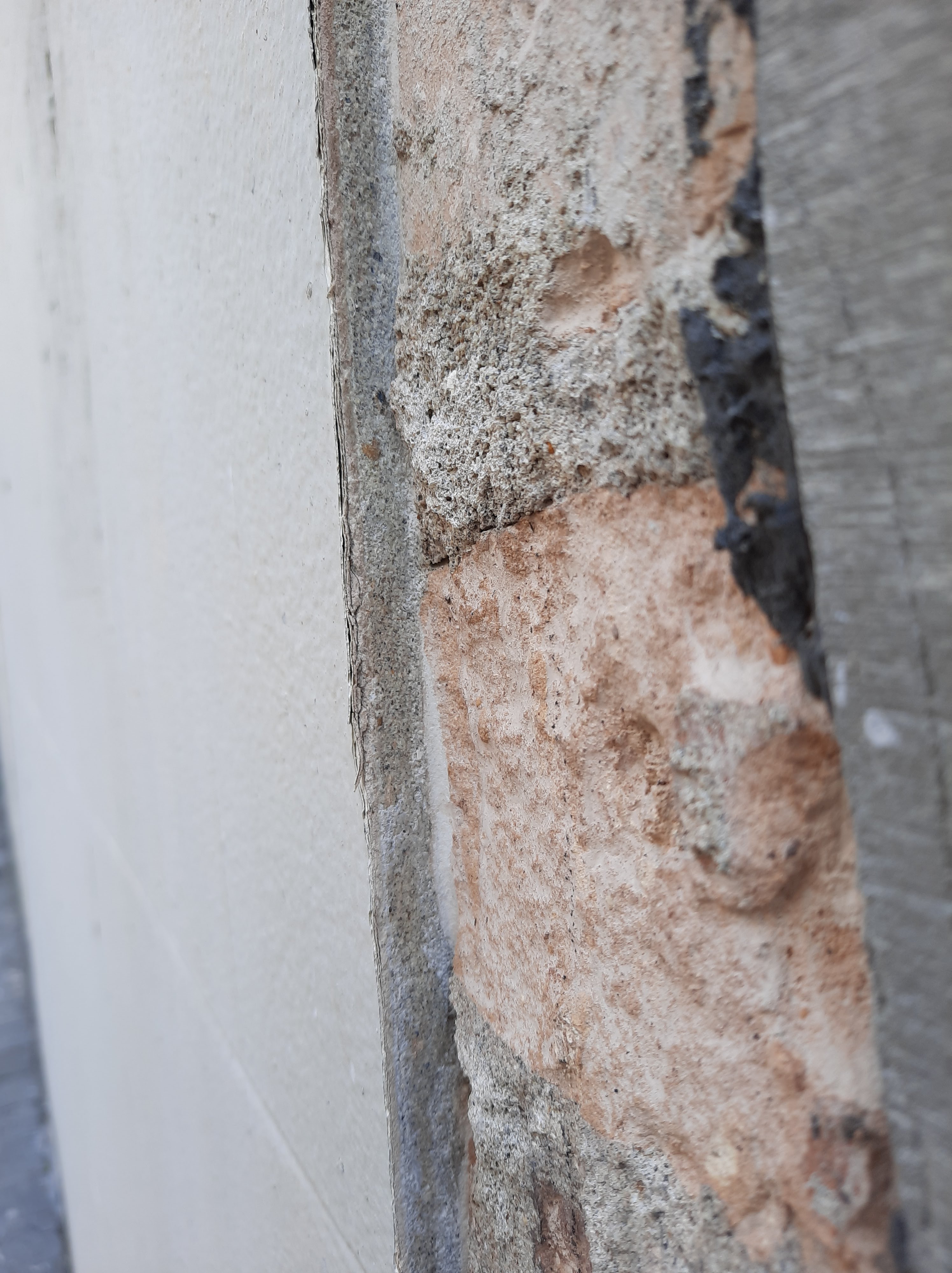
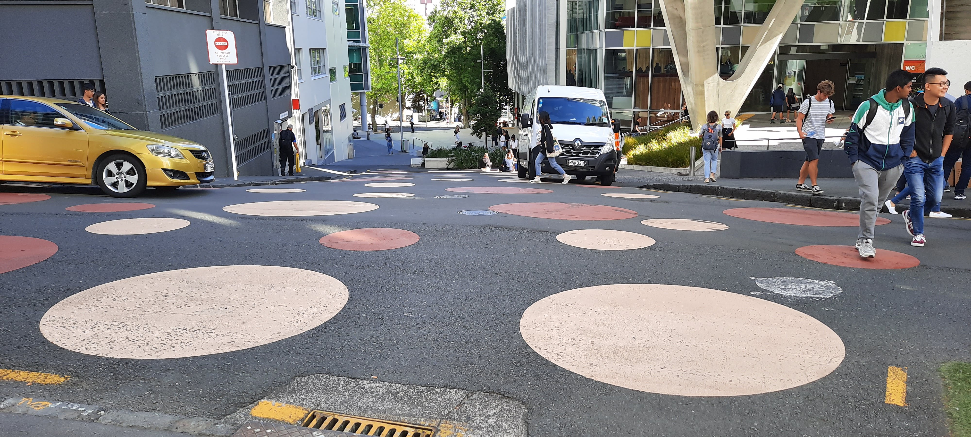
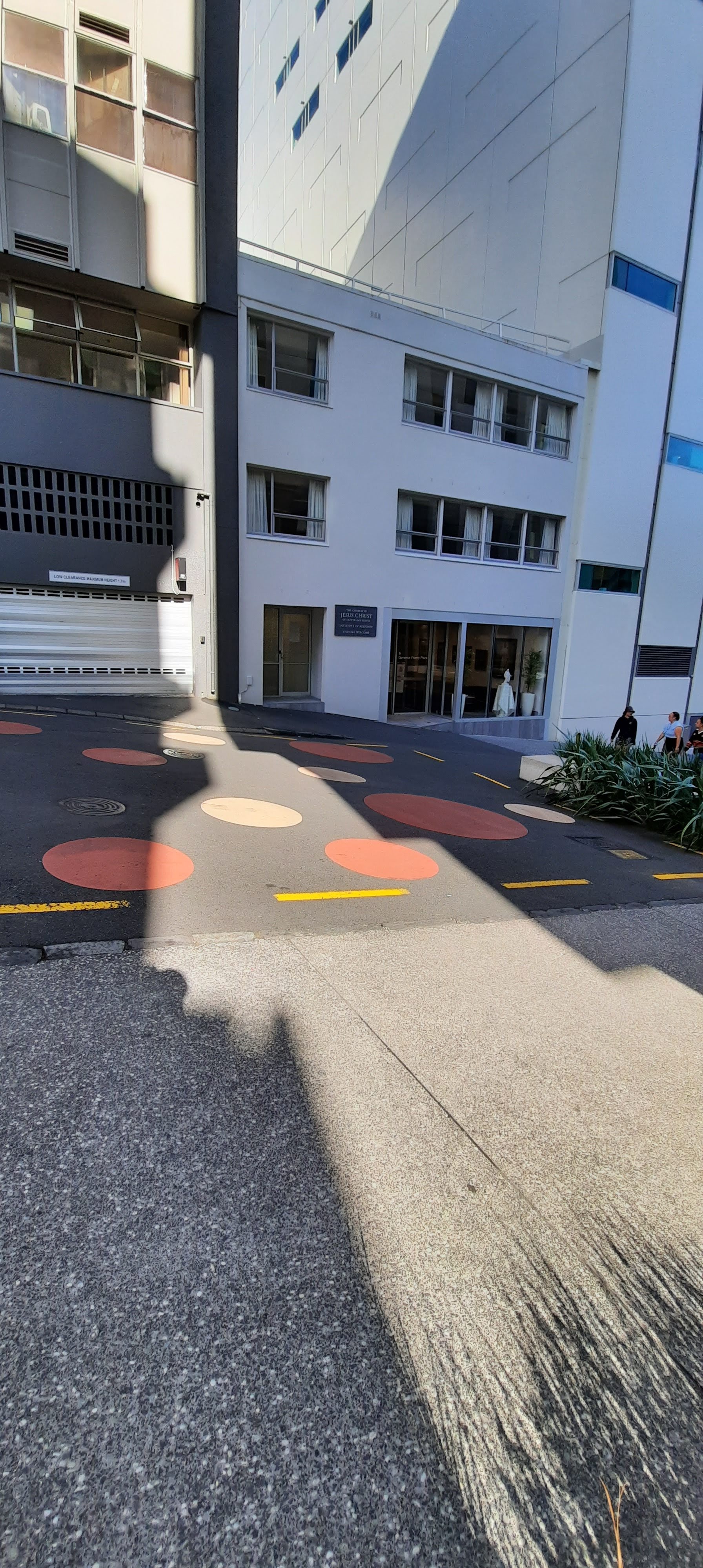
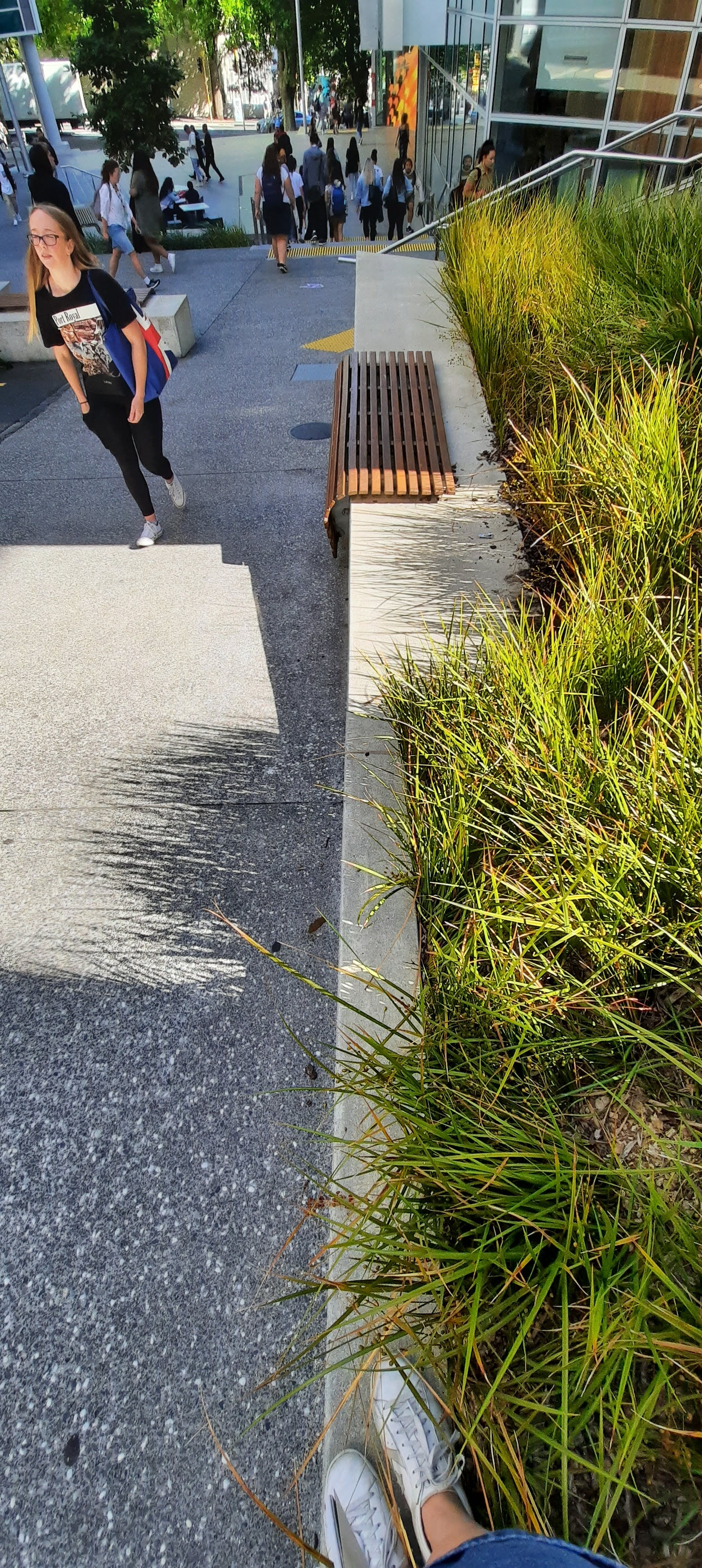
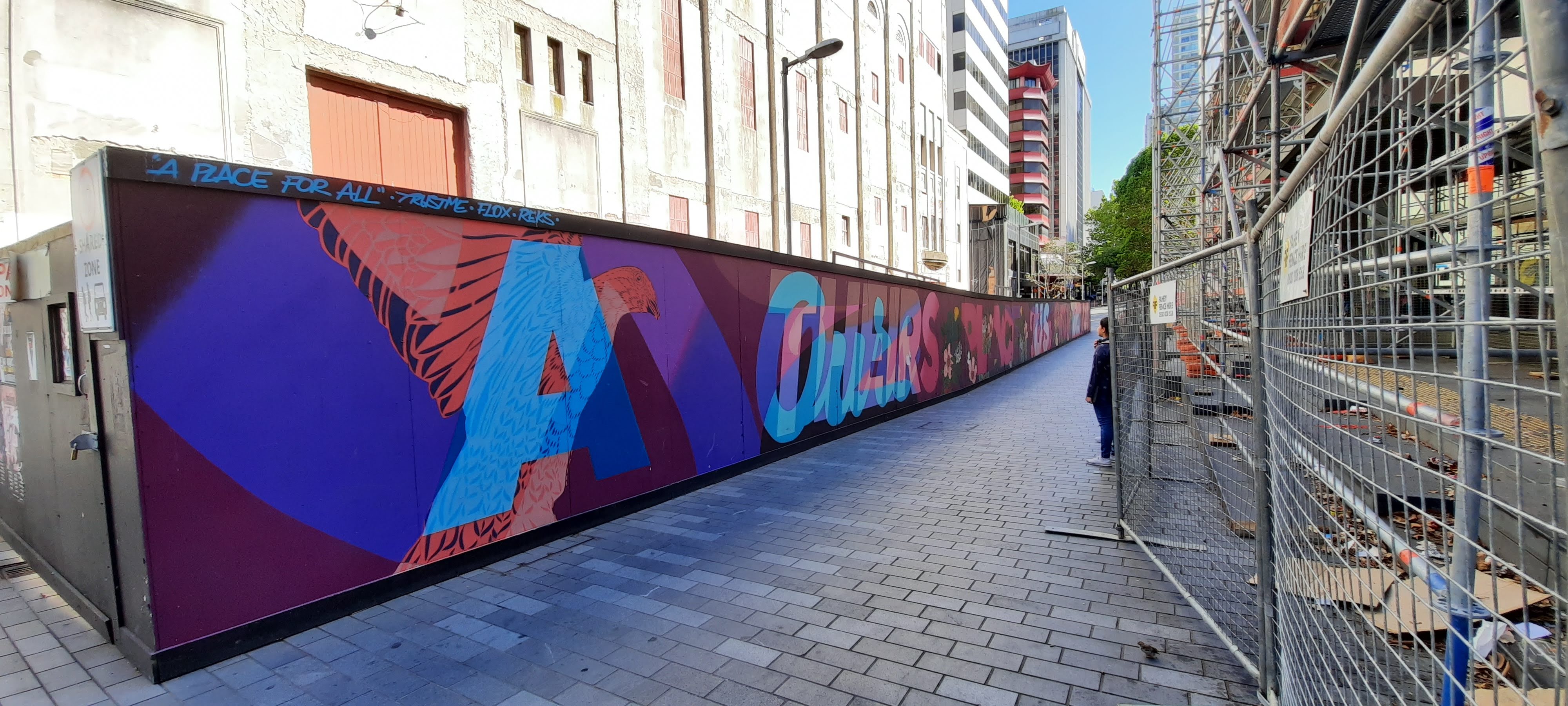
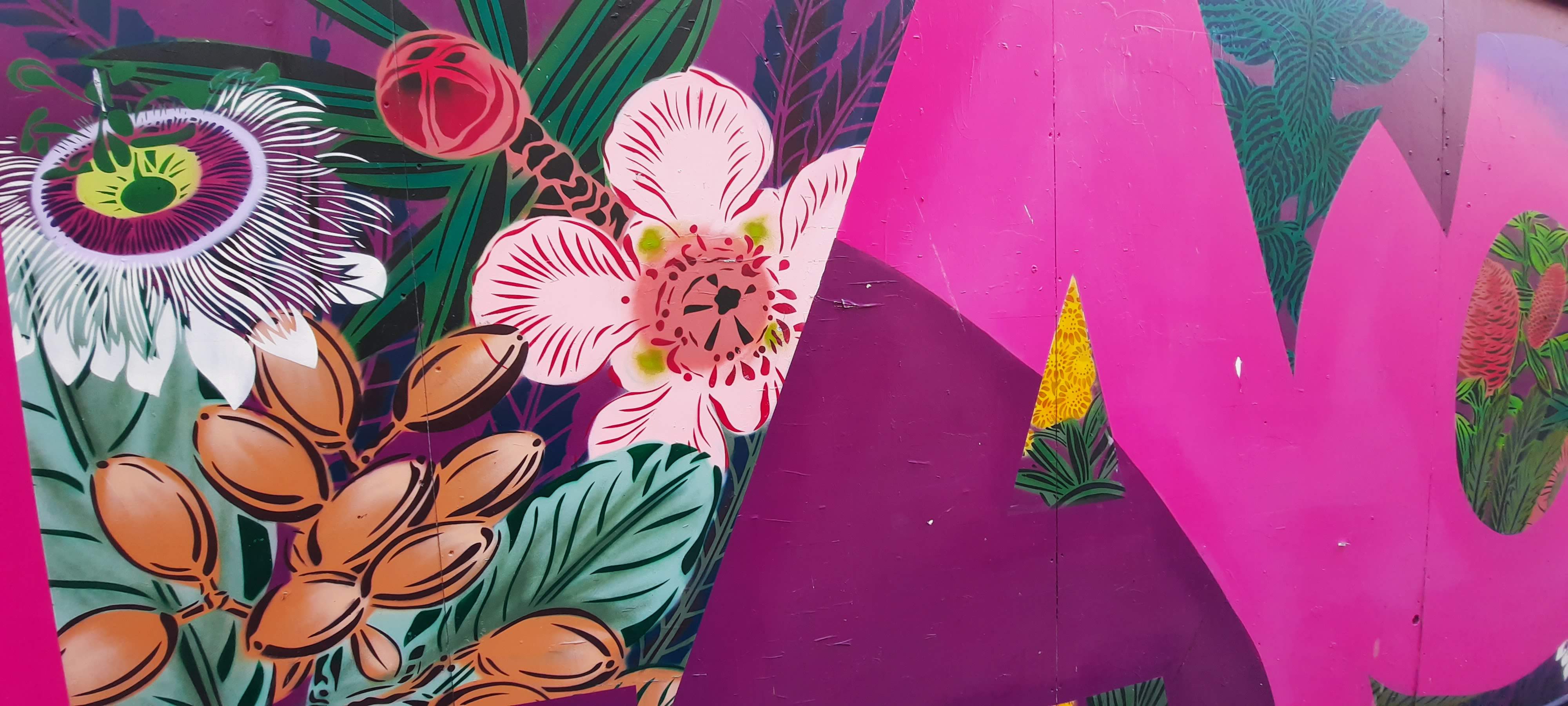
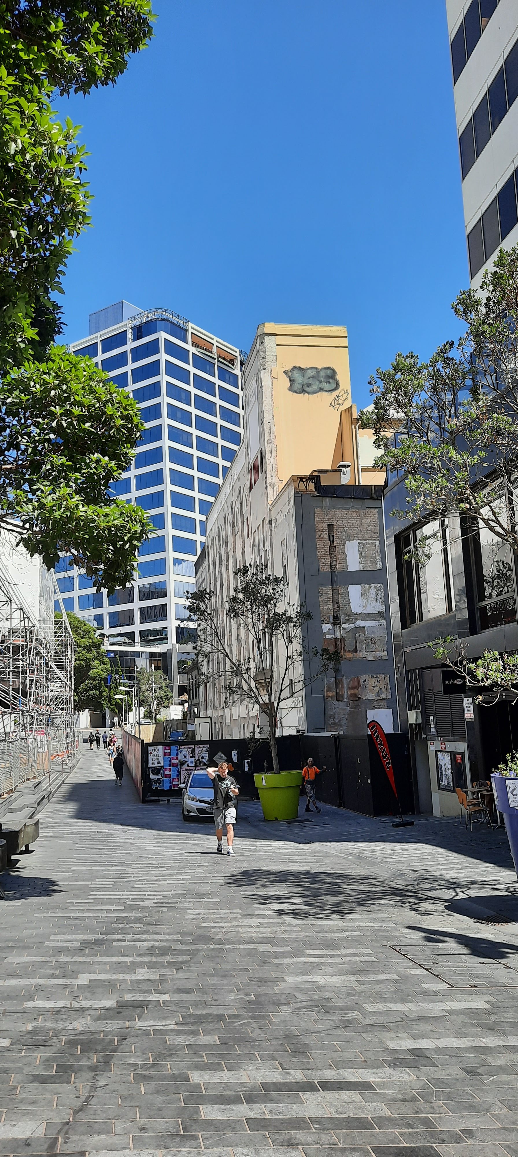
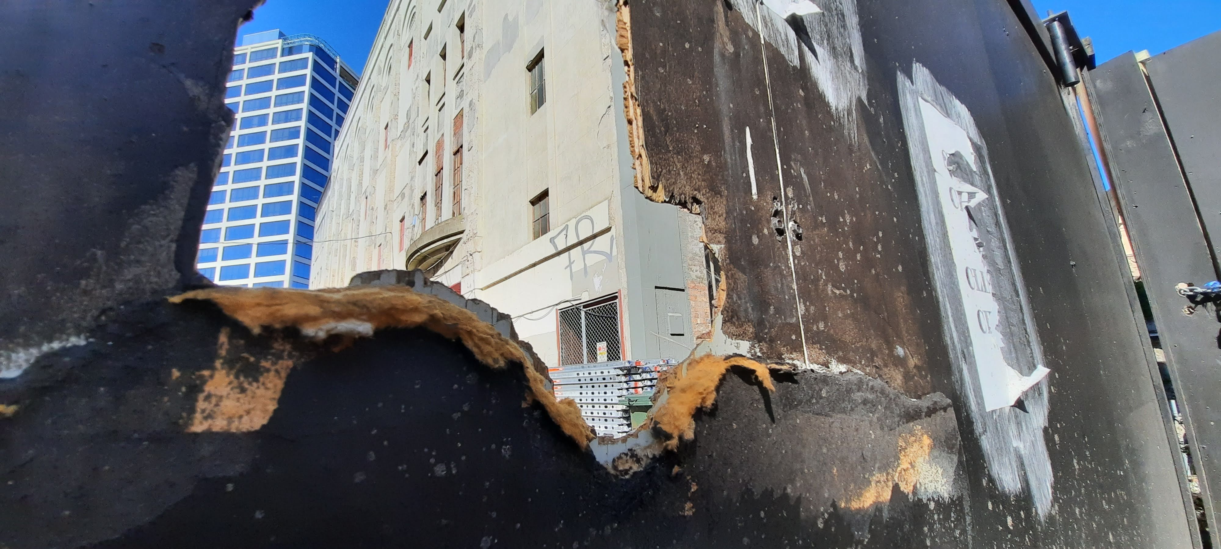
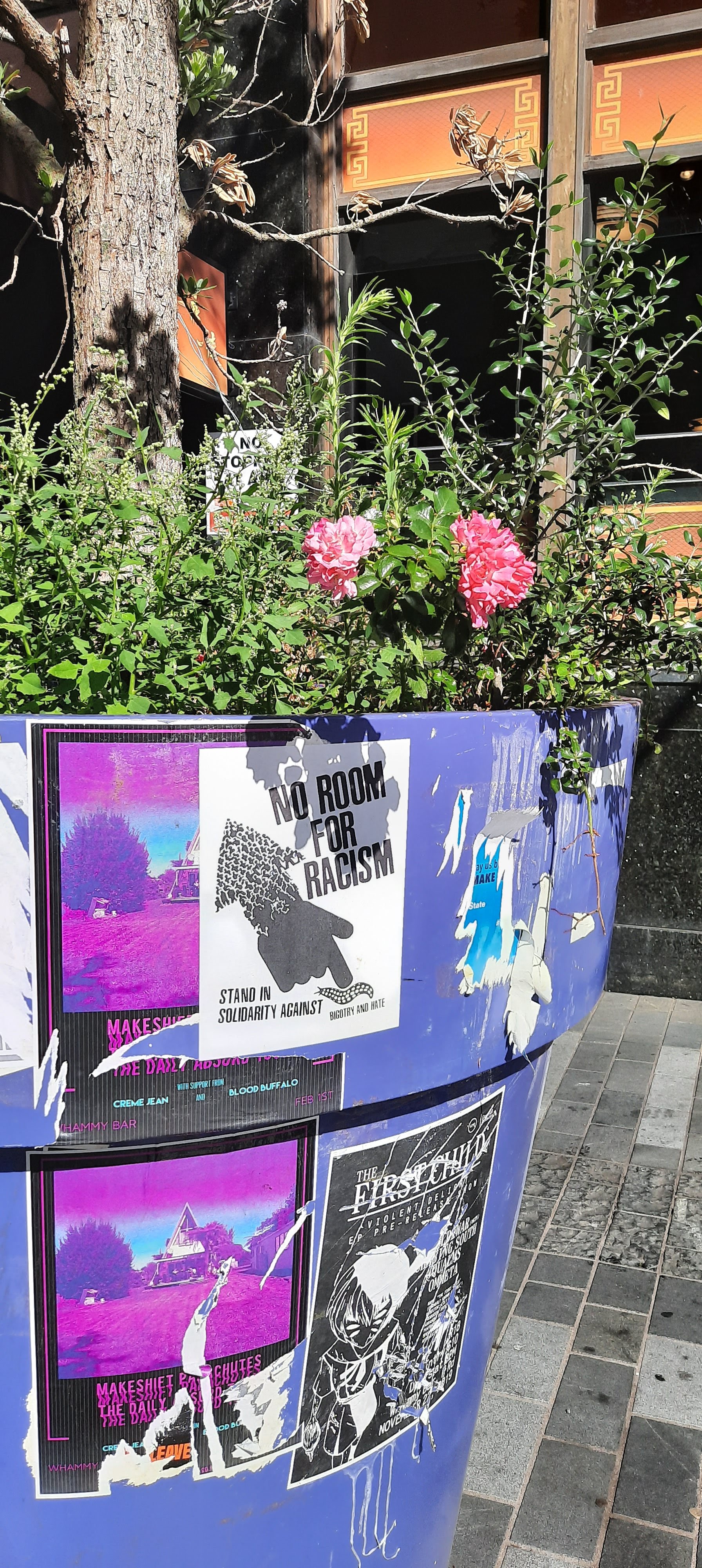
As I arrived at the site, I documented the surroundings including the art wall out the front and the library opposite. I found that there was a focus on the distraction from the derelict site to create a uplifting, pleasing atmosphere to draw the public down this section of Lorne St.
I found that in order to notice and appreciate the St James Theater Building there was a need to look up or look from a different perspective. I myself had walked past the site many a time and never noticed it. It has a sense of disregard because of its weathered appearance. It made me think about how I’ve become so accustomed to focusing on whats directly in front of me that I forget that there is a totally different landscape above my head in the city.
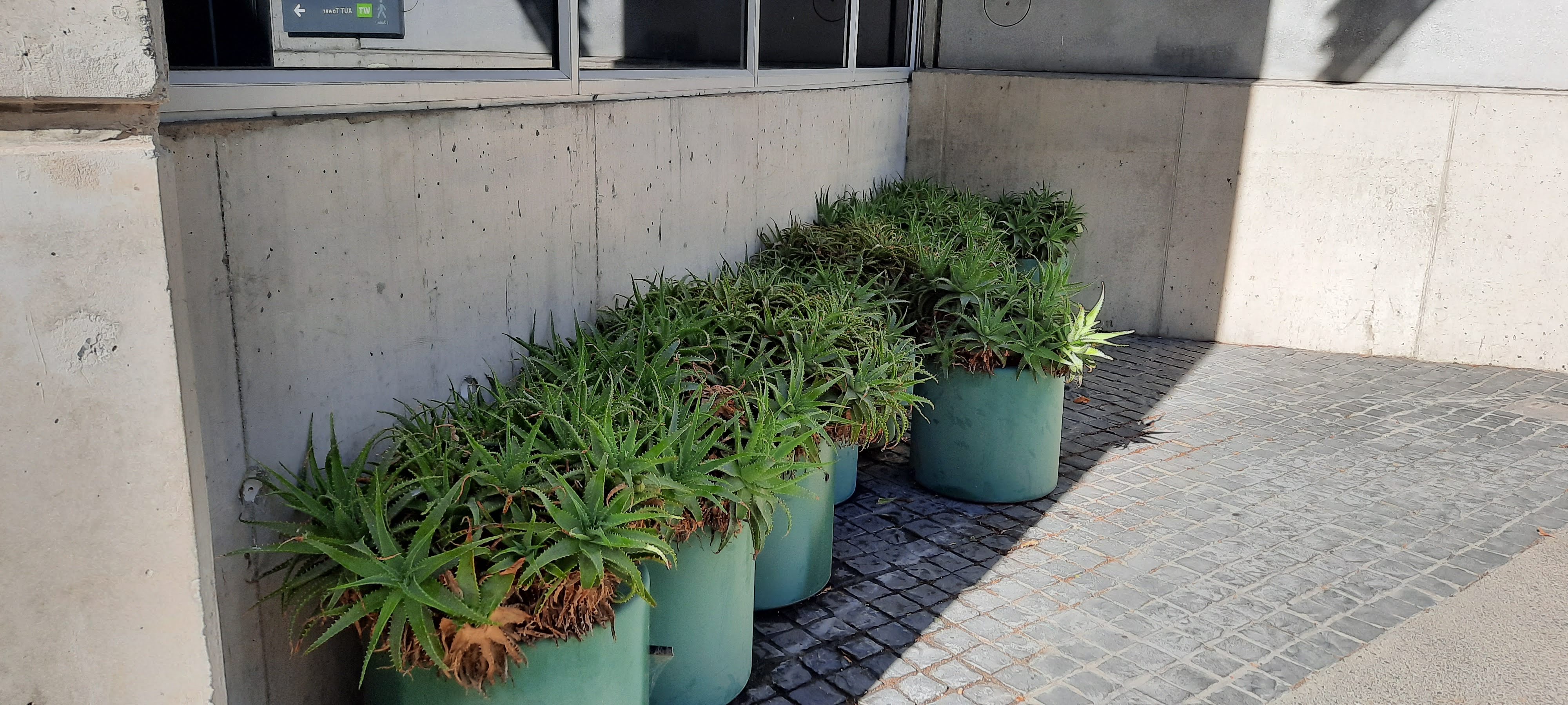
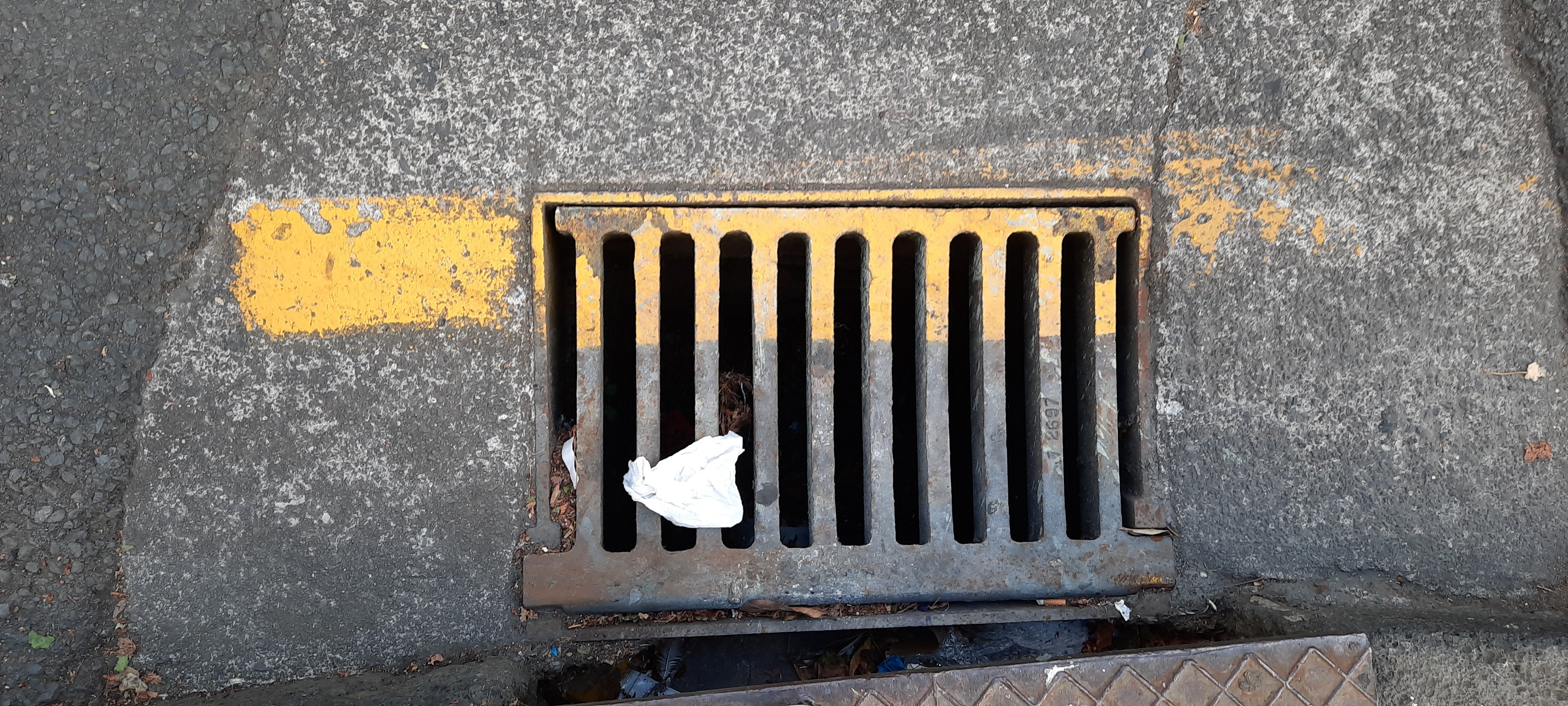
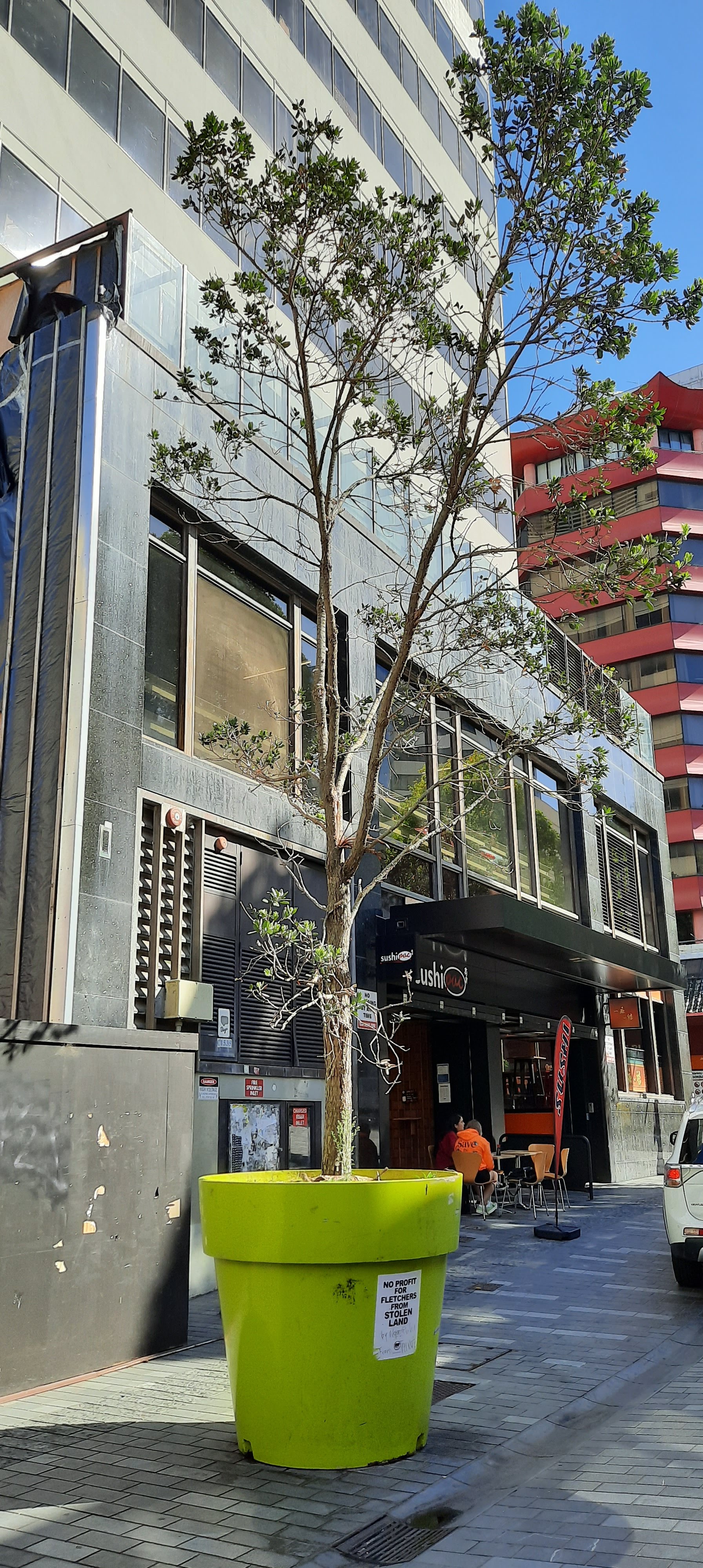
These images above are other documentations of colour around the site as well as some surrounding locators.