Week 2: Model Making Exercise

Thursday’s class was amazing! Not only did Rachel bring in some amazing brownies that we got to eat, but I also got to get back into model making which I hadn’t realised how much I missed. We did a quick exercise which included making 6 random pairs of words from our intuitive maps and making models in response to the word pairs. Below are my the models I made.

RISK TAKING + METHODICAL STRUCTURE
SUBCONSCIOUS + TRANSITIONAL
DECISION MAKING + CUES (SOCIAL/AUDIO/VISUAL)
NEGOTIATION + UNSPOKEN RULES
SIGNALS (SOCIAL/AUDIO/VISUAL) + MERGING MOVEMENT
CONFORMITY + SOCIAL EXPECTATIONS

This exercise motivated me to start making my documents for Part 1 of this assessment. Below are some of the documents I created this week.

Week 2: Intuitive Map

This week we made intuitive maps to help us analyse, organise and interpret our ideas we are exploring about the space. I really struggled with how I was going to interpret my ideas through an intuitive map, but after a lot of thought, I figured out how I would display it. I started with writing out my key ideas and then positioning them in relation to each other depending on how they sit in my mind.

Rom here I was able to figure out how I wanted to display my ideas. I decided to do a vine wrapping round a structure to demonstarte the important ideas of structure and conformity. The stem demonstrated my main/priority idea, and the remaining ideas bled out from that from most to least important and relevant. Below is my intuitive map and my 150 words to explain the site.

150 WORD STATEMENT:
My intuitive map describes the structure and movement of the Mayoral Drive crossing outside AUT WG Building. 
The criss-cross wooden structure is a symbol of the intersection and structure of the crossing and explains the subconscious conformity that exists within the space. 
The creeping vines communicate the conscious organic movement in the space that rejects structure and signals. 
They also explain the organization of my ideas and thoughts about the space and their importance and relevancy. 
The main vine on the right of the page symbolizes my main idea in which all other ideas branch off. 
The closer to the stem, the more relevant and prominent the idea is in my thought process. 
The creeping vines indicate the relationships and connections that ideas have to others. 

Week 1: Social Space Decision

On Thursdays class we brought all of our A5’s together to do an exercise with the selected list of words. Through this and the discussion, I started to look at the spaces we had chosen in more abstract ways instead of literal terms.

I have decided to choose the traffic crossing on Mayoral Drive outside WG building as my site because I wanted to pick a space that is given meaning and context and is created by the people that occupy and interact with the space. I like how the space is not solely defined by physical constructs, but is also largely dependent on movement, interaction and people.

The two words I chose that associate with the space are EXCHANGING and JOINING. I also chose a series of words to help us to start thinking about the space that I found really correlated with the crossing.
SPEEDS
REACTIONS
NEGOTIATIONS
OVERHEARD CONVERSATIONS
EXCHANGES
ROUTES
UNSPOKEN
RULES
EYE CONTACT

I read Species of Spaces by Georges Perec before I went to observe at the site. I found it helpful as an instigator to observation. His work gave me ideas on what to look out for and notice.

I then spent over an hour sitting at my site, observing, and taking notes. I thought I would get bored and sick of siting there but to my surprise, this was not the case. Once I allowed myself to stop, sit down, remove dissociated thoughts, and observe, I noticed that my surroundings were so rich with information that ideas and observations flowed consistently out of me and onto the page. The whole time I sat there, I was taking notes; just as I wrote one observation or idea down, another popped into my head. Below are the notes I took over the hour.

The reason why I decided to take notes in a chronological order in bullet-points was because I wanted to document the breadth ad depth of the site in the context of time. The crossing and its surroundings are constantly changing due to their temporality. documenting like this highlights the importance of time and how dependent the analysis of the site is on it.

Gravitational Pull (100 words):
What originally drew me to the site was the way it acted as a social space but wasn’t confined by the traditional constructs of walls, floor and a ceiling. I have an interest in the way people interact in public with each other and space and the role that unspoken social expectations and rules have on the way a space is interpreted and portrayed. Traffic light crossings are a place where people from all walks of life, with different stories and destinations meet, wait and move together. The crossing is an easily accessible site that allows me to sit and observe in comfort, allowing me to investigate and explore my interest in the role of societal and social expectations, and psychology in space.

Week 1: Social Space Exploration

This week we discussed the brief and what is meant by ‘social space’ and ‘commons’. We were given the task to choose three social spaces, assign 2-3 words from the list given to us to each space depending on how they related, visit the space and observe through note and image taking, and arrange, organise and design my images and notes onto A5 pages.

Below are some images of notes I took in class about social spaces and commons.

The three spaces I chose included the traffic crossing on Mayoral Drive outside the AUT WG Building, Level 1 of WG AUT Building, and Albert Park. Below are some of the notes and images I took of the spaces.

From these, I created an A5 page for each one depicting my observations of the spaces.

Semester 2, 2020

I am really looking forward to this semester. It is so good to be back on campus and be able to work in studio with my peers again. I definitely am able to appreciate having a space to work and being surrounded by my friends and peers. As far as I can tell so far, I like the brief. I like the slightly different approach to studio and like the concept of ‘Social Space’. Last semester I really found a passion and interest in human actions, thoughts and psychology in space and this brief allows me to explore this further.

Final Submission

Presentation:

Recorded Pitch:

Pitch Transcript:

Social behaviour and societal perceptions influence the way in which a space is experienced. My design intervention aims to investigate, challenge, influence, alter and create a connection between the subconscious and conscious mind and an awareness of the influence societal expectations has on the way we move, act and think in terms of space. 

My design intervention has grown from my observation and fascination with the city’s unspoken rule and expectation of physical existence without social interaction. We spend so much time looking down and avoiding eye contact with strangers that we cease to notice the landscape above our heads, something many city goers exist within, but never experience.

I have designed a public walkway in the St James Theatre foyer space between Queen St and Lorne St. The focus of my design was to break the expectation and habit of looking down and avoiding eye contact by subconsciously making the public gaze upwards and interact with the space.

I have done this with a focus on the ceiling feature. A reflective film is suspended from the ceiling which flows down into a series of free-flowing drapes. Lights are positioned along the opposite wall which allows the fluid light reflection to project onto the floor. This was inspired by Anish Kapoor’s work.

I also have a folding sheer fabric wrapping along the wall from the ceiling to the floor. This creates interest at eyelevel as well as allowing momentary interaction with the space. This feature was heavily inspired by Georgia O’Keeffe. The reflective drapes not only allow interaction with the space, but their moving light projections connect strangers through their innocent movements.

My colour palette was inspired by my own fascination with the world above my mind and my adoration for cloudy evening skies, just before the sun sets. I have always loved the unpredictable and temporal colours cast across the sky. This is why I have chosen the soft pinks, yellows, oranges and blues as my colour palette.

Reflection:

I am really happy with my design and the way it turned out. With this said, I did find it difficult to communicate my design ideas through mainly digital means. I think that this experience has forced me to focus and work on skills that aren’t necessarily my strengths and this has allowed me to grow my abilities. Although working from home, working with limited resources and not having the ability to work alongside peers and lecturers has been very difficult, I have appreciated the experience in the sense that it allows me to grow and adapt as a designer.

Week 11: Design Development

Along with my colour experiments, this week I have also explored how to further develop my surface design. I really liked the concept of my surface design but I have been feeling like I have hit a brick wall in developing it. It also didn’t demonstrate Georgia O’Keeffe’s influence on my work very clearly. To help me generate ideas. I printed off a perspective view of my digital model onto A4 pages and began sketching different ideas into the space.

In my first sketch, I explored creating more of a connection between the ceiling and the floor. I developed my surface design to have the reflective material curve around against the wall and then onto the floor. My surface design had a certain sense of separation between the ground and the floor and this design creates a solution.

Below is my second sketch. One of my focuses in this design is making the public a part of the space rather than a viewer of it. I wanted to do this through interaction with the space through movement as it is a public walkway where people will constantly be moving through. This second design explores how I could develop my surface design idea to incorporate this by extending the ceiling material and letting it drape down towards the floor.

In my third design (below), I have explored flipping my second design so the material would drape on the same side of the passage as the stairs. The reason why I did this was because I am design a public walkway. I don’t want to block off the rest of the space, stairs and doorways but I wanted to create a certain level of separation between the two to allow the flow of public with limited disturbance to the rest of the building and its uses.

My fourth design (below), explores how I could create more interaction with the space and other people passing through the walkway. I am not as sure about this design because it would make the flow of people more disjointed but I do like how it allows more influential movement in the space.

My fifth and final design (below) explores space interaction and partitioning the best. In this design, I have demonstrated the reflective film on the ceiling which is covered by the sheer fabric I have used previously in model making. The reflective film is suspended from the ceiling with a series of drapes extending off it to not only create a change in space between the walkway and the rest of the building, but to also allow the public to influence its movements and light projections on the floor. This passing on of movement creates subconscious connections between strangers in the space. The folding sheer fabric is also suspended from the ceiling, over the top of the reflective film, and curves down the wall. This is inspired by the flowing form, folds and depth of Georgia O’Keeffe’s work. The surface volume draws attention as well as interaction. Its flexibility allows public to shape, mold and manipulate the surface. I chose the sheer fabric not only because of its ability to be folded and manipulated, but also because o its soft, warm yellow-orange colour. This colour demonstrates and articulates my chosen colour palette.

I think that my last design best communicates my ideas and intentions with this project. I am now going to focus on creating a presentation with this concept.

Week 10: Colour Exploration

This week, after discussing my work and my next steps with Ceili, I have conducted a series of exercises to push myself and further develop my project. One of the main dead ends I have hit was picking a specific colour palette. From the beginning of this project, I have been interested in explore colour in the sense of reflection, light and shadow instead of the ‘normal’ sense. Because of this, I explored different colour affects on my surface design perspective to hopefully get some ideas flowing. Below are the images of my exercise.

I really liked the magenta when I did this exercise. It started me thinking about ‘sky-blue-pink’, the colour of the sky and the clouds in the early evening before the sun sets. I have always loved and had a fascination with the sky. I love how something so consistent is so temporal and forever changing. I love the unpredictability of its beauty. My favourite time to look up at the sky is when it’s ‘sky-blue-pink’. My project is all about my own interest in the social behaviours and expectations and how i can influence and encourage people to look up and admire and experience the beauty I see. My colour palette can reflect this by demonstrating the beauty that is above my mind.

I also did some experiments with quick drawings (below). I experimented with pencil drawings as well as drawings with acrylic paint and water colours as these were common medium used by one of my artist models, Georgia O’Keeffe.

Below are some images I did with acrylic paints. I painted on a smooth piece of reflective film and then pressed that onto the paper. I was quite fascinated with the texture that was created on the paper.

I did the same with watercolours (below). I liked the way the colour blended with each other to create a smooth transition.

I then did the same experiment with acrylic paint, but this time I scrunched up the film before I applied the paint. I really liked the colour that occurred when the paint mixed together in the press. The texture was also really interesting.

I then conducted the same experiment with the watercolour. I liked how organic the press turned out.

Through these experiments and explorations, I have come to decide my colour palette. I think by having a collection of soft pinks, yellows, oranges and blues, I can create the landscape that many people are too blind to experience and enjoy. This colour palette will allow my to show people the beauty of the world above their heads.

Below are some images to demonstrate the colour palette I am focusing on.

Week 9: Group Discussion

On Tuesdays class this week I had a group discussion with a breakout group about my work. I have still be struggling to get a sense of how I am going to further develop and what ideas I could bring to my design so the group discussion was good to get some outside perspective and suggestions.

I showed my work from the A3 surface exercise we did in Week 6 and also went over my key concepts and ideas I am wanting to achieve with my design. A point brought up was that the walls in the space were very plain. I showed them some images of my artist models and talked about the aspects of their work that I am interested in and how I am using them to influence my own work. A suggestion was to have some kind of illusionary affect on the walls. The ceiling and floor create this abstract and illusionary mood already so further exploring this and how it could grab the viewers attention to look around could work with my project. With this idea I could possibly play with and explore the use of the pillars in the space as they are a structural feature and ignoring and disregarding them would defeat the purpose of my design.

The only thing to consider when exploring an illusionary affect is the level of distractedness the wall would create. My concept is to draw attention upwards as the ceiling is the main feature; I don’t want to keep the public looking at eye-level as this destroys the purpose of the space and makes its direction in development confusing.

An observation made by the group was that the projection of light on the floor was similar to that of a gently disturbed water surface. A suggestion was made to possibly explore this further in my design. This was an interesting suggestion because I have previously considered the reflection affect through water and had considered using this in my design. The article How to Encounter a Puddle By Anny Li and her exploration and documentation of puddles in New York City was what triggered this brief idea and concept. I had considered having a thin layer of water to create a reflective affect but considered the cold atmosphere it would create with the public travelling through water in a dark space and I wasn’t quite sure if this was the affect I wanted to create.

This suggestion from the group made me reconsider this idea. I don’t necessarily have to incorporate water in the sense I had considered before but it could visually enact my concepts, ideas and purpose for my design. Water not only has a reflective element to it (Anish Kapoor), but it also has fluid and rounded form and movement (Georgia O’Keeffe). If it were to be considered as an element on the floor of the space, it could also act as and element of manipulating conscious movement and actions within the space and creates a connection between the public moving through the foyer and the qualities of the space itself. The public would also carry a part of the design with them, in a temporal sense. The public leave their mark on the space (wet footprints) and he space leaves its mark on the public.

Another observation by my group was the horizontal and vertical relationship. My design focuses on the movement of the public on a horizontal axis but also the eye-line and attention of the public on a vertical axis. In some way I need to explore the relationship between the two so that they work together and not against each other.

It was also brought to my attention the work of Japanese architect, Junya Ishigami. Below is a picture of his work, Balloon, which is made from aluminium, weighing over a ton, but is suspended in the air like a balloon because it is filled with helium.

(http://fullinsight.com/blog/2012/10/cuboid-ballon-by-junya-ishigami)

Ishigami, J. (2007). Balloon. Museum of Contemporary Art, Tokyo.
http://fullinsight.com/blog/2012/10/cuboid-ballon-by-junya-ishigami

Not only i the slightly warped reflection of its surroundings interesting and resonate with my design, but also its combination of structure and form with fluidity and movement. It amazes me how something that large and heavy is a creating a sense of floating and defying gravity.

(https://www.iconeye.com/diary/item/3544-junya-ishigami?cpnb_method=cpnbCookiesAccepted)

Week 8: Pitch

Below is my written pitch that explains the ideas explored in my design.

The World Above Our Minds

Social behaviour and societal perceptions influence the way in which a space is experienced. My design intervention aims to investigate, challenge, influence, alter and create a connection between the subconscious and conscious mind and an awareness of the influence societal expectations has on the way we move, act and think in terms of space. 

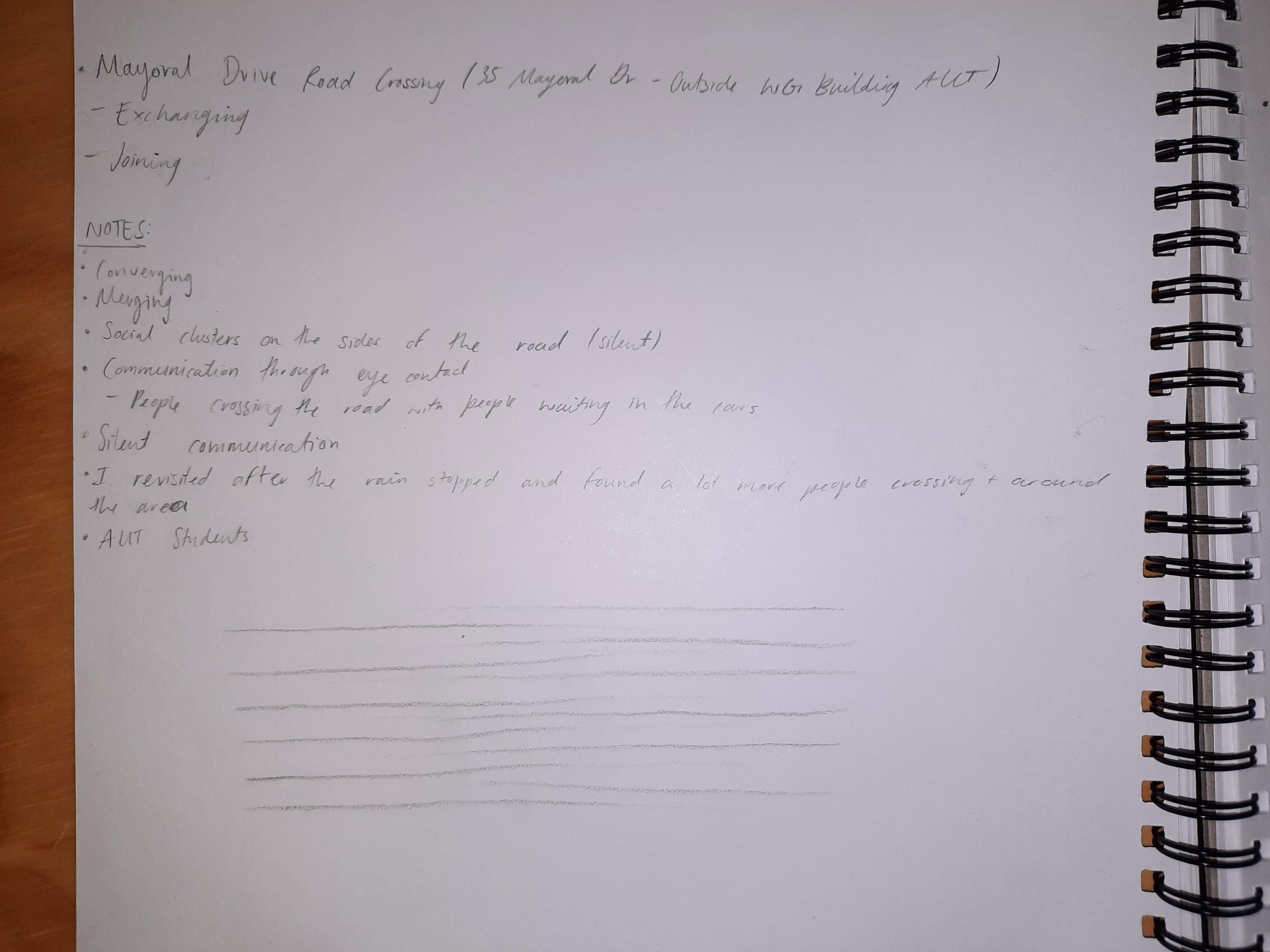
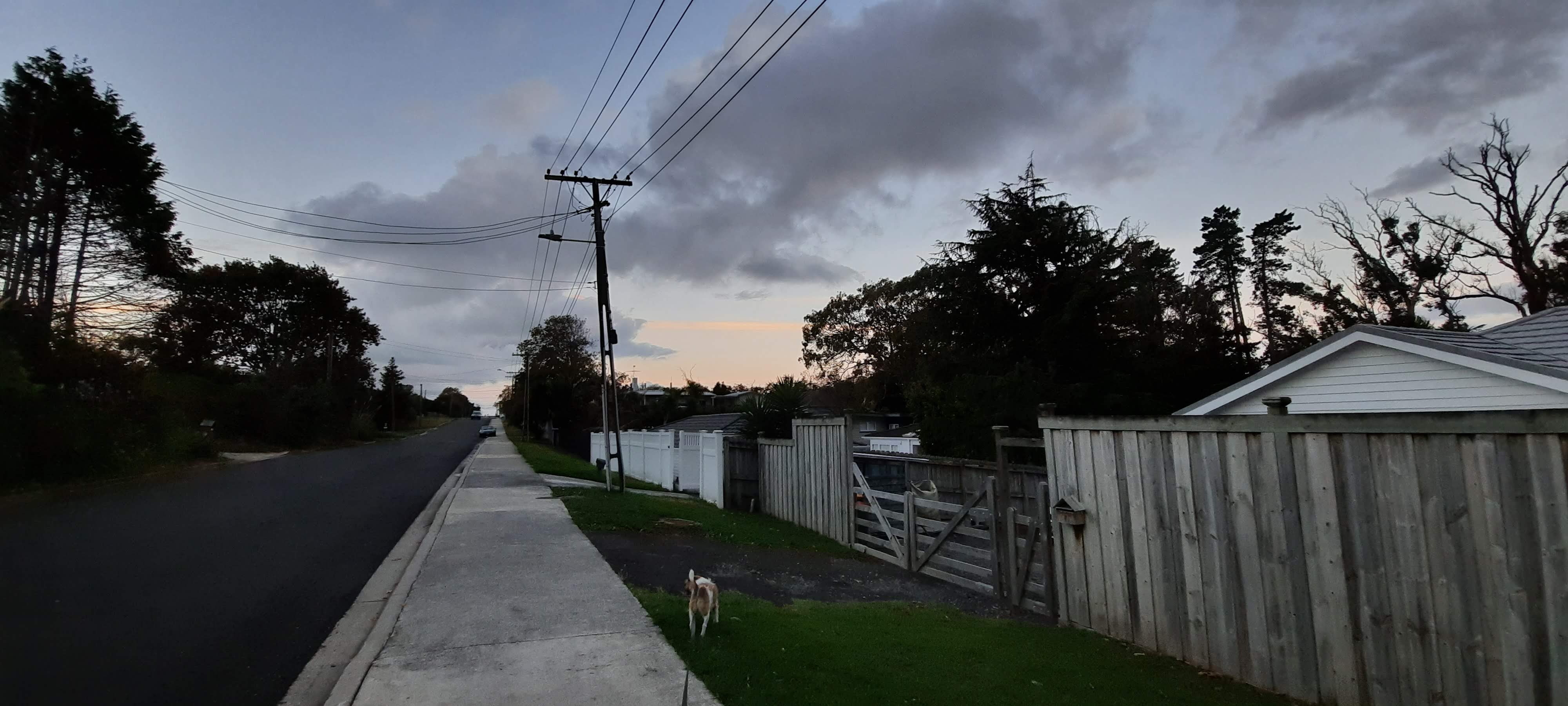
My design intends to bring to the foreground the behavioural expectation within the city to watch where you are going and looking, avoid eye contact with strangers and keep to yourself. As a person who travels from a small community to the city each day and walk up Queen Street from the Ferry Building to university, I have noticed this odd unspoken rule and expectation of physical existence without social interaction. On what would be called New Zealand’s busiest street in terms of foot traffic and people, there is this communal perception to act as if you are walking down the street alone, as if the strangers you pass by and walk along side are a tree, a rock, a moving obstacle in which to manoeuvre around. With this said, sometimes there is a smile returned, often by those stationary on the banks of the flowing stream of people. It’s often those with an instrument, a microphone, a sign asking for spare change that I can depend on for a sense of humanity in the moving rush of obstacles.  

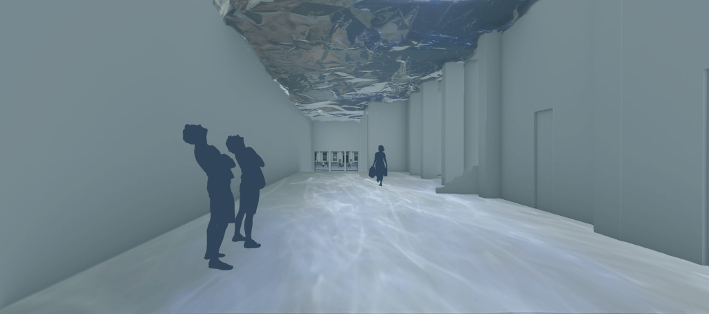
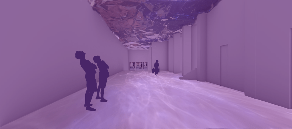
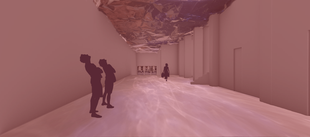
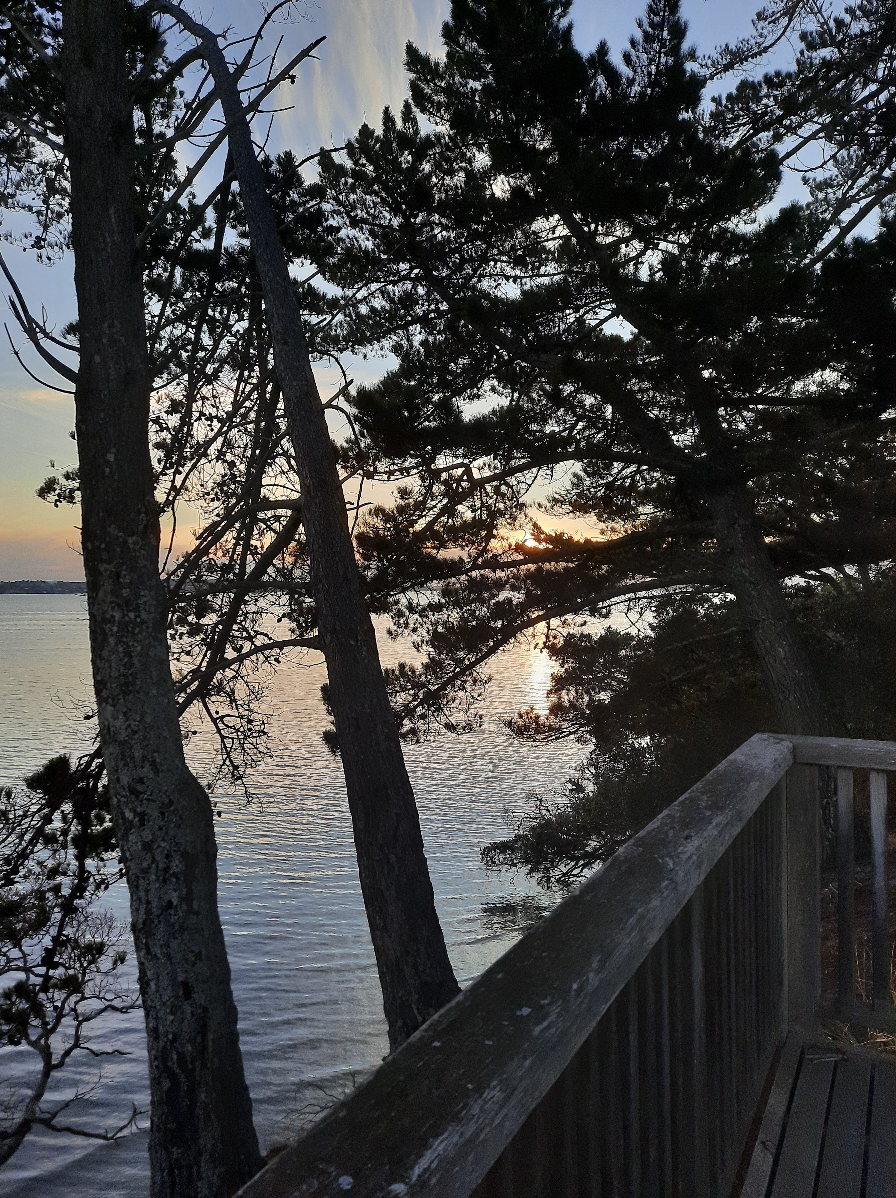
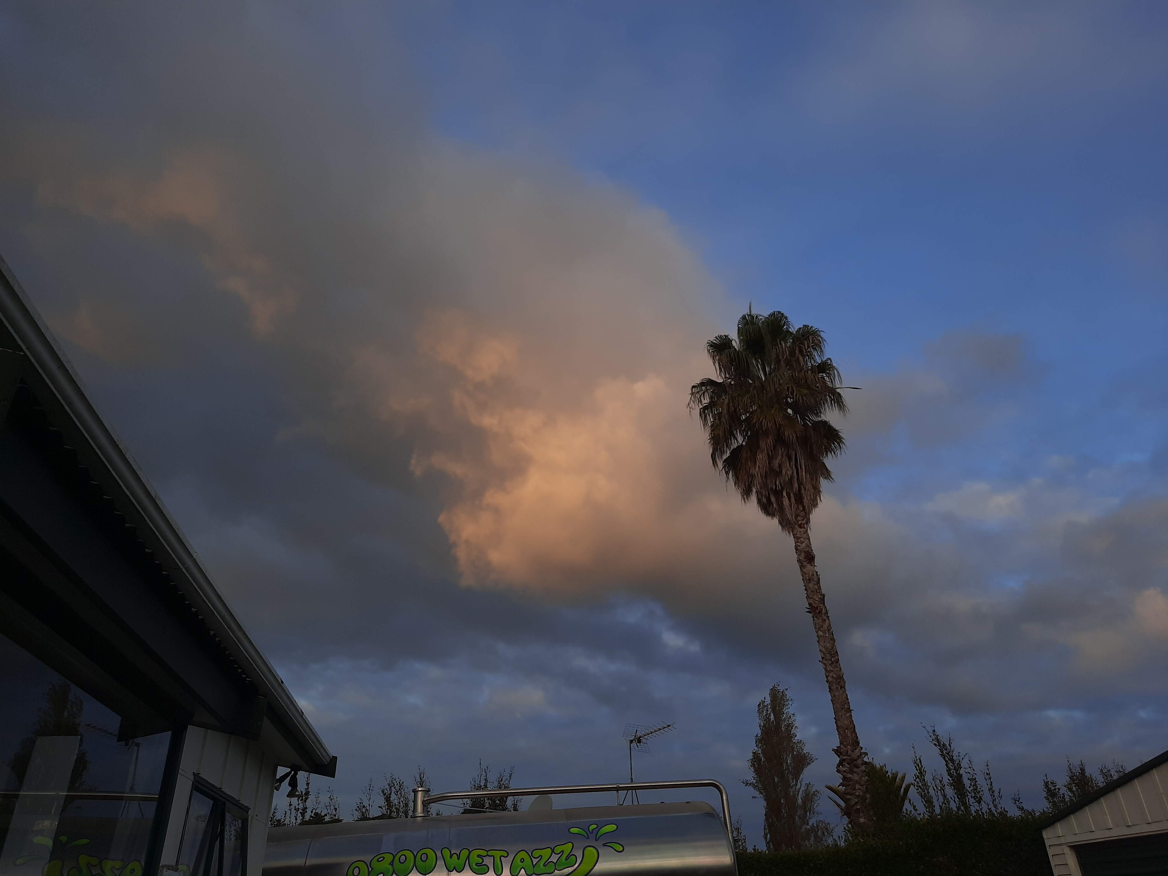
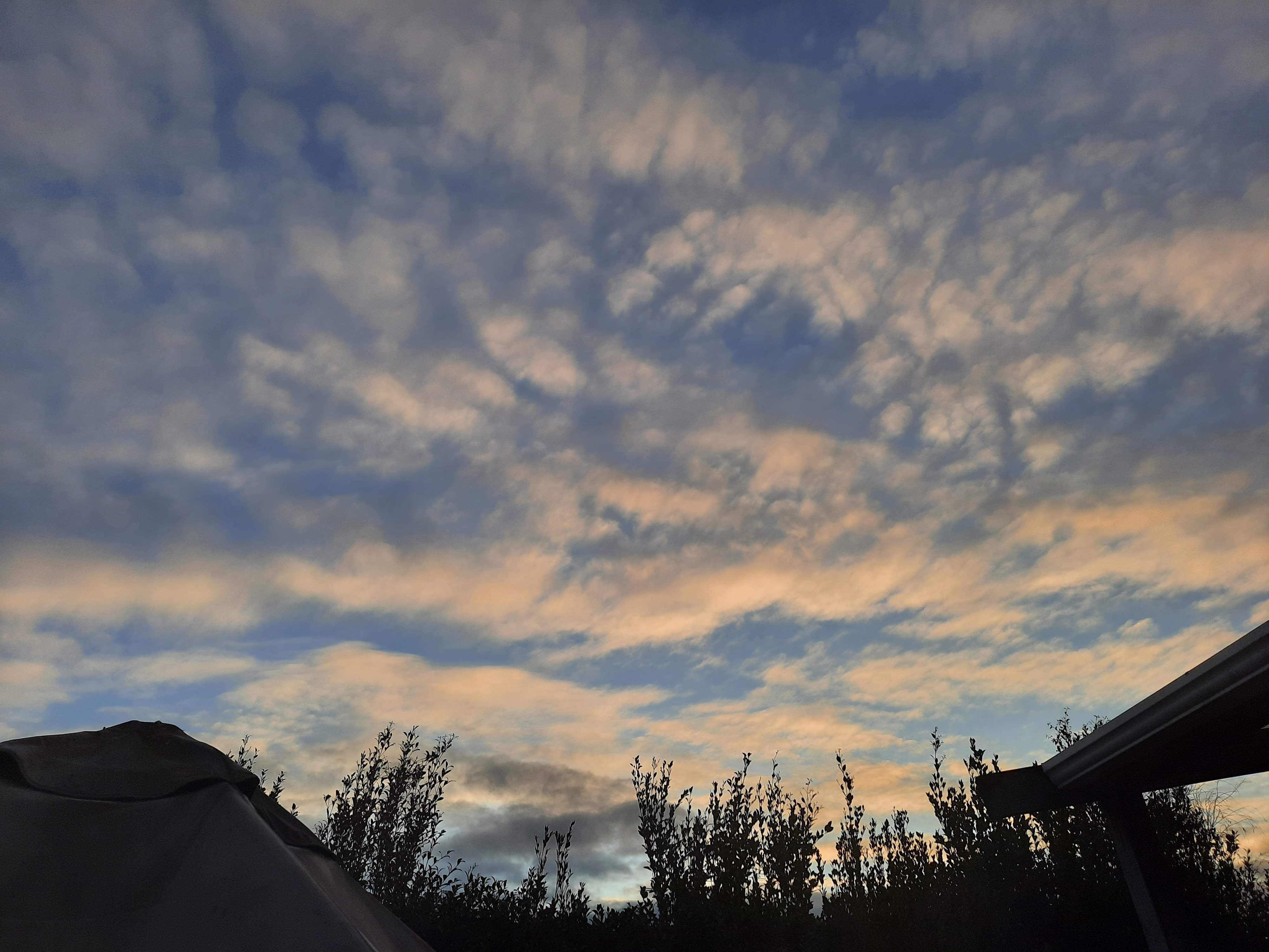
People are afraid to look at someone they don’t know. There is a sense of social fear. This is why, especially in a cityscape, we tend to always look down, avert eyes and blend in with the crowd. But often we see beauty when we take the chance to look up. Studying in the city and experiencing both the interior and exterior of the St James Theatre space, I have come to notice the impact of looking up and experiencing the landscape, environment and world that exists just above our heads, above our line of sight and the beauty of angle, view and perception that many city goers exist within, but do not experience. 

My design is aiming to change social behaviour in the city by encouraging people to look upwards with lighting, shadow and reflection through fluidity, form and depth within the St James Theatre foyer space. The space will be designed as an installation public walk way between Queen Street and Lorne Street as a way to make the general public aware and consider the way they act, move and think not only within the space of the walkway, but in term of the city. The design is a way to highlight, challenge and alter peoples’ social interactions. We don’t exist in a world by ourselves. My design is based around people being a part of the space and altering it with their existence, creating a sense of temporality, chance and interaction, rather than people viewing the space as if it was a framed painting placed in a gallery. 

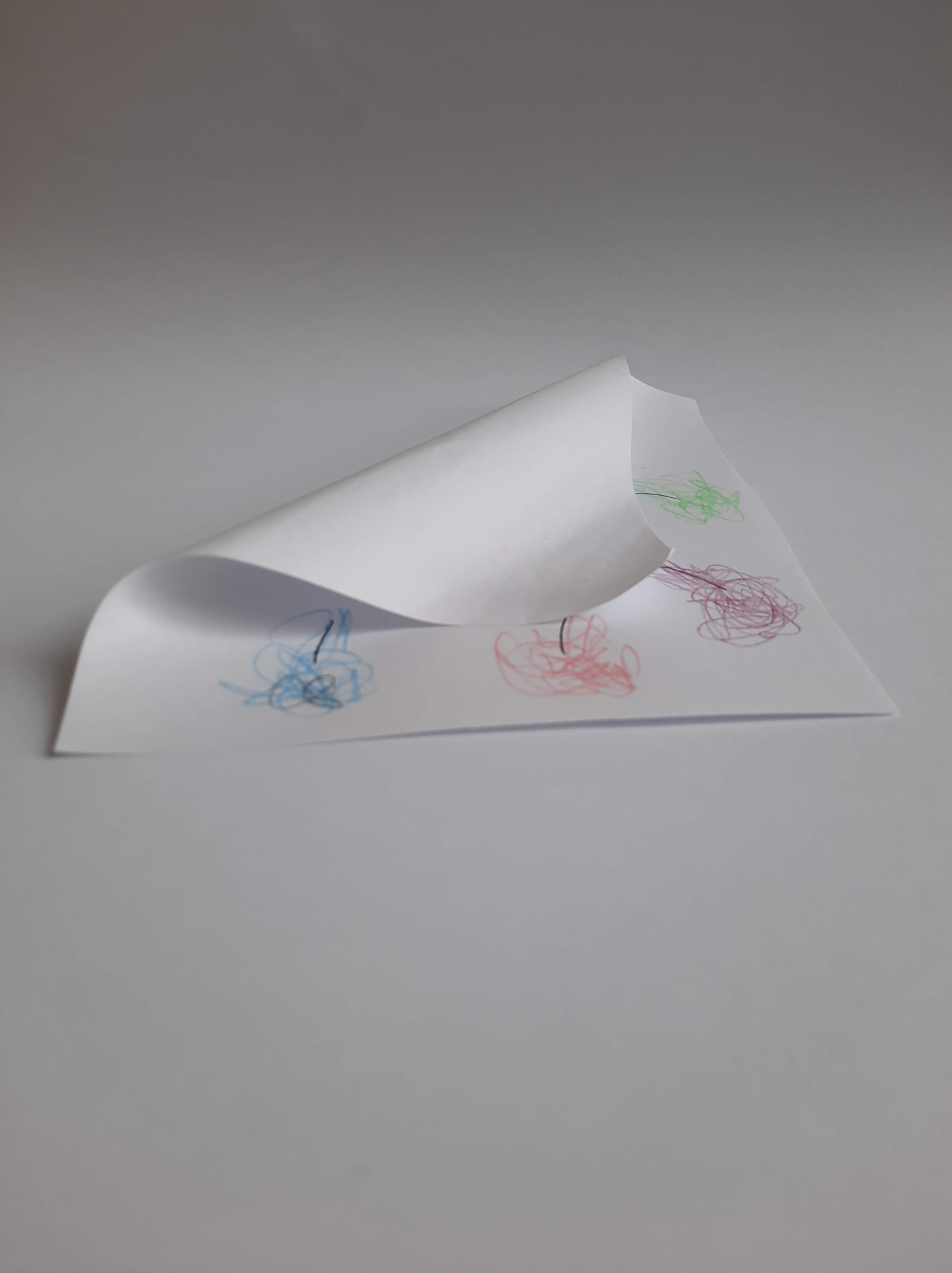
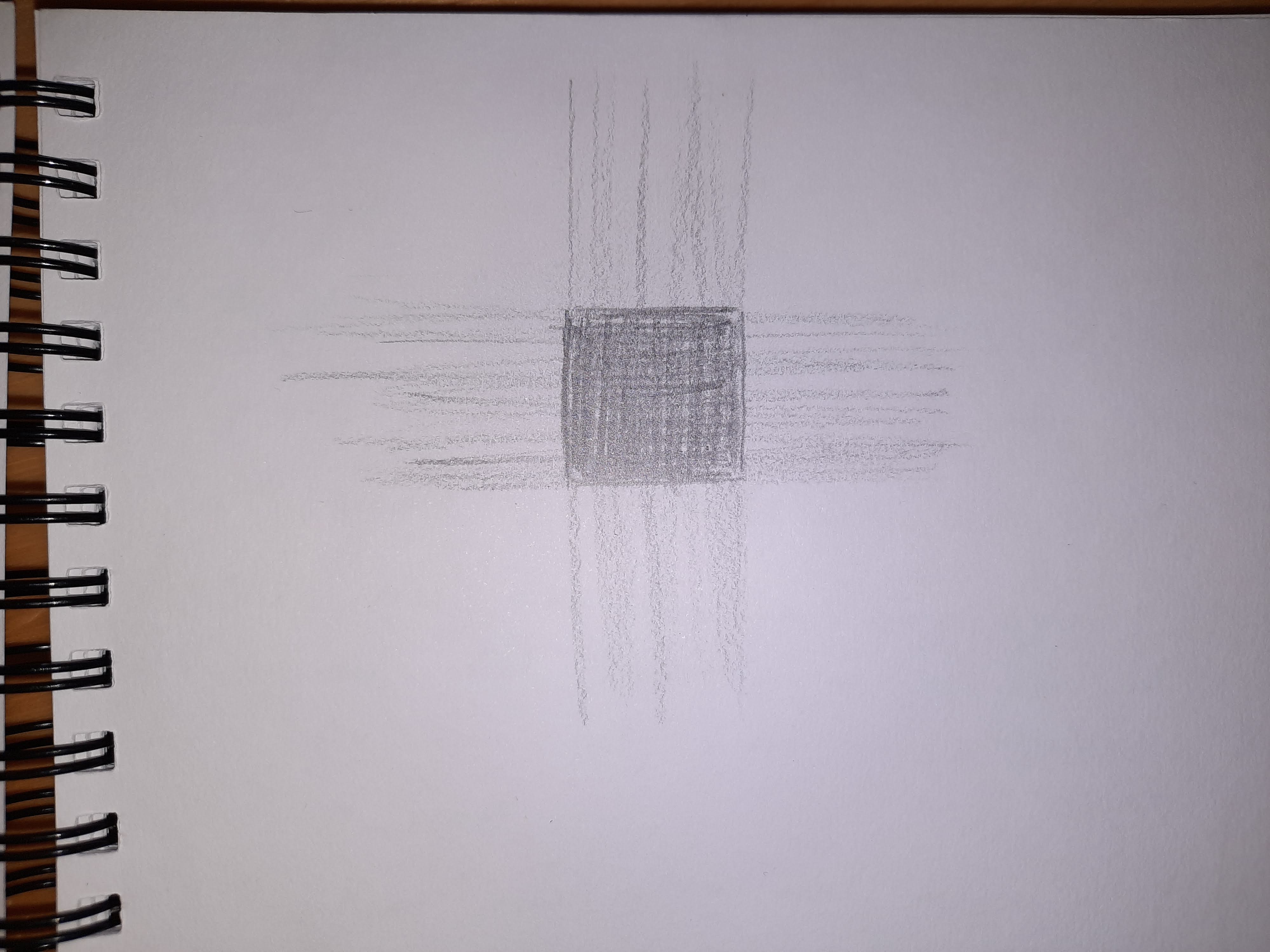
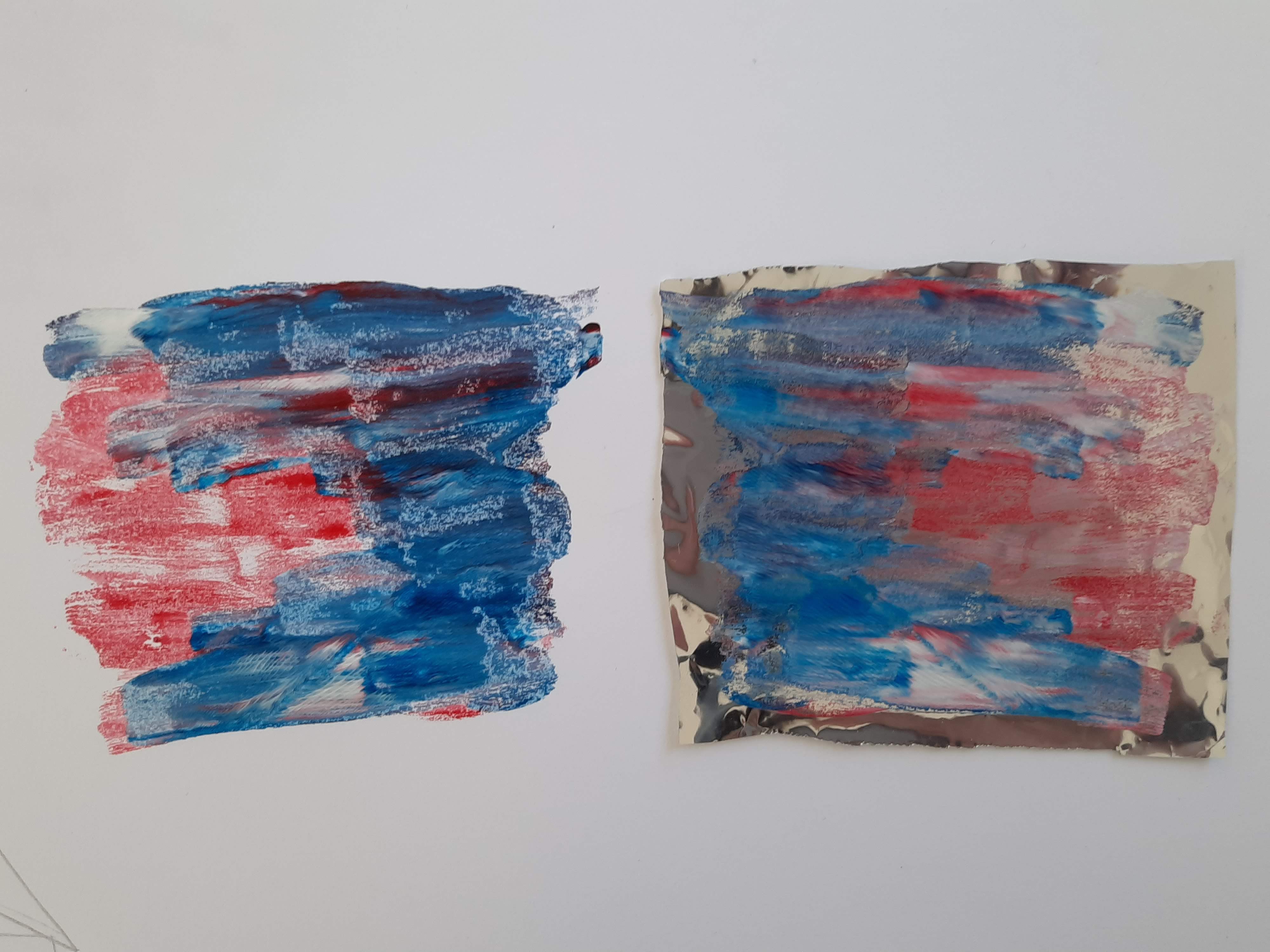
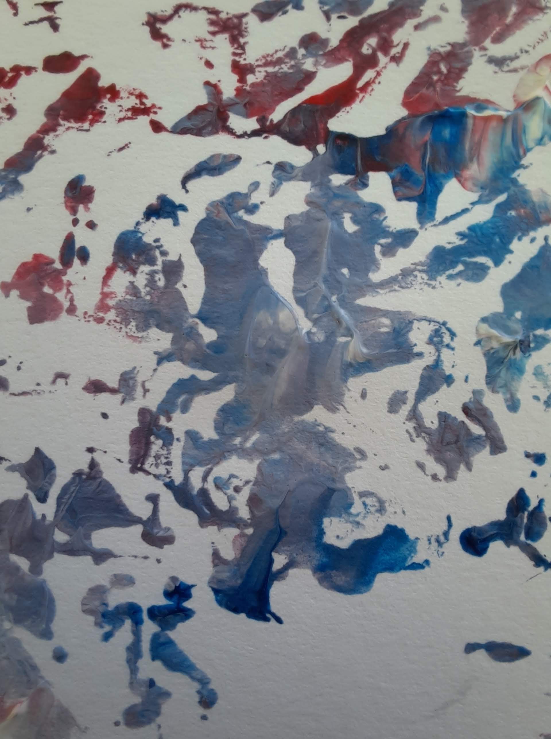
As I am working on this project from home and have limited resources, I plan on making the most of the resources I have access to as well as taking this opportunity to broaden and expand my skills, especially in terms of digital design skills. I plan to use a combination of model making and photography to capture effective and realistic lighting affects as it is a main factor in my intervention. Along with this, I will also iterate ideas through drawings in pencil, pen, acrylic paints and water colours as I find this a more effective way of portraying my ideas than digital drawings. With this said, I am going to make the most of my access to digital tools and use programs such as Photoshop to further edit my hand drawings and photographs. I plan to use Rhino only as a canvas in which I can test ideas in terms of how they will be viewed in the space by an occupant as I don’t have the resources to build my own site model. This tool will give me a sense of scale in my work. I am going to mainly focus on my strong points in terms of making and presenting and use other skills to support my work in its digital presentation.